Simplicity is operative word here. Superb.
June 11, 2025
77
-

-
@MikeFewster Yes, I certainly "see" a wide landscape behind the plant. That is an impression or sensation/impression that comes immediately when looking at the image.
@simplejoy In short (a lot has already been said by other contributors): The plant, or seedhead, whatever kind it is, is on it's way towards the upper left. It will soon hit the ceiling though. I wish there was quite more space to the left and above the plant.
The image is well composed. I like how the dark upper right is mirrored to the the left making a frame for the plant.The plant is almost sharp (don't get it wrong, here it is sharp enough). Is that the best you get from the old lens? If so it's interesting - what else do you use the lens for?
-

Thank you! Indeed a "painted landscape" is what I've been going for when composing for this one. I enjoy the look this lens produces, it's quite unique and the lack of sharpness at distance adds to the effect. It is our tiny garden which is depicted here so the furthest point away from the plant is around 4-5 metres behind it. Indeed - not much space.
Thank you! You're right... more space above the plant would have been preferable, however it would have destroyed the "illusion" of a landscape, because the part above would have been darker. Perhaps a tighter crop could have worked, but I wanted to keep the plant on the left for balance. It's always a trade-off, I guess. As mentioned above the background is our (tiny) garden, so there are not too many options to play around with. Also it's windy pretty constantly here at the moment, so I often have to work with what I can get currently.
I don't mind the lack of sharpness with this lens. According to the booklet I got from Zeiss, it was optimized for 1:1 magnification. It is sharper at closer distance, but of course not up to a modern macro lens. Here are some samples:

I've seen it all, youngins... by simple.joy, on Flickr
Row, row, row your bokeh… by simple.joy, on Flickr
Happy Women's day! by simple.joy, on Flickr -
It's very often about compromises. Wind blowing doesn't make close-ups easier!
The lens... I think it is sharp enough for a lot of things. ("Sharpness is overrated anyway.) In the third of the extra images you show there is some not very pleasing CA around the petals of the center white flower. That is, for me, a bigger problem than having a lens that is on the soft side. Anyway, interesting lens, Graphikon sounds as the lens is made for a bigger format.
Thank you for images and the explanation! -
You're right, the CAs are noticable - but I guess, there's a reason why manufacturers still rarely make macro lenses faster than f/2.8... even 90 years later! The Graphikon needed its speed for the purpose of capturing fast moving subjects (like droplets or lines appearing on a screen), where being able to capture the movement was likely more important than having maximum sharpness or detail. I'm sure it improves when stopping it down further, but I like its look wide open. You're right - I guess what makes the name "Graphikon" sound more large format, is the connotation with Graflex/Speed Graphic and other makers who used such terms... I was thinking more of the graphical industry initially (Rodenstock had a series called "Apo-Graphigon" and Wollensak made a "Graphic Raptar" - what a name!), but I guess the Graphikon might have a different origin and also seems to be the significantly older lens.
-

Thanks :-)
Die Wachau is not so far away from you. Yes, well worth a visit sometime. The wines are great too :-) -

These weirs are so much like the ones on the Atlantic coast of Canada. Nice image of the zigzag structures (what a leading line!) made of sticks and string, leading us to a large formidable piece of classic architecture. Gentle early light on a beautiful morning gives it a peaceful feel. I see that these are, as usual, done with your phone camera. I do hope you had your real camera and a zoom to get some closer detail from the weirs. They are intriguing.
-
A purse fully of parrot, I see. Or a smaller species with parrot features. The groundskeeper at a local park wears a larger parrot on his shoulder as he works on bushes and shrubs, so I am used to seeing them travel about.
Were you using a polarizer? If not, might one have helped cut the reflections so the feathered companion might be more visible? I'm terrible about forgetting mine, and am often sorry.
Cool glimpse of the outback in the rear there.
-
Love the way you've framed this, with the monument lizard looking out at the mountains and the classic Austrian village in the valley below them. There is nice color contrast between the lizard and the red roofs, too. Well taken. And thanks for showing us the colorful inspiration for the sculpture. From your photo I can see why the artist chose a mosaic design to recreate him.
-
A lovely flower portrait with sinuous lines that suggest movement where no movement exists. Lovely color. Ii am not sure whether you shot it using a lightbox or created the lightbox effect in post, but it is well done anyway.
-
I saw there was a lot of traffic around this photo and read some of the interesting comments about the flag.
Yes, in the US there are more open displays of flags, and more variation in why and how they are displayed than I've seen in other countries. And that has changed drastically in the past decade. What it means to this particular resident I can't guess. I could write all day about the variations and my own conclusions about them. But I won't. So I'm sticking to the design.
A tiny house in great colorful detail. A cacophony of clashing and contrasting colors and shapes that is downright dizzying but also engaging in a disruptive way. My favorite feature is that it seems one can see through the front door and right out the back! Cool find.
-

Thank you. It was light box.
-

I did indeed also have a small "real" camera with me (Panasonic GM5 with Olympus 40-150mm F4-.56 kit lens).
But those images will probably have to wait for processing until I am retired (almost). They join the backlog. -

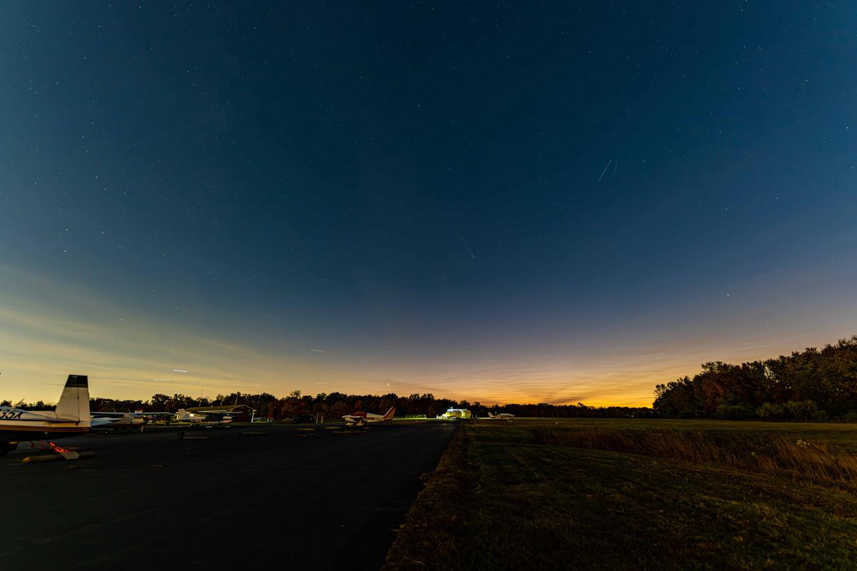
I wanted to get an image of a Comet that passed by back in March. It isn't quite what I had imagined, but still I think an interesting result. Also, doesn't look like much as a preview.
-
Pleasing casual portraits that show emotion and personality. Monochrome renders the backgrounds and colors nicely irrelevant so we can focus on the person. There is a little bother with the overexposure on the hand in the bottom one, pulls the eye away from the real subject a bit too much, and I suspect it is not retrievable.
-
Just wow. Well spotted/taken. What an amazing building. The shapes and reflections are just as confusing as that museum I went into in Las Vegas, and just as mesmerizing. While I appreciate my first look at this amazement showing me that it is indeed an architectural structure, I will encourage you to visit again and take a long lens and see how many different abstract compositions you can isolate within this thing, something you are getting quite good at. You could fill a book!
-
Welcome back and I hope you'll visit more! This one is a classic Simple-Joy offering of mixed degrees of sharpness and subtle blurred elements mixed together in an artistic way. The narrow area of focus is enough to draw our attention to the single shaft of seedy grass that's the subject, but all the other supporting elements (vague shapes, rich colors, bland colors, the single yellow orb that might or might not be the sun, light and shadow) are well placed to create compositional cohesion. Beautiful image.
-
The sky is very interesting, especially that V shape of clouds near the horizon. Nice colors too. I think I spotted the comet coming in to the center from about the 11:00 position. There are numerous other objects with trails but that's the only one that looks comet-like to my untrained eye. The others may be planes or satellites? The airfield may offer good visibility but it doesn't give a very appealing foreground, especially the super lit up tanks below what I think is the comet. I would have the same trouble as I live in a flat place and there are no scenic elevated viewpoints, so I struggle with photographing stars and night phenomena. Looks like you made the best of a limited set of elements.
-
There's some nice ones in this sequence, but I'm unclear about what holds the overall group together without some explanation. You might get more helpful feedback with some narrative, or by submitting a single image you're particularly interested in hearing about. Here's my take:
1 - Probably my favorite because I like a mix of old rusty stuff and nature co-existing with it. I would clone out the little piece of trash upper right, unless I was using it as part of a trash awareness campaign.
2 - Nice sunstar! Makes an average cityscape into something special!
3 - Interesting reflection. Lots of cool geometry and subtle color. Lots of opportunity for abstracts here. Love the wiggly reflections in the lower third.
4 - Really nice architectural image with great framing. The cotton-ball sky helps make it. Another of my favorites in this grouping.
5 - Weird but interesting art object, maybe on the ground or on the side of a building. Calls out for more information!
6 - Pleasing city scape with the bonus of water and some reflection.
7 - Nice architectural image, isolated and simple with good afternoon light.
8, 9, 10 - All the same scene, but I prefer the latter one (my 3rd favorite) with the harbor light in the shaft of the reflection, and the birds of course.
11 - Pleasing evening image, with sunset colors and a really cool sun reflection. I wish for a bit more water space at the bottom and less sky at the top.
12 - Less interesting than the other architectural images, probably because the light has diminished everywhere except the glass on the building to the left. If presented as part of a "disappearing sun" sequence, it has more clout, but without clear context, it becomes a well taken image that's less interesting than the others in the set. -
Like many people I suppose, I already find it slightly absurd to keep an exotic animal as pet in an urban home.
More absurd even is to carry it around in a small cage in the great wide open.
Your title is priceless. -
A great duo of images.
The lizard with its link to the Grüner Veltliner (a very tasty grape; one of my favourites for white wine together with Sauvignon Blanc and Cattarato) is already a sight to behold. Great positioning you employed here, not looking at the lizard from the most expected angle, but looking over its shoulder towards vineyards and a picture postcard village.
The real lizard surprised me even more though: I have never encountered such a wonderfully coloured reptile in West-European nature.
-
Simply wonderful elegance.
You used a perfect camera angle to not look down on the flower, but treat it as a worthy subject, as you would in a human portrait.
The curves are sensual, the colour stunning and your choice of a background with zero distraction is great.
I'm not usually a fan of photos of plants and flowers, but this one ticks all my boxes. -
The logs at the bottom don't bother me. At least not the horizontal ones.
I am less enamored with the vertical pole top far left and the vertical stump intruding from the left bottom. -
Thank you.