Unusual companion to say the least, gingerly carried by the owner. Slice of life in the Outback...
June 11, 2025
40
-

-
Incredibly bright colour certainly makes the mark in viewer's eye. The structure like this will be remembered.
-
Old vehicles left in the wild make a great subject for captures. I bet you could have shown us more angles...?!
-
I like that Vista in the distance. So picturesque.
-

a few seconds difference
When I was meeting my friend in Krakow, I was absolutely that annoying person who kept taking a million photos of both him and our surroundings. I love how quickly facial expressions can change. In a few seconds a person can go from intense and threatening to sweet and happy.
-

-
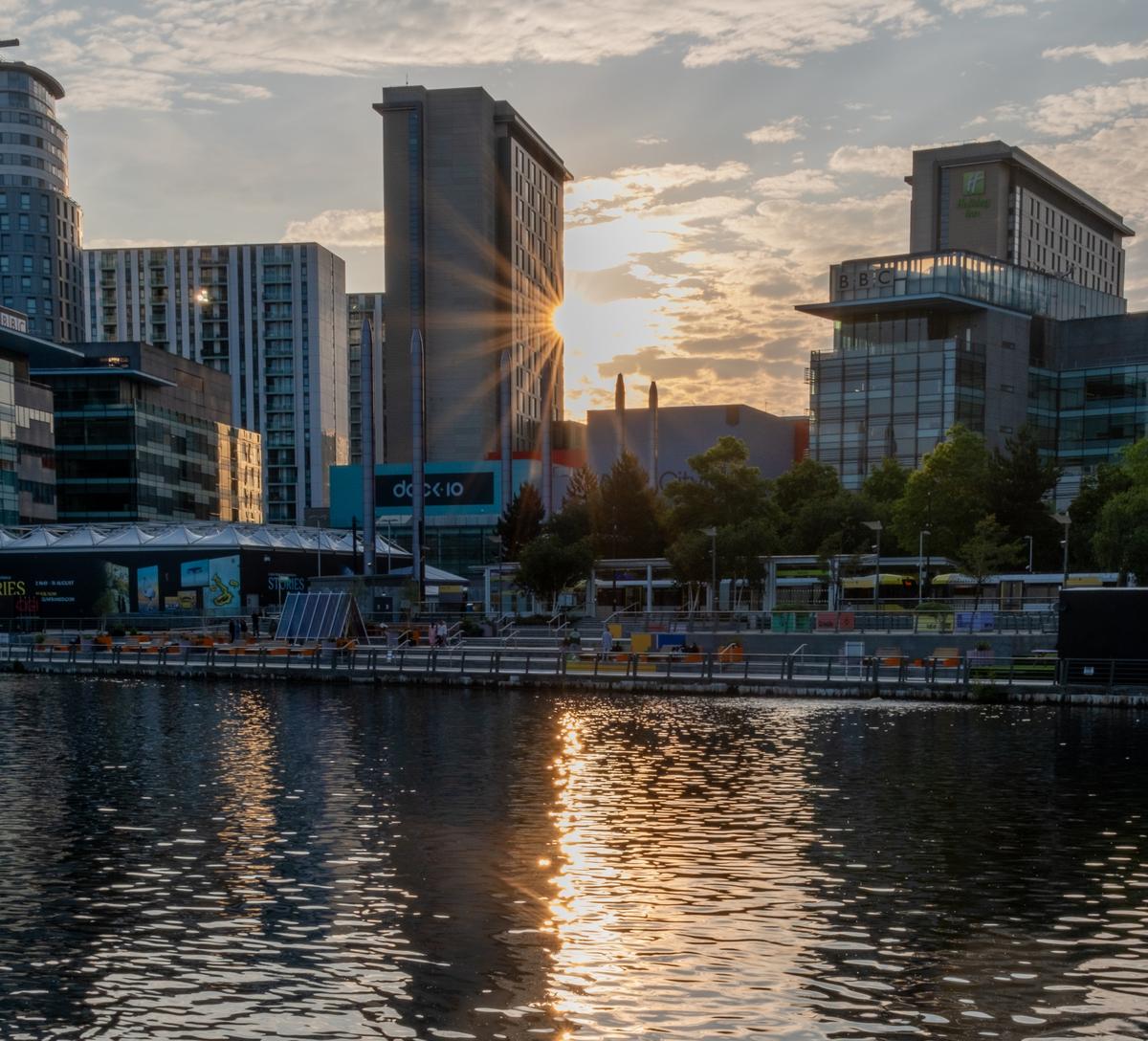
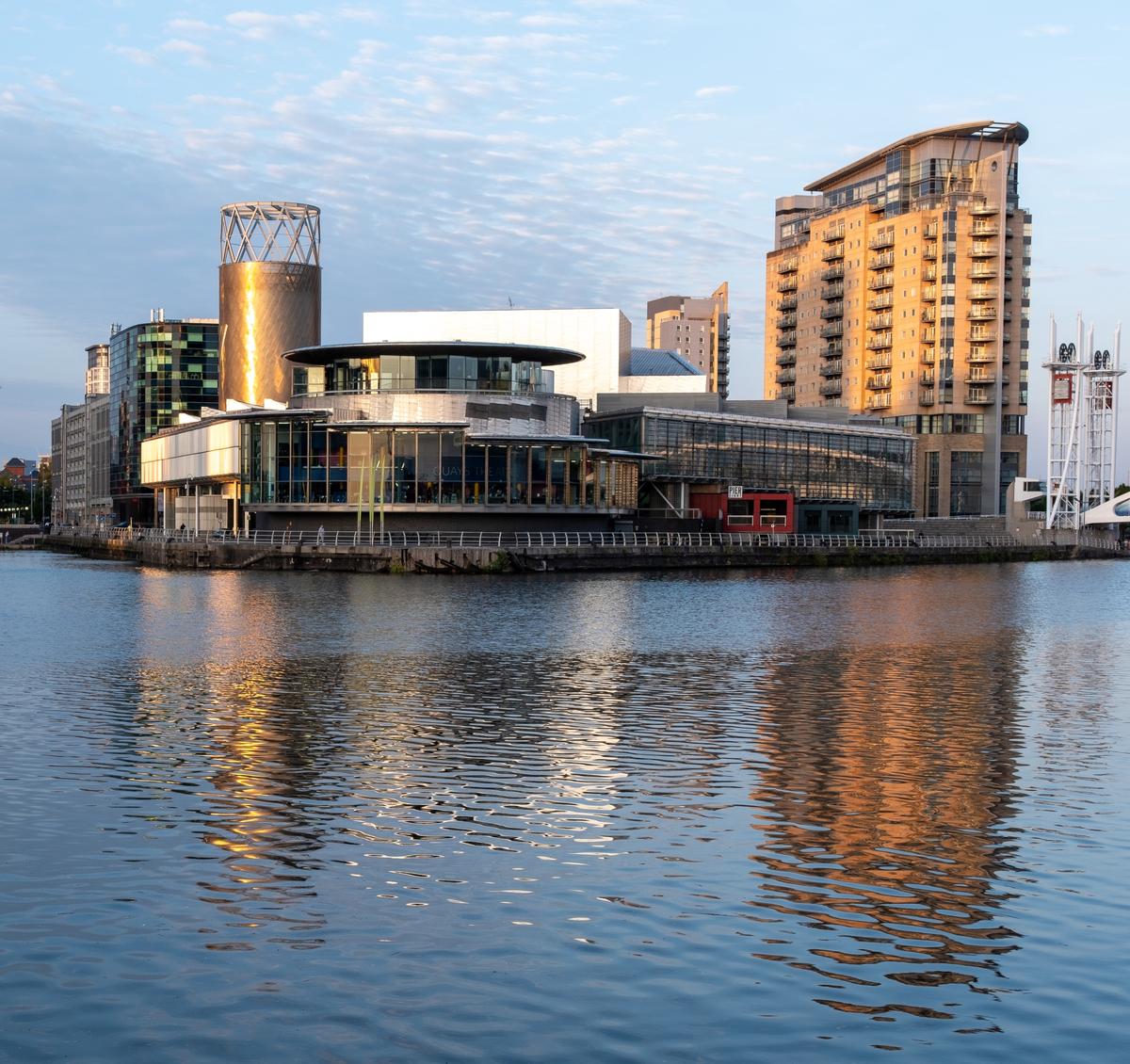
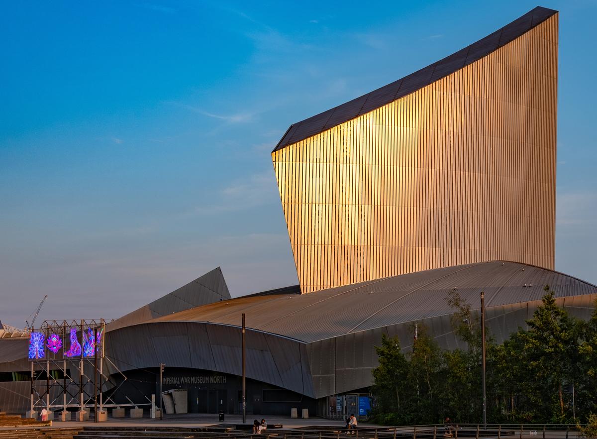
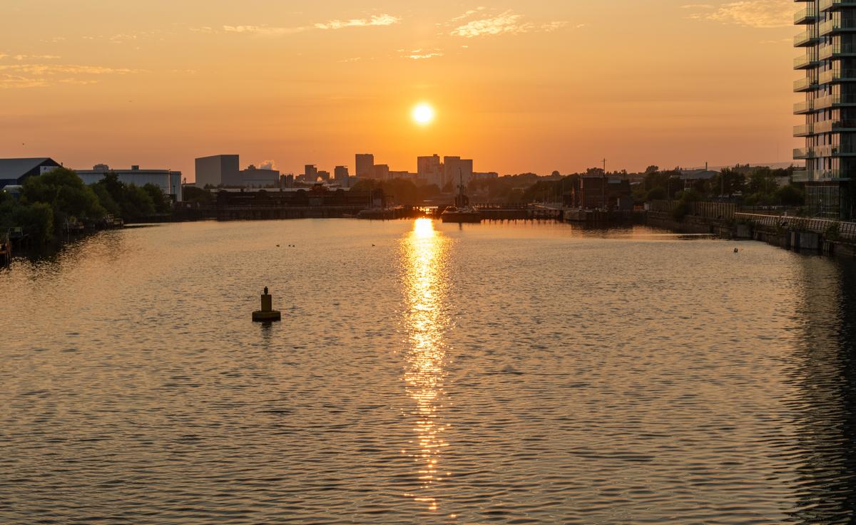
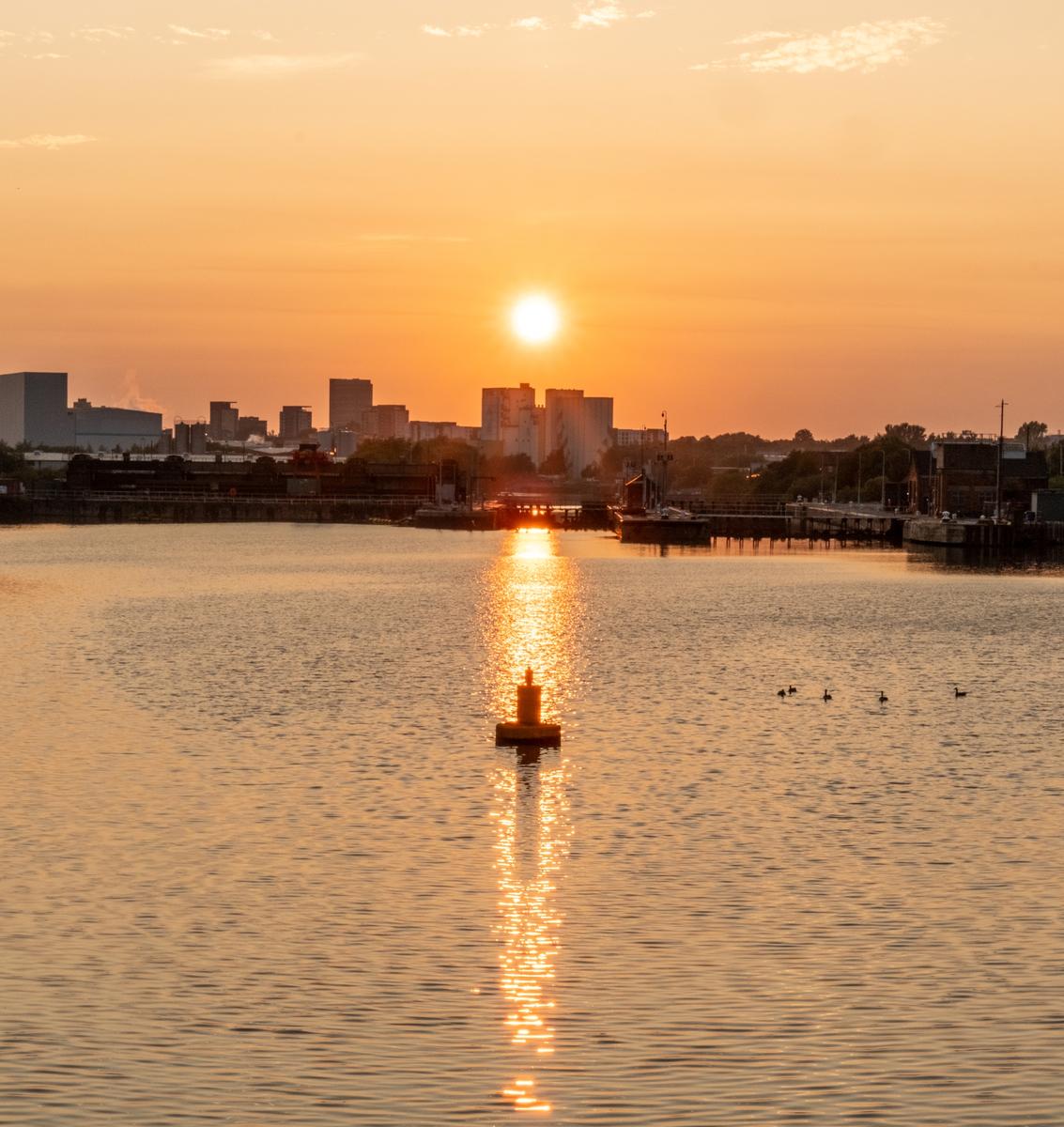
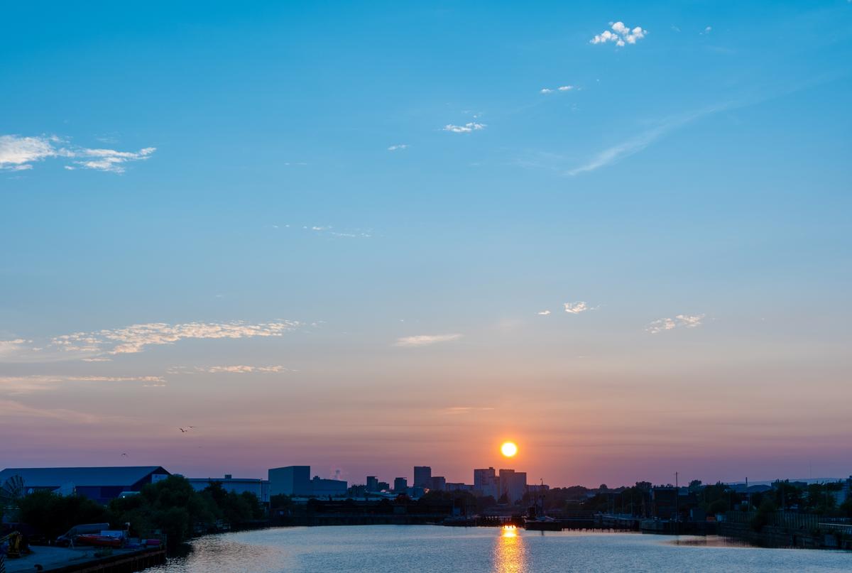
Last night I went down to Salford Quays in Manchester to watch the sun going down. It was a lovely evening and I managed to catch a few 'rays'
-

Very nice set of images, Alan. You used the opportunity well.
My favorite is 0097. (Seventh image)
Rich
-

Thank you Rich. I think photographer also deserves some credit for reproducing this color very close to the natural. 😀 Took some work.
-
Thank you Chris.
-
Your angle makes the most of the zig zagging line from front to back. I looked at it as large as I could get the view and liked the textureand detail of the nets that was then more visible. Cropping a little off the bottom makes these details more prominent when the shot is enlarged - but a case could be made for including all the sea and having the emphasis on the sky/sea balance rather than the nets.
-
Nice. It has the simplicity but careful arrangement found in scientific floral illustrations where the aim is to show the distinguishing features of the specimen.
At first I thought the detached small sections of leaves, bottom right of the stem, should be removed. I changed my mind on that. Now I think they give balance like the corner decorations on the pages of old books. -
The emerald green lizard is an attractive subject but it's the composition and the tower making the image work. The line of the lizard's body and the head direction carry our eye to the white tower. The tree lines from the top left take the eye to around the same point. The result is the unifying of the foreground and background.
Nicely done.
The line of the lizard and direction of the head take the viewer to thw tower. -
Such timing. I've just finished a Greg Iles novel set in Minniev's part of the world. An old pick up truck features in a sinister role. This truck is exactly as I'd imagined it.
There's something of a symmetry between curves of the truck and the cliffs. They look "right" for each other.
The angled pole top left feels like an uneccessary intrusion. Likewise the small upright post at the bottom. They aren't adding to the shot but they are distracting. I might take advantage of PS magic to remove the wires on the right for similar reasons.I wouldn't remove the top left pole by cropping. That would take out the curves of the rear guards. Therefore I'd be using PS generative fill on the pole.
I might also try to solve the problems with a portrait crop with the right just in front of the vehicle, the left a little behind the structure behind the cab and the base just above the horizontal fallen pole. -

Thanks Mike 😊
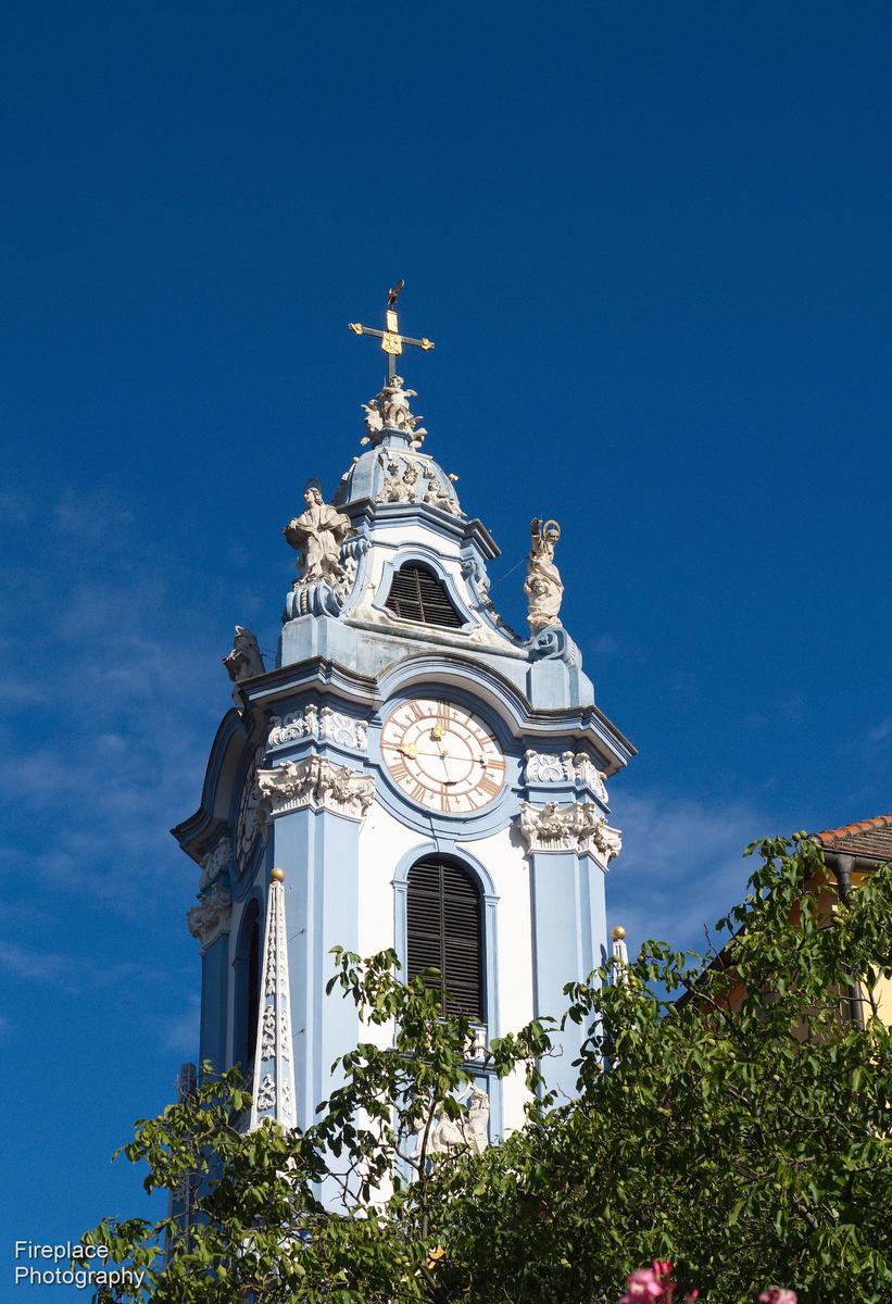
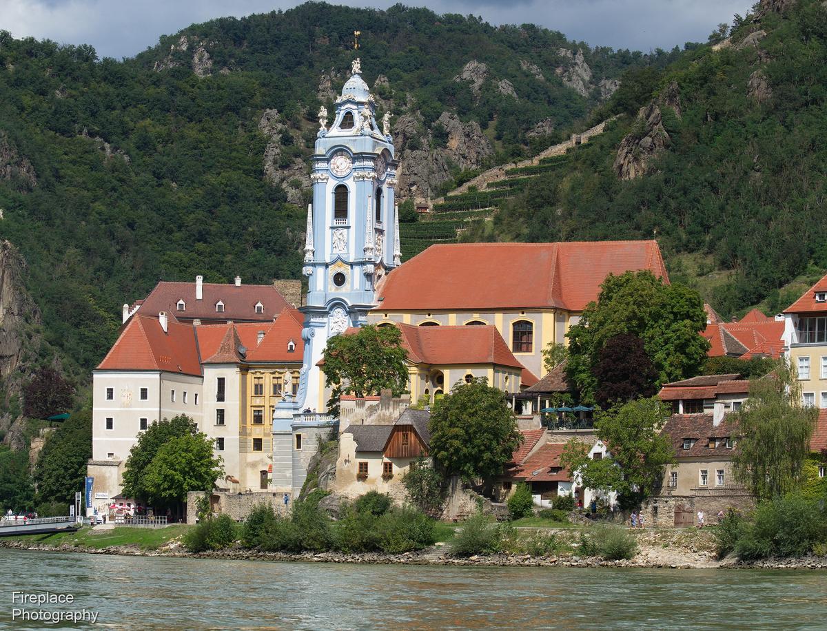
That tower in the town of Dürnstein is quite famous, with its beautiful light blue/white colour. it was right next to our hotel, when we stayed there last time
...here it is closer up, at breakfast time.
or a full view while crossing the Danube to get back "home", on the little ferry boat.
-
A couple of general comments first.
For the same reasons, that's when I do most of my photography too. Dawn especially.
Most Australians wince at personal displaying of the national flag and most of us find this Americanism somewhat distasteful.
Even on Australia Day when many Australians do have flags on display, it still borders on the "uncool." This isn't a lack of national pride. In a country where 31% of the population were born overseas, displays of the national flag on houses and cars are widely taken as an attack on our immigrant citizens.
Australian flag waving at sporting events is different. No probs with that mate.The photo. I recognize that it is extremely unwise to assume that conventions in one country can be transferred to another. My response, as explained above, is conditioned by where I live and is probably way off the mark for Americans. I can only see the shot as a political statement. It's a very big flag for a very small house. The photo itself is negative as to how the symbol's use is interpreted. While the photographer and viewer might interpret the symbolism here either positively or negatively, the image records a piece of Americanism.
-
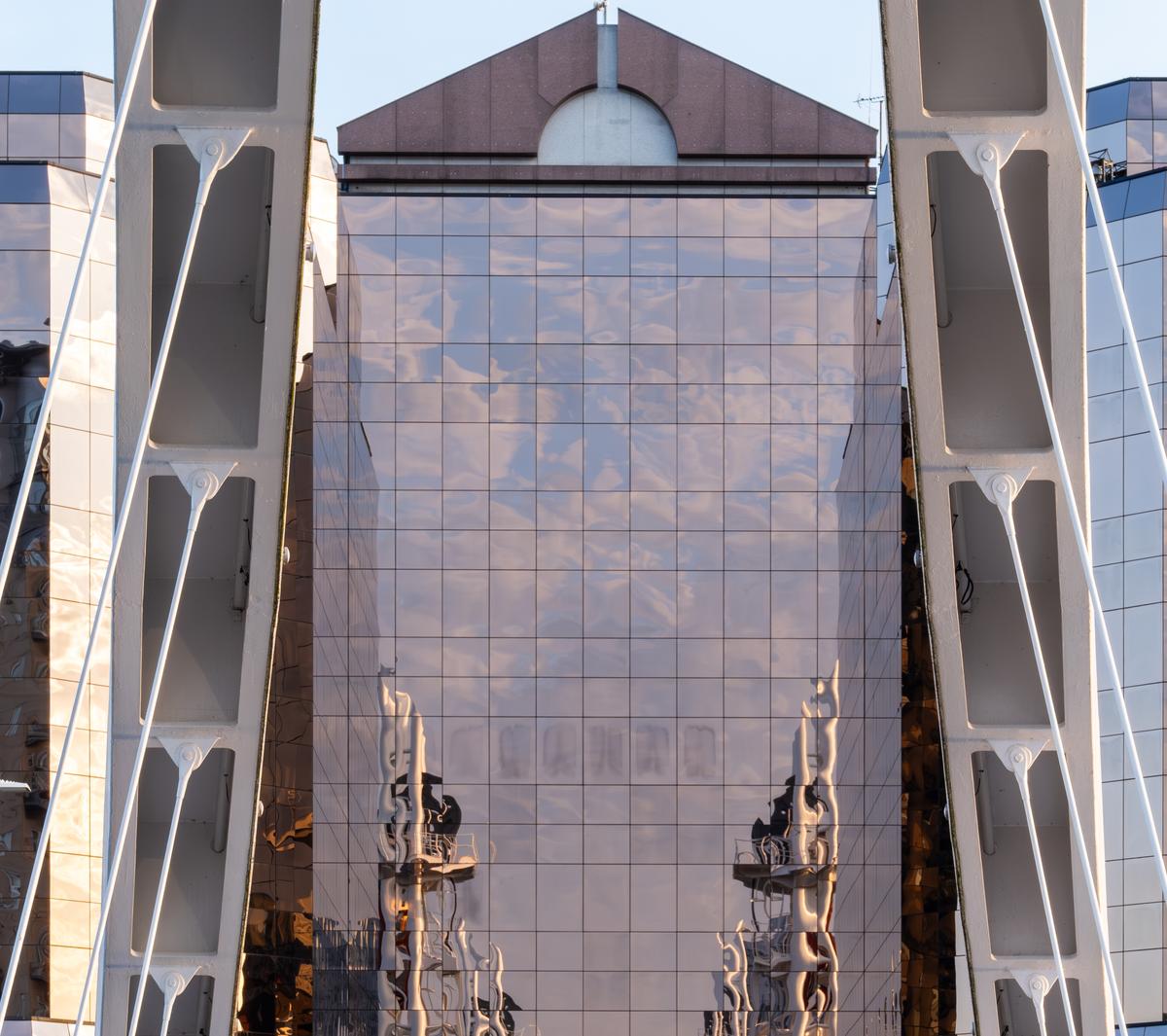
That's a striking collection of reflections and angles to work with. I'd be inclined to simplify the starting point somewhat by cropping out the pole and everything below it - there are too many different shapes and lines down there that somewhat clash with the top section. Then I'd experiment with different crops of the remaining top section. There are lots of options here.
-
These are fun. I like the close in shot you have used with the same lighting. This puts the emphasis all on the expressive bits, the eyes, the mouth and the distinctive ornaments. I can imagine expanding this idea anto a great series of say, twenty shots or more, done the same way and capturing different expressions.
Could you post these over in the B&W thread as well? -
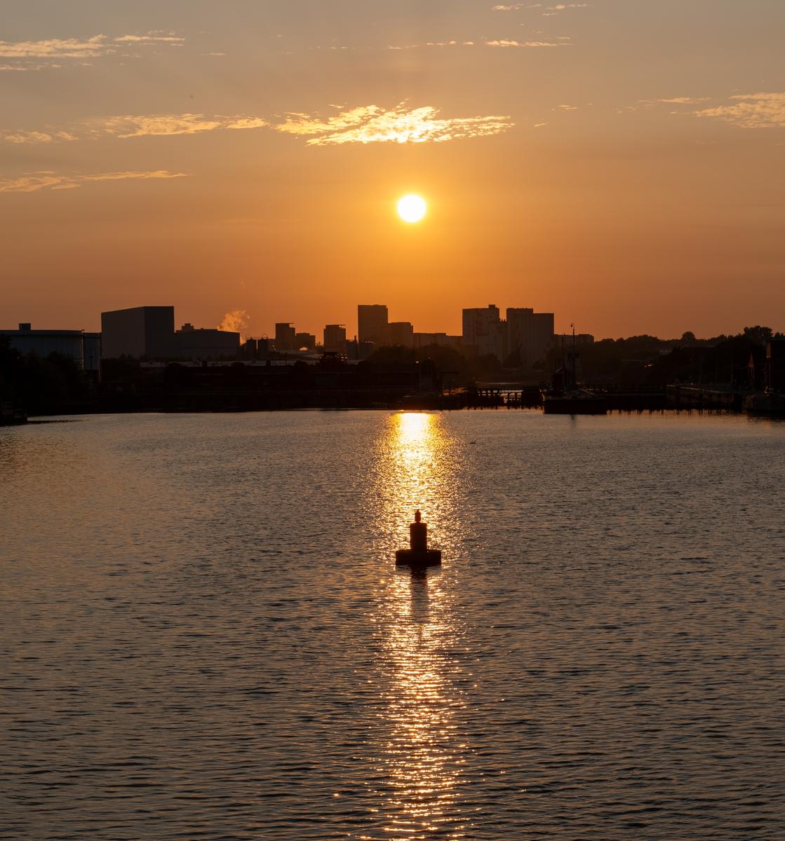
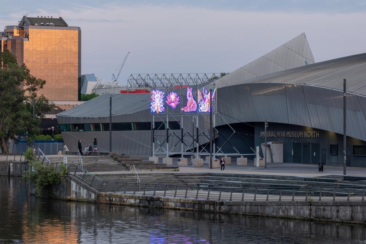
Alan, I'm looking at these as a series so my comments are about the sequencing. Should we feel as though we are on the walk with you? I'd therefore prefer to see them arranged to reflect the changing light. I don't think shot 2 with its warmer colours should precede some of the blue sky shots. Similarly, consider closing the sequence with one of the darkest shots. Perhaps one of the three sunset reflections and buoy on the water?
I'm not sure what 5 is but it's interesting. If it is a symbol that is meaningful to the place, I might use it as the opening shot to identify the place we will then explore. Love shot 4 and the sky suggests it should be earlier than the sunset tone images.
6 then 7 have a deepening transition as the sun dips.
8,9,10 feel too similar. I'd suggest using only one of them- probably 8 with its interesting positioning of the the buoy and its darker colour bringing the series to a chronological conclusion.
11 feels wrong to me. 8.9.10 are more interesting but if you wanted to use it I think it should be sequenced before 8/9/107 is great. Your final shot is something of an anticlimax once we have seen 7. If you want to use the current final shot, I'd put it in before 7 so we build towards 7.
-
Mike,
Thanks very much for the response.
Your reaction is a bit of a surprise, but I understand after your explanation.
I assure you there was absolutely no political intent on my part. I don't think the flag really had much political significance the occupants either. The neighborhood is a very relaxed place. There was no national holiday at that time.
Americans display flags all the time. Not out of super-patriotism or jingoism, but a range from national pride to just liking the colorful appearance.
I saw the flag (which is a frequent occurrence in the area as a festive thing) as a splash of color against a very unusually colored building. Not unusual at all.
I think you're reading too much into the situation, but if the culture in Australia is negative about the display of national flags, ok.
Again, I appreciate the comments.
Rich
-
Thank you for your kind words. If I had access to that friend on a more regular basis, I would certainly be tempted, but alas, he lives in a different country. But I'll definitely post them in the B&W thread, when it comes around for next week! :D
-
Thanks Rich. As I carefully said and as you picked up, I was aware that culture determines how we respond. In giving my reaction, I was aware that my conditioned response didn't mean anything at all about the intent of a photographer from a different culture or the interpretation that might be made from a viewer from a different culture.
It's the grasping of shade of difference that makes discussions across national boundaries worthwhile. -
Mike,
they weren't in sequence - and maybe the should have been. Thanks for the tip (which is why I like this forum). I will sort something out for next time. I'll also post comments against each photo (If I have time (ha ha!) I'll sort something out for the ones above).
Alan