Both are fine but it is the combination that does the trick.
It invites further exploration and artistic experimentation.
You could (just as an example) consider turning each of these into their negative and then flip those over the vertical or horizontal axis, and then display them in a 2x2 pattern/grid, inviting the viewer to ponder what is reality and what is negative/flipped.
The whole quartet could look like a rorschach test or like the product of a kaleidoscope.
-
-
I agree with all of that (I just woke up from the KO).
-
@minniev has written:
Of the first set, I like the first, the pano, for its inclusion of the entire cloud opening, which to me seems the "real" subject rather than the turbines. I'm not terribly fond of turbines, but they serve a function here, in both versions, of corralling that amazing light show. But the cropped version seems to me to cut off too much of the real subject. I love this image, it's exceptional. Print it carefully, and display it.
In the second set, I like the broader view best for almost exactly the same reason. The most interesting part of the image to me is the lake, whose undulating shoreline is laid out like big rambling leading line behind the colorful flower. I think that undulating shape, especially the big curve in the left third section, plays an important role and cropping it makes it feel like something is cut off. Getting a bit lower would have perhaps got you a nice angle, or let the flower break the horizon line, but that is in the past now. I would remove those electric towers in the background along the horizon, it would be easy in Lightroom. They don't add anything and distract little.
The final one has less appeal for me than the others, but it's a decent shot, well taken, with a foreboding sky and a lot of lines and angles mixed with nature.
Overall a good outing with at least one memorable keeper, more than I usually come home with! Well done.
Paula, thank you for the detailed analysis. It really does help me take better pictures when I get information like this.
Alan
-
@MikeFewster has written:@JSPhotoHobby has written:
Playing with some images I took in December in Rocky Mtn Park.
Stitched Pano. I didn't notice the stitch issues in the middle until I posted it.
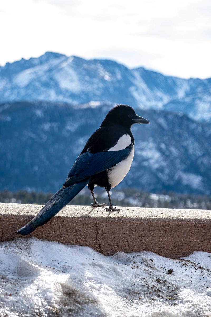
A Magpie looking for a meal.
If there is a panorama error here I wouldn't worry about it. The only contendors I can see are about three small vertical bright areas of reflection in the water and they may be exactly that, reflections.
It's a good subject for a panorama and your pine trees bookend the shot nicely.The magpie. Apart from being black and white, it's nothing like an Australian magpie. Somewhere, there must be a story about the word "magpie" and how it has been used internationally for different birds. Your magpie looks like a passerine hopper while ours is a walker. I thought all covids were walkers but apparently not so I learnt something from your shot.
Raising the shadows would help the bright little eye and head details to stand out. But he's a fine looking fella.I don’t know much about bird identification. The guide told us they were magpies. Could be he knew as much as I do. There are a lot of them in Denver and the park.
I was struggling with making the bird brighter, it caused the background to blow out. I will have to try playing with masking again.
Thank you! -
-
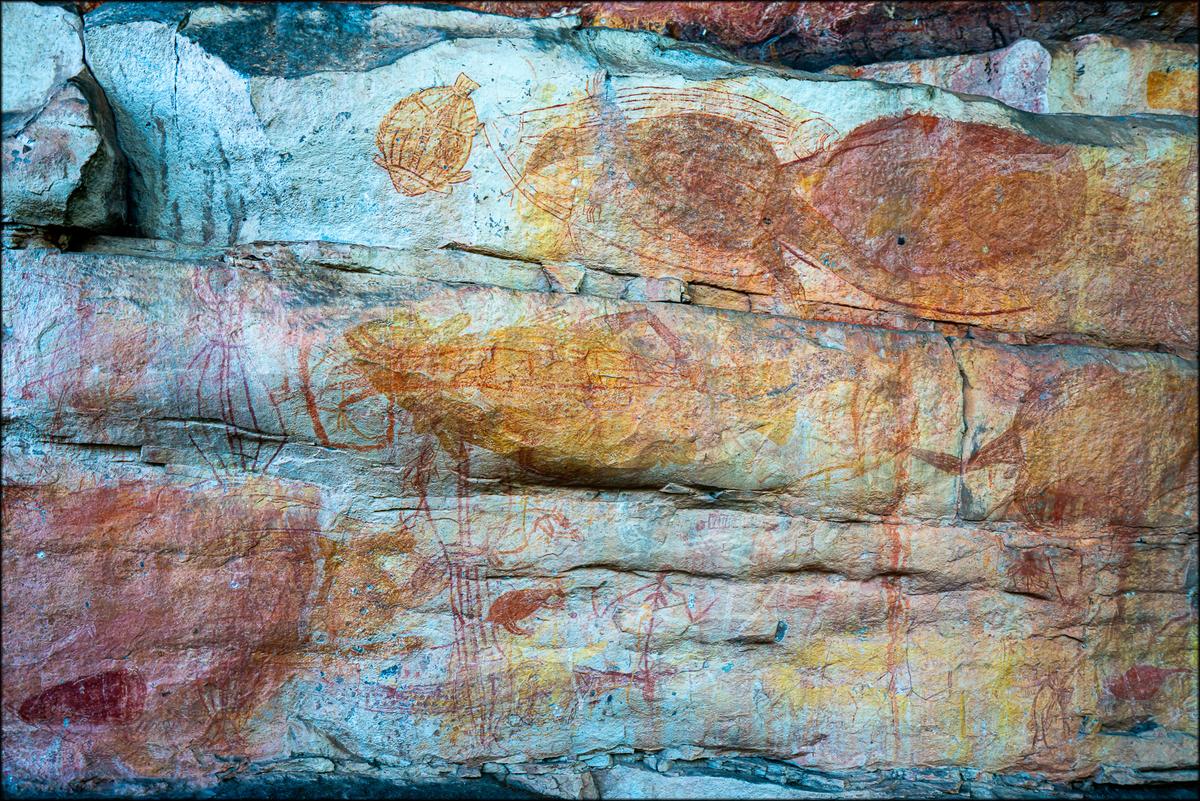
This is a nice illustration of the old times in Australia and where to find that rock art
(This text belongs to the rock art at the first page,{something went wrong!) -
@MikeFewster has written:
Nourlangie Rock. Northern Territory. Australia.
Thanks everyone for the responses to these images.
No one has mentioned the two people in the panorama. It is difficult to see them because of their small size within the shot and they don't stand out against the background. One is only a head at the bottom of the frame. I considered removing the head but decided I liked it.
The amount of rock art in Australia and the age of some of the art is extraordinary. Issues of preservation and ownership are legal minefields. Check the following for example.
www.watoday.com.au/national/western-australia/art-activists-in-legal-bid-to-kill-massive-woodside-gas-project-20250617-p5m80q.html
Some of the art is 40,000 or more years old. Some of the art is in galleries that have been in continual use and are still in use by traditional owners, over those kinds of time spans. As some surfaces have been used, then used again over and over, you can imagine the issues that start to arise when scientists try to study them. -
@LouPhoto has written:
I really like this one. Wonderful dreamy look indeed. I suppose most of that was done in post though?
-
@LouPhoto has written:
I can't make my mind up about 2. The issue is the thin black outlining. I can't decide whether I might have preferred the image without the lines and so let her merge into the sandscape she is drawing. Does anyone else have thoughts on this?
The first is another where I'd be interested in more opinions. I like the sky/sand/figures abstraction and the positioning of these three elements. It's the closest group that feels not quite right. I feel they retain too much detail. But this is putting my preferences over simply responding to the image as it is. -
@minniev has written:@JSPhotoHobby has written:
Playing with some images I took in December in Rocky Mtn Park.
Stitched Pano. I didn't notice the stitch issues in the middle until I posted it.
A Magpie looking for a meal.
That lake is familiar. Which is it? And I have met the magpies of RMNP- they are bold and personable! RM is a lovely place in winter.
I honestly don't see the stitch problem in the middle of the pano that you refer to. But I have noticed in my own panos that I often see stitching errors that observers who weren't there don't see. What is a more significant bother to me is the blown area around the run along the right edge. I don't think there's any detail there. If you don't have detail in the raw or in another image from the sequence to patch in, you might consider cropping that part out. I do love the people playing on the ice. They make me smile.
Of course the magpie is a charmer as he stares out over his kingdom. Well caught.
Sprague Lake
There is no detail left to the blown out area. I tried to minimize it's dominance, or at least make it look more natural to the eye, but ultimately it is over exposed in the 5 or 6 images that make up that part.
-
@MikeFewster has written:@LouPhoto has written:
I can't make my mind up about 2. The issue is the thin black outlining. I can't decide whether I might have preferred the image without the lines and so let her merge into the sandscape she is drawing. Does anyone else have thoughts on this?
The first is another where I'd be interested in more opinions. I like the sky/sand/figures abstraction and the positioning of these three elements. It's the closest group that feels not quite right. I feel they retain too much detail. But this is putting my preferences over simply responding to the image as it is.First, let me address the point that Mike has raised.
I am with him in the camp that is not a fan of the strong black outline around the figure.
It almost feels like the second image tries to overcompensate in contrast and sharpness for the (pleasant) softness of the first image.But apart from that, I like this combo of two images.
The first, very soft and fuzzy, feels like an impression of the beach (as in "impressionism").
And the second, showing a person drawing or painting, almost feels like she is creating the impressionist image that we have seen first.
You could sequence them in any of the two possibilities (as here or the other way around) and the narrative would always work.


