• Members 67 posts
    June 27, 2025, 11:20 a.m.

    Ah, thank you Arvo!
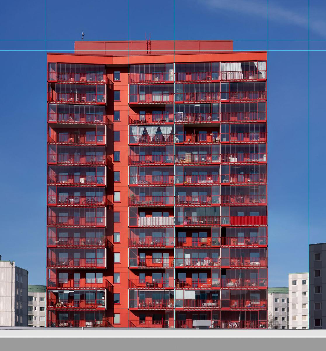
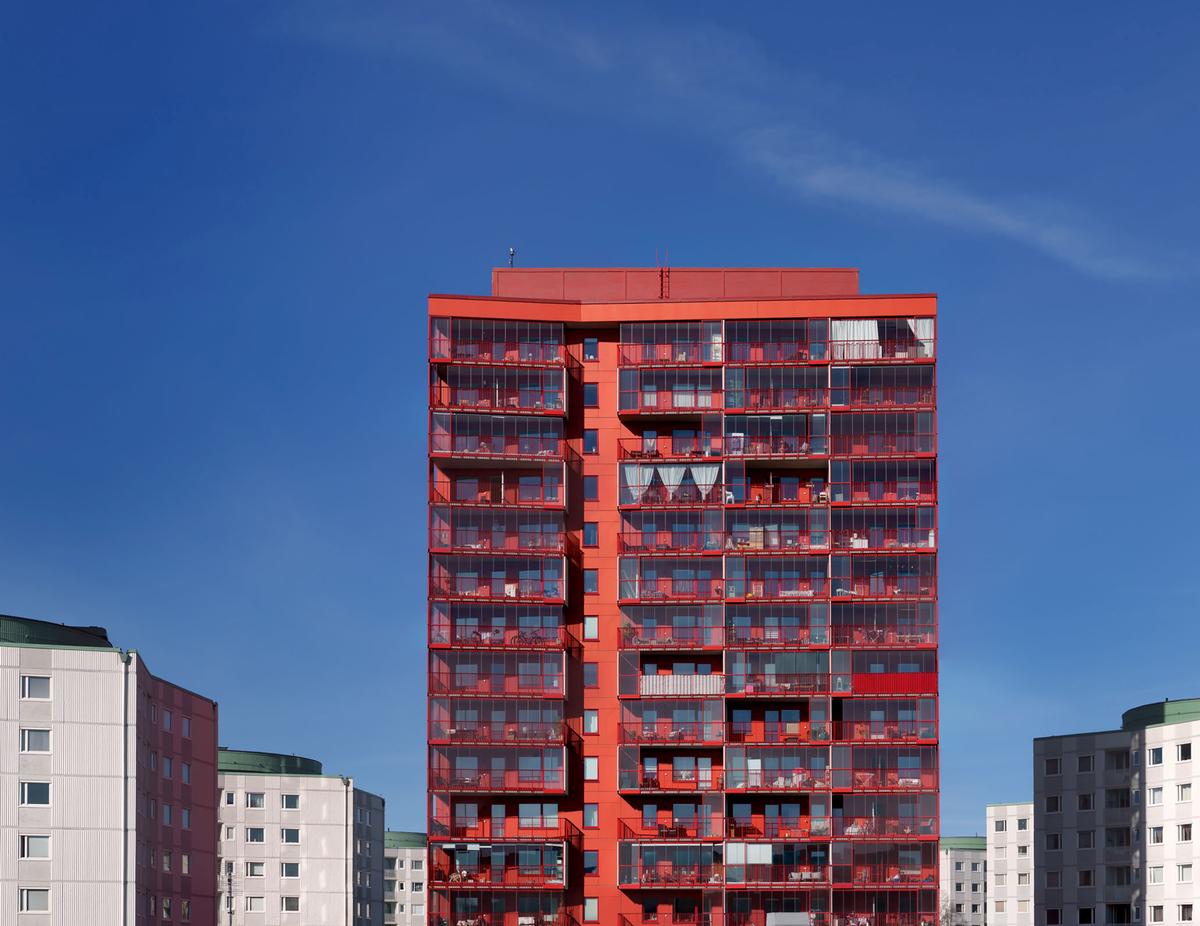
    When taking the images (it's a stitch) of the red building I didn't think it was boring at all.
    Some time later, now that is, when looking at it within the context of the No people series I somehow didn't like it the same way. I think you are nailing it and if i ever make a series of images like "Suburban architecture" I can let it be a part of that.

    The goal of the No People project can of course be wide or more narrow. The idea from start has been to show places making it possible to see them in another way compared to how we usually see them. So, "Valthornsgatan" (this image) will have to go and find a slot in the Suburban... box, a possible future project.
    Thanks again /Jonas

  • June 27, 2025, 1:07 p.m.

    It is not boring :)

    It could be used as part of leading images into your project - like first image is of the sky (and some clouds), second one is this one and third image then could be lower part of this building (or entire building), including empty street and so on. Sure capturing empty street would be challenging (and suggesting to use AI to remove people would likely not be appropriate).
    Just an idea, probably not even good one.

  • Members 67 posts
    June 27, 2025, 2 p.m.

    • As I said, ideas are welcome.
    • I'll have o think a little about your idea about using the image as a three-part leading image. Maybe!
    • No Ai is involved. To get an image of a street free from ugly and distracting goblins I use a tripod, a remote control and then I take multiple images. The Train station for example is made from a dozen exposures. Photoshop and layers make it possible to remove whatever that comes in the way and get an image of the complete "background" only.

  • Members 2157 posts
    June 28, 2025, 2:12 a.m.

    Thanks for the responses one and all.
    More re Pellegrini's
    It's an Italian coffee and food bar. I believe they had the first modern type espresso coffee machine in Melbourne, possibly Australia in about 1954. I think it was a Gaggia. I discovered Pelligrini's and their coffee and their fabulous granita and spaghetti Bolognaise around 1957. An instant love affair. For this photo I wanted an espresso machine and the photos on the walls all in the same shot but I couldn't find a way to do it.

  • Members 67 posts
    June 29, 2025, 9:18 a.m.

    Ah, old espresso machines are often kind of steampunk and science-fiction combined. Wonderful machines.
    Your photo shows a place I would like to visit. The picture is perhaps a little scattered. Is it the dish, the joint, or perhaps the staff that is important? When I compare with your previous pictures from Bell's Milkbar and, above all, Broken Hill, I think they have been stronger and hang together better composition-wise. The "And Chuck Berry was playing on the juke-box...." will not be forgotten.

  • Members 2252 posts
    June 30, 2025, 1:50 a.m.

    This one is quite thoroughly geometrical. There are rectangles, squares, triangles, diagonals, straight and slanted lines, cylinders, all set against other lines and shapes so that the eye has a few different paths but all take the viewer on the excursion around the porch. Porches are ubiquitous in the American South, and serve an important social function, as well as an organized outdoor living space accessible in most weather. Love it.

  • Members 2252 posts
    June 30, 2025, 1:58 a.m.

    Nice series, though as as a series the glass ball pair don't quite fit with the others.

    The star of the show is that first one, an exceptional image of an exceptional tree. Yes, the framing does work but the tree would be remarkable on its own with or without the framing. I do think I like Rich's edit presenting it as a monochrome with intensification of the lights and darks to boost the contrast between the framing trees and the subject tree. The limb of the subject tree seem almost alive, reaching for us, and blocked by the framing trees. The first and fourth might make a nice paired set, converted similarly.

  • Members 2252 posts
    June 30, 2025, 2:19 a.m.

    A simple offering of an old pocket knife, from what looks the the small hand of a child. The focus, so clear on the knife, (located along the thirds intersection) tells us it is central to the story, but it doesn't solve the riddle for us. We are required to build the story around the single clue. The colors are subtle, the blur creatively conceived. Beautiful image.

  • Members 2252 posts
    June 30, 2025, 2:25 a.m.

    We get glimpses of the patrons in the reflections, but the central character is the tired/bored barista. The props around him are interesting to look at in detail, especially the books and pictures and printed stuff. Nice environmental shot.

  • Members 2252 posts
    June 30, 2025, 2:40 a.m.

    A nice, simple, clean study of contrasting textures and forms and colors. It grabs my eye with those contrasts, but doesn't require a story or explanation: it's all visual. I do think it could do without that bottom band of blurred foreground that lends perspective the image doesn't really require. Well spotted and presented.

  • Members 2252 posts
    June 30, 2025, 2:44 a.m.

    Nice spotting. A highly graphic architectural form made into a highly graphic image. Though I am exceedingly fond of reflections, and these are quite nice ones, I honestly think I prefer this image without them: the simple chevron in the blue tones as captured, with the only contrast being the tone and texture. But it is quite nice as it is.

  • Members 2252 posts
    June 30, 2025, 3:02 a.m.

    I think it's a "fit" for the series you are conceptualizing. There are indeed No People, but there is ample evidence of People in the different stuff they have on their balconies and behind the glass of their apartments - plants and curtains and furnishings and such. The whole image retains it's graphic nature (Graphic is evidently our accidental subtheme this week) by virtue of the alternating light and dark panels of the rather spare and dull adjacent buildings as they recede/diminish in size going towards the Red Giant in their midst. There's a nicely contrasting blue sky with a wisp of cloud for punctuation.

    The leveling could use another look. The difference is small, but Red Giant seems to be listing downward to the left just a trifle.

    As for People-free scenes, I think it's strictly your preference. I've gone through phases in my own photography where I wanted no people, where I wanted people doing stuff, and where it didn't matter. But it's more important to pursue your own instincts than anything else, at least for any current project.

  • Members 1029 posts
    June 30, 2025, 3:14 a.m.

    Thanks Minniev!

    As always, right through to the essentials.

    Your comment about the blurred foreground is valuable. I thought it looked chopped off without it.

    Rich

  • Members 67 posts
    June 30, 2025, 8:54 a.m.

    Hi,
    and thank you for commenting!

    About the leveling:
    It's a strange building as there is a angle a bit from the left. Not in the center of the building. I had some problems with that and went back to the PSD file I worked with and it looks this way on screen:
    f877-11_Valthornsgatan_No_People_candidate_PP3_maybe_leaning_minniev.jpg
    I don't know what to do about that. I can raise the top left to hit the blue line at the same point as the right side and i can stretch it all to make sides of the building parallel pointing straight upwards. But I really wonder if it makes it straight to your eyes that way.
    Some things are hard...

    The people or no people question is clear to me but perhaps not to possible beholders. That I'll have to think more about and perhaps print a couple of images and show for some friends here. Haha - the whole idea may be a dead end leading no nothing but more grey hair!

  • June 30, 2025, 9:55 a.m.

    For my untrained eye it looks like it is shot not from center position, but from a bit right side - left vertical is shorter that right one.
    I don't know about PS options, but in DXO I would rotate your image a little to left (or is it right - I have never memorized left/right slider action, does it change viewpoint or scene :)) to make top and bottom parallel (may need horizont adjustment too); also I would play with up-down slider a bit - sometimes fully corrected perspective (parallel verticals) looks worse than some converging verticals.

    But all those problems are minimal and almost unnoticeable.

  • Members 67 posts
    June 30, 2025, 3:46 p.m.

    And again...
    @minniev@: You were right. I loaded the image once again Photoshop. I adjusted it making the top left align, height-wise, with the top right. Like this:
    f877-11_Valthornsgatan_No_People_candidate_PP4_levelled.jpg
    I now also recall parts of the processing from back in April. I didn't want to make the image look un-natural so i took some care making the vertcals lean every so slightly inwards. But, I was a bit sloppy letting the left top sink down.
    The difference is, as Arvo mentioned, small so good on you for spotting the problem! It's good for me as wll as i'll remeber to check and try different versions when it comes to print the "red giant".

    f877-11_Valthornsgatan_No_People_candidate_PP4_levelled.jpg

    JPG, 246.4 KB, uploaded by JonasB on June 30, 2025.

  • Members 67 posts
    June 30, 2025, 3:50 p.m.

    Thank you for jumping in Arvo.
    I wouldn't call your eyes untrained. OTOH, my eyes feel tired from time to time. So, I have faith in your comments.

    I did a very minor adjustment and posted it in my reply to minniev. Does it look better to you now?
    (Please, let some Saint IT have mercy with us and provide us with a threaded view choice here!)

  • Members 2252 posts
    June 30, 2025, 4:52 p.m.

    Yes, the Red Giant has straightened out! I did spot that odd angled "wing" and figured it had contributed to the difficulty in getting a straight top line. Straightening is sometimes a challenge and not a straightforward affair, no pun intended. Some things look better if you leave them a bit off kilter. Some things look straighter if you unstraighten them (visual perception being what it is). But this one did have a hair of difference that made my old eyes want to fix it, and it looks all good now!

    There are long conversations we could have about the why's and wherefore's of straightening for perception, not just for geometry, but they would indeed work better with threaded view. Conversations in flat view can be maddeningly confusing.

  • June 30, 2025, 7:17 p.m.

    This better :)

    I tried to adjust it further (based on your original image) - it was quite hard. I created maybe six different versions, the final one is attached - is that better or worse than your version, I can't even say. Differences are very small, also even your first version was pretty good to not notice any distortions without close scrutiny.

    Anyway, what I did - 4-point perspective (which was not easy due to not having clearly defined bottom horizontal line), cropping a bit from the bottom to remove this gray, tilted roof or something, very little upward tilt to make verticals converging and at least added a little bit of barrel distortion (ta make lower buildings to look straight and to make right upper corner of red building looking less sharp). Proposed simple rotations didn't work, some skew remained - likely I have to train more :)

    f877-11-valthorn_DxO_2.jpg

    f877-11-valthorn_DxO_2.jpg

    JPG, 985.7 KB, uploaded by ArvoJ on June 30, 2025.

  • Members 67 posts
    June 30, 2025, 8:21 p.m.

    Somebody looking into this thread and observing an energetic discussion describing several attempts to straighten one picture can make one conclusion only: "They are nuts!" Let's hope this imaginative person checks back another week.

    I had to compare to understand, then I understood less. I resized my last version to get the same width as the version you worked on for an easier comparison. I noticed a couple of things:
    The grey/white buildings are equally straight in both versions. (That's strange but it's what I saw when making layers of the images and having them in the same new image in Photoshop.) The image you posted is more sharpened. The red building was straightened pretty much the same.

    It's all interesting in a way. Minnieev also mentioned the mysteries about perception. At the same time I'm not super interested: For the most of the time I get my images straight enough without too much hassle. Confident, no... haha. Then something like this happens and I learn a few things. Thank you.
    To end (?) this long conversation I give you the material I had to work with (or let the software work with):
    f877-11-valthornsgatan_pre-Post.jpg
    Yes, there is a seagull of some kind sitting on the lamppost (red light for chopters to avoid) at the top.
    I appreciate all comments the poor image generated!
    /Jonas

    f877-11-valthornsgatan_pre-Post.jpg

    JPG, 343.0 KB, uploaded by JonasB on June 30, 2025.