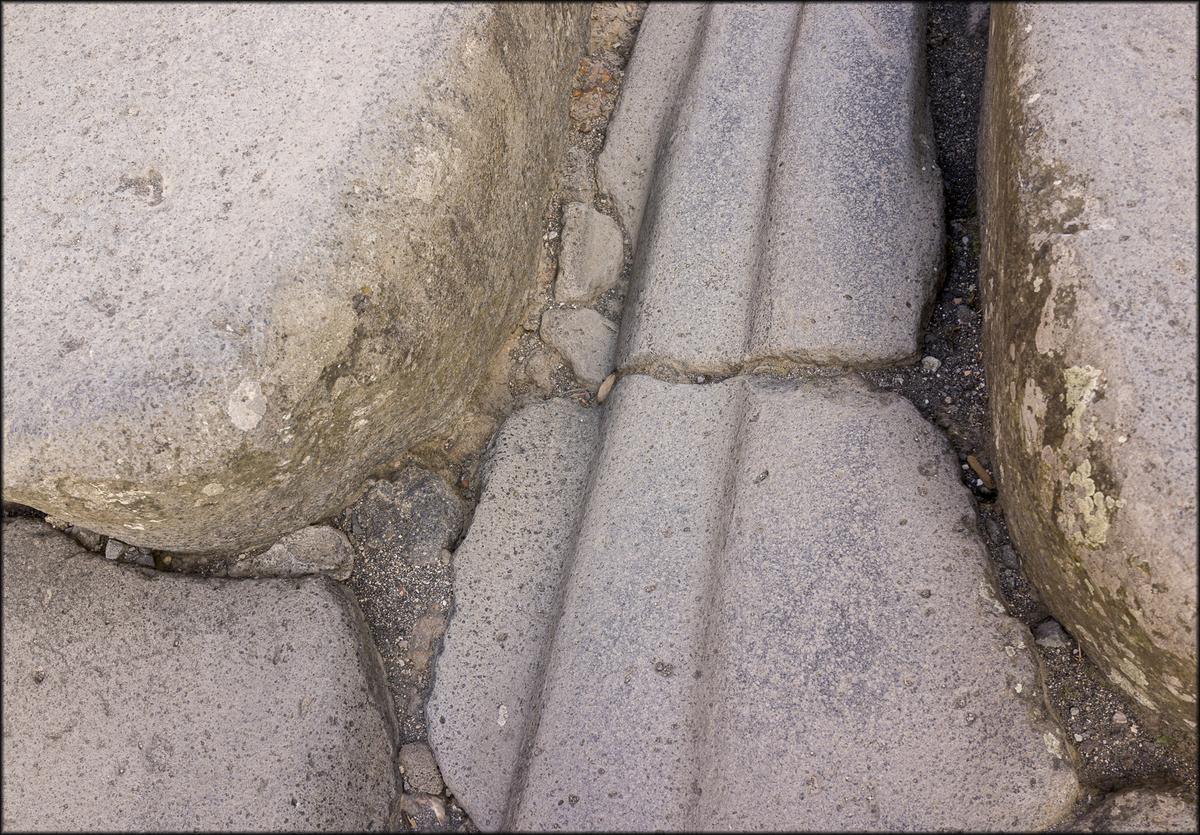
Yes, that is an attractive balance of line and form, as you say. The rounded shapes contrast nicely with those straight lines.
Those lines are indeed mysterious and look far too regular to be caused by wear. I did some research and the general idea is that they were indeed caused by wheels. Once there is a bit of a rut, all following wheels will find their way into it and wear it further. I also found this interesting article, which suggest roadworks in a busy main street in Pompeii were as annoying and disruptive as they would be today, especially as paving with cobblestones would be more tedious than modern methods, so they came up with the idea of using molten iron to repair it quicker!
archaeology.org/news/2019/05/15/190515-pompeii-iron-roads/
-
-
@Fireplace33 has written:
Soteska Vintgar Gorge
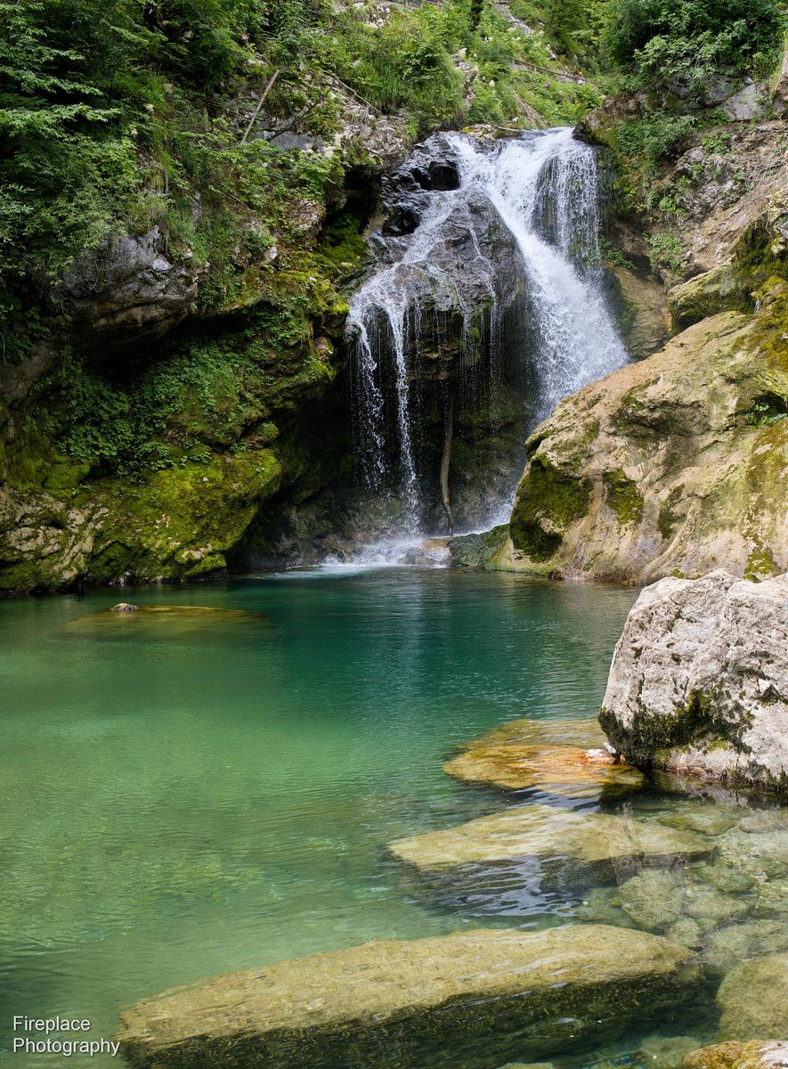
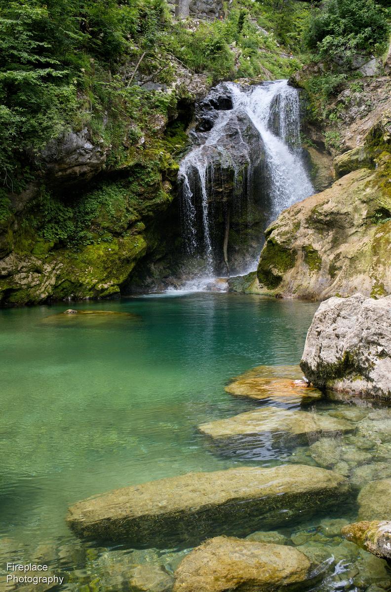
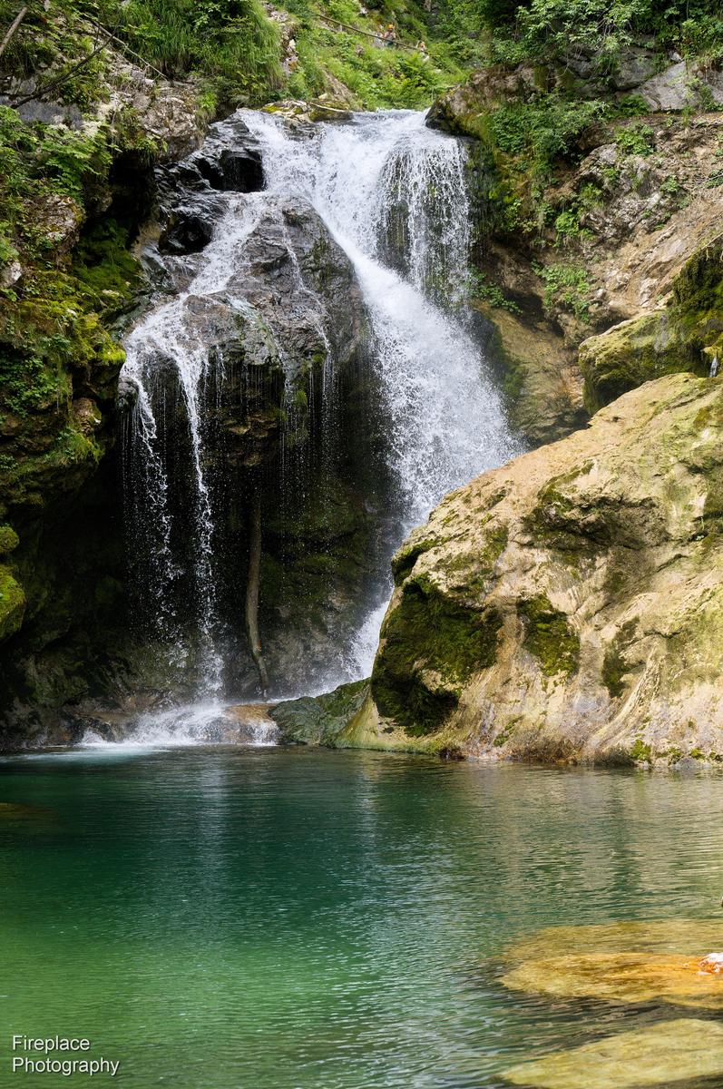
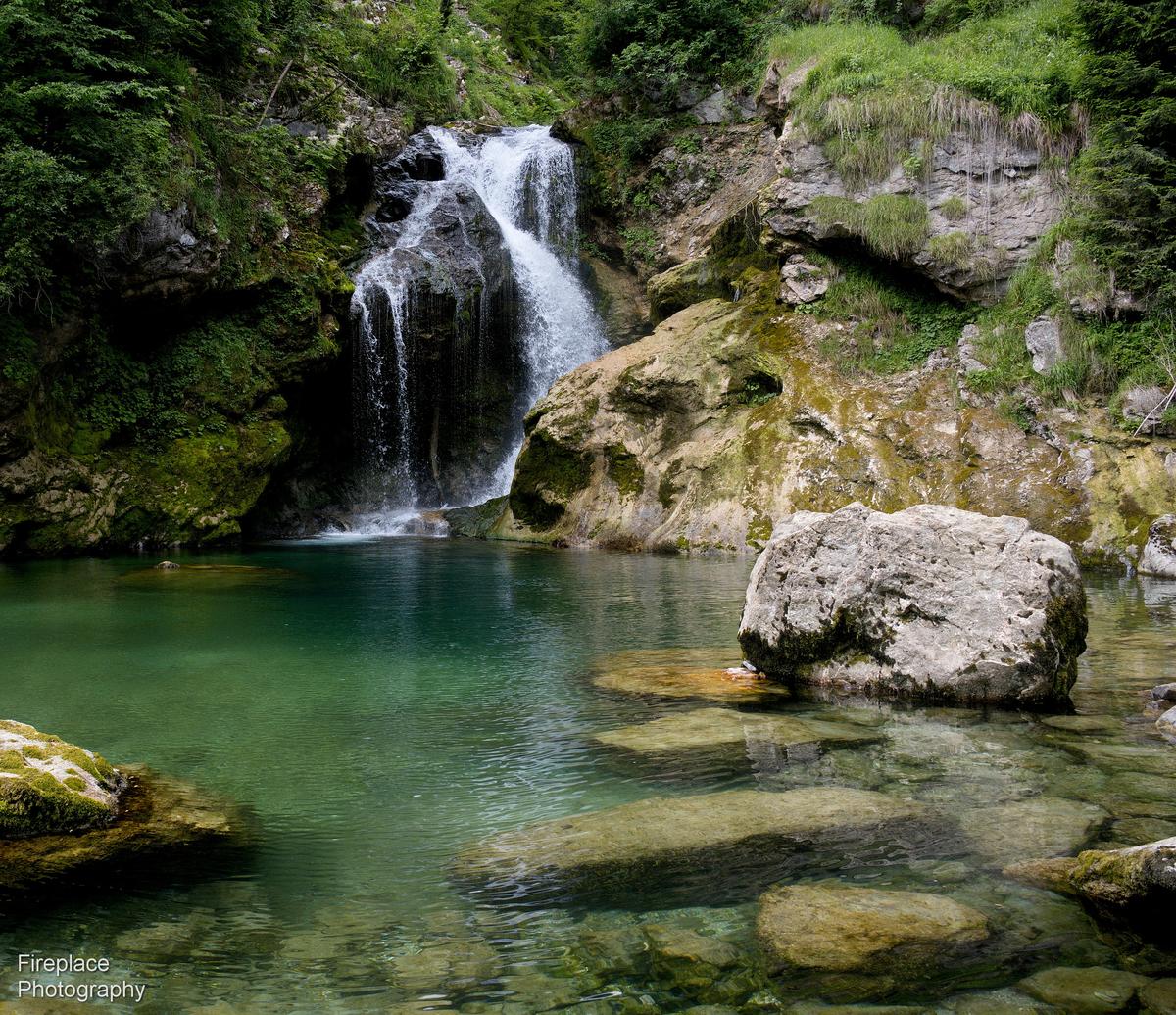
There are some great waterfalls and fast runniing white water along the Soteska Vintgar Gorge in Slovenia!
Here are 4 shots from just one of them, all just slightly different.
I'm curious, which one works best for you?
ThanksThis is fun. I think if you had posted any one of these, I would have been impressed, but now it's time to make a choice.
Comparing #1 and #2, I prefer #2, as the rock at the bottom of #1 seems cut off.
I prefer #3 compared to #2 as objects have been cut out, making the composition is cleaner. There is a nice diagonal balance between the rocks at bottom rignt and the waterfall towards the top left, whereas #2 is more vertical with the big rock and the waterfall right above it. I wondered about the relatively empty expanse of water bottom left, but the brighter patch of water and then the colours going from a bright yellowy green to a dark blue-green is very attractive, so it really doesn't seem lacking in interest.
In #4 the multitude of objects are back, but this time I like the balance better, with that rock at bottom left. I also like the almost square format. But is it better than #3? When I started to write this, I thought it was, but in the meantime I think I prefer #3. -
@simplejoy has written:
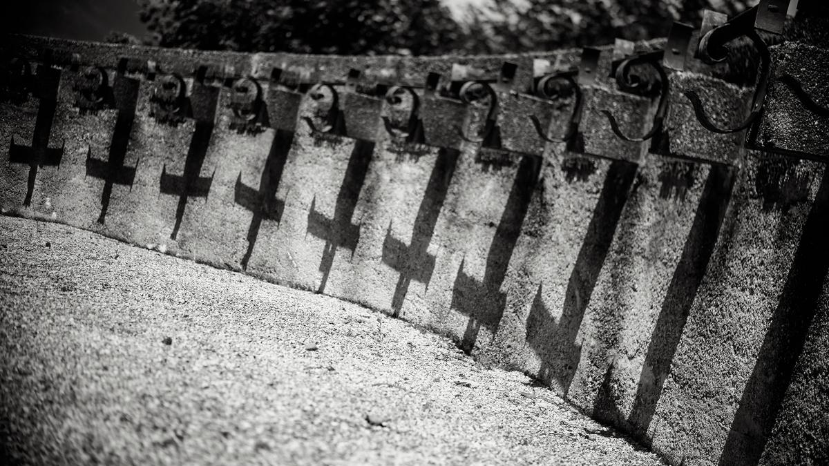
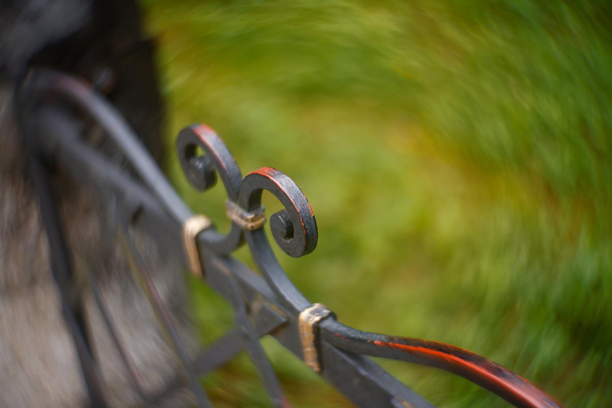
Two images from the same place... one up, one down!
It is interesting, that these two were taken at the same place, beause they trigger very different emotions.
The first has something dark and sinister about it. Yes, the contrasty B&W helps that, but I think it is also because I cannot tell exactly what I am looking at. The shadows are hard to reconcile with the objects casting them, and they look like rather satanic upturned crosses. This uncertainty creates a tense and defensive attitude. It's a treat, like watching a Hitchcock film.
The second is more joyous. The world is spinning, but we seem drunk with pleasure, helped by the positive Spring greens. The dancing bokeh works well with the waves in the wrought ironwork and shows the lens was an inspired choice for this subject.
-
@ChrisOly has written:
Congregation
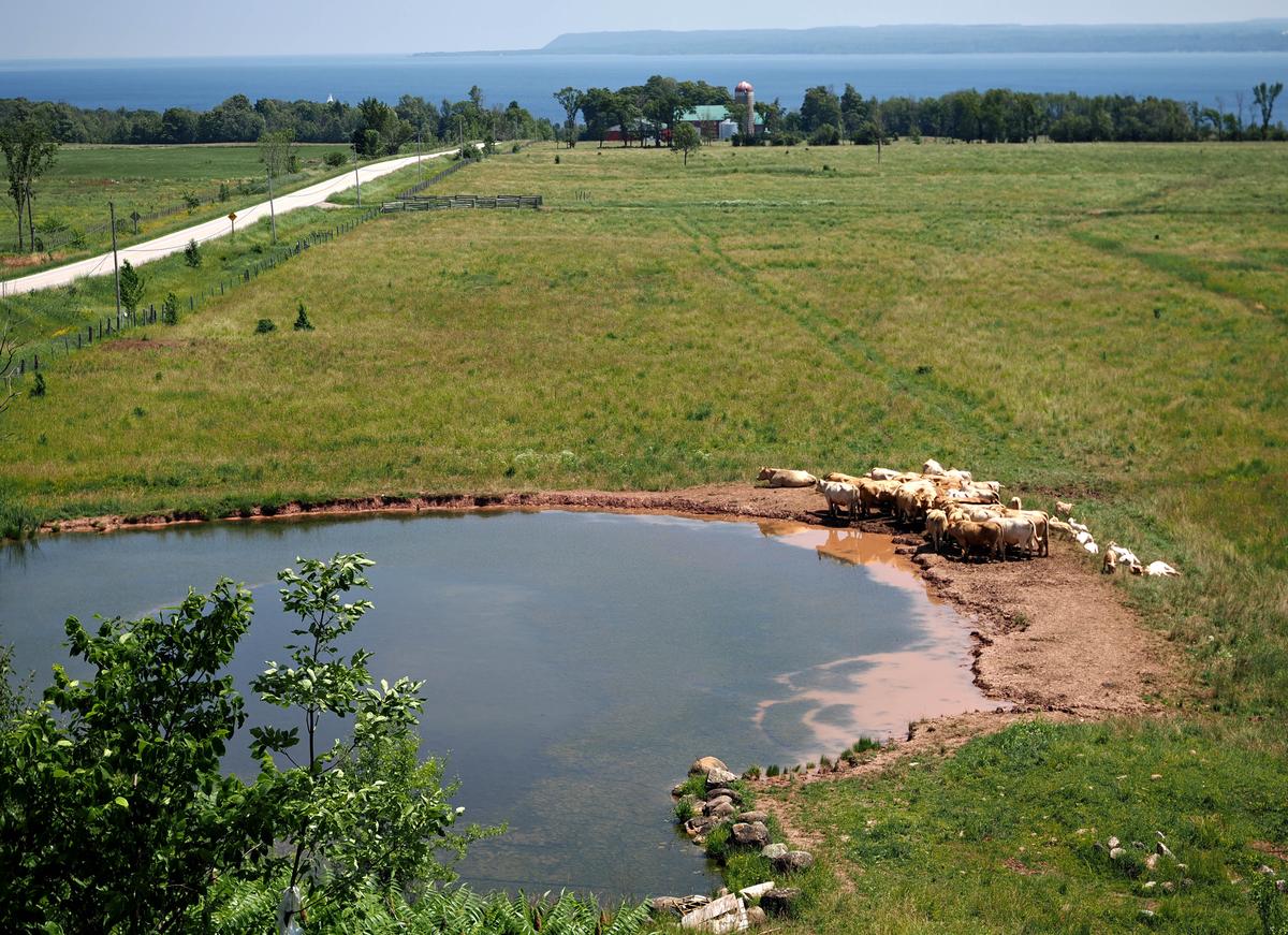
While touring Georgian Bay, Ontario I came across this peculiar assembly...
This is a nice peaceful rural scene.
The highlights on the cows are overexposed and, since they are the main subject, it would be good to darken them, if the RAW file contains enough data. -
@Rich42 has written:@MikeFewster has written:@Rich42 has written:
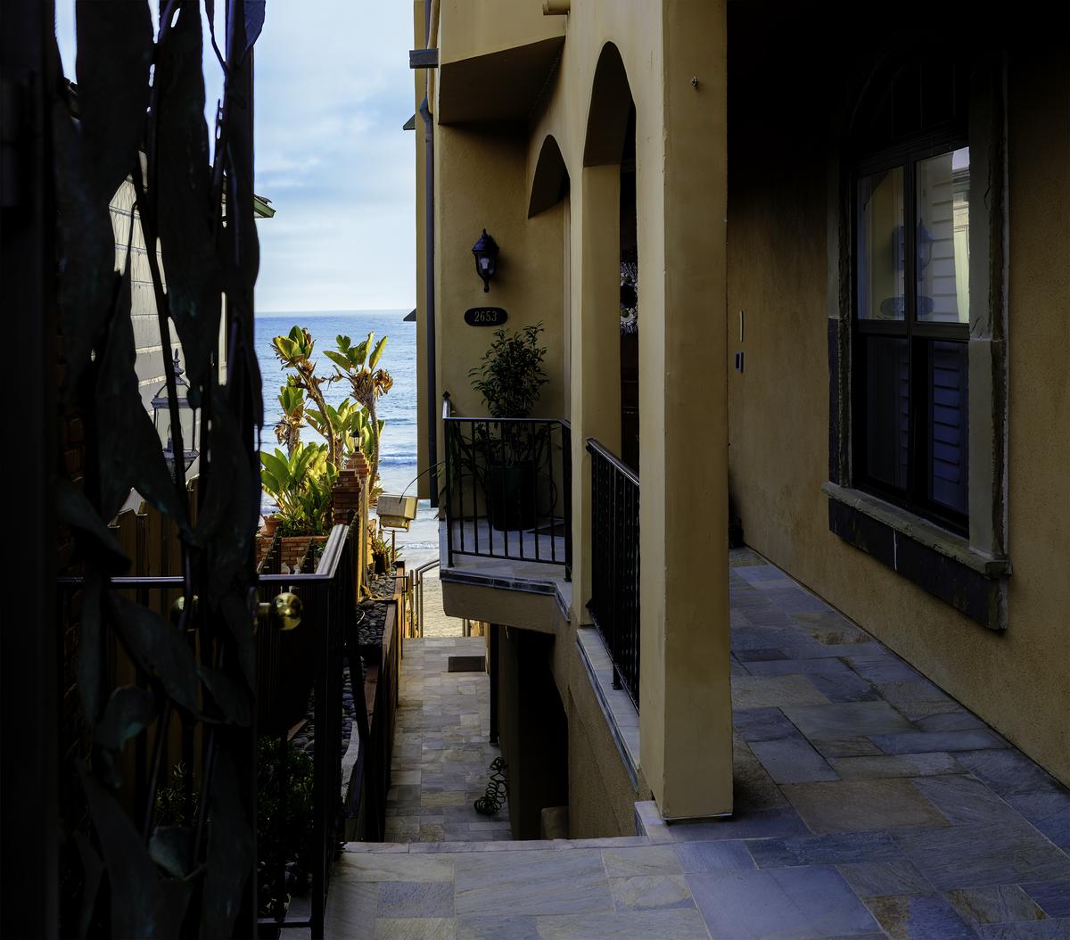
It's good to be the King. Or as wealthy.
Don't even ask. You wouldn't believe . . .
Rich
This is one of those subjects where our response is probably conditioned by our culture. Beach access is a sensitive subject in Australia. My immediate outrage at the content kind of overwhelms thoughts of colour and shape and dof etc.
Even so, the photographs settings have helped to induce the response. Lots of dof takes us from the foreground to the sliver of ocean behind. All the vertical lines from top to bottom multiply the feeling of enclosure. The little piece of balcony that intrudes even further into the space, ices the cake.Thanks Mike.
I had hoped you would notice the brass door knob on the entry gate.
Rich
The photo certainly conveys the message of a privatised paradise well. It does so even better than last week's post, but lacks its beautiful light, so is not as attractive.
I didn't notice the brass door knob either! The gate is too dark to show that off or even to identify it as a gate. It doesn't really matter, as it just comes across as more vertical prison bars. -
@MikeFewster has written:@ChrisOly has written:@minniev has written:
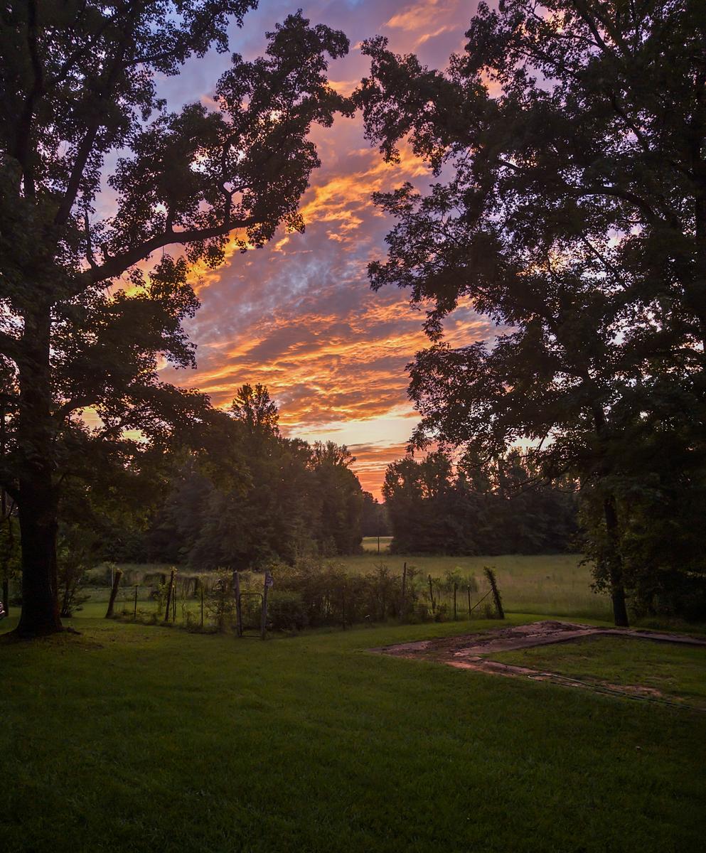
Just My Yard
Beautiful shot regardless of app or cam or smartphone. Looks like fire is fanning the flames in the sky. There is drama there.
As Chris has said. Although it is dark, there's enough detail in the garden for it to be easily appreciated. Then the contrast with the fiery sky between the garden and the sky becomes the point of the image. The cloud spectacle is beautifully positioned by the trees to show the clouds lighting to advantage while creating a line that makes the connection to the garden.
I can't add anything to what Chris and Mike have already said. Except maybe that people could travel a long way looking for this beautiful scene, but you found it in your garden!
-
@RoelHendrickx has written:
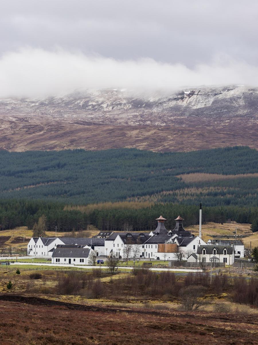
DALWHINNIE
Luster Publishers is gearing up for a new edition of the book "Hidden Scotland", to which I have contributed a number of images from our five hiking trips.
In the previous edition, roughly a third of all images in the book were mine, with other photos contributed by two other (local) photographers.
In the new edition (which will now also include the Orkneys), more than half of the images will be mine.In the chapter/list on whisky distilleries, an image of Strathisla in snow will be included.
Which means that this image of Dalwhinnie distillery was proposed for the book but not included.Stately and imposing. The buildings look as important as the looming peaks.
The mountain is shrouded in clouds and mist, maintaining mystery and grandeur.
Rich
-
@MikeFewster has written:
Textures and Tracks.
Attempts of man to rival the longevity of the rocks. The texture is attention-getting. But nothing lasts . . .
Rich
-
@Fireplace33 has written:
Soteska Vintgar Gorge
There are some great waterfalls and fast runniing white water along the Soteska Vintgar Gorge in Slovenia!
Here are 4 shots from just one of them, all just slightly different.
I'm curious, which one works best for you?
ThanksI like number 4. I think the composition is best balanced. The colors are vivid (in all) and inviting.
Rich
-
@simplejoy has written:
Two images from the same place... one up, one down!
I don't get the first one.
I like the close-up detail and texture of #2, but I'm not a fan of swirling OOF backgrounds.
Rich
-
@ChrisOly has written:
Congregation
While touring Georgian Bay, Ontario I came across this peculiar assembly...
Nice. Close community spirit.
"Do not muddy the waters around you. You may have to drink it soon!"
Rich
-
@minniev has written:
Just My Yard
Watching the aftermath of a nice sunset from the porch swing, I decided to experiment with the new Adobe camera phone ap for iPhones which seems to be named Pi but some refer to it as Indigo. It's very "computational" in a way that is supposed to make phone photos look more like those taken with "real" cameras, less artifacts, less flat, less plastic-y. Right now it's free. So far I am liking it but still a novice with it. Still prefer my real camera, but it is a lot better than what I was getting with the native camera ap, especially in extreme ranges of lighting like this. I took photos with my camera, too, with regular settings and in HDR mode, and even with careful editing, neither of them came out as good as the Pi image.
Beautiful display from nature. Hard to beat. Did it look this good "in person?"
And the inexorable march of technology which we apparently cannot resist.
Rich
-
@PeteS has written:
Treasure beneath a Bridge
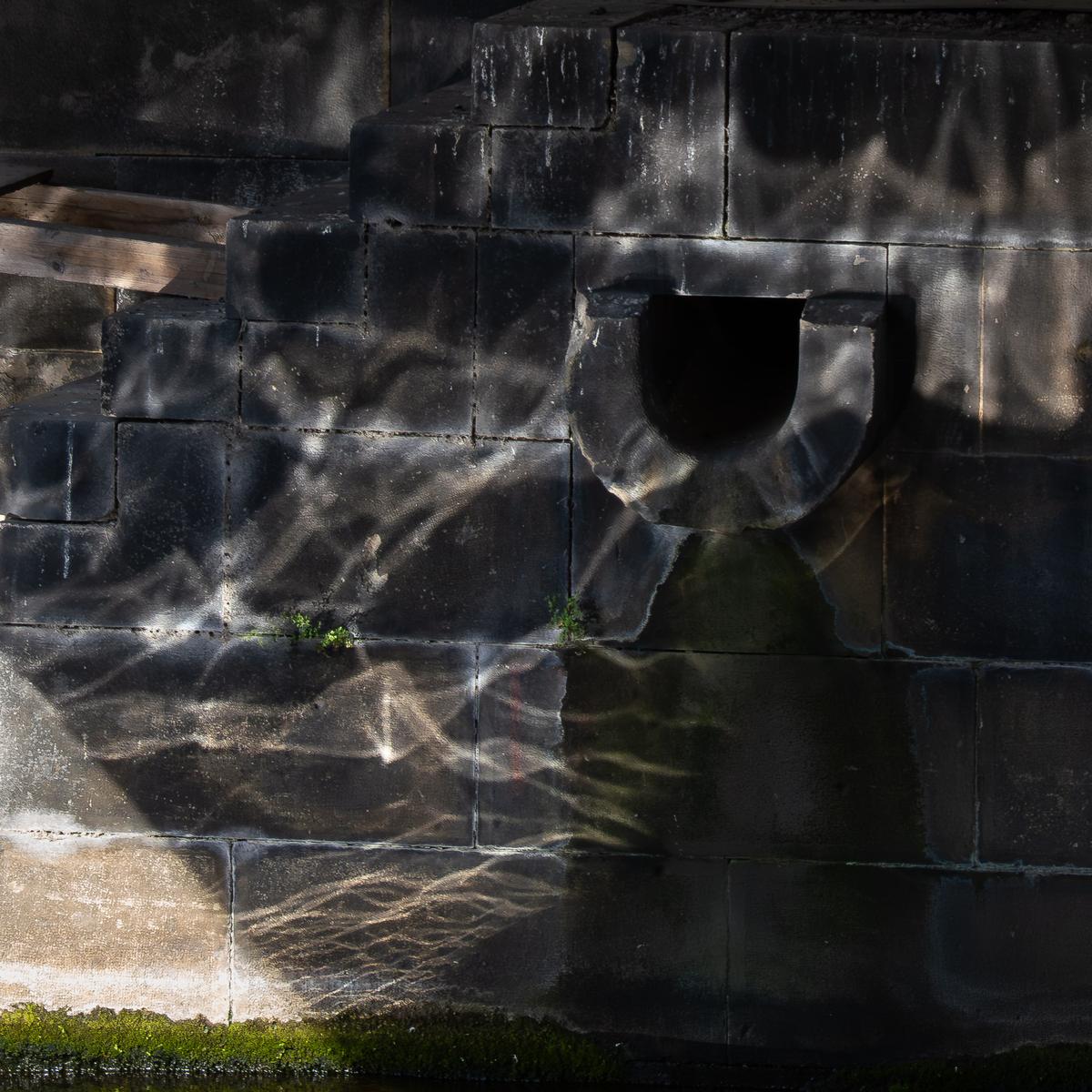
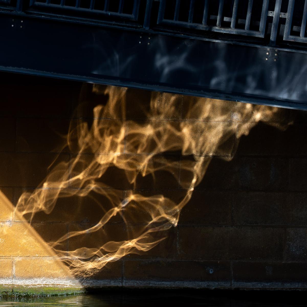
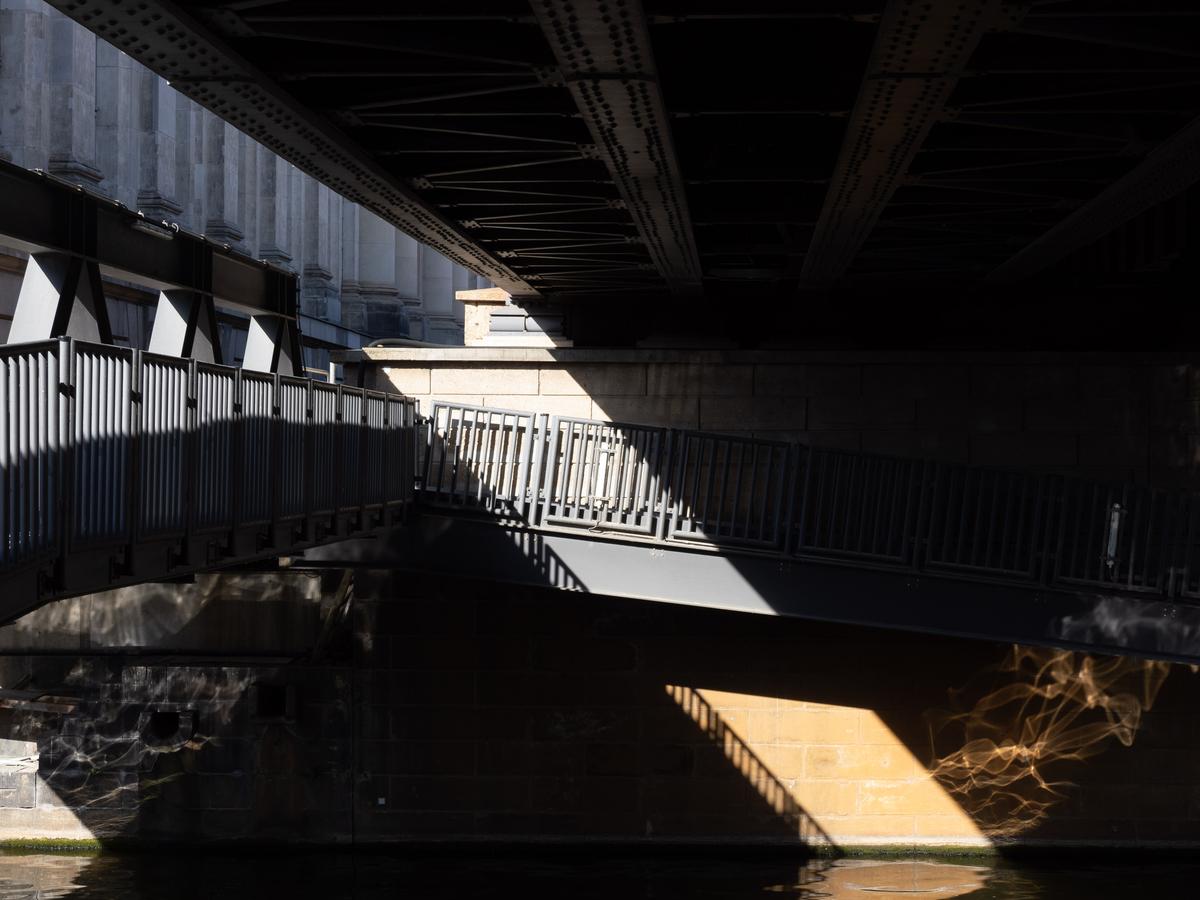
I discovered some delightful abstracts on the walls of a Berlin museum, but not on the inside, on the outside. In fact they were under a bridge and changing by the second. There were two of them alongside each other, spirit shapes dancing over the stone, one silver and one gold.
Silver Spirits
Golden Spirits
Making of..
And this one is straight out of camera, just to illustrate the entire scene. It could make an image in itself, but is very busy and would need some thought.
I like #3 the most.
It needs a little editing, but is the most interesting. Great light, shadow, shapes and patterns.
Rich
