A series on old cars is a promising idea. No one shot needs to be outstanding as an image, it's the overall variety of shapes and colours and fates that together make the statement. Add the nostalgia we probably all have recalling vehicles that were important in our lives and I think it's a winner. Just add lots more to these two and display them together.
Could you bring up the shadow areas a little? There are large black areas showing beneath both that might benefit.
July 23, 2025
53
-

-
How sumptuous can a red be? This is the red of quiet luxury and extravagance. The dark green complements the mood of this red. It's no shrinking violet either. It confidently demands centre stage and it couldn't be more central. The sharpness of the flower centre is a striking foil to the soft swirling background.
-
Simplejoy sums it up. Layers of time. A philosophical image and well spotted. Maybe one for physicists as well.
-
There's an idea here that I'm going to borrow Chris. Studying different sections of the same tree and then displaying them together. Shot 1 is the trunk as it fastens to the ground. Strong. Solid. Shot 2 of the other end. Multi stemmed and airy. Your angle has an explosion of lines. Perhaps make the contrast with the trunk weight more pronounced by lightening up the shadows?
-

The second is certainly not bad (that lens is performing well in the hands of the competent photographer)
But I think the better shot of the two is the first. It has the same kind of layering as the second image, but because we also look down deep into the valley, there is the added bonus of a greater sense of scale/height/depth. -
That kind of light is not only golden and flattering for human subjects, but the lower angle of the sun also creates the nicest reflections.
Beautiful memory. It exudes a nostalgia for simpler times. -
This image fits well in with the capitalist story of previous offerings, but as a single image, it does not do that much for me.
I needed your explanation to realize that I am looking at marble and copper (I probably should have looked closer).
The weathering of the copper creates a strange impression in my mind: almost like I am looking not at the object but at a solarized rendition. -
Remember Pierre De Coubertin : "Participation etc etc."
Remember also my local darts champion : "If you just don't throw the dart, you will never hit the bull's eye."
-
The crow really makes the shot, and is a main reason for going vertical orientation here.
I think, however, that it might also work well as a square.
And have the crow right in the exact center, both vertical and horizontal.Love the muted colour scheme of that landscape.
The sheer black of the crow is even blacker than it really is against that background of pastel colours. -
I really enjoyed your story here and it rings very familiar with me.
In a very odd way, it reminds me of one of my all time favourite shots that I made myself, with the reflection of a young Iranian woman in the window of a moving train, while seeing through the window towards a desert landscape with snow-capped mountains further away.
This image actually does the opposite (which is why I cannot really explain why I made the mental connection) : it shows a reflected cityscape and what we actually see through the glass pane is a person, in this case a historic figure.I like quirky and unexpected. Quirky is good.
-

Love your family‘s addition to the English language! Your wife is obviously very skilled at it, whereas the man in the foreground is still an amateur and doesn’t take it seriously, but then, he is only salaMANdering. He is in the foreground and very prominent, so I see him first, but my attention rests with her for much longer. Possibly it is because she is more central, or maybe simply because she is more intense. In any case, the man adds something to the image, even if he turns out to be a secondary subject. He adds an extra layer of interest and the photo is brighter with his smile.
-
In the first photo, the bright green is an eye magnet and from there the view rolls down into the valley to the distant mountains and the dramatic sky. It is a lovely landscape and rewards a study of its details.
I don’t think the second is as successful. The greens are just as magnetic, but the dramatic sky is too, and pull attention away from the meadow, which is a shame, as the flowering meadow with its more subtle changes in colour texture is actually more interesting than the sky, and the title suggests you feel the same way. You could try cropping off a bit of the left and the top to get rid of the sky, dramatic though it is, to keep the viewer‘s attention on the grass and flowers.
-
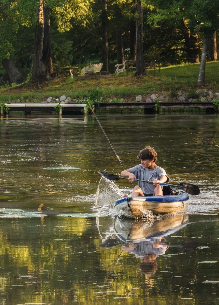
You and your family certainly found some beautiful light and the scene is lovely too. There are plenty of little details to savour. Your grandson and kayak in fine light, the splashes from the paddles and kayak, the patches of bright foliage and their reflections and the garden furniture amongst the trees.
The boy in the kayak and the garden furniture are linked by the fishing rod. Both are towards the centre of the frame and most of the important details are there two. You could consider a vertical crop, which has the benefit of condensing to the important objects and the disadvantage of presenting the wider scene. For instance like this…..
-
I agree with Roel. As a single image this photo does not have the lovely light to make it easier on the eye and, as you explained to Mike, you were forced to crop off the right hand side. However it still has a voice in your series. On its own, we cannot see that it is blocking a fine beach view, although that would be obvious in a series, but it does add to the theme of questionable taste. It might sound grand to use marble and copper for the garage and its door, but a quick glance reveals it is just bling. The keystones in the arch over the door are not even touching, which reveals their function is purely to show off and has nothing to do with strength. Similarly the copper doors show some fine colour variations, but closer inspection reveals they just look shabby and badly maintained rather than any tasteful and colourful decoration. Similarly the colours of the paving are not attractive.
However, one detail is intriguing and that is the little rainbow leading from the bottom left corner of the door to a paving stone. That must be where they keep their pot of gold! -
I agree with Mike.
You should definitely continue with the series. -
I love this photo, although actually I see it the opposite way to your title. For me it is a photo of a crow with the bonus of a gorgeous background! The crow and that lovely bush are sharp, but the background is slightly out of focus, which doesn’t matter, in fact the contrary, as it helps highlight the crow, but is still sharp enough to explore.
The colours are very attractive and so too are the textures in the bush and the landscape and the difference between the two adds yet more interest.
There’s nothing wrong with your framing, but I like Roel‘s idea of a square format or even a horizontal 4x5 crop and think they would be fun to try, as both would emphasise the crow even more. -
The bright red poppy does not let the eyes go anywhere else for a moment, and those very sharp stamen at its centre keep them there. This centre sharpness of the poppy (and the lens) together with some detail in the petal gives an impression of a very sharp flower, although that is an illusion, as the edges of the petals are already in soft focus, which helps blend the flower nicely with the bokeh behind.
I also like how the left-hand background is predominantly brown, whilst the right is green. -
They are a nice pair, with the first highlighting the strength of the sturdy trunk and the texture of its bark. The second shows the feathery texture of the branches and leaves, which are forming a mesmerising pattern against the sky. I agree with Mike, that you could try brightening the shadows.
In any case it is a nice idea.