Beautiful sunset (I think) through the complexities of the cockpit.
July 30, 2025
80
-

-
I haven't seen it before, and it is lovely. Not sure whether those little bokeh balls are flowers or fireflies or dandelion pieces, but they are magical. Rich beautiful colors.
-
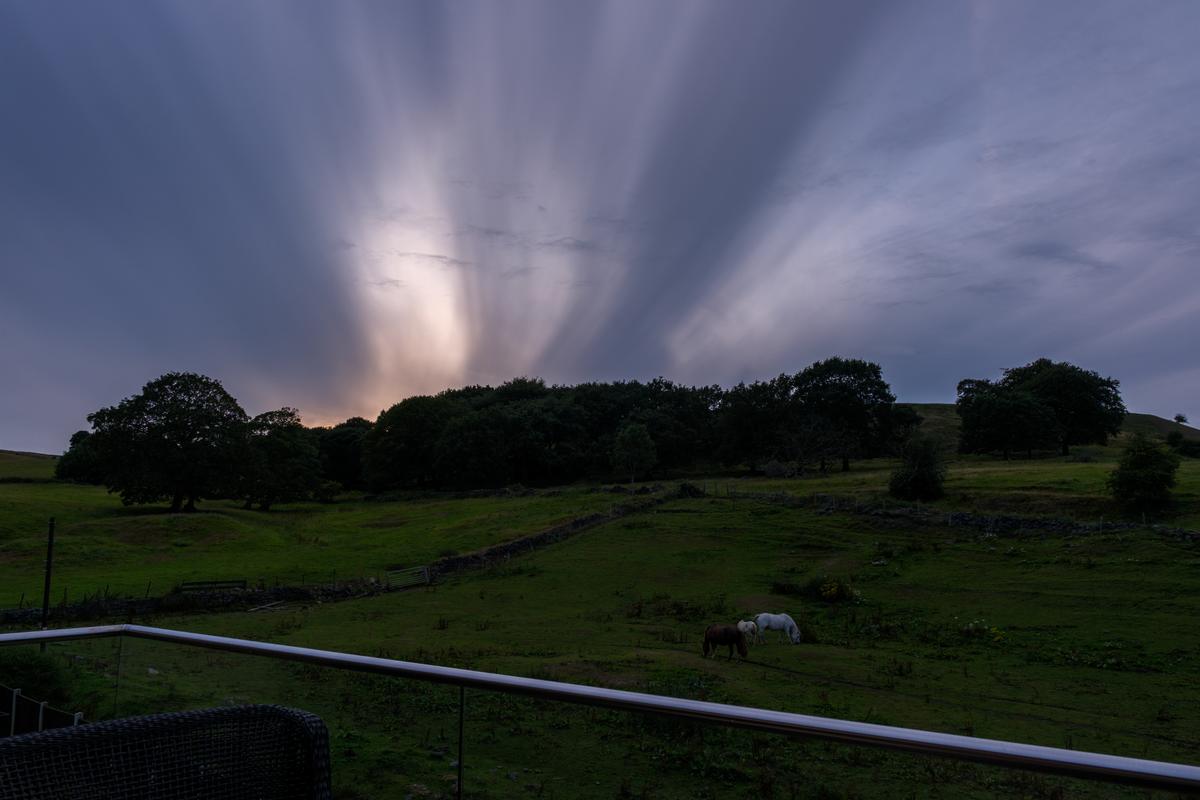
There was a really weird sky last night as the sun set.
-

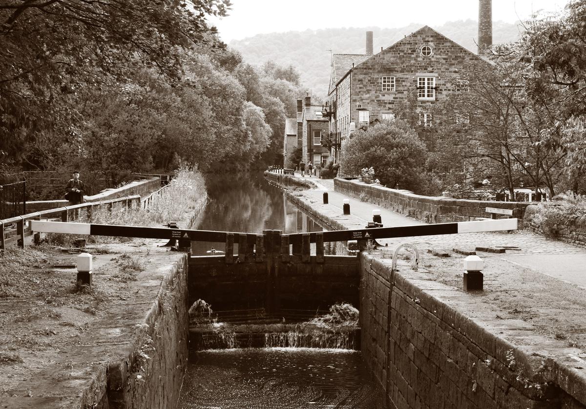
Hi again Alan,
Now we/you have found a style. Then it's time to figure out how we want that image to look. It might be perfect at it is but here may also be things to improve or try. I took your image and made the leaking water at the bottom of the lock doors more sparkling, increased the contrast locally at some places (mainly the trees and the building), I removed the elbow to the extreme left and while being there I also removed some other things to the left that weren't to my personal liking, repaired some damaged caused by my quick monochrome Photoshop action tried without much of a success to remove the obvious satellite dish on the building:
You may like it or not, or like parts of it. My goal was to make the image more... well, maybe more enticing at the first glance to make people look at it a little longer. It may all depend on the idea behind taking the image and what to do with it. Maybe crop away a little at the bottom?
I hope you don't mind this further fiddling!
/Jonas -
I don't mind at all. Some of your ideas will help ME improve. So, keep fiddling 😁
-

It's a good thing that I looked at a couple of responses to Roel's post before I posted. I'd have made the same point about the use of differing formats from the same position. If I was still teaching, I'd have used these for a discussion about the "why" of each shot and then there would have been a homework exercise to do the same thing.
Thanks Fireplace. Thanks Roel. -
A "Lonely Bench" with a difference. LB shots are usually out of season with trees and lakes and snow etc. Here's a LB with nary a tree or touch of green or anything that may soon become green. Concrete and steel and engineering. The bench itself picks up the lines of the bridge structure. The lines take us into the heart of the city. The clear blue sky area is nicely positioned to help take the eye to the same end point of the bridge. The verticals on the right of the bridge balance up the huge structure and crane on the left.
Great shot where the photographer's decisions are important to the final success. -
Very good. Your angle enables us to pick up many of the faces in the crowd but also gives just enough of the speaker's face to add to the outstretched arms. The fence positioning is quite superb. It gives a line that ensures the speaker is immediately seen. The empty space to the right reinforces the jamming together of the mob to the left.
Love the right hand of the speaker. The background to the hand ensures that the important splayed fingers are spotlit.
Deceptively simple but repays close study. -
Shot one works for me for the reasons you have given.
I agree with your comments on the other shots.
With three, perhapd crop about 1/3 off the right? The Out of focus flowers on the right aren't adding anything - they take the eye away from the subject. Those on the left and below the girl frame her and take the eye to her. The crop would give a more portrait format. -
This is written after my earlier response to Alan's photo. Chris is right and I've changed my mind. I thought the great V at the top of the gates would be lost. It isn't. If anything, it is now more striking because those industrial lines have even more significance when seen with the ye olde buildings and rural setting.
-
I'd be intimidated about photography in this location. Why? Where to begin? What would I do with the images?
I think this is simply brilliant. The visitors are here but they are dominated by the reminders. We see only a little of the visitors and you have them looking upwards and through windows. I like your use of colour. There's no attempt to make it a 1940's image. This is the past and it's relevant today. The receding lines of the windows also suggest time.
Total admiration for what you have done here.
And thanks for the technical information as well. -
A technique full of possibilities. Especially with the new ability to exercise more control over the reflections in PP.
There are plenty of spikey shapes in the artwork and the reflection that might be combining for a meaning but I'm not seeing it. The golds and blacks plus the small area of red wall and gracious window frames are visually pleasing but I'm not linking it together. -
All the satisfaction of a cup of good coffee.
I feel it would have been better to left this as an abstract where the colours, balance and texture create their own response in the viewer. The title and comment channel our thinking a bit too much. -
The combination of the techno screen and the clouds works well. They give similar east/west lines and have plenty of similar colours. They create an awareness of the magic of flight and what it can do for us. Clouds with sunsets makes window seats obligatory.
-

The main attraction here are indeed the very diverse expressions of the listeners.
-
This looks like a sunset photographed through the Heads Up Display in a modern aircraft. Fascinating and original POV.
I wonder: were you the pilot or were you allowed into the cockpit? It looks like a sizeable plane. -
a bull and a bulb.
and then much more to explore
photographic fun(There, that was another of my haikus before I even knew that I was on course to writing one. It just followed from realizing that the first observation had 5 syllables, and then I modified my second thought to be 7 syllables.)
-
Agree that this was a very interesting exchange of ideas, both in words and in images (PP examples).