Yes we visited the Residenz and its gardens.
Reminded us of Versailles (although that is situated on a much larger estate).
Some of the rooms in the Residenz were unique in our experience and we have seen a LOT of palaces...
Aug. 6, 2025
52
-

-

It's an intriguing structure and your photos, especially 3, suggest this. However, I can't work out what it does. I think you need a couple more so we get the idea of what is moving, where it moves to and what the issue is the bridge design is solving. Or, maybe it's me that isn't getting it?
Whatever. It's a subject worth the study. -
Taking photos of objects in motion in a landscape always presents us with choices and dilemmas about timing.
What exactly is the "Decisive Moment" as Henri Cartier-Bresson used to call it: that one exact and unique moment when all the objects that make up the composition are in perfect geometric harmony with each other (at least that is how I interpret his notion).
Your shot of the grandson's little boat coming towards you, is an illustration of one such moment: the point where two V-shapes touch eachother's tips, with the main subject right at the intersection: the upside down V-shape of the trees' reflection is met by the V-shape of the boat's wake. It is an inspired choice.
Personally, I think I would have waited a bit longer, to get the boat at the moment where it clears the trees' reflection and is isolated just against water, to avoid any overlap. But that would, of course, have resulted in the trees' reflection being disturbed by the ripples of the boat's wake.
Your shutter depression is probably wiser.
(Maybe you also made the other shot, seconds later. I would be interested to see that one too.)
-

I do get where you're going with this. Chiaroscuro has come to mean a more graphic style of light and dark but my interpretation is that it's about the 3D/modelling effect of an object through light and shade with an emphasis or rounding by using gradual rather than abrupt changes. Kinda how you make a tree trunk look round in a graphic style rather than how you make it stand out by it being black against the background, but everything being relative it can do both. My interpretation would be more like this:
-

A nice Birds Eye study of an old city, featuring lots of red roofs and some fabulous old towers. When visiting old cities I do try to get to these high spots where the initial layouts are best seen.
-
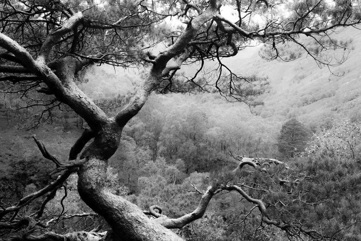
I like sunbursts in lone trees. Both of these are quite nice. I prefer the first one because of the anthropomorphic "arms" reaching upward to catch the sun-star. Though the greens are lovely, the myriad of colors in the sunburst may give you some challenges in a print. I say this from my own experience, and ended up converting it to monochrome which actually resulted in a better and more simplified image. YMMV.
-
What a wonderful image, bursting with energy created by that tension. The colors are rich, the shapes and angles are clean, the ropes are taut. In almost every instance I prefer to straighten a horizon, but in this case, the lean seems to accentuate the tension and add more drama to the scene. Well done.
-
When I first looked at this, I automatically assumed it was Rich's.
Nice composition with geometry at its heart, and a secondary dose or color and texture. The shadows on the glass panes, each taking up more space in the pane than its neighbor, add mystery and contrast. The inclusion of elements revealing perspective at the top but making it invisible at the bottom also makes the scene more interesting. Good spotting.
-
Intensely rich colors and powerful lines make these candidates for galleries in plain black frames or screensavers on sleek screens. The lines and textures are captivating. If I had to chose a favorite it would be the first because of the mix of strong and subtle patterning to complete the geometric shape.
-
I really like this set. I like to photograph old desiccated bridges too. I love how you've brought out the colors of the paint and rust in the first two, and given us the distant and close up shots. That close up could stand alone as a high quality abstract. The third one could benefit from some of the color and detail. I understand how hard it is to get a meaningful picture of the lift part of one of these types of bridges. There's one I've photographed for years and never solved the problem. With the shot you have, raising shadows and lowering highlights might give you a better starting place, letting you take advantage of that interesting sky, and allow us to peer into the shadow-hidden inner workings of the thing.
Fascinating subject. To me, at least.
-
Both have a specific quality.
In the first, the foliage is "anonymous": the sunburst emphasizes mostly the ghostly shape of the tree itself: a screaming figure with arms held high, running towards us.
In the second, the tree branch is secondary, and it is the light X-raying the leaves that is the main attraction.
I like both effects, and I think that an image combining those two effects (if at all possible) would be the true winner. -
I remember this kind of fishing nets (they were called "chinese nets" there) on a morning walk along the coastline of Fort Kochi in Kerala, India.
Fishermen were labouring hard; it was much earlier in the morning (just before sunrise).
This image of yours, without people, looks more peaceful, and still it shows a lot of "tension" (as you rightly indicate).
I think that the tilted horizon is doing some of the heavy lifting in this image to convey the sense of tension.
The large grey beam of the installation is not vertical, and it would be even more tilted if the horizon were straight horizontal.
All those other fragile lines seem to be tugging at the beam in order to get him further upright.
So much so, that the earth itself gets tilted.
I feel like this is a small psychological/visual effect from the tilted horizon.
And I like the effect (and being aware of it). -
Is that frost on those windows?
Sure looks like it.
It creates a ghostly impression, enhanced further by the subtle reflections on the highly polished wooden floor.
This japanese architecture is rigid and square, all beams and frames. Bauhaus has certainly studied Japan closely.
The organic shapes of frost and reflection bring welcome life. -
The first is clearly a landscape. That's what the tree does.
Eliminate the tree (as in the second) and the level of abstractedness skyrockets.
The vineyard lines look like they are combed onto the canvas with thick paint, applied with a rough instrument.
The poppies in a small patch of grass, too irregular probably to be included in the cultivation, bring the highlight of this painting.
Amidst the thick green paint, applied heavily, the poppies feel like they are airbrushed, or sprinkled by shaking a soft small-haired brush.
Only then, when our gaze has been saturated by the red, do we notice that there is also a tree in this image, much more humble in the frame.
Love it. -
-
How I was fooled.
Great stuff.
I trust that you see why I thought that is was what I thought it was. -

[/quote]
The composition is nice and works, but the real star of this image (for me) is the combination of colors (warm and cold) with a mixture of modern (contrasty lens rendering) and old (sepia tones), which is a nice fit for what we can see.