Good idea for adding something interesting to a darker room. Both shots look great. I‘m amazed those stars are as sharply defined. I‘bve never experimented with that… guess I‘ll have to stop down one of my lenses for a change? 😅
-
-
Initially I thought this shot might work better when cropped (because the lower third is pretty busy as well) but after some consideration I think you've done the right thing with the nice diagonal the bridge and yellow house provide in the composition. I'd still crop it (very slightly) from below because that bright skylight doesn't add anything and I'd probably also darken that white area in the left corner slightly in post. The more I look at it, the more I think you did an excellent job composing and capturing that scene because it certainly is a challenging one - well done!
-
Thanks a lot! It would be unfair if I'd call it lens limitations, because I significantly tilted a lens here, which was never intended to be used for that. I've tried to crop it some more initially to get rid of the dark corners, but then I thought I don't mind it at all. It's not meant to look natural as you can probably see in a number of aspects.
-
@ChrisOly has written:@RoelHendrickx has written:
WÜRZBURG VARIATIONS
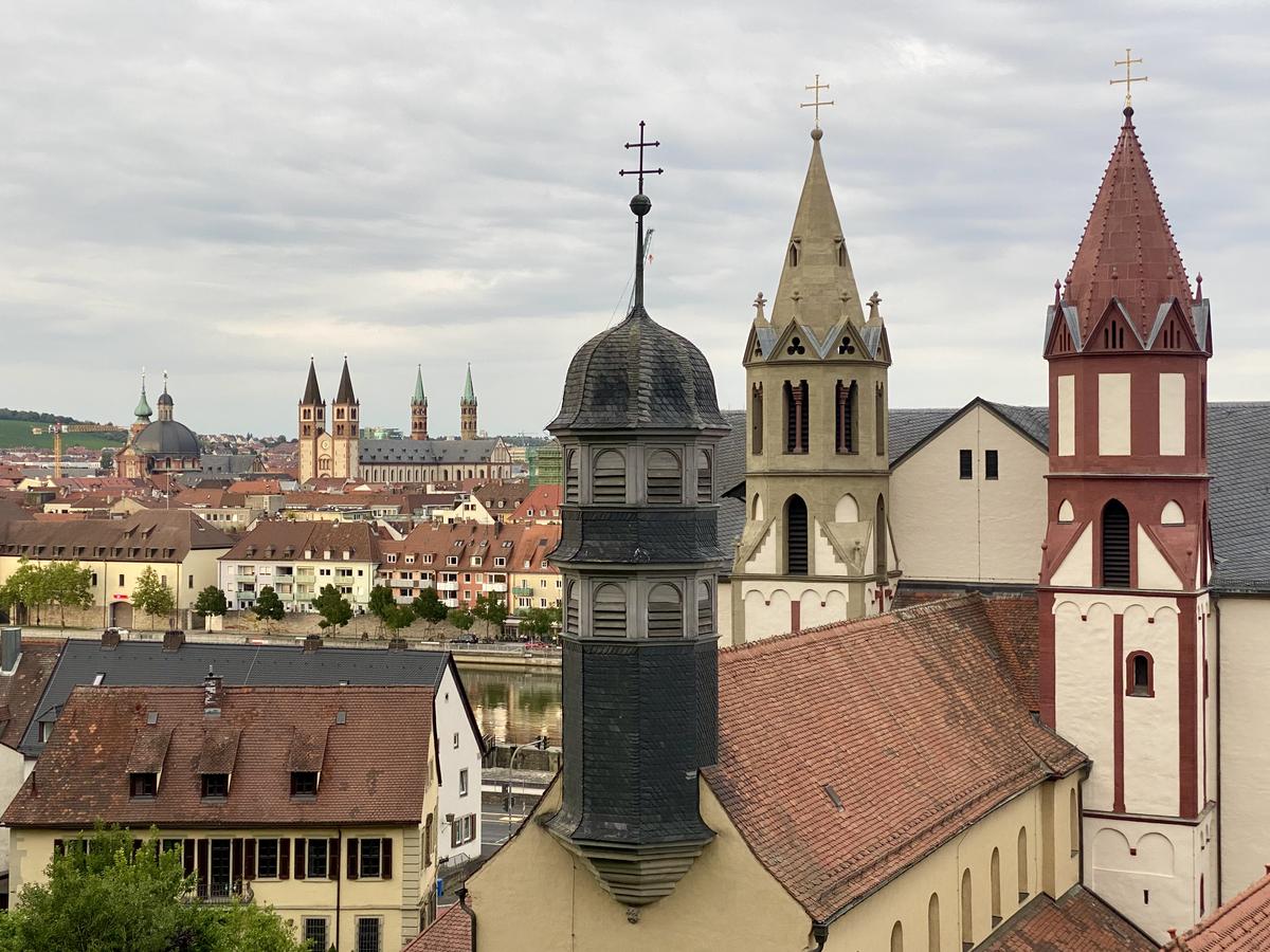
If I can honest the last one is the most successful for me with those towers being so dominant and interesting.
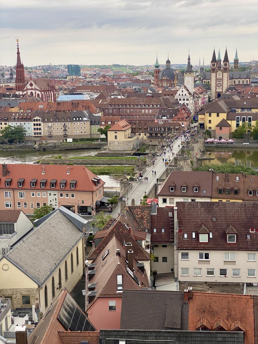
As to #1, I would lop off at least 35% from the bottom ( too many roofs).
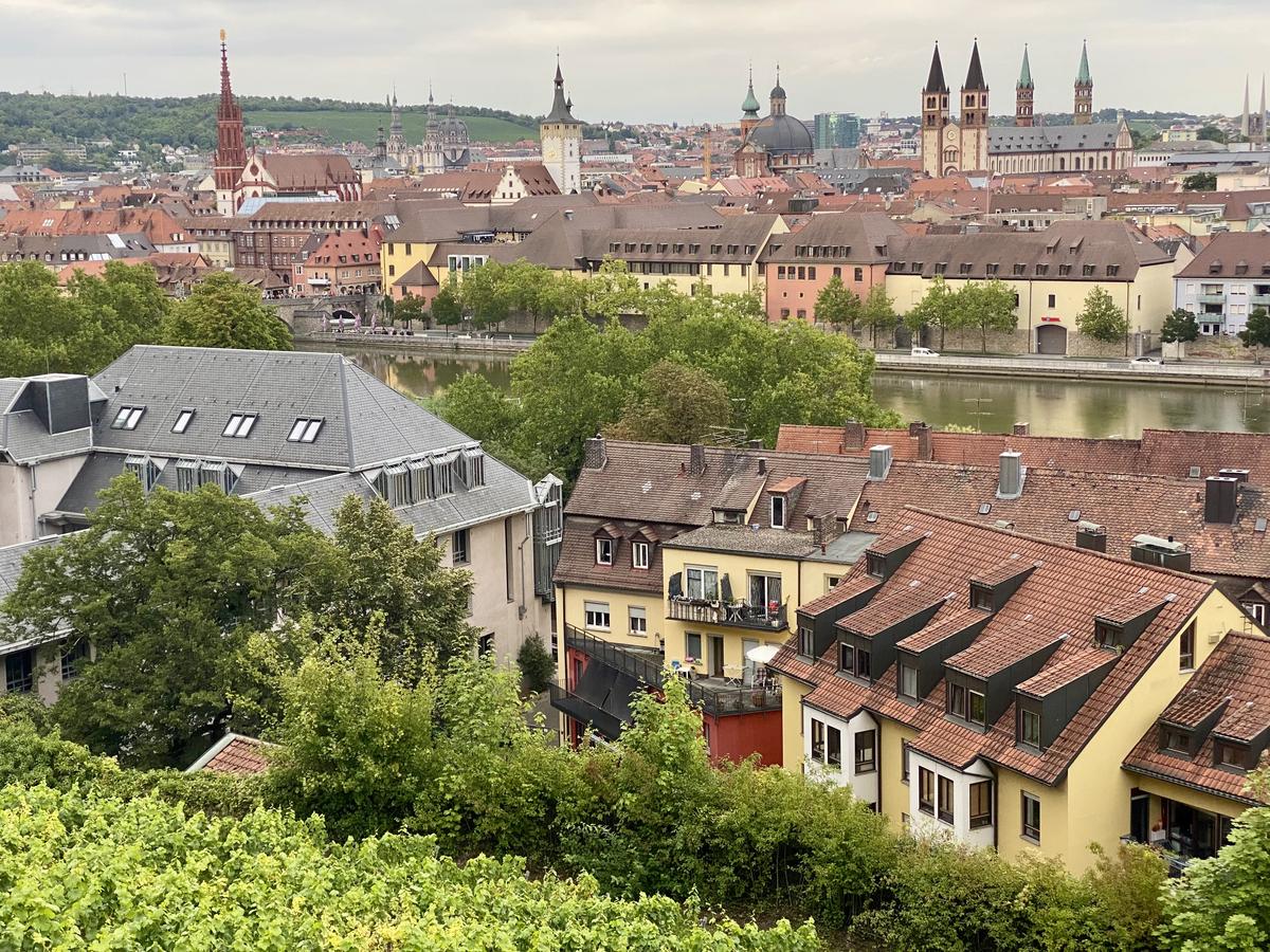
And #2 - could do with the crop of 20% on LHS.
But that's me. Maybe using smartphone limits your ability to compose and focus on more specific subjects, don't know. On the other hand it's the prerogative of the picture taker to select what HE feels is the most appropriate frame. We all have different vision...
Yes, of course you can be honest.
You not only CAN be honest but you SHOULD.
We don't learn anything if we are not honest in our comments.I really appreciate your input.
These images were all cropped a tiny bit (if only to get verticals straight; I am a lousy straight-keeper while shooting).
But I have kept the original ratio (4:3 on my phone).However, you make a compelling argument for cropping the first image to square. That is IMHO your best advice.
Also your suggestion for the second image is a valid one, but I would not want to lose the left most tower (absent from #3).
-
@MikeFewster has written:
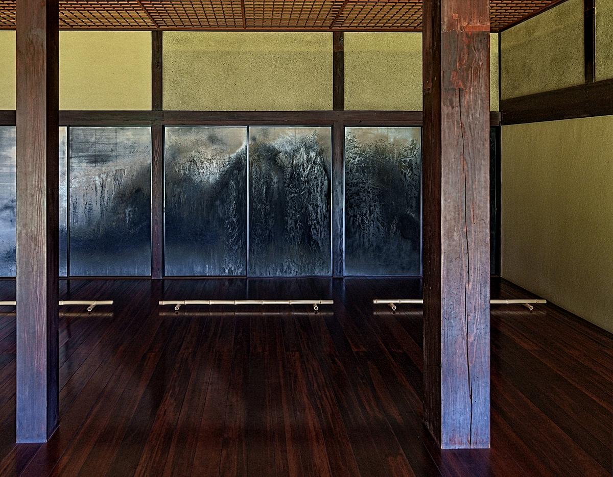
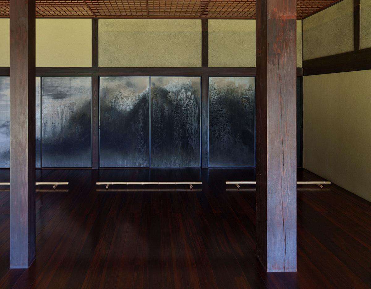
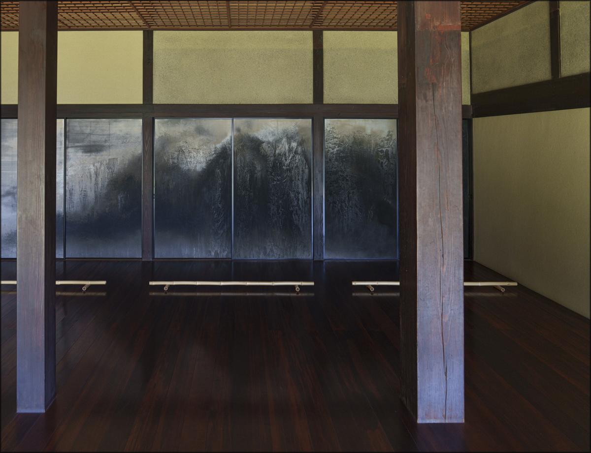
House Porch. Japan.
I edited the original. Version 1 (deleted) needed the shadows raised.I like the idea of this image very much Mike.
I think there is a small amount of barrel distortion from the lens in this image. I would also apply a very small amount of perspective correction to the horizontals and verticals. I have included two versions of this above, since I pouched the posting here somehow. One with just the corrections and a second to which I applied some contrast changes to the image via a preset in ON1 Effects, Ai. For me it brings out the wood grains in the structure and adds more interest. Somewhat shockingly I had not noticed the background behind what I assume are windows. If it is in fact windows, a stunning view lies behind. It could however be a painted scene! -
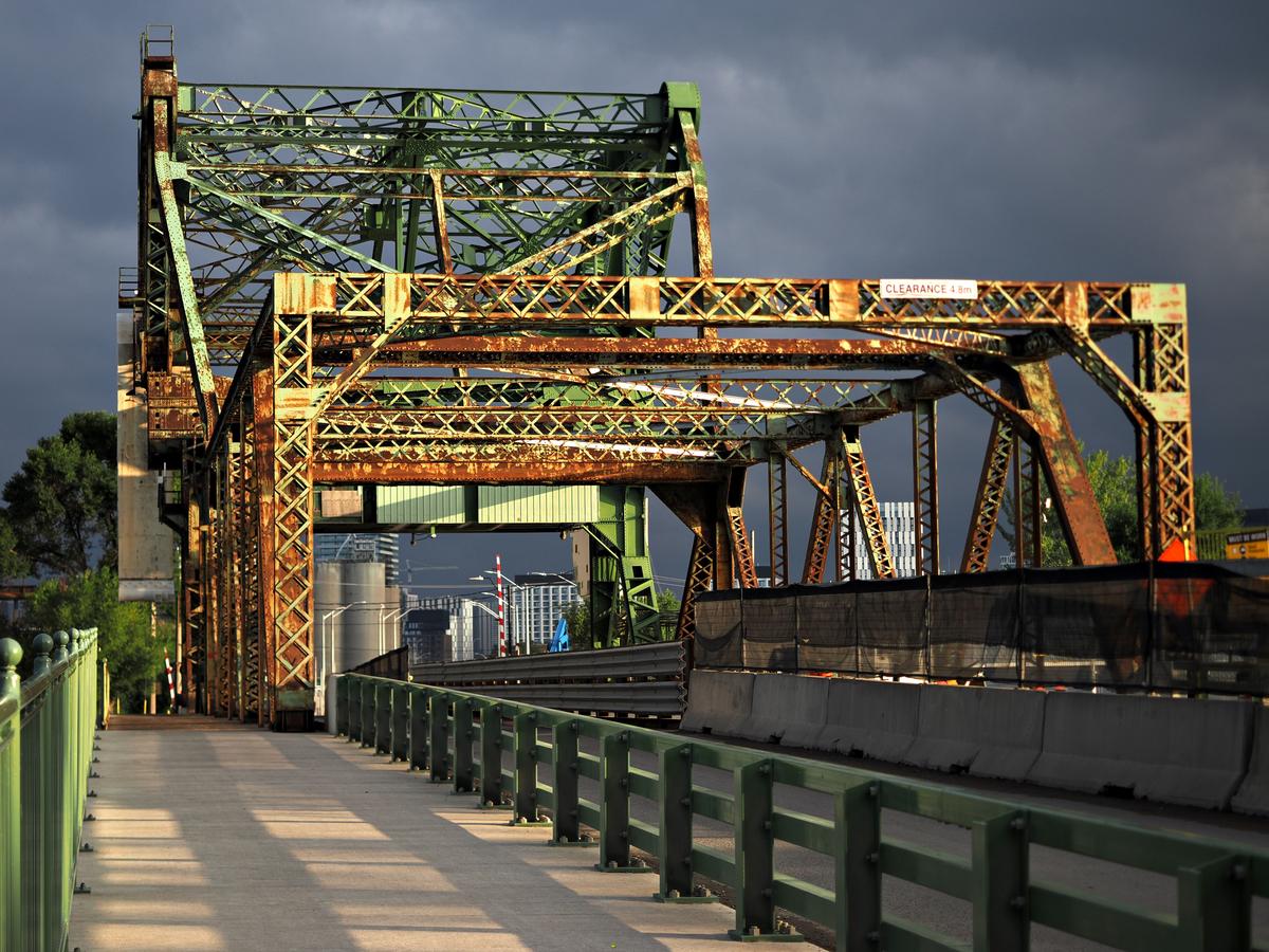
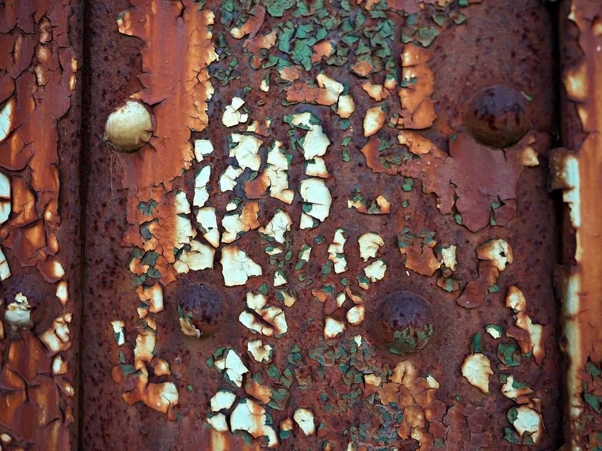
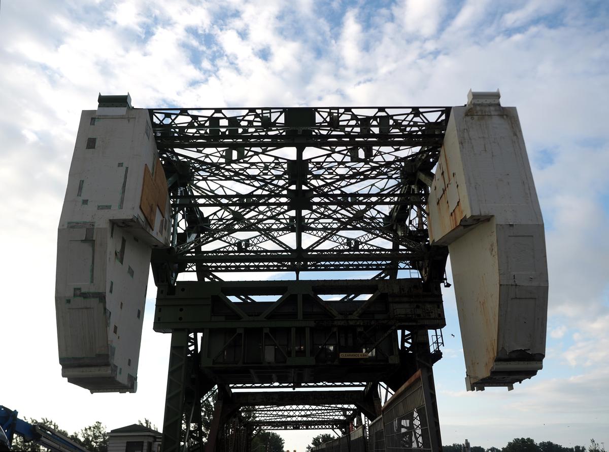
Bascule
Strauss Bascule Bridge in Port Lands section of Toronto, Canada. Moveable type of bridge built in 1930 and still in operation is constantly requiring service due to complicated mechanism. Mr. Strauss is also credited with design of suspension type - Golden Gate Bridge in San Francisco, California which was unveiled in 1937.
-
@19andrew47 has written:@MikeFewster has written:
House Porch. Japan.
I edited the original. Version 1 (deleted) needed the shadows raised.I like the idea of this image very much Mike.
I think there is a small amount of barrel distortion from the lens in this image. I would also apply a very small amount of perspective correction to the horizontals and verticals. I have included two versions of this above, since I pouched the posting here somehow. One with just the corrections and a second to which I applied some contrast changes to the image via a preset in ON1 Effects, Ai. For me it brings out the wood grains in the structure and adds more interest. Somewhat shockingly I had not noticed the background behind what I assume are windows. If it is in fact windows, a stunning view lies behind. It could however be a painted scene!Lots of thanks Andrew. You are correct on all points and your version of my shot is a big improvement. I've never put much effort into learning the finer points of vertical/horizontal PP correction and your work here is a clear demonstration that I need to. It's an image that lives on having this right. What program did you use?
You are correct in your suspicions about the rear window. It's a painting.
Roel and Rich have recently posted shots of porches so they were in my mind as well when I contributed this take. Japanese aesthetics very much hit my buttons. me. -
@minniev has written:
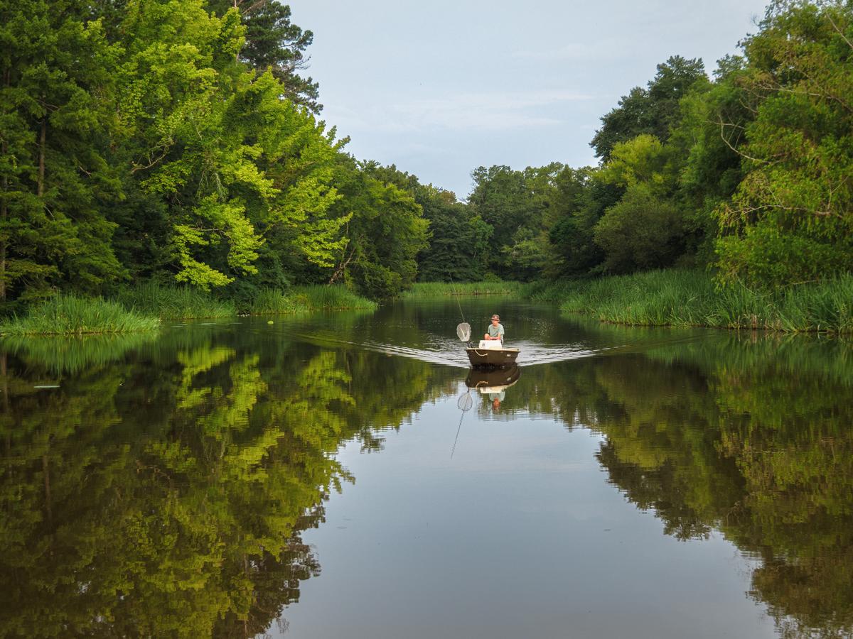
Another fishing photo, this of grandson #2 bringing his boat into the dock...
Encouraged by the fun my family had with the last batch of fishing photos, I took the camera to my last summer meetup with the 13 yr old. He takes his little john boat out at dawn and fishes his way to the bait shop where there's a great country breakfast. After we fill up on biscuits and eggs he fishes his way back to home. School started next day, so that activity will be shelved for a while. I wished for better atmospherics, wished I'd thought of this earlier in the summer, and hope he doesn't outgrow it before next summer!
A great photo made even more delicious with the text.
The X composition is doing a perfect job of highlighting our Tom Sawyer. As if this wasn't already perfect, the silver V of the wake does it again. The lighting and darker background ensure that the rod and net are easily seen to complete the story.
It's hard to see the appeal of school. -
@Fireplace33 has written:
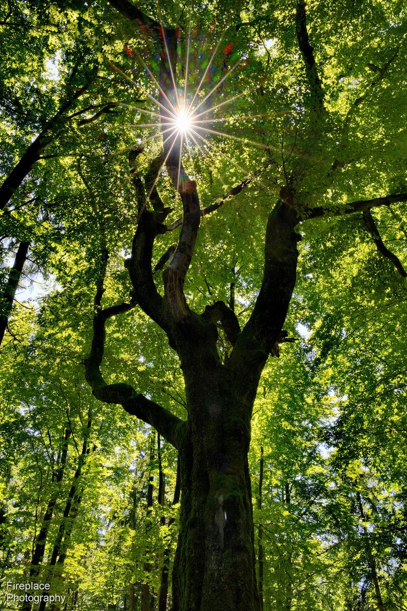
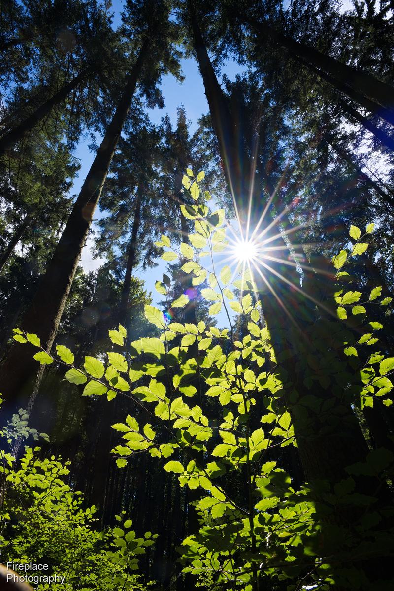
The illusion of Chiaroscuro
Yesterday, I went for a walk in the local forest, looking for a photo that is generally relatively dark, but has a bright area that shines out brightly.
I found these two shots.There is a technique used by artists called Chiaroscuro which uses strong contrasts between light and dark to make the subject really stand out.
Perhaps used many years ago for paintings that were hung in darker places?
I wanted to test this method out and make a large print for a wall in my house that is often only dimly lit,... with the hope that the print will still look bright under those dim conditions. After all everything is relative , right?
I can't add a spotlight to this particular area, so maybe this technique will work instead.
After testing with A3 sized prints The second shot works better than the first; it gives the feeling that the sun is shining and lighting up those leaves despite the dim lighting in the room. (The final print will be 60 x 90cm)
Only problem is that my wife doesn't like it, but I think I'm on the right track.
I'll just have to find something, with a similar lighting effect, but a bit less "messy" and with a simpler somewhat more minimalistic pattern, that fits better to the curtains ;-)Thanks for this post.
IMHO photographers should pay more attention to art traditions and discussions of painting. There are multi centuries of insights on visual literacy to be mined. Chiaroscuro and its sidekick tenebrism should be part of the awareness of all photographers.
I prefer 2 in that I feel it is a better example of what chiarosco attempts to achieve. The balance of light to dark in 1 is already about even. In 2, the proportion of bright is considerably smaller and the sunstar positioning keeps it with the brighter leaves. I'm not arguing that 2 is necessarily a better photo than 1, just that 2 is a better example of the chiaroscura concept. -
@MikeFewster has written:@19andrew47 has written:@MikeFewster has written:
House Porch. Japan.
I edited the original. Version 1 (deleted) needed the shadows raised.I like the idea of this image very much Mike.
I think there is a small amount of barrel distortion from the lens in this image. I would also apply a very small amount of perspective correction to the horizontals and verticals. I have included two versions of this above, since I pouched the posting here somehow. One with just the corrections and a second to which I applied some contrast changes to the image via a preset in ON1 Effects, Ai. For me it brings out the wood grains in the structure and adds more interest. Somewhat shockingly I had not noticed the background behind what I assume are windows. If it is in fact windows, a stunning view lies behind. It could however be a painted scene!Lots of thanks Andrew. You are correct on all points and your version of my shot is a big improvement. I've never put much effort into learning the finer points of vertical/horizontal PP correction and your work here is a clear demonstration that I need to. It's an image that lives on having this right. What program did you use?
You are correct in your suspicions about the rear window. It's a painting.
Roel and Rich have recently posted shots of porches so they were in my mind as well when I contributed this take. Japanese aesthetics very much hit my buttons. me.I use PSP2023 Mike. This is a Corel program. I think the company has abandoned its photo software since there have been no new releases since then. You can still buy it and likely for around $50. Not sure I would go that route as I suspect you have software already that can do it. Corel is very easy to use for this purpose. A rectangle appears on the image when you chose the perspective control mode and you just line up each of those lines with verticals and horizontals, at least the ones you want to be either. Try to pick lines closer to the sides of the frame if possible. Pretty simple really and if you don't get the result you like, undo is your friend and try again!
Long ago I used LR but it did not have a tool for that use then. Today I suspect it does.
Andrew -
@simplejoy has written:
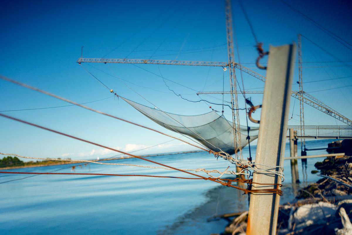
An appropriate title. There are enough lines converging about the point where the bottom of the net touches the chain for this to act as a focal point. In this shot, it isn't a point of great interest, it is acting more like a fulcrum with the heavier, darker masses close on the right being balanced by the longer lines extended out to the left. The old principle of levers works visually as well. The backward tilt of the off vertical rail to which things are tied gives balance to the dipping horizon.
So yes, it's a visual composition in tensions. -
@simplejoy has written:@ChrisOly has written:@PeteS has written:
Linescapes
[
]
Of the 2 I prefer this one. Somehow it's more appealing, less busy, peaceful and the lonely tree plays a major role, to me anyway.
Fully agree. That's a beautiful image with excellent use of lines and a pleasant harmony to it. Very well spotted and framed.
Agreement from me as well.
Compare Pete's 1 this week with Roel's 1 this week. The subject matter and colours could hardly be more different but they are actually very similar photos and succeed for the same reasons. -
@RoelHendrickx has written:
WÜRZBURG VARIATIONS
Like last week's old images of the Sächsische Schweiz, here is another exercize in getting different images from (roughly) the same spot.
We visited friends south-east of Munich last weekend and to break up the +900 km drive over German highways full of road construction sites, we turned the visit into a four-day mini vacation.
Our one-night stop on the way south was Harburg, a lovely little town dominated by a massive fortress - I may post photos of that place in coming weeks.
On the way back north we decided on Würzburg, a bigger city with a university and rich history, surrounded by the vineyards where the grapes for Frankische Wein are harvested. A very pleasant surprise that will certainly get another visit if we have to travel south or north through Germany again.
The Franconian wine is an ingredient of one of the city's enduring traditions: Brückeschoppen.
Roughly translated as "Bridge-Drinking", it is a phenomenon (Bridge Apero Time) that takes place every evening (already afternoon actually, starting 11.00 AM until 22.00 PM) on the oldest city bridge over the Main (the Alte Mainbrücke). This stone bridge is now strictly pedestrian, with lifesize statues of saints, like on Karoly Most in Prague and Ponte Sant’Angelo in Roma. Locals (and tourists) gather there with BYOB wine (or glasses purchased from the nearby winebars) to celebrate life and toast to … whatever!
We obviously participated, but I also needed some physical action, so while Els enjoyed another glass of Sylvaner or Riesling on the bridge with her book, I hike up the Marienberg on the opposite bank of the historic city center (Altstadt), to get some panoramic views of Würzburg. The Marienberg has impressive fortifications and a Castle that reminded me of the gastle in Budapest. Every available slope of the rocky hill is planted with wine. A great walk.
And as I had anticipated it yielded some pretty good views of the city, first from the top of the Citadel, and then on the way back down through the vineyard..
Here are three of those views, all made with the Iphone (camera photos are still on my SD card and not even on my hard drives yet).
First, a vertical composition overlooking the city from an altitude and concentrating on the Alte Mainbrücke leading into the city to create depth:
Second, a horizontal composition from almost the same altitude but more to the right, focusing on the city's many bell towers within the cityscape (notice how the white Rathaus tower and the cupola of the Neumunster have switched places as compared with previous image), and showing some vineyard and houses on this side of the river:
Third, having descended a bit along the path that meanders through the Marienberg vineyard, a closer look on (most of) the towers (except the red sandstone tower of the Marienkirche and the white belltower of the Rathaus), combined with the nearby church on the foot of the Marienberg. This one was made with the phone's 2x camera from a vantage point where I could get them in a nice alignment:
I agree with others hat the composition in #1 & #3 are excellent, but I really like #2. Not for the composition, but the contrast between the vines and buildings.
If I had to choose, then it would be #1.
I really like Würzburg. Not just for the wine on the bridge, but the Bishop’s palace is incredible too. -
@MikeFewster has written:@minniev has written:
Another fishing photo, this of grandson #2 bringing his boat into the dock...
Encouraged by the fun my family had with the last batch of fishing photos, I took the camera to my last summer meetup with the 13 yr old. He takes his little john boat out at dawn and fishes his way to the bait shop where there's a great country breakfast. After we fill up on biscuits and eggs he fishes his way back to home. School started next day, so that activity will be shelved for a while. I wished for better atmospherics, wished I'd thought of this earlier in the summer, and hope he doesn't outgrow it before next summer!
A great photo made even more delicious with the text.
The X composition is doing a perfect job of highlighting our Tom Sawyer. As if this wasn't already perfect, the silver V of the wake does it again. The lighting and darker background ensure that the rod and net are easily seen to complete the story.
It's hard to see the appeal of school.I like what Mike said.
It is a lovely photo, not just for artistic or technical reasons, but for family reasons too, and that is even more important. -
@Fireplace33 has written:
The illusion of Chiaroscuro
Yesterday, I went for a walk in the local forest, looking for a photo that is generally relatively dark, but has a bright area that shines out brightly.
I found these two shots.There is a technique used by artists called Chiaroscuro which uses strong contrasts between light and dark to make the subject really stand out.
Perhaps used many years ago for paintings that were hung in darker places?
I wanted to test this method out and make a large print for a wall in my house that is often only dimly lit,... with the hope that the print will still look bright under those dim conditions. After all everything is relative , right?
I can't add a spotlight to this particular area, so maybe this technique will work instead.
After testing with A3 sized prints The second shot works better than the first; it gives the feeling that the sun is shining and lighting up those leaves despite the dim lighting in the room. (The final print will be 60 x 90cm)
Only problem is that my wife doesn't like it, but I think I'm on the right track.
I'll just have to find something, with a similar lighting effect, but a bit less "messy" and with a simpler somewhat more minimalistic pattern, that fits better to the curtains ;-)I can understand why #2 would work better than #1 as a chiaroscuro. It is relatively dark with those bright leaves and the Sun standing out from a shadowy setting in stark contrast. In #1 the whole thing is relatively bright, with a dark trunk, so there is not the same bright and well differentiated subject as in #2. Now you just have to persuade your wife or have another go along the same lines as #2.
-
@simplejoy has written:
This works well, and the title is apt.
Often wires are a pain, and candidates for cloning out, but you have embraced them and made them the subject, proving the point that fortune favours the brave. -
@19andrew47 has written:@MikeFewster has written:@19andrew47 has written:@MikeFewster has written:
House Porch. Japan.
I edited the original. Version 1 (deleted) needed the shadows raised.I like the idea of this image very much Mike.
I think there is a small amount of barrel distortion from the lens in this image. I would also apply a very small amount of perspective correction to the horizontals and verticals. I have included two versions of this above, since I pouched the posting here somehow. One with just the corrections and a second to which I applied some contrast changes to the image via a preset in ON1 Effects, Ai. For me it brings out the wood grains in the structure and adds more interest. Somewhat shockingly I had not noticed the background behind what I assume are windows. If it is in fact windows, a stunning view lies behind. It could however be a painted scene!Lots of thanks Andrew. You are correct on all points and your version of my shot is a big improvement. I've never put much effort into learning the finer points of vertical/horizontal PP correction and your work here is a clear demonstration that I need to. It's an image that lives on having this right. What program did you use?
You are correct in your suspicions about the rear window. It's a painting.
Roel and Rich have recently posted shots of porches so they were in my mind as well when I contributed this take. Japanese aesthetics very much hit my buttons. me.I use PSP2023 Mike. This is a Corel program. I think the company has abandoned its photo software since there have been no new releases since then. You can still buy it and likely for around $50. Not sure I would go that route as I suspect you have software already that can do it. Corel is very easy to use for this purpose. A rectangle appears on the image when you chose the perspective control mode and you just line up each of those lines with verticals and horizontals, at least the ones you want to be either. Try to pick lines closer to the sides of the frame if possible. Pretty simple really and if you don't get the result you like, undo is your friend and try again!
Long ago I used LR but it did not have a tool for that use then. Today I suspect it does.
AndrewI like the extra detail Andrew brought out in the floor and raising the brightness of the landscape panel in particular.
You can easily correct vertical, horizontal and distortion in the Transform section in Lightroom. Just move the sliders from one side to the other to see what they do. Actually even the Auto button does a good job.
Well-kept secrets are the X-axis, Y-axis and scale sliders. They reveal parts of the image normally hidden in the standard version of the RAW conversion, giving you a little extra in the horizontal direction, vertical direction or both in the case of scale. They are real rescues if you messed up whilst framing and cut off slightly too much, or if the Transform process has cut off an important detail. Try it out.In any case I like your interpretation of the Japanese interior aesthetics.
-
@ChrisOly has written:
Bascule
Strauss Bascule Bridge in Port Lands section of Toronto, Canada. Moveable type of bridge built in 1930 and still in operation is constantly requiring service due to complicated mechanism. Mr. Strauss is also credited with design of suspension type - Golden Gate Bridge in San Francisco, California which was unveiled in 1937.
That is a great subject and a very nice series. I think I would sequence it differently as #1,#3,#2, always getting closer. I love the light in #1.
