I like the way the grandiose and welcoming entrance quickly becomes more sombre walls. I'd imagine that there was a less artistic "tradesman's entrance" for the arriving guests? Well worth preserving. In Australia we have some similar prisons from the same era. Some are being re-developed as guest houses.
Tinternaut's comment on the use of "keystoning" here is very apt.
Jan. 14, 2026
48
-

-
Another significant old building to be treasured.
Let's talk about the flagpole. It cuts through the building in an akward way. In itself, I don't mind the pole and quite like the additional vertical line it adds to those of the tudor building. There's something of a visual joke between the pole and the woodwrok that I quite like. it just seems to be in the wrong position. Betwee the chimney and the limp flag, the lines get confused. If you had been a step or so to the left, the chimney would have formed another clearly distinguished vertical to add to the others in the shot and the flagpole vertical would have been isolated to make a cleaner straight line. -

At the country house last weekend. The colors in the heavily shaded forest fooled the camera some, but I liked them so I didn't tinker much.
My participation may be spotty and my offerings limited to my immediate surrounds for a while, due to family medical emergency. I will enjoy all your travels though!
-
Agreed Chris. I'd suggest a little below the film like strip that is below the painted vines. The pieces of buildings, top left, somewhat break up the important horizontal lines of the image. It also would change the proportions to add a little more strength to the generally horizontal composition by giving a bit more prominence to the railway line.
How thoughtful of the graffiti artists to select colours that blend with the scene! Winter colours enriched with sun warmth. -

I can see where you are both coming from with your ideas for the crop, but let me propose a couple of counter arguments and the reasons I didn’t crop that way.
Firstly, for me, it is not just about the wall. It is a very important part, maybe the most important part of the image, but not as important as being just a part of the pattern or collage of pieces in the scene. Although the horizontal lines are more prominent, there are vertical lines too, such as the trees, the gantry for the overhead cables, the vertical lines in the buildings themselves, and, importantly, the high-rise building in the background (actually it’s the staircase to the car-park), which would be chopped out by a crop. The way I see the image, it lives by having both prominent horizontal and vertical lines, which help the eye revolve around the scene, with especially strong lines along the railway tracks, up the gantry, across the painted vine and down the high-rise and tree. A crop would not encourage that and the tree and gantry would simply become stops in horizontal scans, when viewing the photo. The image becomes flat and slightly oppressive, which is fine if that is your point.
Then there is the second story I found in this scene, which is the struggle of natural life in the city. A city is full of rectangles, whereas nature is anything but rectanglar. In this scene nature is struggling. Its main champion is the tree on the left, whose branches are nicely chaotic and break up the rectangles, but it is still a largely vertical element, and I have certainly used it as such in my composition, lol! The other tree is a poplar, which by nature is a very vertical tree and as such complies more with the city norm. Then there are the plants being trained to grow up the side of the car park, and are currently little more than vertical lines controlled by humans. Finally the ultimate municipal plant is the vine painted along the wall of the car-park, and looks very healthy in its strong greens. The leafless trees look lifeless and look incapable of bringing natural flair to the city. The only colour in the scene is on the walls. But wait until Spring. -

These images serve as a reminder that, for all the allusions to art, sometimes it really is just about the moment and capturing it however you can is all that matters. You captured the light and the chaos and chaos of the hordes nicely.
-
(Another botched post where I didn't quote correctly)
-
Fungi? Check*. Rule of thirds? I reckon so. Contrast is nice. The colour of the fungi looks a bit off. If it's not as you remember it, you could try adjusting the white balance (if you have a raw capture).
I hope your medical emergency is behind you soon.
- Love fungi photos; never get to take them.
-
I like the framing of this shot. That said, it does look like a smartphone shot. No bad thing - you'll be getting some photos from my phone over the next couple of weeks (plus a story of an absolute disaster, for me). I look forward to seeing some of your Morocco photos from a big camera.
-
It's alwys an interesting question. How far can we/should we use PP to adjust tones and contrast etc? When we run our eye over a scene, it changes constantly s it feeds info back to our brain. A camera makes one setting that is applied to everything in the initial image.
Which is correct?
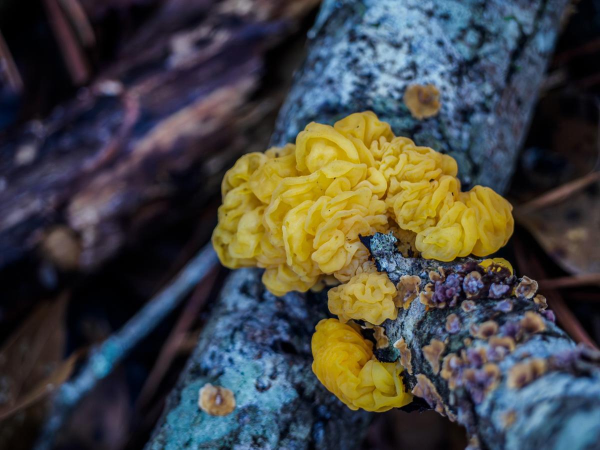
What's important here is the extraordinary fungus. Well, it's extraordinary to me from my part of the world. I've never seen one like this. Mission accomplished.
That aside, the composition is helping too with the fork and out of focus lines taking the eye to the fungus. The additional small roundish fungii markings on the branch add repitition and pattern.
It's a little dark and contrast could be added for image zap but dark and dank is where most of the fungii I'm familiar with are at home. -
You have convinced me Pete. I looked again. The main trees and verticals looked OK to me in the suggested crop but one section didn't. Just left of centre is a slightly panoramic shape rectangle with plants growing up supports. This isn't the abstracted mural of people that I had taken it for. If cropped where I had suggested, this space looks awkward alongside the more horizontal rectangle now on the left. Your original has two mildly vertical rectangles now on the left. It feels better balanced than my suggested crop. With further thought, the hint of the city waiting for Spring behind the walls got through to me.
-
Lovely image with the beautiful gate tucked inside of the archway with the picturesque carriage in between to bridge between the two. The colors: brilliant blue and straw yellow- are excellent complements to one another. The mixture of circles, squares and arches is balanced and pleasing to the eye. A wonderful photo to use to teach composition.
-
Another elegant old structure for our viewing pleasure. This is one of those rare architectural photo sets where I'm not tempted to straighten the perspectives. The distortion is part of the attraction here. The sculpture features a distortion that matches that of the building itself, making that detailed close-in shot just jump out at the viewer. Good creative captures.
-
What a wonderful happenstance to be there to see what the long ago builders had intended as a tribute! These sites are so moving in spite of the tourist gaggle they draw. The colors are rich, the details are visible and clear. Thank you for sharing your special moment with those of us who'll never have the chance otherwise.
-
Lovely building and garden, excellent colors. I am of mixed minds about that flagpole. I'd be tempted to do a version without it and compare them before deciding. It is a visual intrusion but it's such an odd one, completely bisecting the building, that I'd lean towards keeping it in place.
-
I would name it Tracks because there are 8 different Track patterns running horizontally. (Only two vertical, just enough to provide visual relief). What a wonderful image! The muted but compatible greens and yellows are perfect for allowing the patterns to claim the composition. So well spotted!! Love this one.
-
Hmmm... Now you've got me wondering whether Lightroom's AI distraction-removal tool would see that flagpole as a distraction...
-
I'm pretty sure it would. But if not, you can just use the Remove tool and mark it up, then pick whichever removal you like best. I seldom have to take removals into Photoshop anymore since LR has such good removal tools. Every once in a while I find something that baffles the LR distraction and remove tools, then a trip into PS to use their remove tools which seem to work right down to the one pixel level. Then you could decide which one you liked best, with or without the pole...