An interesting interplay of light and color.
It works for me.
-
-
I've never seen pelicans on the river before.
Very informative and interesting.
I can even see the fish in the last photo! -
Most unusual. An image composed almost entirely of shapes in shadow. It is only when viewed large that the highlight areas reveal detail - until then they look as though they might be burnt out. Or that might be because I'm using a small laptop screen. I'd like to look at it on a large screen showing the whole image at once and I don't trust my following response here.
As I see it, I'd prefer the image without the bright green highlights at all. I very much like the pattern of leaves against the somewhat darker (sky or water?) and the slightly brighter path through the leaf shapes towards us -
I agree with Mike. Lots of lovely and interesting scientific and behavioural information on these very peculiar creatures.
I felt like I was reading the transcript of what Sir David Attenborough could be narrating.The photos are also great and form a very good sequence (obviously, since this is our resident birdphoto guru Minnie at work).
One thing I could not help but start wondering about, was the fate of the fish.
Being fished out of the water and killed with a knife or a blow to the head is one thing. (Suffocating is less ideal).
But then: being swallowed whole and alive, and to perish in a birds stomach... Brrr.(A large snake ingesting a small mammal whole is in the same region of horror.)
-
@Fireplace33 has written:
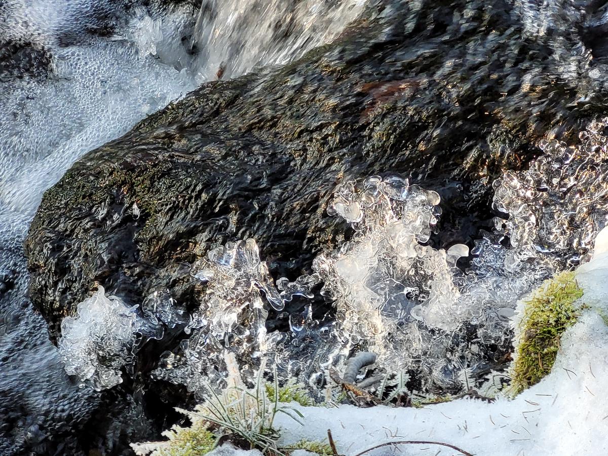
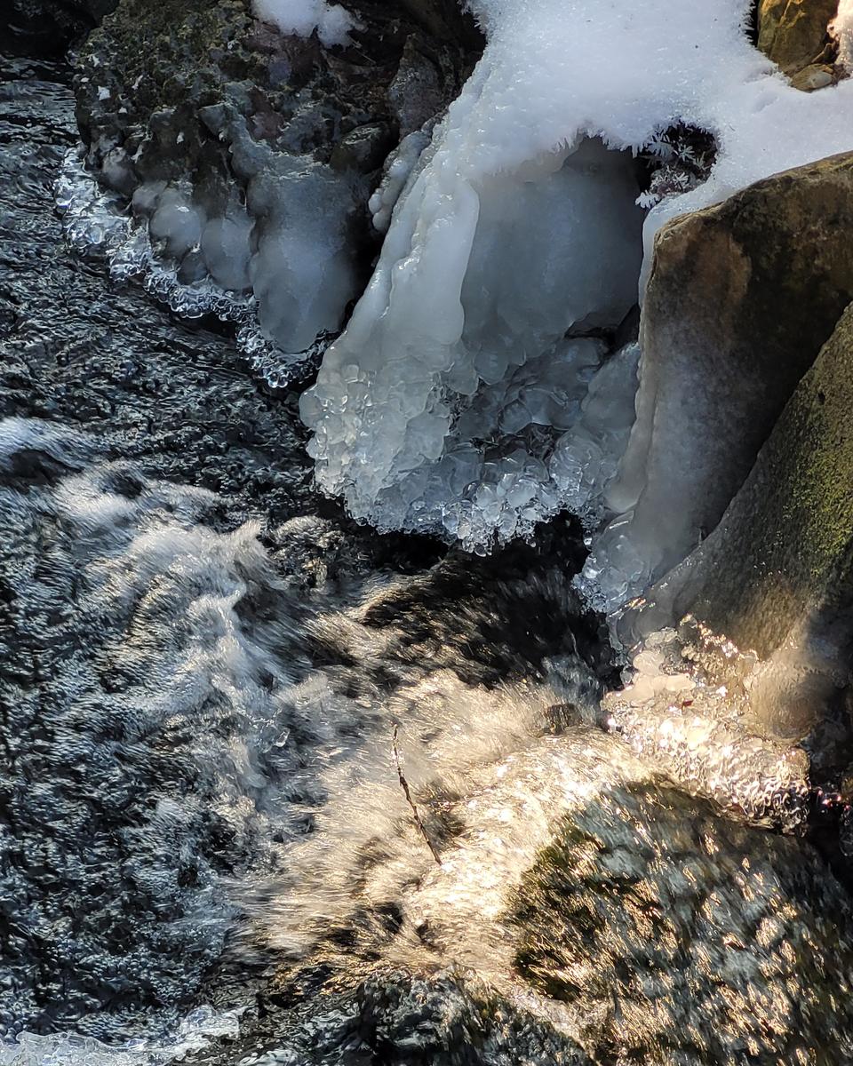
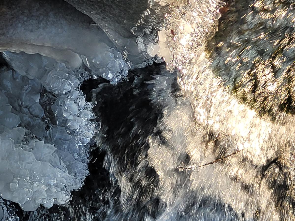
Icy patterns
Haven't been out with the camera this week, but here's a few shots from a local walk with my phone. The ice is slowly melting away here, but it's still quite cold.
The sun was shining on the little stream and making the ice look pretty.That is a nice collection of abstracts.
When I have to compare them between themselves, my impression is that the more we get closer and the more the view becomes undecipherable (abstract), the more I like them. -
@MikeFewster has written:
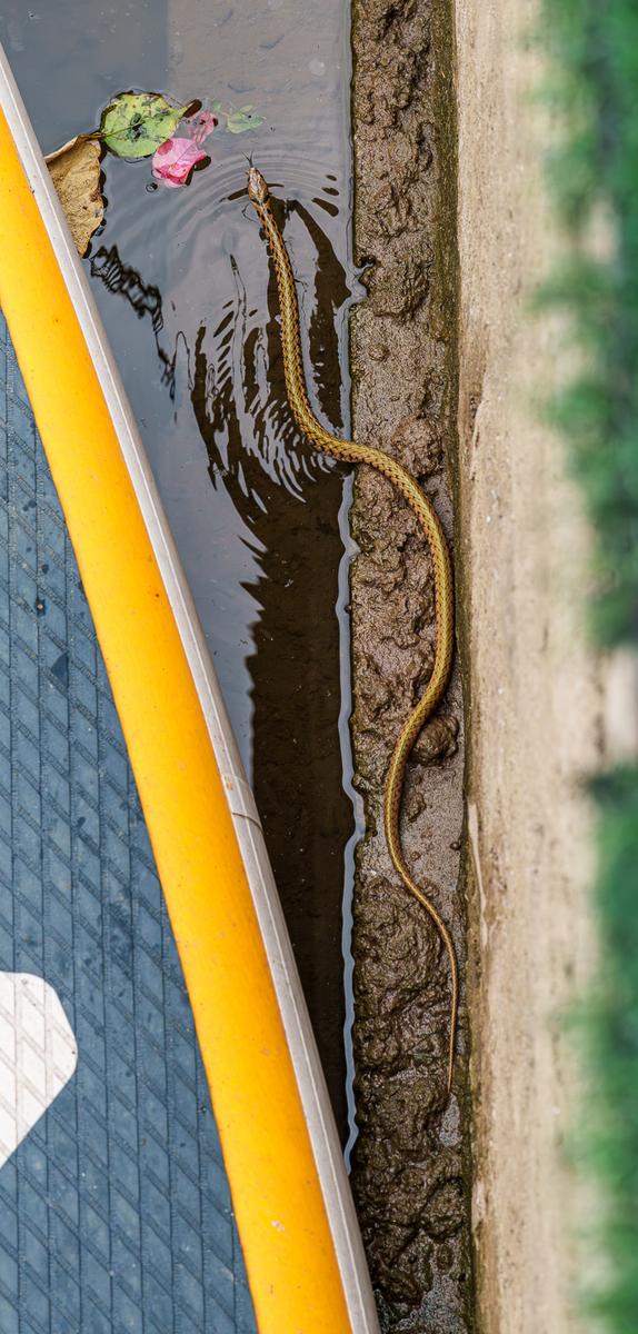
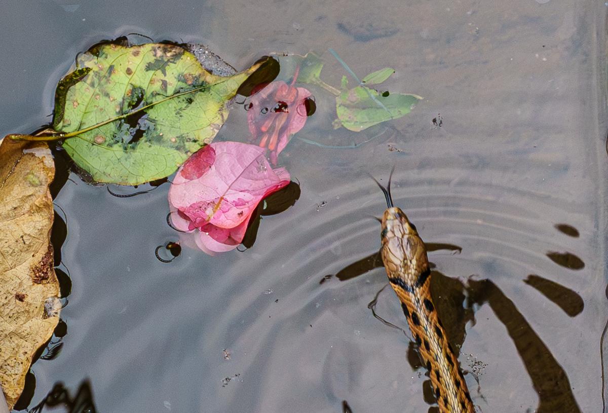
Watersnake. Vietnam.
Two versions of the same photo. I cropped to get a close look at the head and liked the result. I can't decide which I prefer.The first image does not work for me.
The elongated vertical ratio feels weird and that yellow thing whatever-it-is is such an attention-magnet that we barely notice the real subject.You fixed those issues with the second image.
-
@ChrisOly has written:
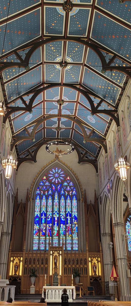
Power
St. Michael's Cathedral in Toronto, Canada. Opened doors in 1848...
Every time I go there there's overwhelming feeling of greatness, architecturally, spiritually etc.I think I love the subject, but I would like to see more of it.
Your crop (narrow vertical) does not do the subject any favours, I think. Show us some of the side walls, please, instead of just the altar and the ceiling.
Making the image so narrow also emphasizes how skewed our view on the ceiling is. We would expect the middle of that ceiling to be a straight line.
That is runs slightly diagonal would be easily forgivable in a wider image, but jumps at us because of the narrow crop.
You could probably correct that perspective to a large degree in software PP, but NOT when there is so little width to work with. -
@ChrisOly has written:@Sagittarius has written:
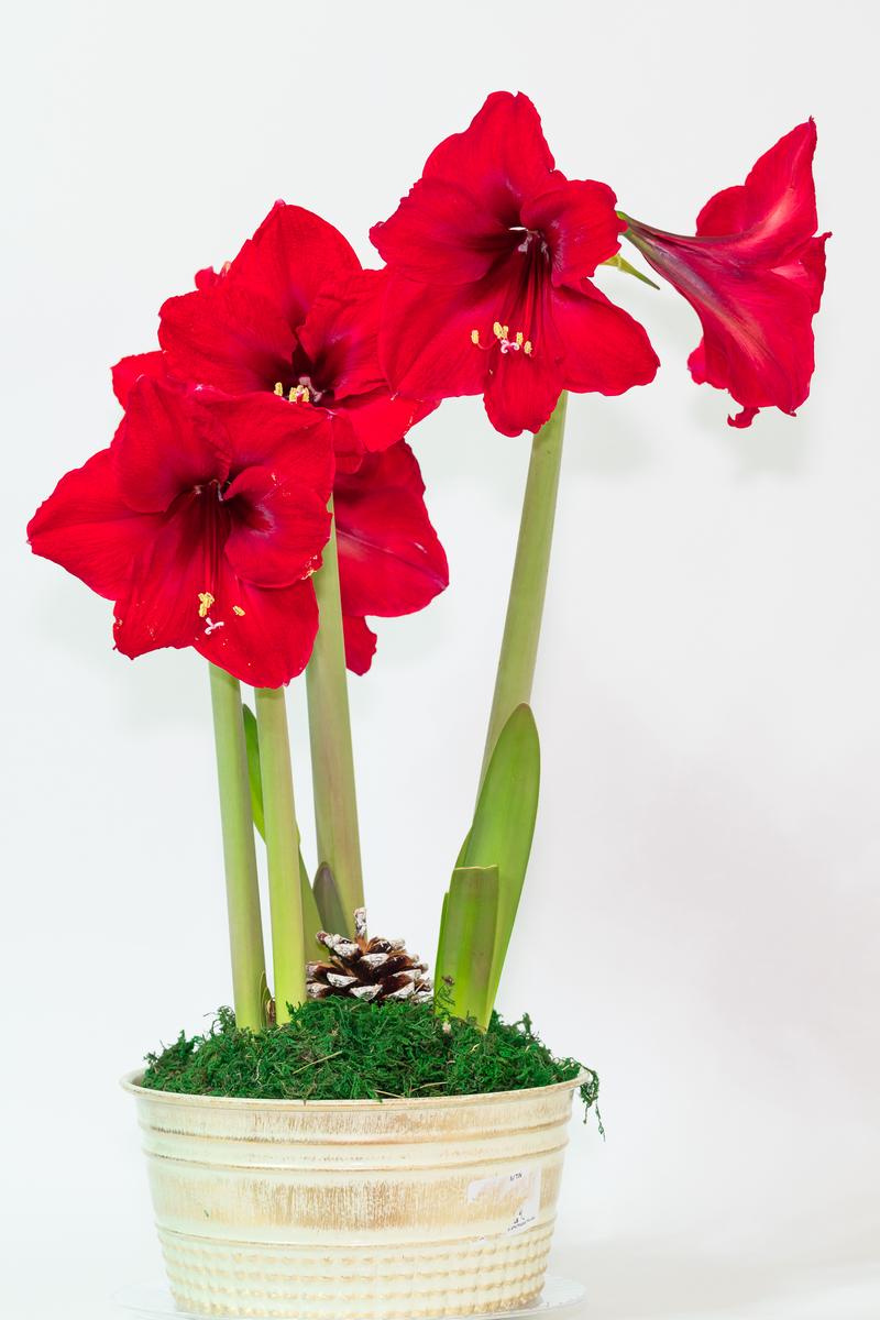
Amaryllis. Amazing flowers, require no watering, constantly blooms new flowers.
Great, brite, colorful. Amazing growth.
You could include this photo in a dedicated "Flowers" thread under Showcase...so more people would appreciate it's beauty.
Agree with the recommendation.
Which is NOT to say that your image is not welcome here.
I am sure that some of our regulars can provide meaningful feedback, but me not so much: flowers are not really my thing, unless there is an anthropomorphic quality or an abstract beauty to them (Weston comes to mind, or Mapplethorpe). -
@tinternaut has written:
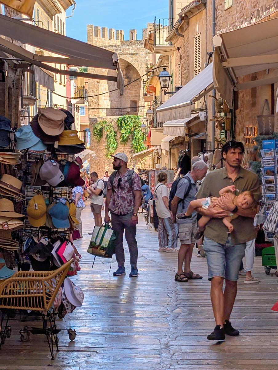
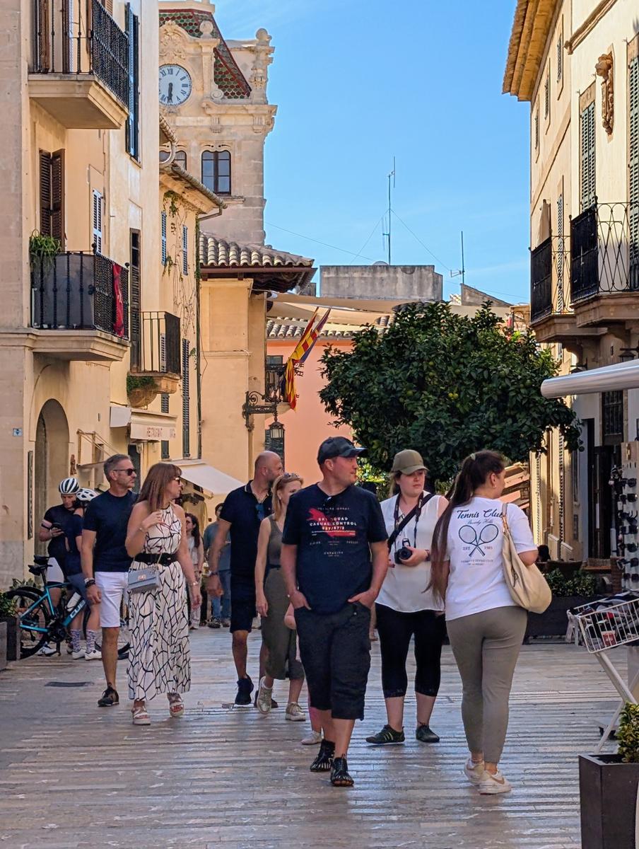
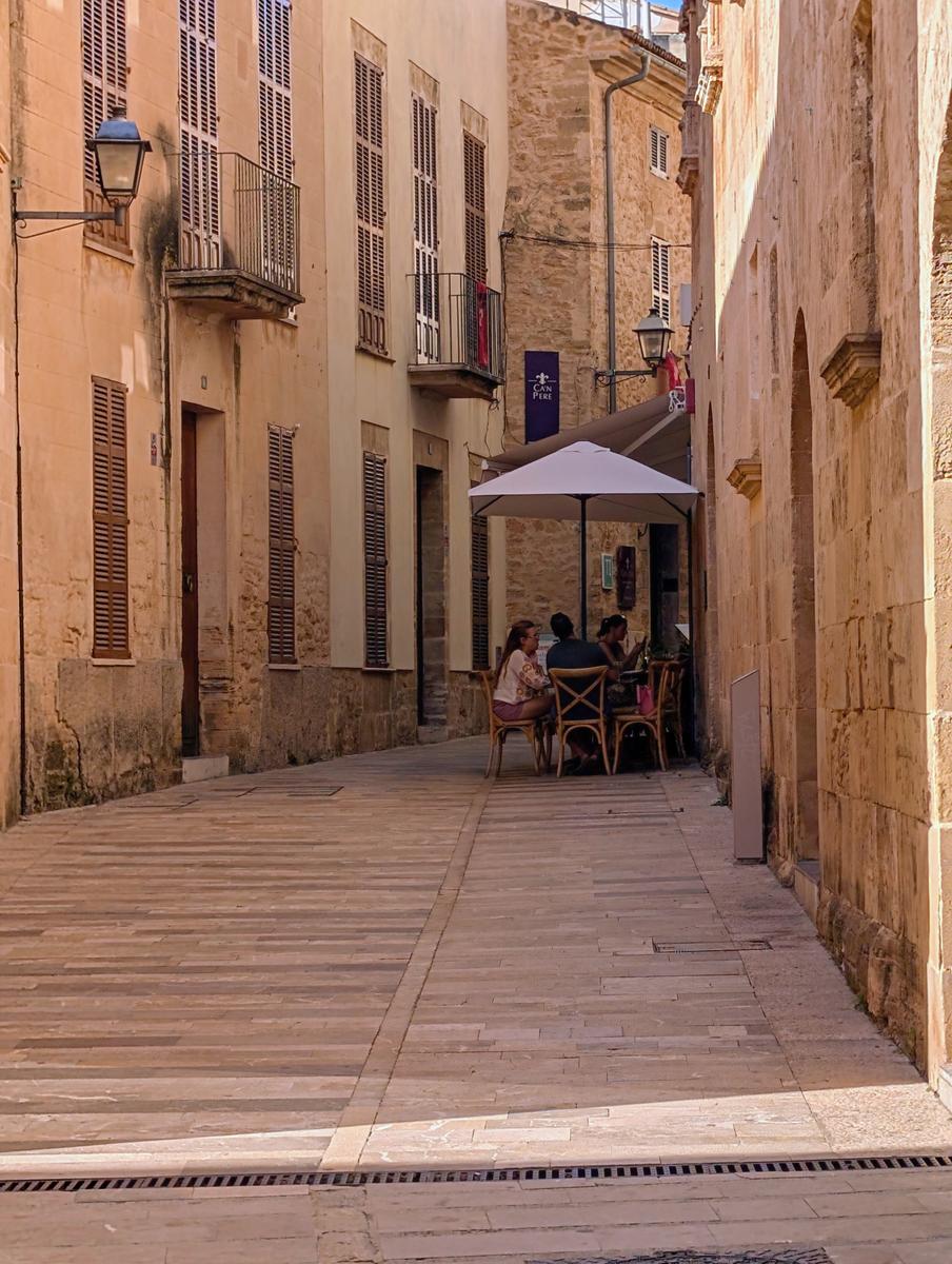
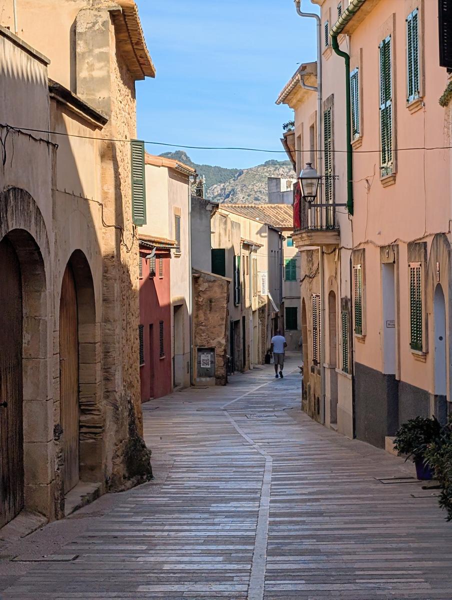
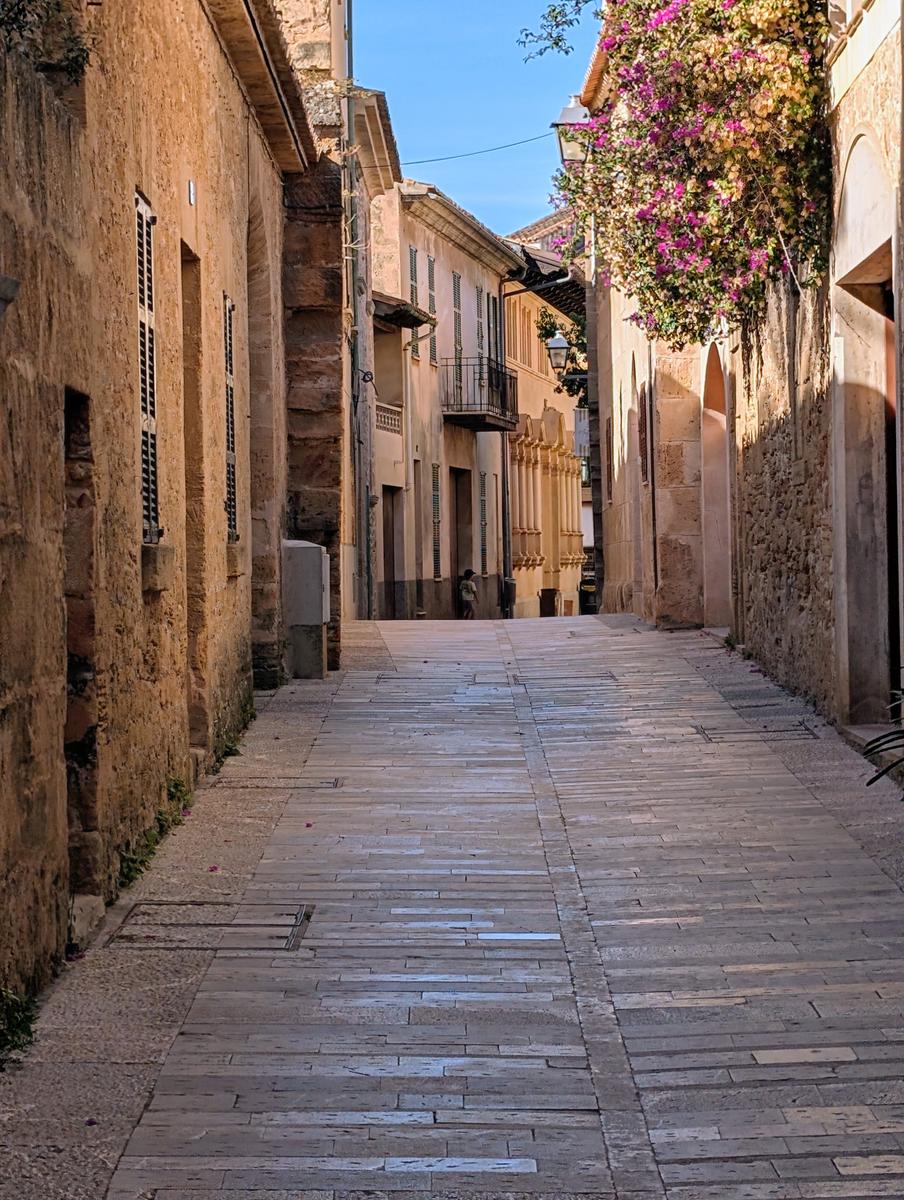
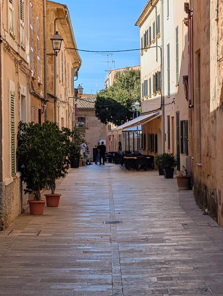
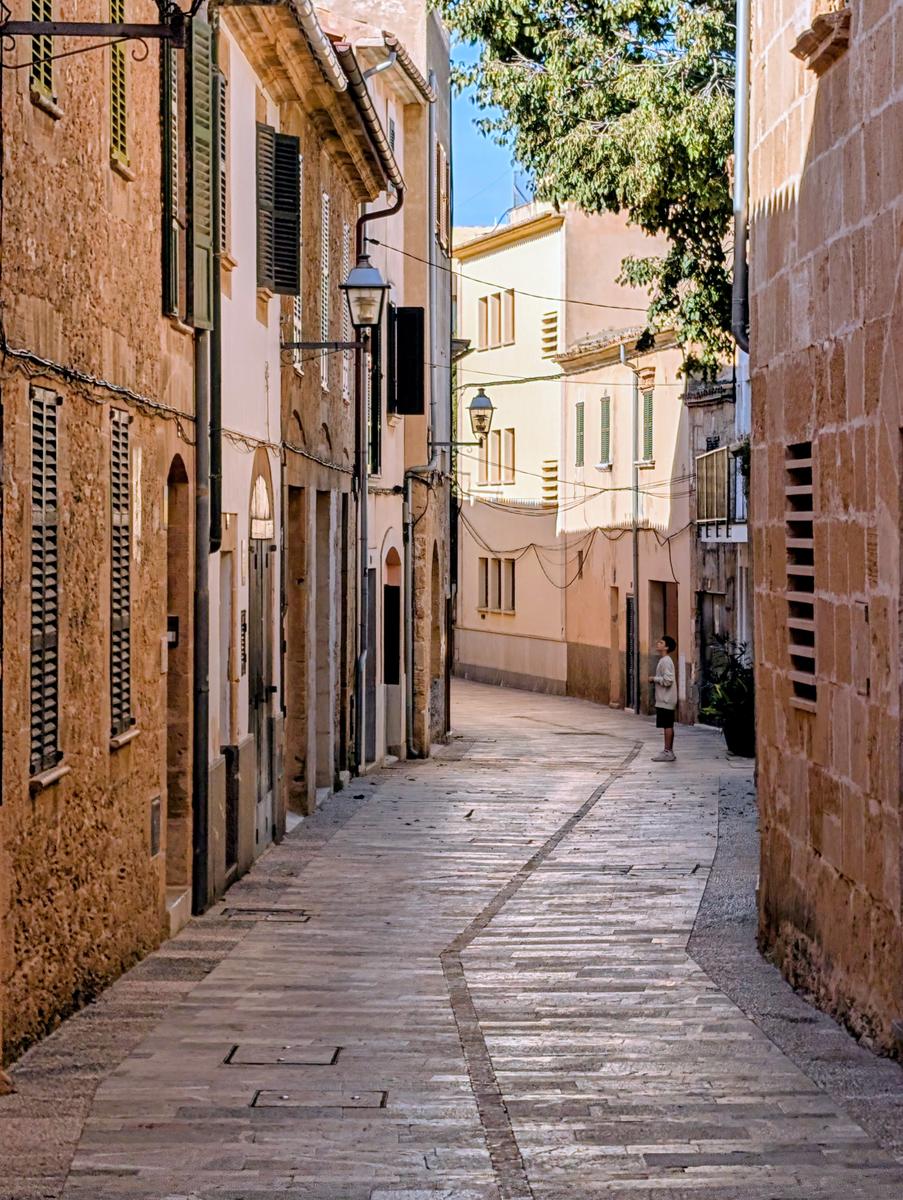
Alcudia Part 2: A Portrait Of Alcudia
When the first photo turns into a mini project. Less than twenty minutes walking from the resort of Alcudia is the walled, medieval town of Alcudia. The first photo I took (on the way to a very nice cervecería) was in portrait and at 4.5 zoom. I decided to keep that setting for the remaining photos. Per last week, these were taken with my Google Pixel 9 Pro and, moreso than last week, have that typical HDR look with no deep shadows (I like my shadows BTW).
You tell us that the first photo turned into a mini project.
And that is a good thing.
It's always good to consider one's work not as a succession of randomly succesful one-shots, but as a whole.
Going for a narrative sequence is a great way to enhance one's skill to show different sides of a subject or situation, with different perspectives and a narrative flow.Unfortunately, I feel like the mini project is a bit too repetitive to be really succesful as a series.
(Some famous photographers would disagree, like the couple Hilla and Bern Becher, who photographed disappearing industrial architecture and for whom the repetitiveness of their subjects was the main point and became their trademark -- but I can still say what I said because the fact that the Bechers are famous, does not prevent me from finding their work slightly boring...)
In the first two images, the streets of Alcudia are shown in wide angle (although vertical but that is good) and most of all : bustling with life in close proximity.
But then you made a very different image, one in which depth and almost canyon-like claustrophobia was supreme.
And you continued in that same vein for the following images: different streets with the same empty (or almost empty) narrow and enclosed feeling of depth.
Streets that stretch in the distance and are totally empty, or with a lone figure somewhere at the very end of the vanishing point.
They just keep coming, those similar views. As if you could not yet decide which one was your best.
For me, they are just too similar. Not in actual subject (the streets are different), but in the atmosphere.I think I would prefer another series: one of maybe 4 or 6 images, everytime alternating between :
- a wide and close view of a busy street in proximity
- and a narrow view of an (almost) empty one.Less repetitiveness, more juxtaposition. More story. More room for interpretation.
-
@MikeFewster has written:@PeteS has written:
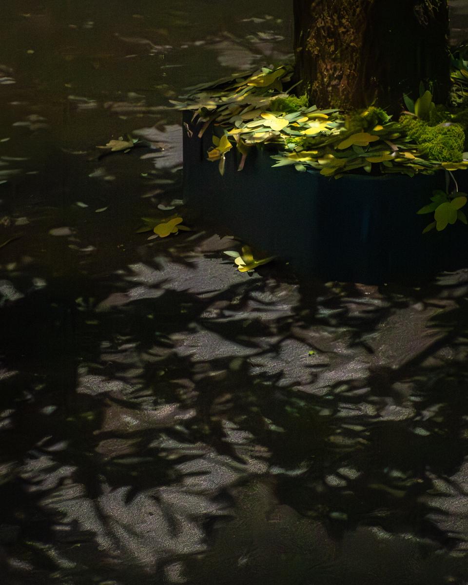
Leaves
Playing with light and embracing the shadows.
Most unusual. An image composed almost entirely of shapes in shadow. It is only when viewed large that the highlight areas reveal detail - until then they look as though they might be burnt out. Or that might be because I'm using a small laptop screen. I'd like to look at it on a large screen showing the whole image at once and I don't trust my following response here.
As I see it, I'd prefer the image without the bright green highlights at all. I very much like the pattern of leaves against the somewhat darker (sky or water?) and the slightly brighter path through the leaf shapes towards usGood observations by Mike on a pleasing if unusual image.
The low key vibe of this image reminds me most of very richly woven tapestry.
Or velvet.
Or the deeply saturated wood that is left after a wood cut is printed onto paper : that "tool" can be an art piece in itself.In other words: it is different from "photography" because what we see here is less painting with light than painting with darkness.
Scurography maybe, to coin a term? -
@MikeFewster has written:
Watersnake. Vietnam.
Two versions of the same photo. I cropped to get a close look at the head and liked the result. I can't decide which I prefer.A mumble first about the problems of flat view when trying to manage a discussion with several participants while keeping the image being discussed at hand for reference.
I was looking down over the edge of a landing on a river. The object on the left with the yellow stripe is a windsurfer that was tied to the steps. The green on the right is grass that was a few feet higher above the snake. At first, I didn't see the snake. All the long lines were creating camouflage for an animal in plain sight. It moved slightly and the ripples gave it away while creating more lines. I tried a photo and wanted emphasis on the long lines. Looking at it in PP on a screen, I was tempted to use Photoshop magic to remove the white area (it's part of a brand name) from the board. Eventually I decided I liked it for the similarity of shape to the leaves at the top but I accepted that it would grate on many viewers. I looked closer at the leaf area and was delighted to see the forked tongue. Now I had two images I liked and gave up and posted both.
As an aside, the camera has a 61mp FF sensor. The ability of modern sensors to create images that can be cropped to ridiculous levels to reveal new images awes me. Then add Noise reduction software.
