The unusual roofline and the shape of the open space are somewhat interesting. The museum might have lots to offer. If this was an opening shot to a series, say, about the museum, I could see the point. It suggests a trip yet to be taken.
On its own, it doesn't engage me in the way that your recent posts on people have.
Feb. 18, 2026
38
-

-
Duxford is a name that excites me. Douglas Bader was one of my childhood heros and I knew he was based at Duxford. It's satisfying to learn it has become a museum. I like the figure of the airman waiting by the Spitfire. Could a little be done to give it more prominence from the background? And I like the positioning of the plane on the roundel.
Please post the indoor shots here. -
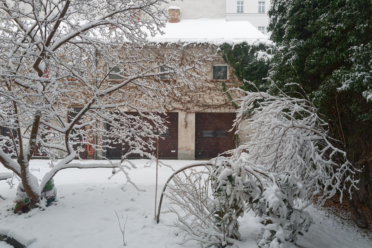
At last! REAL SNOW!
David
-

Really nice essay of a specific, peculiar, colourful and just plain cute cultural phenomenon.
Obviously, we see groups of girlfriends photographing eachother in instagrammable poses everywhere in the world nowadays.
If you had not provided the explanation, we might have considered this display of dresses and camera-camaraderie as just "business as usual" in Hanoi.
Now, it gets an extra layer.
(And one more layer: that lady in the puffy jacket with the grey hair that is photobombing the endeavours, looks familiar...) -
Four good images, but I still have my clear preferences.
I like the graphic composition of the first image most: trees, water/ice, reflection, they all work together.
The second image is like a link between the wide view of the first and the detail of the third: we almost feel the downward tilt and zoom of the camera.
The third image is my second favourite, because it concentrates on the abstract shapes in the ice.
Compared to the clear sequence that those three images create, the fourth feels a bit like an afterthought. -
A bit different trees, image taken in December in Finland, near Lohja.
Ghostly trees
-
"the lady with the grey hair" who photobombs a lot of my shots. It's tempting to repeat the Henny Youngman vaudeville line. Or possibly a Sony artefact?
-

Love the blues in the color palette - the tiles and the skies. The colors, patterns and similar angles of view tie these two somewhat unrelated images together quite nicely. Well done.
-
These are pretty wonderful. The third one is my favorite because I cannot help smiling with these lovely, animated girls. You captured life in those moments, replete with local culture and universal emotions.
-
The first shot is so classic! Loads of detail in the "star of the show" sitting on its elevated platform. Subdued but sufficient lighting helps keep the focus on the "star". The second one works less well because its "star" is hiding amongst lots of other less stellar vehicles. I would crop away as much of the other stuff as possible and keep the blue baby, the flower circlet, and as little of the rest as possible.
-
Black with the contrasting layer of white along the top is a perfect way to bring out the branches. They stand out no matter what is behind them. I especially enjoyed the areas of the photo when seen large where we looked through those branches.
Now it needs a rotund old chap in red standing by the chimney. -
I assume that is frost on the trunks? Maybe a dusting of snow? Either way it dramatically brings out the texture of the bark.
As an alternative, the right hand side, without the larger green area of the centre, would make an excellent study of line and texture. -
This building is interesting because of what it contains rather than its appearance, so it is hard to imagine how to reflect that in a photograph. It is artistically very solemn, almost bleak, and perhaps it should be. The angle you take with the receding "V" shape makes the most of it, especially with that interesting sky nestled in.
I wonder if a black and white conversion with luminosity masking to work with the tonalities for extra contrast, might offer a different version that would enhance the starkness of the design and the drama of the sky.
-
Nice shot of an historic plane. My father was a pilot in WWII so I grew up hearing about and looking at photos of various single seat fighter planes. They are classic little beasts. The colors of the display pad are bright and eyecatching which is pleasing in one way and a bit of a distraction in another. So I find myself making a similar case as I did with Kumsal's museum, wanting to know how it might look in monochrome, with color controls that help the plane (and the cutout pilot) stand out more.
For any who love this stuff, if you ever make it to the US, the WWII museum in New Orleans is amazing.
-
I haven't seen snow for years so I'm jealous. And it looks like you caught the flakes actually falling!
Lovely and peaceful. Save it for next year's holiday card.
-
I am glad to see what a Finnish forest looks like. Forests are amazing places, even my own messy forest seems magical, though the magic is resistant to photography and the challenge of photographing forests is one I've never solved to my own satisfaction.
A distant shot like this is my personal preference but that is mainly because I forever put too much in a frame. Closeups that reveal detail of bark and mosses and vines and colors may be more effective in some ways. I hope you took some closeups, and would like to see them. This looks almost swamplike, so reminds me of some of our swamp forests. The moss is quite different than most of ours. I'm curious about the kinds of trees, and about the way that cedar (?) seems to be growing out of the hardwood. Tell us tree-huggers more about the scene.
Because I like artistic approaches (and I understand that not everyone does!) I would probably try enhancing this image in some ways but it might not be totally realistic to what you saw. I'd darken it a bit, add a gentle Orton effect and a vignette.
-

Resting
-
It is mostly lichen on trunks. There could be some light frost (it was few degrees below zero C) too, but mostly on the ground.
I can't say, is that typical Finnish forest or not. In Estonia and Southern Finland mixed forests prevail, it is usually mix of spruce (or pine) and some decidous trees. It heavily depends on how such forest is managed previously, is it replanted or natural and so on.
About photographing forests (and many other things) - usually my results are mediocre at best.
Most likely the trees are black alders (Alnus glutinosa). I think the green one is not cedar, but pine - but as there are old manors and parks nearby, it could be cedar too. (Cedar is not native to Finland, but may be introduced in parks).
It is not swamp, but certainly it was damp place. As there is hard soil below (on top of granite), then flat areas may retain enough water to make them swamplike.
About closeups - not from this place, but I'll share some other images in future.This image is already enhanced - it was much darker in reality :) As I attempted to create a bit high-keyish image, then vignette was no-go. I may reprocess it in some other day, maybe some darker version is much better.
-
The gorilla is the subject. There are two things about the gorilla that impress.
First, the sheer bulk of the animal. The lighting brings out the massive body shape. The contrast with the background and the bright/dark edges on the fur accentuates the curves. We see similar bulk in the piles of rock in the background.
Secondly, there's the expression on the face. These animals are far too human for us to discount facial expressions. We are being invited to interpret feelings and thoughts and the photo will provoke different responses in everyone. -
I agree with Minnie on the difference between the two images.
But I don't really mind.
Because these two images are clearly shot to do two different things.
The first (of the modern Bugatti - and what a beauty it is if you are interested in car design) is clearly intended (and succeeds) as a "hero portrait", showing us a great angle on that car and nothing else.
The second image also includes a Bugatti (and that is the link between the images) but is clearly more intended as a general view on the layout of the exhibition. If you had wanted to make a similar "hero portrait", you would have moved closer and tried to avoid overlap with other cars (which would obviously have been harder than with the new Bugatti, because that one is isolated on the platform while the older one stands in a row between other cars, as a kind of history timeline.I feel like both images achieve what you want them to do.
It is just your commentary that starts comparing the new with the old Bugatti, that invites us to try and look at these images as being similar, which they however are not. -
I agree totally with Mike.
Technically, your biggest achievement here is tonal control: the background is not overexposed, and still we see so much detail on the body of the gorilla who sits in the shade. That body could just as well have been one big black blur.Gorillas (like Chimpanzees and Bonobos) are a subject of endless fascination for me.
Whenever we use our year pass to visit the Antwerp Zoo or its Planckendael subsidiary, we always visit the apes.
Their facial features can convey so much (perceived) emotion.Unfortunately, much of that emotion looks kinda sad, which inevitably leads us to fantasize about them regretting their captivity etc. I believe that this is the result of projection of our own feelings of "guilt" onto the faces that just look naturally that way (also in the wild).
I do believe that most of these animals in reputable zoos lead a protected and well cared for life without major dangers and could be considered happy.
Most of them are the offspring of breeding programs between zoos and they cannot possibly compare their situation with that of their brethren in the wild.The conservation and breeding programs of reputable zoos are an indispensible link in the chain of preservation.
In an ideal world, no animal would ever have to live in a cage (or a more modern "enclosure"). But this is not an ideal world. In the REAL world, zoos have an important function of education and conservation, and they treat their inhabitants as good as possible.*