The central part of the rust almost has the shape of the superstructure of a ship (the "castle" and bridge, or in an older vessel, a couple of masts with sails).
That makes it a maritime abstract squared!
Feb. 25, 2026
35
-

-
The B&W makes the scene timeless, but the large advertising sign for the Dortel lockmakers negates that illusion of timelessness because it is very contemporary.
Same goes for the AC units over the awnings.
If this were my image, I would almost certainly crop it to square, keeping only everything that is below the top of the awnings. -
I read this comment after posting mine.
I agree that in the crop I would consider, that lowest sliver of contrary bricks would have to go too. -

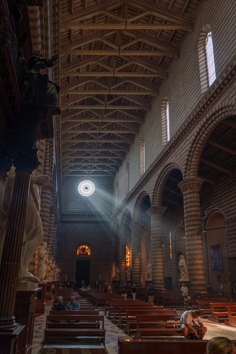
A complete co-incidence that we both had places of worship this week. I'd already made my selection before you posted the week's opening. But I laughed when I saw your choice.
Re. the cathedral roof. When I lined the shot up, I wasn't thinking about the roof, I wanted to get the upper windows converging on the rose window and the roof beams came along as well. When I later looked at the image on a screen, I liked the reflection of the roof in the pews and the radiation of lines from the roof and pews from the far end of the church. The lines, I thought, added to the lines of the beam of light.
It's a shot where I was never tempted to straighten the verticals. -
I understand your reasoning behind the shot.
But I still believe a vertical crop is worth considering.
Something like this :As you can see, we retain the curves of the arches on the right, and even some of the diagonal vector created by the smaller windows in the side wall.
But both the rose window and the person in the front pew, feel more prominent to me, with the beam of light connecting them.Just for your consideration, of course.
-
As I've done for Mike, so I do for you too.
Here's the square format I was thinking of.
I didn't change anything else than crop to square (full width, same ratio in height): -
The drop works in that it keeps the relationship between the roof , the windows and the pews. It changes one thing that I'm not so sure about and I'd welcome the opinion of others. It isn't something that I'd planned with the shot or my pp treatment. but it is something I became aware of looking at Roel's suggestion.
Roel makes the figure considerably more prominent. In the original, the individual is smaller in the weight of things. The philosophical viewpoint has been changed.
This isn't a right or wrong issue, I find it an interesting example of how we find meaning in amages. Thoughts ny one? -
On this occasion, I don't like the square format. To me, the large sugn at the top is a useful in contributing to the feel of the street. Visually, the larger square of the sign balances up the mass of the cart area but I'd make the bottom crop higher still - about 1/3 of the way between where Roel has placed it and the lower bottom edge of the lowest cart wheel.
-

Exquisite detail work well captured. Nothing wrong with resurrecting old photos made with old cameras. Some of them did a rather classic job of their captures, as yours did here. (I would not hesitate to use my old E30 if my EM1 was out of commission).
The beautiful and intricate designs in the dome's interior are worth close examination but from a distance create a lovely abstract. There is a bit of CA around the bright windows that should be easy to correct in a modern version of Lightroom.
-
Interesting that you and Roel chose places of worship, though the images are quite different. While Roel's focused on detail, yours tell a a story. The interior is darkened, the details are harder to make out, but we see the essentials: the columns, pews, statuary, the warm colors through the stained glass windows, the visitors. But the subject is that light beam, and how it plays on the nearest man. Though he may well be rooting around in his camera bag for a different lens, the impression he gives within the context of the setting is one of worship or even penitence. Strong image, well spotted.
-
What a grand abstract! You have a gift for this, Chris.
Excellent colors and sharply caught textures. Nice alignment and choice of what to include and where to put it, one of the secrets of good abstracts made from large objects.
-
Well taken scene from a busy market, with interesting characters in the near foreground to draw us into the scene. Monochrome is a good choice here in my opinion; color would have been interesting but our attention would have been fragmented. Monochrome allows us to easily focus on the trio in the front, and follow the large < shape of the compositional lines to discover the rest of the image. Nicely done.
-
Very good image!
But :) For me there is something wrong with perspective. I attempted to adjust that a bit (or rather let DXO do that itself - my manual tries looked much worse), also made top area darker. This way the image looks more 'correct' geometrically, but at the same time loses anchor point somehow...
-

I could stand and stare at that ceiling for a while, trying to discover and admire various details and it's intricacies.
-
I really like the variety of light sources this image captured. One has to observe and admire all the ingredients which contributed to very captivating shot.
-
I could just sit on a bench and watch this scene unfold. Very atmospheric.
-
There is a wealth of information and activities in this capture from a foreign land.
-
A general response. Thanks everyone. This is a photo where luck was on my side. It's also an image that is better when viewed small rather than large. Minniev is correct. The dramatic figure is a tourist, probably a photographer rummaging in a camera bag. It takes much of the drama and story from the image. A larger view shows more people intruding into the scene as well.
The angle and perspectives are as they came from the camera. I later explored some variation/correction but preferred the radial lines effect of the uncorrected version. Once again, I'm awed by the ability of modern digital cameras to bring out shadow details and handle "noise."