It's an impressive building. You captured it well.
Glad you enjoyed the meal and the lovely experience at the restaurant.
March 4, 2026
45
-

-
That green light looks pretty cool! The little fountain catches the light really well.
It works well, but I might have cropped some off the left, and little from the bottom, to concentrate on those two elements alone -

A spiral staircase with one flat side is unusual. It gives something of a snail illusion when, as in the gallery shots, the creamy tone shows. Number 7 especially appeals to me. The builders have considerately given you lots of floors to work with so there are a huge number of whorls and you have made the most of them. Generally, spiral staircase shots are in stone building but this is altogether different. It's light and airy with many fine lines.
I enjoyed the collection and watching you choose the angles. -
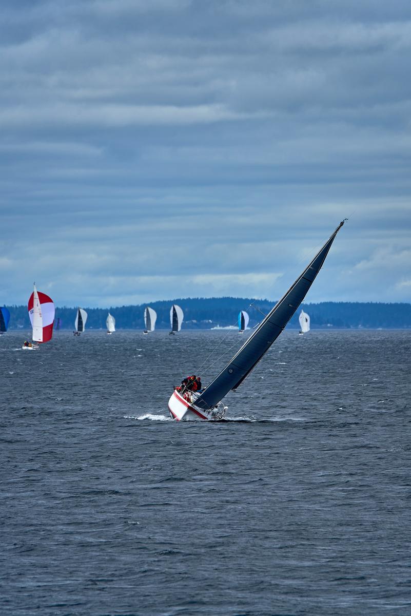
The first image is peak after peak against a white background. On the hut, the trees, and finally the mountains. They build to a satisfying visual crescendo.
Snow again in the second and a completely different image. The corner to corner downhill diagonal sets a stage for dynamic movement. The red jumps off the screen and comes almost straight at us.The backlit plume and the stocks work exactly as do the "speedlines/action lines" added in comics. The skier feels perfectly balanced as well. Power and skill are conveyed by the image.
Excellent shots. -

You are right about the number of levels.
My meeting with the city officials was on the fourth or fifth floor (IIRC), but when I saw the potential of this staircase, I extended my workout to go all the way to the top (ten or twelve floors I think, something in that ballpark). It was worth it.
The special thing was that the view looking up from the ground floor was good, but so was the view from the top looking down.
In staircases, very often one view is far better than the other.Here is some more info about the (renovation of the) building: www.vai.be/gebouwen/publieke-gebouwen/den-bell
And some more general historic info including historic images: nl.wikipedia.org/wiki/Den_Bell_(Antwerpen) -

Quite a wonderful abstract and architectural image. The staircase is exquisite and you found a perfect angle for the image. The geometry is hypnotic, between the nested offset ovals going on forever and the shadows that fool the eye and provide exits and re-entries into coil. Of course monochrome is the best choice - simplification and enhanced contrast are only two of the many advantages. Well done.
-
Such different images from the same place! The first exudes peace and tranquility that only a snow scene with a rustic little cottage and craggy mountains can provide. The second is full of power and adrenaline, angles and lines. Interesting study in contrasts.
-
I'm glad I'm not the only one who imagines animals having conversations!
I think our imaginations make animal photos more interesting.
Good job in preserving the whites on the birds. Those who don't do bird images may not realize how challenging it is to hold the detail in those bright, wet, reflective feathers while capturing the rest of the scene somewhat appropriately.
-
Wonderful image that transcends place and culture. Poignant scene of two pairs at different ends of the life spectrum sharing a moment of friendship. Can be read in any language or country. The brilliant colors, the delicate details or the door, the recurring rectangular motif, even the fact that the cane is pointing to the soccer ball, all join forces to make this one so very impactful. The technical shortcomings (some haloing, some loss of detail in the reds, some lack of detail from perhaps noise reduction and/or cropping) are more than outweighed by that impact.
-
i
Interesting image with an interesting lady, who has an air of mystery about her. At first I was a little off put by the horizontal lines of the metal girders or whatever they are. They seemed a distraction, but after considering them again I think they add a quirky kind of balance. The black lines, in the ceiling and on the floor act like a Morse code overlaid on the scene.
-
Would not have figured it out without the hint in the title, but again, a nice water abstract with perfectly caught water drops, stopped in motion, set against a blurred and unrecognizable backdrop of phosphorescent green and blips of yellows and oranges.
Do you see the humanoid figure comprised of the green light? Like a blurred robot of some kind. I can't unsee it.
-
It has been a very rough time for you and your family so I'm very happy to hear of your night out and sharing a moment.
Second photo first. The table, glassware and rose is a universal story. The fade off of the edges of the setting into the backdrop suggests intimate luxury and personal attention. Cheers. The candelabra is disconcerting. It seems too big and overwhelms above the table. I assume it's considerably closer to the camera than the waiting table. It does a good job of telling us about the style. We aint in MacDonalds
I followed up on the Choctaws and Phillip M. He's impressive.
In the USA in 1998 I had two brushes with native people's resorts. The first was in, I think, Connecticut, or somewhere close. A vast, French Chateau style casino that had made the owning nation fabulously rich. Luxury plus. The second was somewhere along Route 66 out New Mexico way. This was a huge aircraft hanger building where we were the only non locals. We were there for the food. The place was ultra depressing. Filled with what I assumed were local native american people who appeared to be hooked on the gambling and filling in their lives.
It's of interest tome because I know some of Australia's first nation people are in contact with those in the USA and they have been looking at the Casino/resort models. If it proceeds I's hope what emerges looks more like the Choctaw model than what we saw on Route 66..
Photo 1. A building that was definitely designed to link with a name. The angle and lighting of the photograph make the most of the association. The tree, bottom left is unfortunate but I can see why you didn't change your angle. -
The shot is nothing special however the title lifts everything to another level. As well as being funny, it adds meaning to the diagonal line connecting the ducks and allocates a role to each of the players. An enjoyable post where the sum is greater than the parts.
-
Having a key human subject at the very edge and looking out from the rest of the image is usually not a good idea, but here I think it works. The upward cast of her eyes and having her back to the main image area, suggests total preoccupation. She simply isn't interested in the fine old portico that we admire. We don't know what she is thinking but it makes for an intriguing photo.
Once again your camera/lens/B&W rendition has done a fine job with the lines and textures.
I don't mind the black reinforcing scaffolding complete with security camera and cabling. It tells its own story about the significance of the location and gives even more point to the woman looking away from it. However, I feel the black line it gives across the top of the photo is too close to the edge of the frame. There's plenty of space in the lower foreground. If the camera had been tilted up a little there would have been a little less foreground, the subject person would have been untouched and the black line across the top would have more comfortable distance from the frame edge. Of course, there might be other objects in the roof area that you didn't want included in the shot..
I this image has been cropped (I suspect that it hasn't been cropped) is it possible to recrop it to how a little less foreground and a little more at the top? -
You are right on all counts about the technical shortcomings. It's a significant crop with LR noise reduction applied to a digital image about twenty years old. I was in two minds about the red. I still am. I've tried dialing it back but I missed the pop it added.and the extra attention it gives to the boys. I tried this in B&W as well but didn't like it as much. It reminds me of Kodak colour reds but I never liked those reds decades ago. Does anyone else have views on this?
-
The luminous green plus the spot of orange jumps from the dark areas. It takes the eye down to the frozen droplets of the fountain. I like the balance given by the two horizontal white lines , top left and the line in the shadow, bottom right.
Problem, for me. I don't like the little cluster of highlights on the very edge of the frame, bottom left. I'd seek help from Dr, Adobe to remove these. -
I couldn't care less about technical shortcomings.
It's a wonderful shot about connection, friendship and aging. -

Out of control and headed the wrong direction.