Superb shimmering blocks. Like those lines in a cement...
-
-
So vivid and full of variety of b&w patches and one example of brown specimen.
-
Great series and variety. This one resonates with me most. I admire intricacies of building such a natural contraption.
-
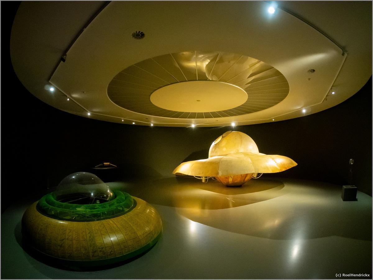
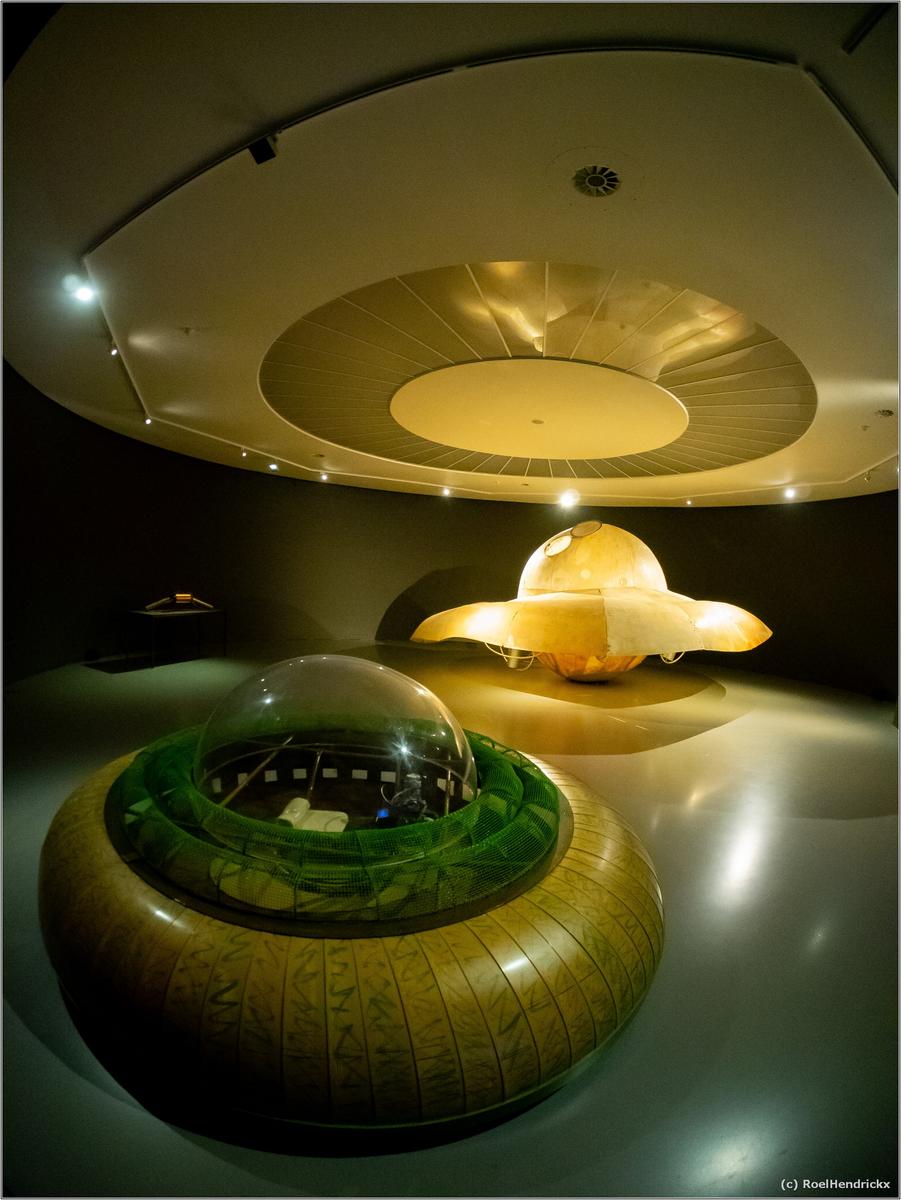
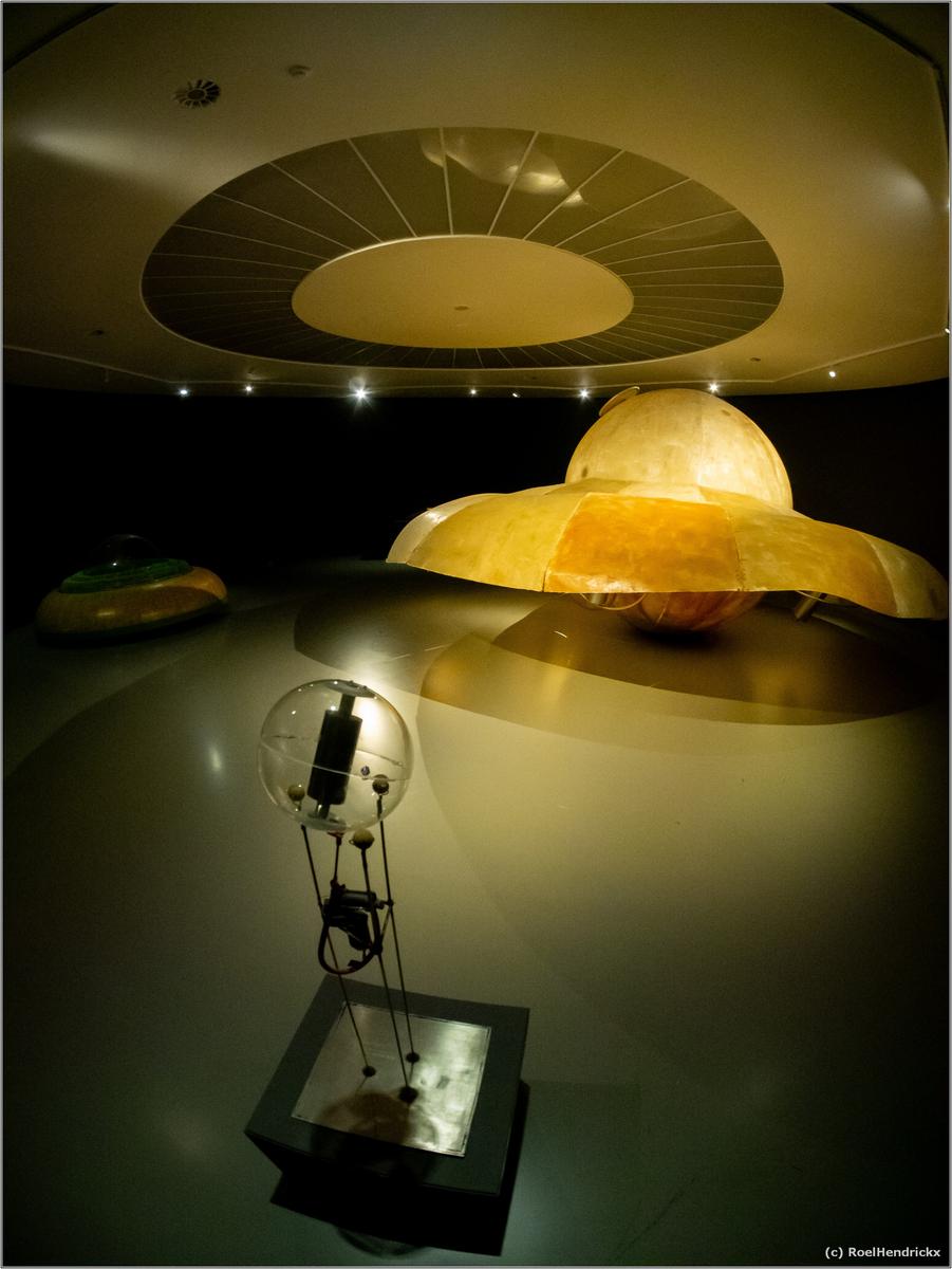
You've done well in presenting exactly what you describe. The captures do justice to the subject matter, with all that delicate detail framed marvelously to tell the story. The colors and lighting are just perfect. Excellent photo essay.
-
Quite nice trio to illustrate an amazing bridge structure. Well composed, well taken, and tell a story. That last one, though, is architectural art. Well done.
-
Can a herd of cows be considered an abstract based on pattern? This one certainly qualifies. Might also be interesting in black and white!
-
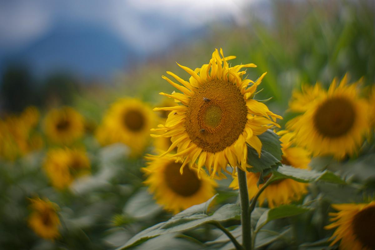
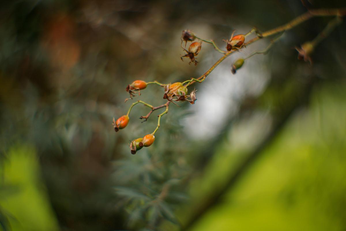
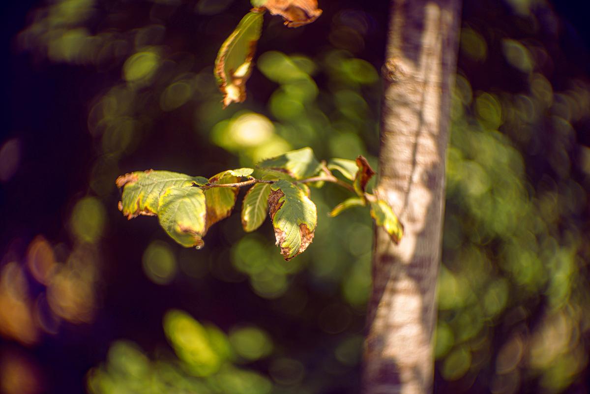
Quality set of everyday beauty, small slices of nature placed against OOF backgrounds to show off maximum detail. I'm partial to the first because I'm partial to sunflowers. The color contrast of yellows and blues makes this one sing.
-
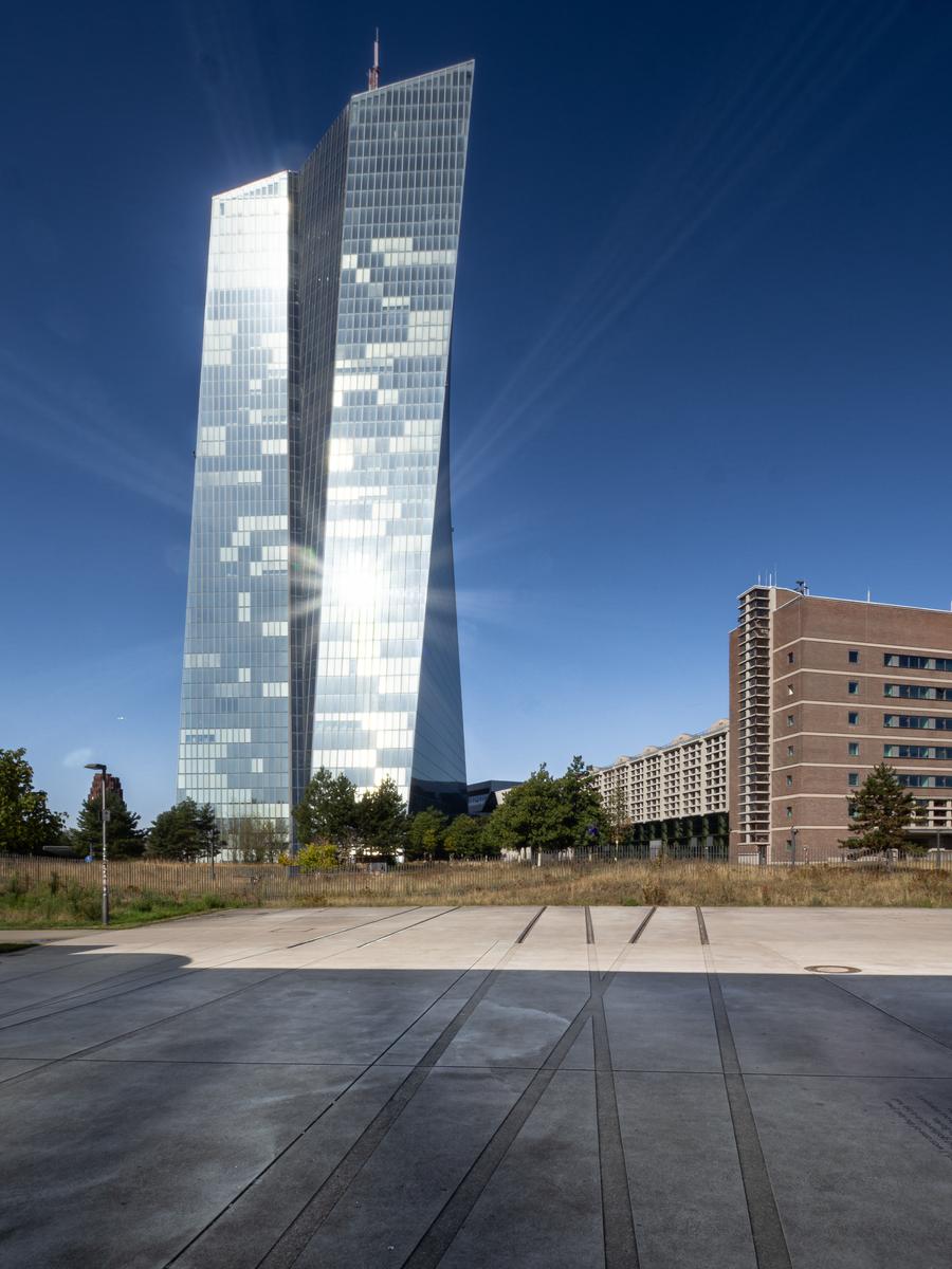
The history, of course, is compelling enough to carry the photo, but the photo has its own strength too. The reflective silver gives an ethereal touch to the modern neighbor of the building with the history attached. The light rays from the reflective star and the converging lines in the pavement suggest some competing powers, dark and light.
-
Minniev, you are enticing us down the rabbit hole to end all rabbit holes.
The series issues a challenge. Four images where the nature of "art" is quite different. In what way does each show "art"? Further, in what way might the image itself be considered "art"? I'm therefore considering the series rather than individual shots. A nibble around the edges rather than a dive from the high board.
I suggest that "art" has no objective reality. It's a construct of the human mind and therefore entirely subjective, although many people can share aspects of the experience. Images, sounds, words (probably all the senses) kick off previous experience in my head. The more the moment is able to do this, the stronger the associations it stimulates, the more profound is the "art."
I don't have the time and space to discuss this in relation to all the images but I'd agree that each shows "art."
One snippet of expansion on the above. The last image. We could legitimately talk about colour, line, shape and surprise. I can't look at it without also seeing the splash screen for the latest version of Photoshop. With that box opened all kinds of thoughts are then loosed. And it was the potency of minniev's image that pushed my button. -
I agree with the premise that art is a construct of one's own perception. I agree with the lecture my 13 year old grandson delivered to his younger brother when they were 6 and 4, where the older one was explaining to the younger that his art did not have to look like its own subject or any particular way at all, what matters is that it feels right to the artist.
I've always had that same kind of notion about my photography, perhaps because I dabbled in traditional art long before I discovered a camera. I firmly believe that the pixels I capture, like the lines and circles I draw, are mine to do with as I please. I learned Photoshop before I ever had a camera, as a way to play with digital paint, so I never felt any compunctions about scribbling on my photos with digital brushes. Now I sometimes play with AI as I did here. I wanted a monkey in a red vest with a blue hat and certainly had no monkey of my own, so I invented one. That piece will probably end up in a digital painting or watercolor, but I wasn't unhappy with its rendition.
AI in general I have great misgivings about, in art and in everything else as well. I wonder where the monkey I got really came from. And I would never try to pass him off as a real monkey I photographed in my front hall. (I wouldn't lie about photo editing either). But, like fast food, I will occasionally partake of AI in spite of those misgivings.
-
@PeteS has written:
Precious
The low brick and concrete building on the right is the Großmarkthalle (Wholesale Market) in Frankfurt, which was completed in 1928 and is now protected by a preservation order. It was linked to the railway, which brought mainly fruit and vegetables and care was taken not to cut, bruise or split the skin of the precious cargo on its way to the tables of the citizens of Frankfurt.
Fifteen years later, the buildings were used for something even more precious, but criminally rejected. The Jewish citizens of Frankfurt were rounded up, kept in its cellars and the railway distributed them to places such as Theresienstadt, Majdanek or Auschwitz. This time cuts, bruises and split skin were not avoided, but welcomed.
In 2004 a modern centre took over the function of the Großmarkthalle, built far away from the railway, but right next to the Autobahn, and the Großmarkthalle was disused, except for the office blocks at either end.
The European Central Bank integrated the Großmarkthalle into its design with the sloping-sided tower and opened in 2014. It protects the Euro, the precious currency of 350 million European citizens. Split skins are no longer a danger, but they try to avoid runs and scrapes and crashes at all costs.
Thanks Pete.
I want banks, especially central banks, to be rectangular, close to the ground, of solid stone and with small windows and doors. Your European Central Bank bothers me. You have solved my increasingly desperate weekly hunt for a Wednesday image. More on that come Wednesday.
Do those foreground lines mark the railway lines you mentioned? The shapes repeat the shapes of the towers while adding balance and movement through the front shadow to the back. Well done. This would have been a challenging shot for a photographer avoiding the obvious.
-
@minniev has written:@MikeFewster has written:
Herd
Can a herd of cows be considered an abstract based on pattern? This one certainly qualifies. Might also be interesting in black and white!
You are right. I hunted for years for a herd of B&W cows that could form an image like this that suggested abstraction. I didn't want the grass in the front however there were no more cows for the top and the image was too narrow without that foreground. The original idea was for a B&W but with the grass, I liked the brown cow and left the shot in colour.
-
@minniev has written:@RoelHendrickx has written:
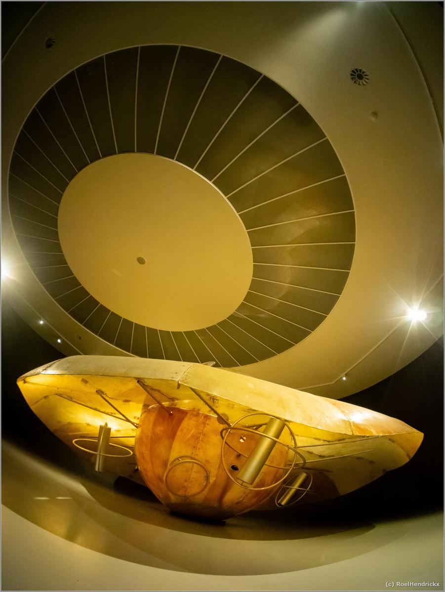
The UNIVERSE of PANAMARENKO
Quick visit to the MuHKA yesterday. That's the Antwerp Museum of Contemporary Art.
Summer is nearing its end and new exhibitions will start in September so I still needed to visit some shows that will soon close.One of them is part of the "Panamarenko85" celebrations, marking the 85th birthyear of Panamarenko (deceased 2019), a very colourful figure in the Antwerp (and international) art scene, who had his home and studio in this city (a few miles from my home - currently easily recognizable from the flying saucer that has landed on its roof). Panamarenko is one of our true 20th century greats, who gained worldwide fame with this fantastical creations and theories.
Fascinated from a young age by Jules Verne, physics and science and space travel (as well as Einstein relativity theory, flying saucers, perpetuum mobile, man-powered flight, Icarus, time travel, electromagnetism and numerous other scientific and science fiction subjects), Panamarenko made a name for himself with this playful and highly imaginative creations that were always shrouded in a veil of scientific seriousness. Most of those were cobbled together with waste materials, spit and string in his own backyard. They were always accompanied by elaborate blueprints, notebooks full of calculations and clippings etc.
The exhibition contained a few (lenghty) video fragments of Panamarenko in the 70s and 80s, appearing on television and baffling his interviewers (and both art experts as well as science professors) with his ability to drone on forever in seemingly all serious pseudo-scientific babble, laced with formulas and quotes, with which he almost always managed to sell his incredible ideas as based in hard science. The beauty of it is that he always seemed totally confident and that he seemed to believe what he was saying, although most of it sounds like Doc Brown fever dreams, or conspiracy theories that belong in Area 51. And all of that in his very colourful Antwerp dialect with quite a few tics and speech defects. Truly wonderful example of the idiot savant. You should really find some clips, preferably with English subtitling (although native Flemish speakers don't necessarily understand more of what he is saying than anyone speaking any other language).
Anyway, so I went to see a (small) selection of his works yesterday.
Some of them need an airplane hangar, but in the MuHKA the selection was limited to two rooms.I was immediately totally sucked into his wonderfully crazy universe and transported back to my own childhood.
Fun personal fact: visiting an exhibition in the Brussels Museum of Beaux Arts that combined René Magritte with Panamarenko, is actually my personal oldest memory of coming into contact with art: a friend of my mom who was interested in my boundless curiosity took me to see that show. This was in the 70s and I must have been a bit younger than 10.One room contained numerous drawings, blueprints, videos and small experimental installations, as well as a selection of the sources he always kept close at hand (including comic strips and Revell scale models of actual spacecraft).
Here are shots of the second room. This one contained a few of his mid-scale creations.
I think the MuHKA's dark and circular exhibition room was a perfect match for the subject (and my fisheye on the E-M1 the right lens to capture it).
(And yes, I had to lay flat on my back on the gallery floor for that last one.)You've done well in presenting exactly what you describe. The captures do justice to the subject matter, with all that delicate detail framed marvelously to tell the story. The colors and lighting are just perfect. Excellent photo essay.
Agreed, and as so often you have worked the scene and presented quite different images of the same subjects. They are all good, but my favourite is #2.
-
@MikeFewster has written:@minniev has written:@MikeFewster has written:
Herd
Can a herd of cows be considered an abstract based on pattern? This one certainly qualifies. Might also be interesting in black and white!
You are right. I hunted for years for a herd of B&W cows that could form an image like this that suggested abstraction. I didn't want the grass in the front however there were no more cows for the top and the image was too narrow without that foreground. The original idea was for a B&W but with the grass, I liked the brown cow and left the shot in colour.
That’s a really good and unusual idea for an abstract, and the result was worth the effort.
Even so, as you pointed out, it would have been even better with a bit more height to the image. Actually a higher viewpoint would have helped you. I think what you needed was the ladder from Roel’s archaeologist last week - together with steady nerves, steady friends to hold it and a good insurance policy, just in case they didn’t quite hold it. -
@PeteS has written:@MikeFewster has written:@minniev has written:@MikeFewster has written:
Herd
Can a herd of cows be considered an abstract based on pattern? This one certainly qualifies. Might also be interesting in black and white!
You are right. I hunted for years for a herd of B&W cows that could form an image like this that suggested abstraction. I didn't want the grass in the front however there were no more cows for the top and the image was too narrow without that foreground. The original idea was for a B&W but with the grass, I liked the brown cow and left the shot in colour.
That’s a really good and unusual idea for an abstract, and the result was worth the effort.
Even so, as you pointed out, it would have been even better with a bit more height to the image. Actually a higher viewpoint would have helped you. I think what you needed was the ladder from Roel’s archaeologist last week - together with steady nerves, steady friends to hold it and a good insurance policy, just in case they didn’t quite hold it.There's a lot to be said for a wife as a travel photography accessory.
-
@simplejoy has written:
The kinostar images. The swirl background is interesting for the swirl but I don't feel it is doing much for your subject. I think it works better in the last image where the subject is much larger and able to compete with the background.
I prefer the Projectar image. Here the smoother background emphasizes all the details of the main flower. The out of focus flowers recede in size and focus and prepare the way for the main flower to dominate the shot. The relationship between the min sunflower and the blue/grey mountain shape, top left, adds much to the success here. The petals of the sunflower suggest diagonal lines up to the shape and the shape gives balancing mass and complementary colour to the main sunflower. Beautifully done. -
@ChrisOly has written:
New bridges
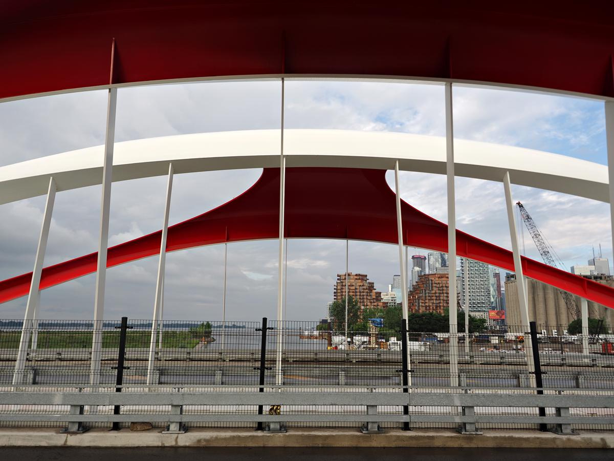
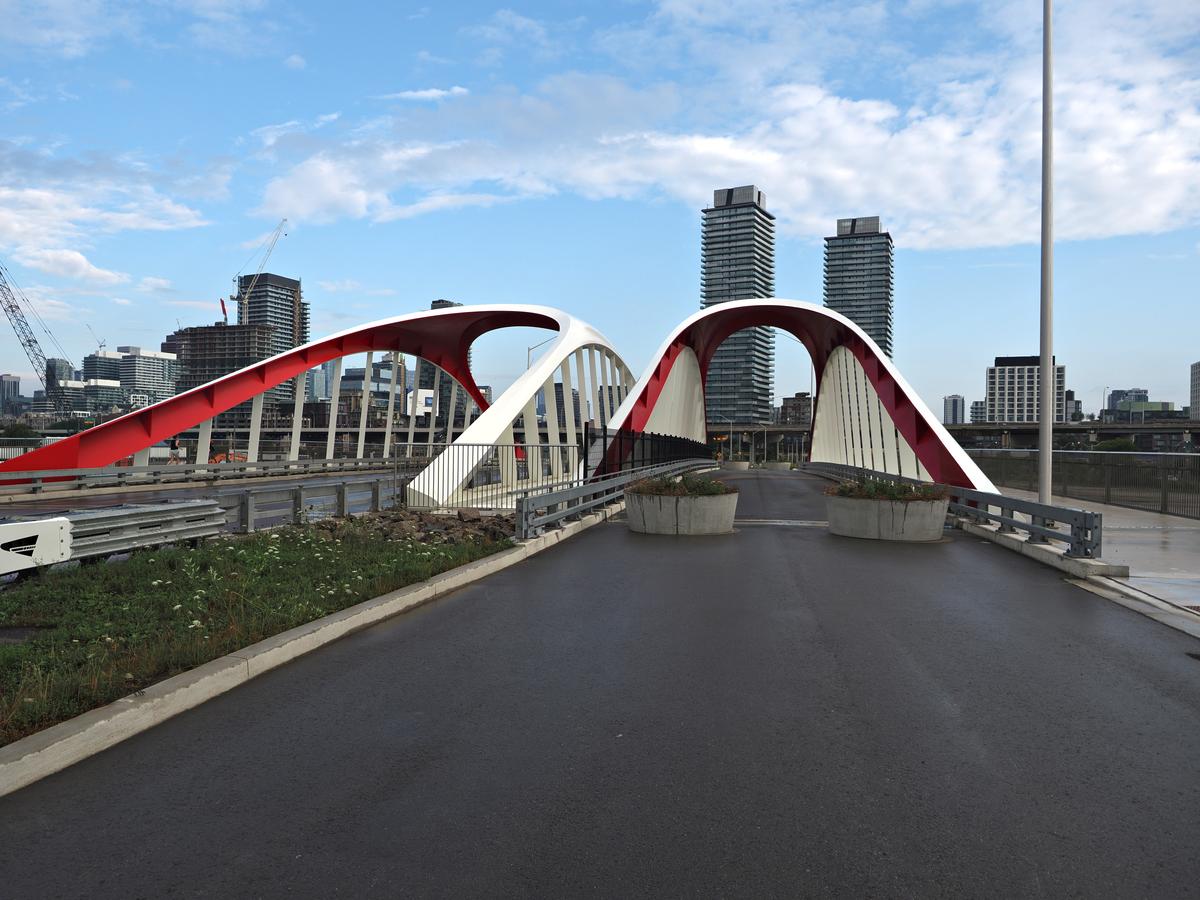
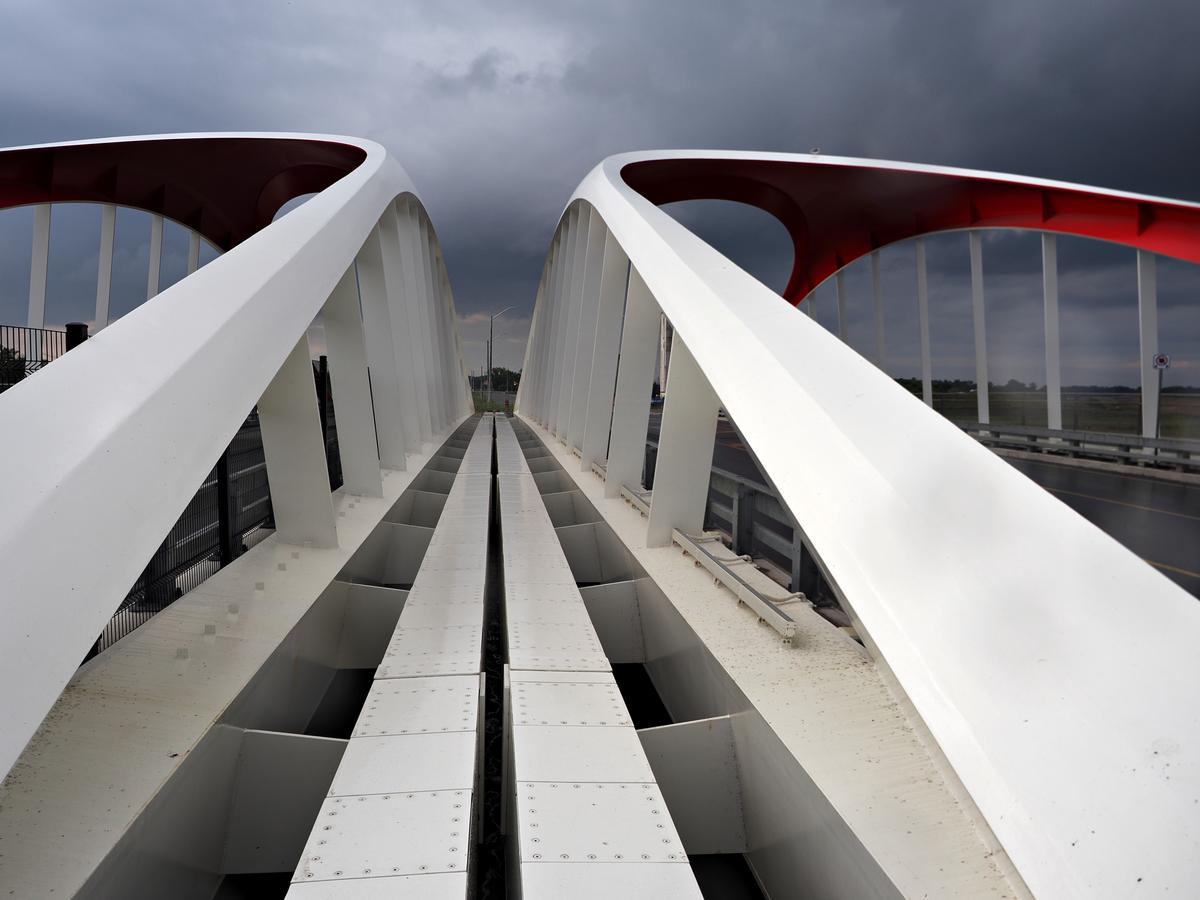
International award winning for design and engineering new bridges in Toronto, Canada Port Lands. Manufactured in Canada and Netherlands very innovative and pleasing to the eye bridges are part of massive $1.5 B infrastructure and development for flood control in downtown Toronto.
There are 4 of them and I will visit the rest in the near future and post the results at some point.
While the photos are OK in their own right, it is the progression of the three together that pleases me most.
It is clear to me, if these are in sequence, that you have explored this location to look for ever more interesting angles.
The first is a partial sideways view of the two bridges, resulting in arches over arches and a mostly horizontal (curved) geometry.
Although we see through the bridges towards the background, the photo does not really convey a sense of depth because there is no connection between the bridge (parallel to the photo plane) and the distant background.The second introduces that sense of depth by viewing along the bridge into the distance. That can be seen as an advantage, but lining up the bridge with the background was difficult: there is not really a smooth flow: the background intrudes upon the scene.
In the third you have resolved that problem of overlap and distraction, but getting closer and "zooming in" with your legs. Although the focal length has remained a constant 12mm the photo feels much more like a telephoto shot, because of how the background is eliminated. The bridge has become a successful abstract composition. (You have avoided the symmetry that could have been boring, but showing more to the right than to the left.)
-
@MikeFewster has written:
Herd
The crop is what makes this shot stand out.
Cows are not individual animals anymore, with their legs removed and their bodies overlapping.
Their individuality gets lost in the crowd and the title is appropriate: a herd (singular) is not the same as cows (plural).
The long scroll is like a tapestry or a roll of wallpaper, rolled out, with an intricate pattern in mostly black and white, with that single brown cow the odd fella out.
