• Members 1127 posts
    Aug. 26, 2025, 7:44 a.m.

    A strange but intriguing collection you've got here.

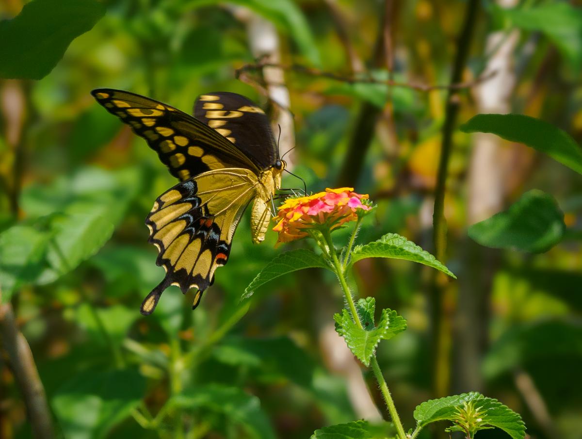
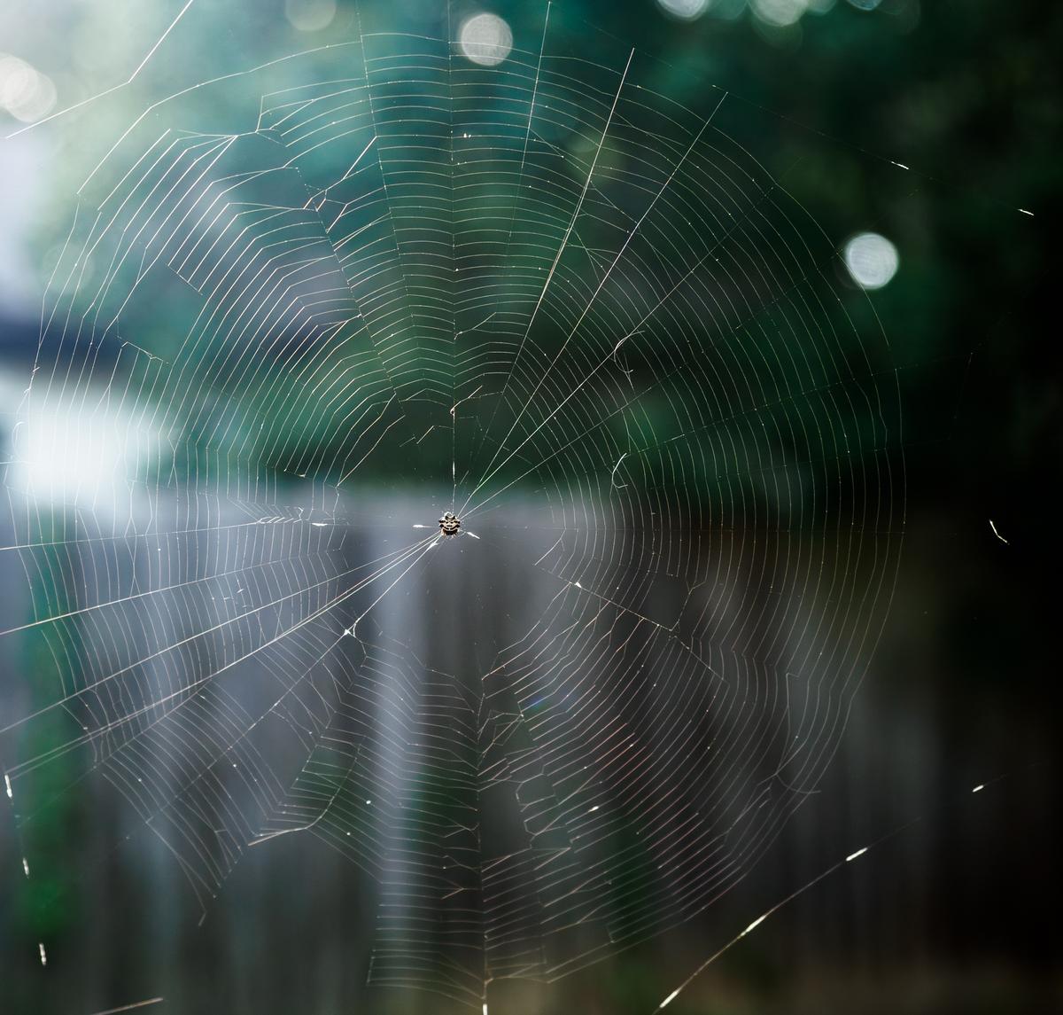
    The butterfly and spiderweb don't need much explanation: they speak for themselves.

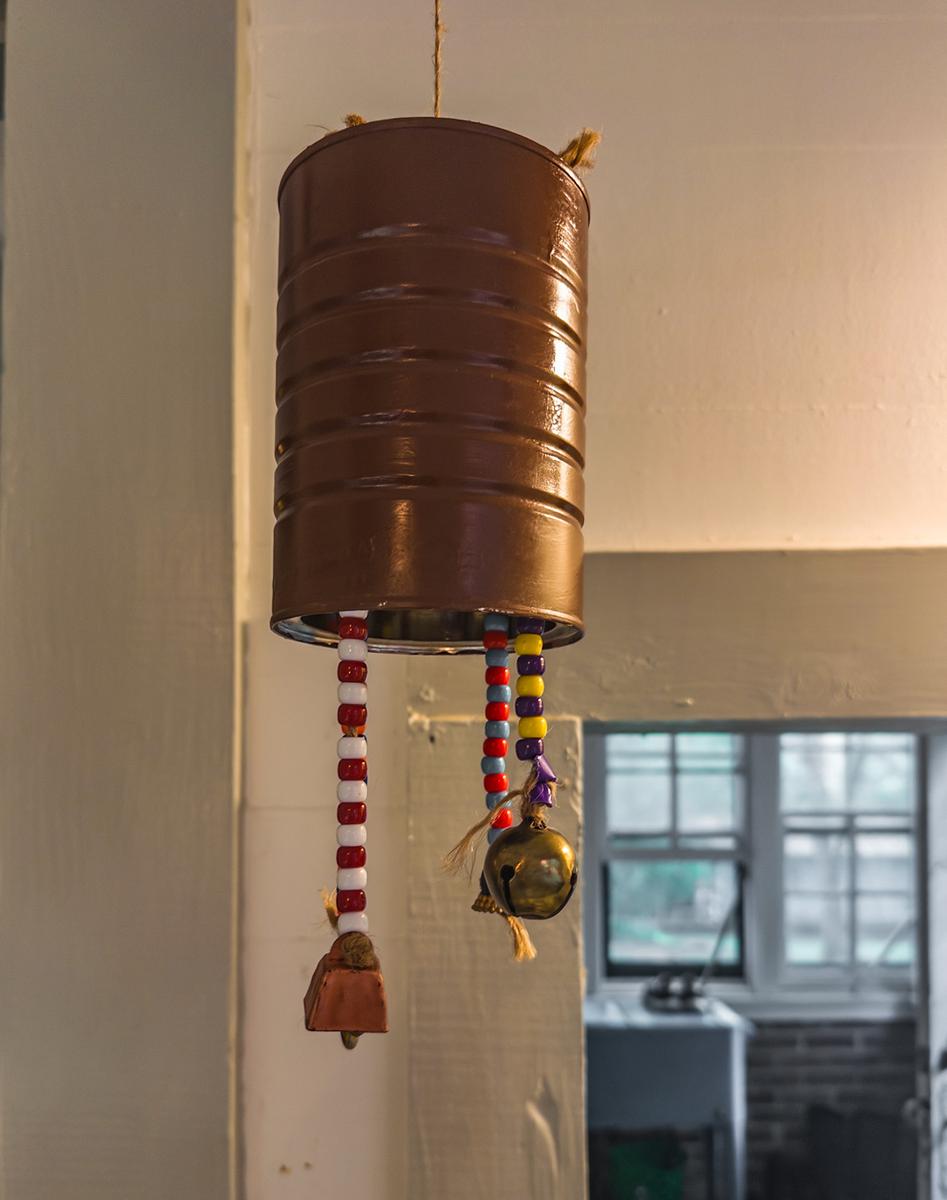
    The wind chime is a fascinating object, testimony of imagination and handiwork (I like how you framed it, itself warm and with the cool-coloured window in the background, reminding us of the wind that makes this chime come alive.

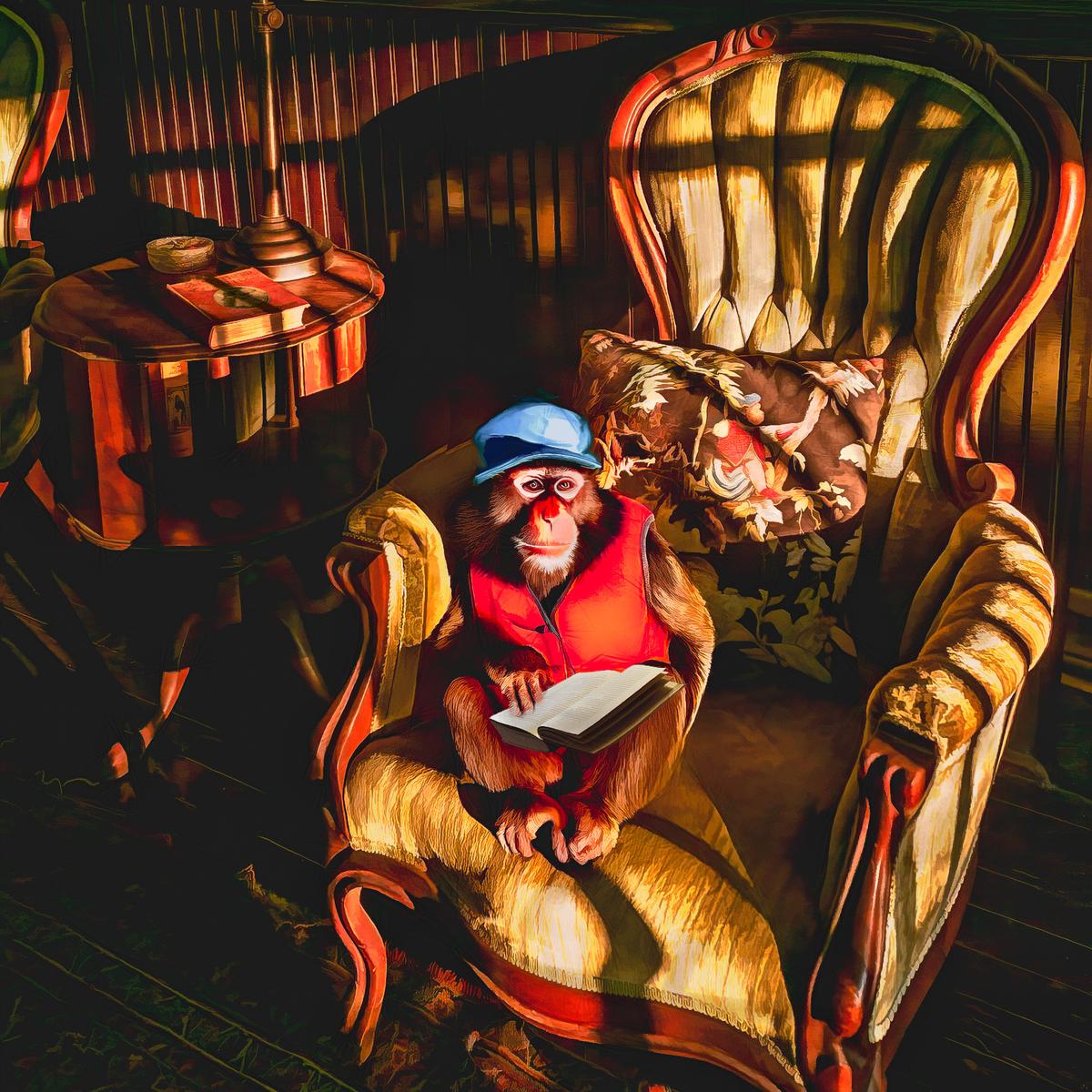
    The AI generated monkey is equal parts fascinating and creepy, like a character from a Stephen King novel. It is beyond my comprehension how AI has managed to blend in that monkey in such a realistic way, with shadows that fit into the scene and the chair.
  • Members 1127 posts
    Aug. 26, 2025, 7:56 a.m.

    The modern glass building could be a Liebeskind creation.

    Your photo is good, juxtaposing the modern and the old, but it benefits a lot from your narrative.
    That narrative gives the historical building more "weight" than it gets from the actual photo by itself.
    (In other words, without the narrative, the photo seems to be a photo of the tall glass structures, with the modest brown building almost as a random, collateral inclusion. The portrait orientation is part of the reason for this impression: the format of the photo echoes the shape of the glass building, subconsiously promoting that building to be the main character here.)

    I wonder how this would look in a square format, or even in a slightly wider landscape format, showing us the whole of the historical building, as a horizontal equivalent to the verticality of the glass building.

    Going square (and certainly going landscape, would result in less of that (largely empty) foreground.

    I do realize that this foreground does have its own meaning (with crossing railroad tracks forever invested with a more sinister meaning than they could ever have before 1939-145), but the heavy shadow does not do it any favours. Maybe the part of the tracks that we see in the sunlit stretch of concrete right under the buildings, is enough.

  • Members 1127 posts
    Aug. 26, 2025, 7:59 a.m.

    To the casual observer, these are nice photos of flowers and foliage.

    To a photographer, these are interesting studies in the characteristics of fast lenses.

    I love the shallow DOF, especially in the first and second. Swirly bokeh in the third and fourth are very peculiar and interesting.

  • Members 1127 posts
    Aug. 26, 2025, 8:03 a.m.

    You'll certainly get a chance in little over a month (in Umbria) to take just such a photo, although it not from a "youngie" but from a middle-agie.

    When I go out photographing, I usually also have my phone with me, and inbetween camera images, I let the camera dangle and make "equivalent" shots (insofar as the smartphone's three focal lengths allow) with my smartphone, to get a quick first impression that I can share with family and friends.
    (And then, more often than not, the actual camera images - lots of them - end up on my harddrives and take an unreasonable length of time to see the light again, while the phone photos make their way into the world.)

  • Members 791 posts
    Aug. 26, 2025, 8:35 p.m.

    The views are very different and interesting.
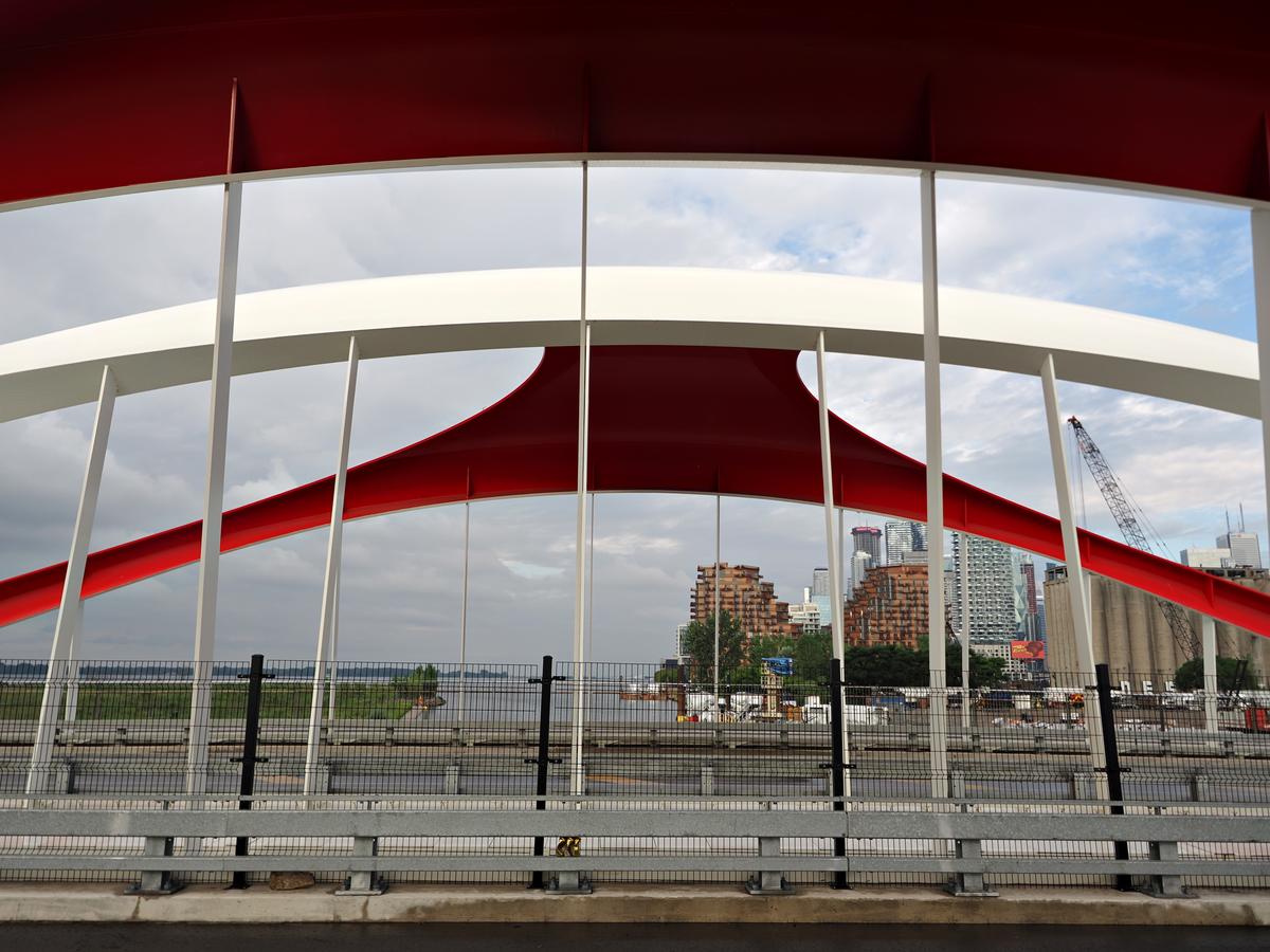
    The first has part of the bridge hovering over the scene. It could be protective or threatening.
    The vast expanse of road leads to the bridge on top of the city and I find the result visually confusing. I think this is because the bridge and city occupy a strip across the middle of the composition. The road does not add any interest in my view and if most of it is cropped out, it transforms the image. The bridge and city now occupy the major part of the frame, which invites the viewer to spend more time there, and discover the interplay and contrast of the curved, fluid shape of the bridge with the static, rectangular forms of the buildings.
    I really like the third one.

  • Members 791 posts
    Aug. 26, 2025, 8:45 p.m.

    Yesterday I wrote a lengthy reply about each photo and joined in the conversation on art and ai. Then the browser hung and I lost the lot, so I am afraid I only have time for a much shortened version.
    I think the idea for the series is very good and the individual photos very worthy. When zooming in to the spider, I was intrigued to find it looks like a cartoon cat character!
    I don’t think I would have thought to add a brightly clothed monkey to the scene, and it makes the point that so is just another tool in the creative toolbox, and so long as it is used that way, I have no problem with it, but it should never be used to deceive.

  • Members 791 posts
    Aug. 26, 2025, 8:51 p.m.

    Again, you have used the shallow depth of field and gorgeous bokeh to produce something really satisfying. My favourite is the first for the subject, the colours(blue and yellow) and composition. I also particularly like the last one. I don’t think I would have chosen it as a subject, but you have shown how beautiful the shape and colours of that dying leaf are.

  • Members 791 posts
    Aug. 26, 2025, 9:06 p.m.

    Thanks Roel. I appreciate the thoughts and considerations on the composition, and agree a square format would be good for the reasons you mentioned. However, I chose the format deliberately. There are better positions to show the old market buildings to greater effect, but I was following a footpath along that side of the building, which is dedicated to remembering the holocaust victims (as well as leading to the river). This was at the forefront of my mind when I took it, so the photo and the story were interwoven even at conception. Using a wide angle lens to avoid cropping the tower meant I had a lot of foreground, so I was glad to use the railway lines to add interest, which was relevant to the story, and also because they mimicked the shape of the tower.
    @Mike: yes the lines in the concrete represent the railway lines. You can still see the original rails, which look slightly darker, just above the shadow line.

  • Members 2229 posts
    Aug. 26, 2025, 9:50 p.m.

    I prefer vertical format for this shot for the reasons you have given. Additionally, usually, I don't like large shadow areas in the foreground with a brighter area behind. In this case the lines are so strong in the shadow area and they lead into the bright area in a way that has some potent symbolism. The curves on the shadow edge and again within the shadow area are omportant in making the shadow/bright transition division effective.