The silhouettes themselves are nothing special but the photo is. You saw the potential in the bands of tones and here we are. All the proportions feel right as do the axis proportions. I like the trees that reach across the bands to tie them together.
It all kind of balances. The trees are like a sentence across the page.
Sept. 17, 2025
50
-

-
I'll start by saying what I think this is, but what it is doesn't matter. This is an image that goes beyond a mere "guess what it is" game.
A Mason and Pearson hairbrush where the ends of the bristles have little blobs to soften the otherwise sharp points?The shot is full of movement. Lots of legs and an incline and some bend on some of the lefs. Lots of east/west movement lines. A taper of shapes from east to west. all done with a couple of the most staisfying complementary colour combinations.
-
I really need some help with this one. We've had some great skies recently. Very threatening and heavy. I am struggling to portray it well ...maybe trying to literally reflect what I see ?
 190925 storm over trees by softmarmotte, on Flickr
 -
Just spotted Roel's respone. I hadn't seen it when I made mine. A Mason and Pears hairbrush in action?
-
This forum is helping my vocabulary as much as my photography. "Wabi-sabi" is something I intuitively understand but I never knew there was a name for it.
Earlier today I took a photo of an old door. There's nothing to the photo except wabi-sabi. Minniev's photo has wabi-sabi with a contrasting splash the young and fresh. They also add some fine lines that paly with the horizontal lines of the boards.
I prefer minniev's original with the lower band matching the upper bands but adding a new element and anchoring the flowers. I'd remove the wire top left which seems to break up the to horizontal bands. -

A nice shot of an amazing structure. The repeating curves lead the eye gently from left to right, with room for side trips up and down the stairs and posts to find all the delicate details. The bright yellow cement mixer is a reminder of, as you say, the banality of it all.
I do like the alternative version SimpleJoy provided as a classical interpretation, almost musical in its visual reading.
-
What makes this image work is those four layers of light with the silhouettes threaded through them. You found a contrasting pattern and went with it. Nicely spotted. A full monochrome would work too but I think I like this delicate gold tint on the upper layer, with the texture of the water barely showing within it.
-
I am interpreting this as someone brushing the hair of a red-haired child with the light shining on it. Rich use of complementary colors of gold and cyan, with a suggestion of dynamic movement and friction, coming to an arrowpoint near the right edge. Interesting image. All that little bokeh in the lower right corner is a bonus.
-
Well captured and quite amazing geological structure somewhat similar to our pocket folds (?) in the Colorado Plateau. Rich colors and tones, exquisite detail. The sparse wind-riven foliage suggests a challenging environment but one that has been around beyond man's reign here. Really beautiful.
-

I really like this shot, particularly for looking like a small-scale model of what happened during the geological creation of mountain ranges. We have a spot here up on a mountain which lies 1000+ m above sea level and you can find fossils of small sea-based creatures and plants there… It‘s amazing thinking about the fact that this place was once at the bottom of the sea. Your image is an impressive reminder of the force of our planet and also the underlying beauty! Very well captured and the colors are powerful as well.
-
What an interesting and challenging photo! The skies look very threatening, but strangely colored and I'm assuming these colors are what it actually looked like, impacted by the unusual storm light and the time of day as well (I'm guessing it was late in the day).
When confronted with all these factors, you have many choices. You can attempt to match the photo to the strange but interesting color scheme nature presented to you. Or you can try to tame the late day yellows and normalize the range of colors involved. Or you can go full on creative and pick another set of colors (there's reds/oranges/blues hiding in those clouds that could be brought out by color grading the image and pushing the blues and red/oranges that are muddied by the stormlight). Or you could just quit fighting the color battle, convert to monochrome, and focus on the drama in those clouds. The colors in the leaves are interesting but less so than the formation in that threatening sky, so they may need to serve a secondary role. Any of those should yield an interesting image as long as you make good use of the strongest elements (the cloud shapes and textures and tones) I played a bit with the image and got several interesting results. You have a lot to work with here. Hope to see some other suggestions from other folks too!
-
It's a difficult question to answer and how to go about it will probably depend on familiarity with the software you use for PP.
To me, the potential of the image is in making a statement where the shapes and textures of the vegetation link to shapes and textures in the clouds.
I'd suggest two starting points. First, there is an overall yellow/green cast. It feels unpleasant to me. Is that how you remember the scene and do you want to retain that cast? Once this is decided I'd suggest giving attention to the detail and contrast in the sky. -

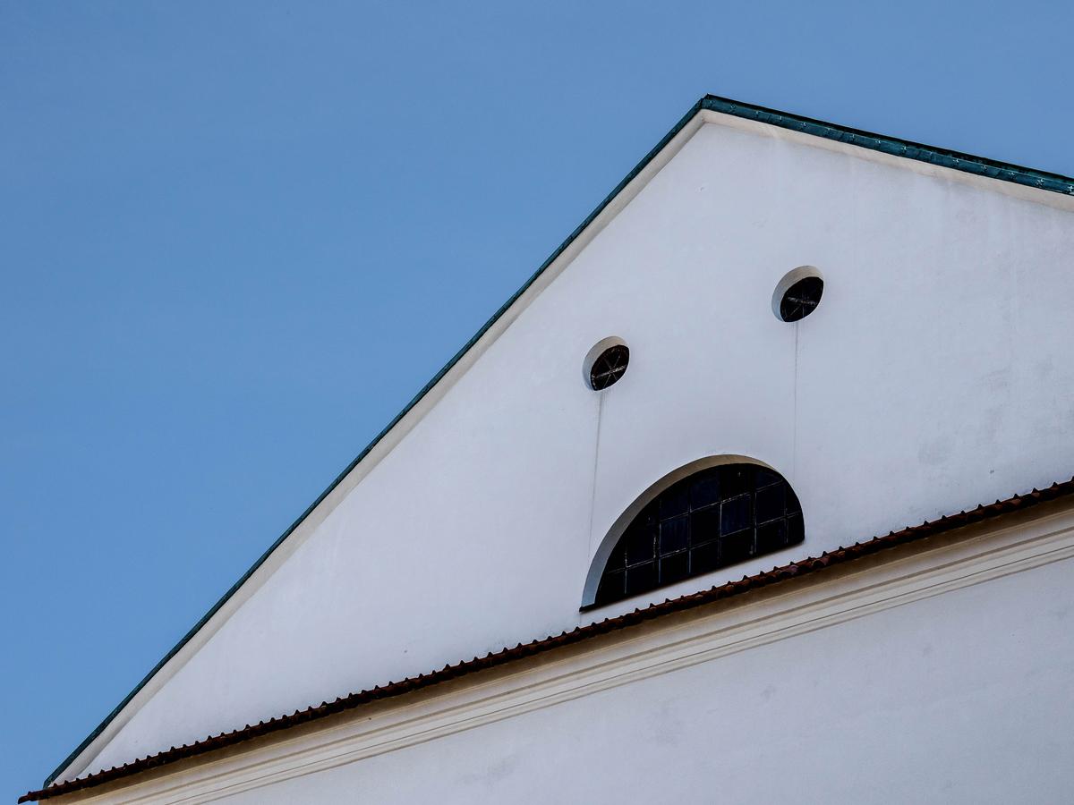
Sad House
I am late this week, leaving not much time left for discussion, so here is a simple photo. I enjoyed the fact that the inanimate object not only showed a face, but also emotion.
-

The combinaton of windows in itself is already great, but those tears (or running mascara streaks) really hit the bull's eye.
But you are selling yourself short if you present this as "I just made a simple photo of what was there": the angle used is very instrumental in getting the emotion across. -
I'd agree. I like the shot and I believe this is close to what it actually looks like to your eye. I'd still suggest to tone it down slightly for the ground at least. I like the shadows - they help a lot in making it threatening and heavy, which is what you mentioned going after. So keep the contrast as it is on the ground part. When you've toned down the yellows slightly on the vegetation, start playing with the contrast of the sky a little bit.
It certainly works well as it is already, so I don't think much is needed to make it even more impactful.
-
I think so as well! It's a great image where part of it is spotting that face and another part is finding a suitable angle and composition. You made it work very well here!
-

Great shot. So simple, but so meaningful.
-
Like big ocean waves, amazing...