This image is a classic, to me anyway. It leaves lots to interpretation...
Sept. 17, 2025
50
-

-

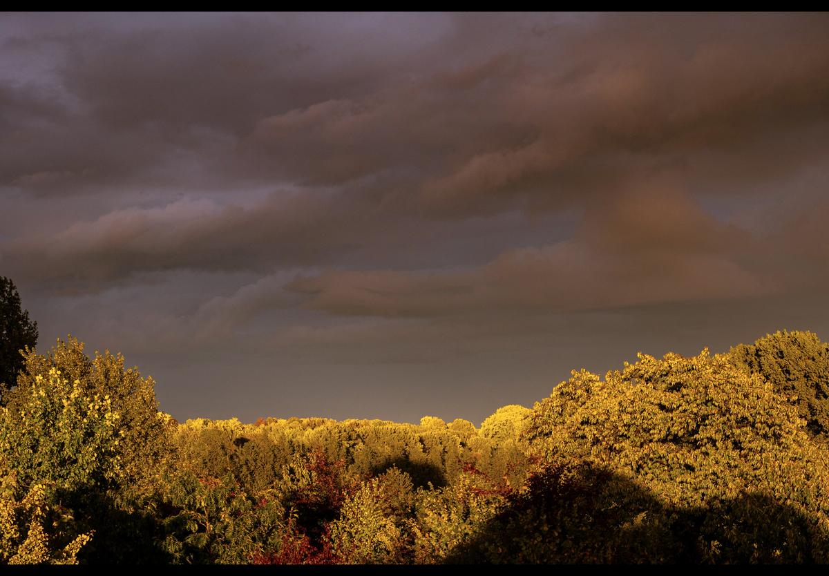
Mike, did you ever consider using the
pruningclone and heal tool on the two trees ?
A small trim on their tops, would restore a skyline.
This would pull the eye back to the iron rather than tracking the bright trees breaking out of the top of the photo. -

Yes, I could have done that. This is one of a series of shots I took in the Pilbara iron ore region of Australia. At the time I was fascinated by something apart from the waves of rock. This image isn't a good example of what i was looking for. What fascinated me was the incredibly thin layer of soil, on top of the iron, in which the trees managed to establish themselves. In straight visual terms, I'd agree with you, the image would be stronger without the trees, especially the half cropped trees shown here.
I don't remember the exact figure but I think that rock is 60% iron. Pick up a stone here and the weight comes as quite a surprise. -
As Chris and Roel have said. The strength is in the simplicity. The tilt of the triangle adds extra interest while reinforcing the "downwards" and therefore sad interpretation.
A gem of a photo. -
Interesting.
The more you crop the left side, the sadder it gets.
It forces you to make the call on how much emo you want ! -

The division in horizontal bands is so striking that it could almost be the flag of a monochrome and gold nation.
The silhouetted trees "interfere" but don't disturb. -
A nice punny title ("Awe" instead of "Ore" and/or "Wave" : the english language is so rhyme-acrobatic that two visually very different words still can resonate).
And a great shot of the violence that our planet can manifest.
Those waves and curves and the multitude of colours are magnificent, awe-inspiring indeed.
What struck me most, was the sheen on the earth layers.
I too have seen geological phenomenons with this type of colours and textures (in different NPs in the USA, but also in the desert and in places like Roussillon in France, where this type of earth is used for painting pigments and ceramics). But most often they lacked this kind of shine and were more matte. -
Agree with Mike on most counts, except on the green/yellow/gold cast being unpleasant: it is present, no doubt about that in my mind, but I don't get irked by it.
For me it creates a feeling of golden light on the brink of a summer storm. -

My eyes are sucked into the photo by the curve of seats and follow them in an arc to the right hand side. It is very elegant with those delicate arches, but also very grey, so at the right hand edge, my eyes notice the blob of yellow and are drawn back into the image, where I notice the rather incongruous cement mixer amongst all that elegance. An amusing juxtaposition.
-
I like Roel‘s comparison to a flag and agree with the trees do not disturb, in fact I like their texture, which is totally different to the texture of the bright sunlight on the waves, but equally pleasing.
-
I think this is of brushing hair, but it doesn’t matter what it is, as it is also a fine abstract. The interaction of the soft, wavy, blurry (hair) with the straight, crisp, hard prongs (of the brush) and their contrasting character is great.
Being bathed in gold usually gives a positive feeling and certainly does here, especially paired with the blue. -
This actually reminds me of a folk theatre, where the stage is rather primitive, which actually adds to the charm.
Here a troupe of red flowers are dancing across a makeshift stage, in front of a rolling hill of yellowy green spring grass, a blue sky and grey peeled clouds.
Or maybe it really is Zadie‘s spider lilies! In any case it is a lovely photo. -
This is very dramatic. The glistening reds and the wild wave formation makes the rocks look as if they are still hot, molten, and pouring across the landscape.
The spindly trees have a contrasting form and agree the would look better if pruned before reaching the top edge, but that is only nice to have and not a show-stopper. -
I have no problem with the concrete mixer. Indeed, my first impression was just of something coloured, that made the otherwiae grey picture much more interesting than it otherwise would have been. I prefer the original shot as presented.
For me, Simplejoy‘s b&w version is nowhere near as interesting, and is too dark.
David
-
I think the greens are the main problem. I tried removing them with the tint slider then masked the sky and moved the slider from yellow to blue a bit. Then increased the whites and highlights and lowered the shadows and blacks.
Of course, I have no idea how it really looked, but it appeals more to me. It is just a rushed job and would need some further removal of green cast in some clouds and the whole thing is done on a screen shot, so no quality inspections here!In any case, the colours are a matter of taste. In my case the green cast bothered me, but a blue or yellow probably wouldn‘t.