Age of innocence comes to mind...
-
-
The feast is about to start...
-
Good question Kumsal. That's an excellent job you have done on the shot. The simple answer is ... I've never played with the reflection removal tools. I'll explore them. Thanks for bringing them to my attention.
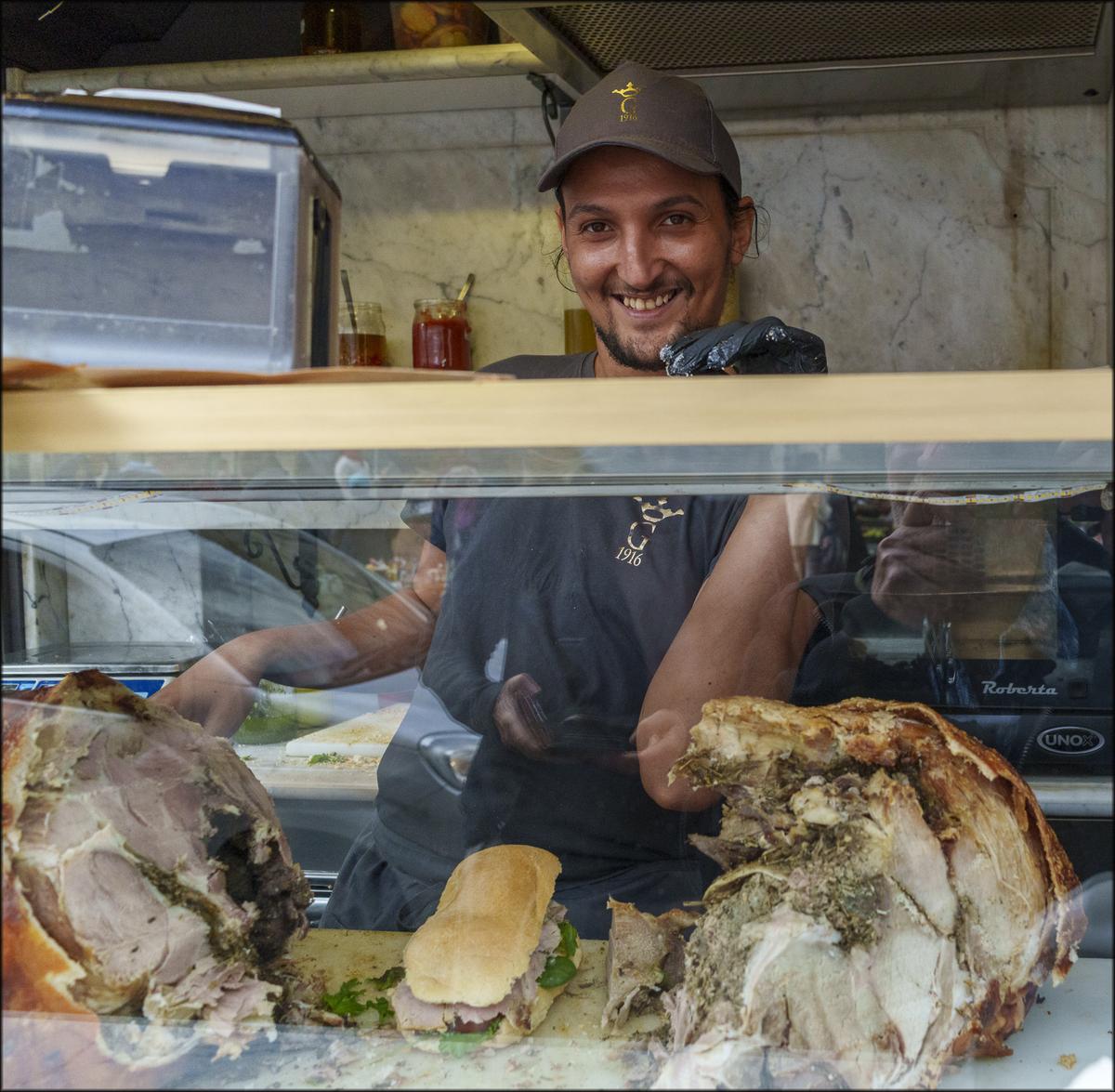
I have a couple more shots that were wrecked by the reflections and I'll review them. Not that I have much time. While 'm traveling I spend as little time as possible on PP. However I have a laptop with me with Photoshop on board so I'll get around to it.The skills that made him a maestro are what I wanted to bring out in a series of shots. On review, with the reflections removed, maybe I got them? Firstly, he works with speed. Secondly, he is skilful in getting the mix of meat and textures exactly right and that's important. Everyone of his paninis has the perfect blens of light meat, darker meat, rosemary stuffing, crunchy crackling and salt. It gets done while keeping the shape of the original meat right so the future cuts for the panini can be easily made.
-
It was just one click, and Camera Raw did the rest.
In the second step, I would restore the colors in his left arm from the original.
I really like your description of why you took the photo. -
@MikeFewster has written:
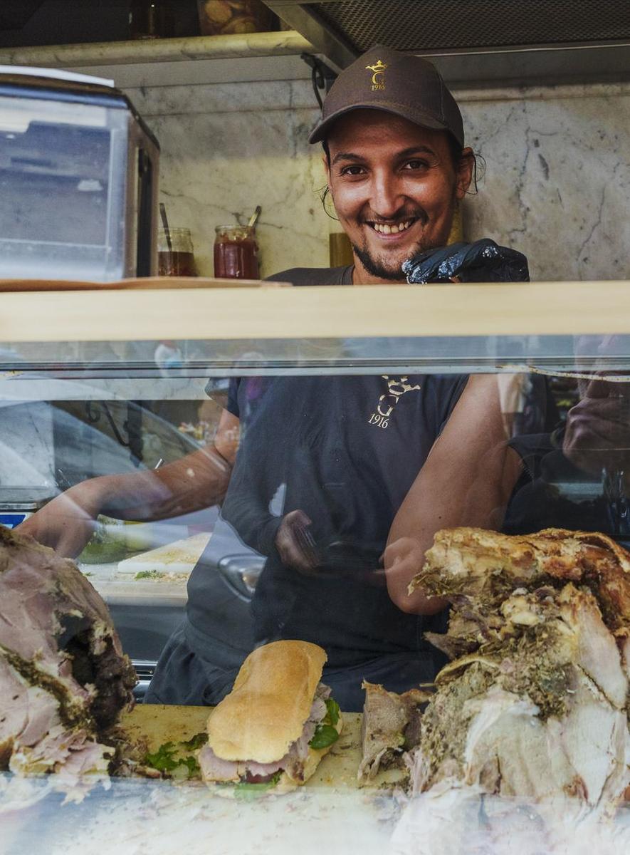
Porchetta Maestro.
This street bar in Perugia has specialized in porchetta since 1916. Lunch today was memorable. Unfortunately, my attempts to show the artistry with which this panini was sliced and assembled came to naught. The shots were ruined by reflections.
Now I can try again tomorrow.Very good portrait - makes this guy seem very friendly for sure! I have no idea why you'd want to remove the reflections however... to me they're essential and play an integral part in showing how he is able to juggle doing a great job while keeping in contact with the customer in front of the glass. It's in part what makes this authentic and more interesting to me than a clean corporate portrait.
I'd go for a portrait format and try some slightly different stuff in terms of processing, but I think this works nicely if the goal is to show something authentic rather than staged.
-
@simplejoy has written:@MikeFewster has written:
Porchetta Maestro.
This street bar in Perugia has specialized in porchetta since 1916. Lunch today was memorable. Unfortunately, my attempts to show the artistry with which this panini was sliced and assembled came to naught. The shots were ruined by reflections.
Now I can try again tomorrow.Very good portrait - makes this guy seem very friendly for sure! I have no idea why you'd want to remove the reflections however... to me they're essential and play an integral part in showing how he is able to juggle doing a great job while keeping in contact with the customer in front of the glass. It's in part what makes this authentic and more interesting to me than a clean corporate portrait.
I'd go for a portrait format and try some slightly different stuff in terms of processing, but I think this works nicely if the goal is to show something authentic rather than staged.
The idea was to have a series of shots demonstrating the skills of the panini maker. The shot I used is easily the best in showing what was happening on the bench. Even then, it is only showing a completed work of art. The other shots mainly show my reflected camera at waist level.
-
@simplejoy has written:
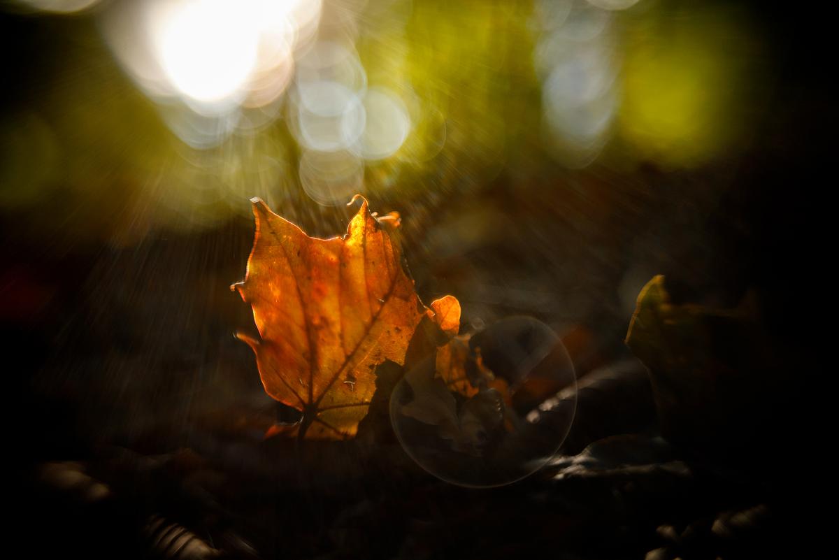
Protect what's left of your soul!
Sometimes my reaction to an image gets shaped by recent experiences. That's the case here. In the last three weeks I have seen stained glass windows in churches almost every day and here I'm doing it again. It feels like the rich glow of glass with leadlight surrounds. Behind is a wall with more of the same, out of focus.
While I don't get the title you have selected, I certainly feel something of the intensity and beauty that is within the great churches and their use of stained glass. -
@simplejoy has written:@JSPhotoHobby has written:
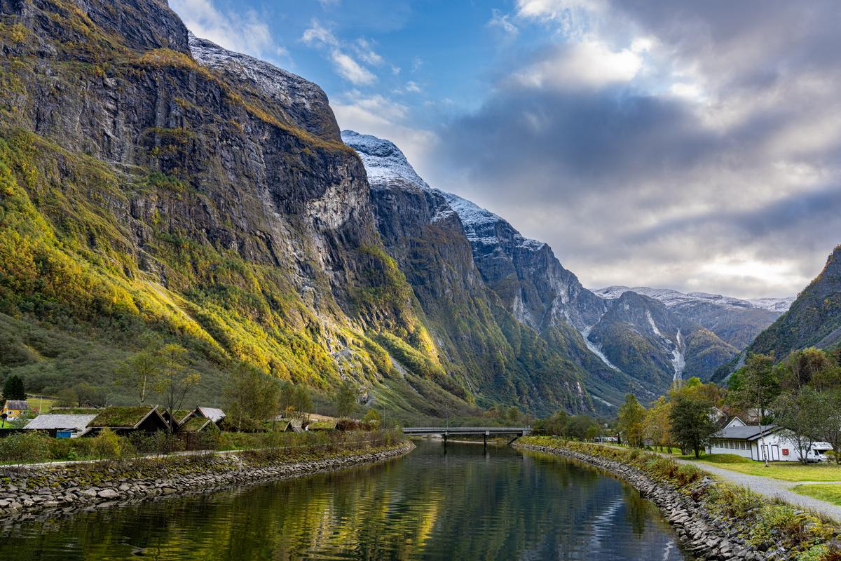
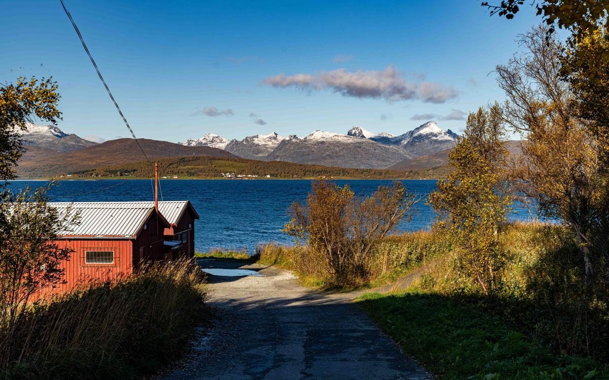
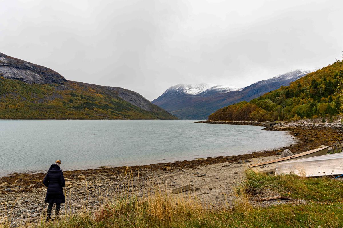
Haven't taken a descent image all year. I apologize for not having had much to share.
These are from a year ago and work together I think, but not alone.Excellent shot! I certainly think this works great alone. Beautiful light and tones and a nicely balanced composition.
I agree with Simplejoy. This is a fine landscape shot on its own. The cliff with the full face filling the left and then tapering down to the right, effectively gives the scale. The highlight on the rockface adds plenty of detail interest and balances the road to the right.
-
@ChrisOly has written:
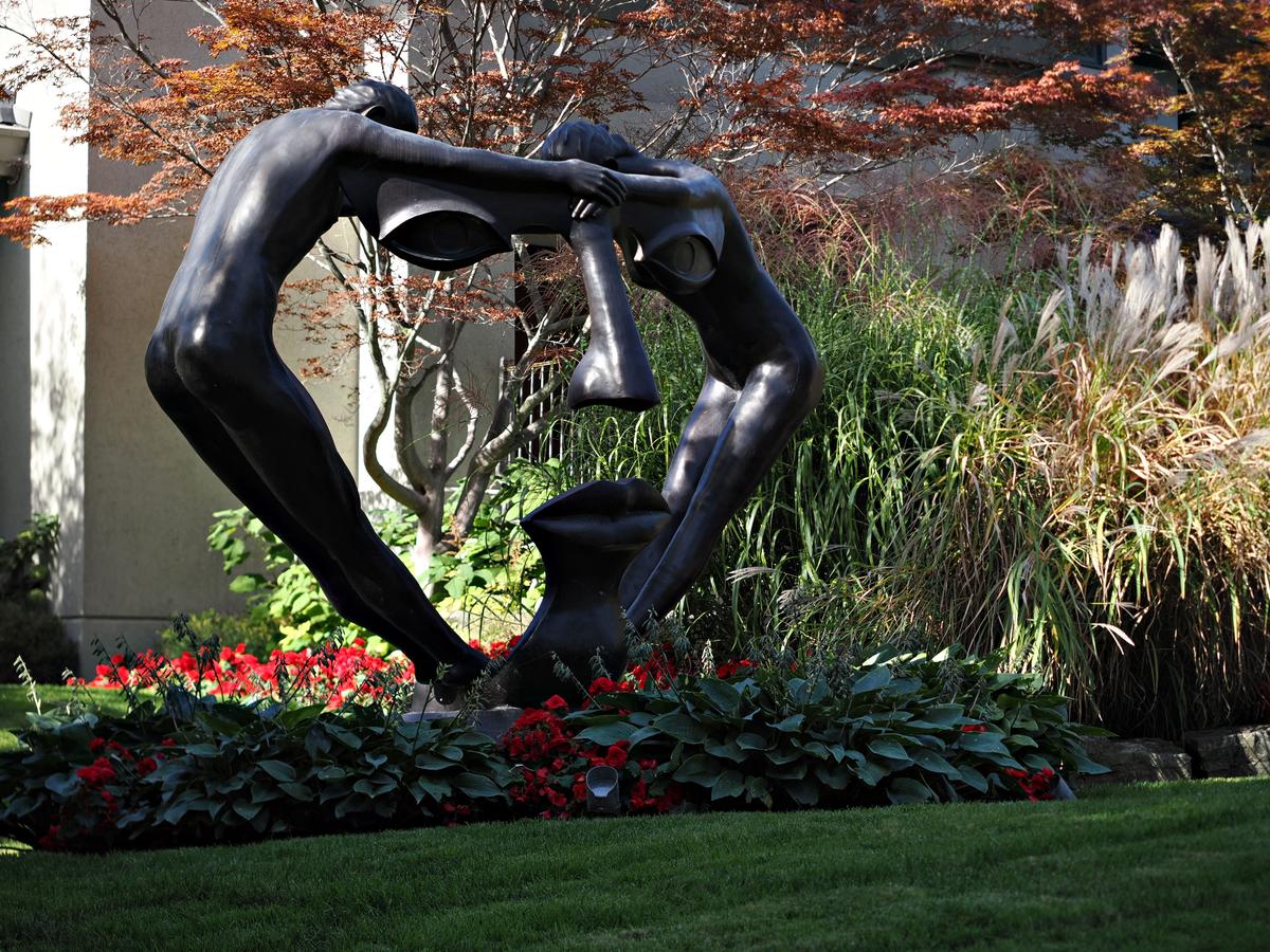
Garden frolic
That looks fun. Beats weeding.
Chris, I feel that there's a problem with the shot that probably can be fixed with some PP.
To me, too much of the figures are in deep shadow with an almost complete loss of detail. Is it possible to raise those shadows and some of those of the plants along the base as well? Viewed at the largest possible size more texure emerges. Alternatively the better lit areas of the statue could be darkened to give silhouettes but I don't think the shapes are strong enough from this angle for it to work. -
@JSPhotoHobby has written:
Haven't taken a decent image all year. I apologize for not having had much to share.
These are from a year ago and work together I think, but not alone.All three are good but the first one is spectacular.
-
@RoelHendrickx has written:
FORTIFIED WINE
Three iphone 11 images from two months ago.
Back to Germany.We stayed one night in Würzburg, a quite lovely city in the center of Germany.
On one side of the river, the town center is laid out.
On the other side, a rocky hillside with a castle dominates the city.
The slopes leading up the to main castle fortifications and entrance gates, are also part of a defensive systems with towers and walls, and form a path from which nice views of the city center can be had.
I've already shown images from that city center, as seen from that location (see link below).But the main attraction of these slopes is that they are planted with vines that produce (a small fraction of) the local wines, for sale in Hofkeller Würzburg.
While Els enjoyed a nice glass of white on the bridge (see here for the story on that peculiar local habit: dprevived.com/t/wednesday-cc-no-theme-thread-903-revived-123-on-2025-08-06/7463/3/#post-105674), I walked up the steep shortcut descent with stairs to the castle, and descended via the scenic route.
These images are impressions from that walk:
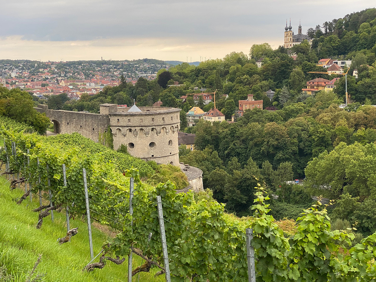
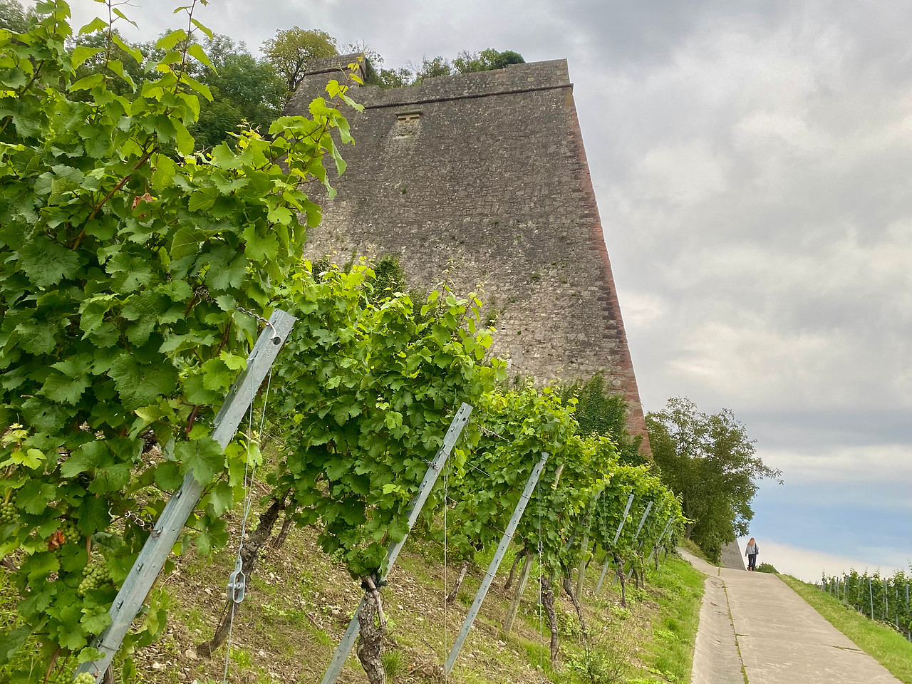
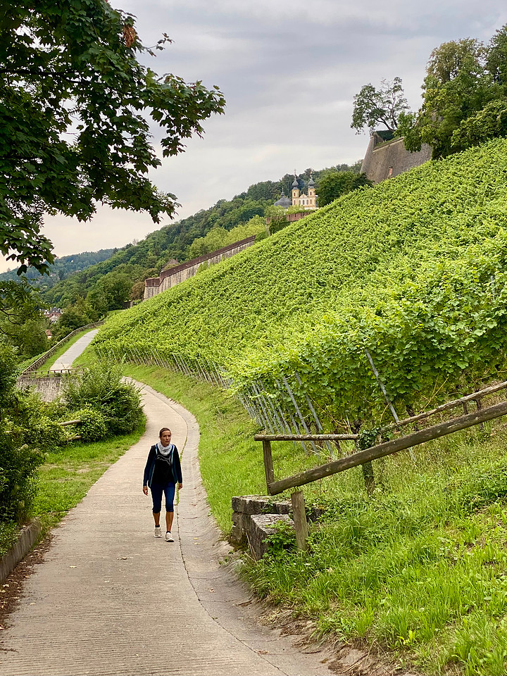
I live about two hours away from Würzburg and have also enjoyed that walk through the vineyards, which you captured very well and chose a really cool title!
As a single photo I like the first one, which captures so many important features in one go. I also like the second one. Initially I felt like I had drunk a good amount of that wine, as the verticals are all over the place, but they are accurate, as proved by the upright person. It feels wild with the contrasting slopes of the hill, the walls the path, the poles holding the wires for the vines. It is a fun image.
-
@MikeFewster has written:@simplejoy has written:@MikeFewster has written:
Porchetta Maestro.
This street bar in Perugia has specialized in porchetta since 1916. Lunch today was memorable. Unfortunately, my attempts to show the artistry with which this panini was sliced and assembled came to naught. The shots were ruined by reflections.
Now I can try again tomorrow.Very good portrait - makes this guy seem very friendly for sure! I have no idea why you'd want to remove the reflections however... to me they're essential and play an integral part in showing how he is able to juggle doing a great job while keeping in contact with the customer in front of the glass. It's in part what makes this authentic and more interesting to me than a clean corporate portrait.
I'd go for a portrait format and try some slightly different stuff in terms of processing, but I think this works nicely if the goal is to show something authentic rather than staged.
The idea was to have a series of shots demonstrating the skills of the panini maker. The shot I used is easily the best in showing what was happening on the bench. Even then, it is only showing a completed work of art. The other shots mainly show my reflected camera at waist level.
As Simplejoy says, the guy seems friendly and that makes me feel he is proud of his handiwork. If he was trying to sell junk, he would look more shifty.
It is a nice mix of street portrait, documentation and travel photography.
I also agree that in this photo, at least, the reflections do not worry me, and even help set the scene. Kumsal is right that they are easy to remove in Camera Raw or Lightroom, with just a click box in the remove tool, and usually removes them well, and get better with every software update. There is also a slider, which allows you to adjust the amount of reflection you want left in the photo, from nothing at one extreme to leaving only the reflection at the other. -
@minniev has written:
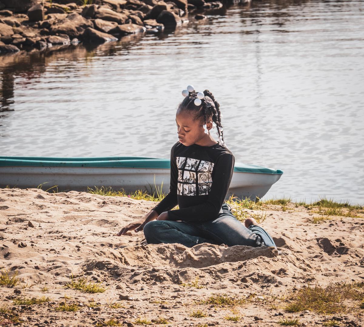
Daydreamer
Met this little girl at the river last weekend.
This is a lovely photo and exudes peace and contentment. The girl seems at home in her environment, even if happens to be her home only for the duration of the holiday. There is no eye contact and she is concentrating on what seems to be a casual pastime, with no stress.
-
@JSPhotoHobby has written:
Haven't taken a decent image all year. I apologize for not having had much to share.
These are from a year ago and work together I think, but not alone.Yes, they do work nicely as a series, but at the very least the first is a strong photo on its own, as others have already pointed out.
I expect it is a case of a scene or landscapes you know too well and see them differently from someone who lives elsewhere.
-
@simplejoy has written:
Protect what's left of your soul!
The shallow depth of field and the lighting work hand in hand to show off the textures and colours of the autumn leaf to their best. The bokeh is very attractive too.
-
@MikeFewster has written:@ChrisOly has written:
Garden frolic
That looks fun. Beats weeding.
Chris, I feel that there's a problem with the shot that probably can be fixed with some PP.
To me, too much of the figures are in deep shadow with an almost complete loss of detail. Is it possible to raise those shadows and some of those of the plants along the base as well? Viewed at the largest possible size more texure emerges. Alternatively the better lit areas of the statue could be darkened to give silhouettes but I don't think the shapes are strong enough from this angle for it to work.I agree with Mike. It is an interesting photo, but brightening the dark area would make it even better.
-
@PeteS has written:@minniev has written:
Daydreamer
Met this little girl at the river last weekend.
This is a lovely photo and exudes peace and contentment. The girl seems at home in her environment, even if happens to be her home only for the duration of the holiday. There is no eye contact and she is concentrating on what seems to be a casual pastime, with no stress.
Agree and let me add that IMHO a large part of the attraction of this image is caused by the fact that the sand has acted as a giant reflector, throwing some very nice and soft golden light upwards onto the face.
-
@RoelHendrickx has written:
FORTIFIED WINE
Three iphone 11 images from two months ago.
Back to Germany.We stayed one night in Würzburg, a quite lovely city in the center of Germany.
On one side of the river, the town center is laid out.
On the other side, a rocky hillside with a castle dominates the city.
The slopes leading up the to main castle fortifications and entrance gates, are also part of a defensive systems with towers and walls, and form a path from which nice views of the city center can be had.
I've already shown images from that city center, as seen from that location (see link below).But the main attraction of these slopes is that they are planted with vines that produce (a small fraction of) the local wines, for sale in Hofkeller Würzburg.
While Els enjoyed a nice glass of white on the bridge (see here for the story on that peculiar local habit: dprevived.com/t/wednesday-cc-no-theme-thread-903-revived-123-on-2025-08-06/7463/3/#post-105674), I walked up the steep shortcut descent with stairs to the castle, and descended via the scenic route.
These images are impressions from that walk:


Very pleasing travel set in spite of the gray skies. I like the composition of the first one with the arrowhead "V" outlined in greenery, and the gorgeous array of historic architecture within and without.
