The general atmosphere here reminds me a bit of my own image of a small boat, near sunset, on Lago Trasimeno.
But the effect you have achieved is notably different.
Your image is darker and "richer" in shadow, emphasizing more the coming night than the receding day.
This is a boat at rest.
I love (of course) the combination of rich golden orange in the sunset (none of it blown), combined with the blues of the clouds.
Particularly: the streaks of orange on the underside of the clouds nearest to the actual sun, but also the way the clouds in the left side of the image get lit from the right, creating marvelous texture and depth.
-
-
There are quite a few of these that I really like.
The #1 is a quiet opener of the essay, juxtaposing young fresh leaves with ancient trees. It works, but is definitely NOT my favourite, because there are so many more goodies (and betteries) yet to come.
The #2 shows similar leaves and similar trees behind them, but goes well beyond that, by showing depth and extra layers in mountains and mist. So: better than #1.
The #3 is (for me) a step back : more foreground but it does not really excite me. The highlight here is how the light-coloured tree is framed against the darker backdrop. Again : good, but not the best of the series.
The #4 is really good. The sun and its rays are put to use here and it results in a great cinematic effect. That sun is an obvious first focus point for the viewer, but once we have seen that sun enough, the eye can wander through the layers of foliage and THEN discover the light coloured tree amidst its darker brethren. That is a really cool discovery. So this one goes high on the list. The only minus here are the manmade elements that intrude : the fence posts.
The #5 gives us a change of pace by changing from a very wide perspective on a big landscape to focus on something small and nearby.
The image in itself is not my favourite, but its place in the sequence plays a cunning trick on my mind: having gotten used to great far vistas with trees and mountains and misty clouds, my very first quick impression of the image, sees it as something totally different from what it actually shows. That first impression turns the boulder into a mountain face, and the individual leaves into trees dotted on a mountain meadow and the silken waterfall behind it, into mist between mountains.
The surprise of what I am actually looking at, gives this image bonus points that it would not have when not in the sequence.
I may be the only one seeing this (my imagination, and especially my visual imagination can go wild), but I wonder if anyone else can see what I was seeing.The #6 is somewhat ordinary when compared with what came before.
The #7 goes back to #5. I think it may even be possible that I did not really recognize #5 as what it is (but was firmly believing in my self-inflicted illusion) until I got to #7.
(EDIT: I had to put "The" in front of every sentence. Having the hash tag at the start of my sentences resulted in the paragraphs shown in a ridiculously large font. Ah, the wonders of digital text layout...)
-
Very nice collection of autumn colours.
Compositionally though, the image feels a bit underwhelming : it is an objective, documentary view (head on) of a patch of trees in a meadow.
Good for showing the colours, but not terribly exciting beyond that.You could ask yourself the question: in front of a scene like this, what are my options to bring dynamic tension to the image.
The series of B&W images from Hochkönig can serve as an illustration of how dynamic depth can be achieved with different perspectives and angles. -
I appreciate David's candour, brought with a touch of humour.
But I do hope that he manages to look at these images another time, and look beyond the absence of colour.
Turning landscapes (and any image, actually) into Black & White can result in different perceptions and focus.
Our eye is trained to perceive colour as a primary focal point in any image or scene.
Devoid of colour (and reduced to infinite shades of white over grey to black), other aspects of a scene/image can come to the forefront: texture, depth, geometrical composition.Not saying that B&W is better than colour (sometimes it certainly isn't; only snobs think that B&W is the true artistic side of photography).
It is just different. -
@RoelHendrickx has written:
(EDIT: I had to put "The" in front of every sentence. Having the hash tag at the start of my sentences resulted in the paragraphs shown in a ridiculously large font. Ah, the wonders of digital text layout...)
Looks like you can use backslash as an escape character (
\#1):#1 is a quiet opener...
-
@ArvoJ has written:@RoelHendrickx has written:
(EDIT: I had to put "The" in front of every sentence. Having the hash tag at the start of my sentences resulted in the paragraphs shown in a ridiculously large font. Ah, the wonders of digital text layout...)
Looks like you can use backslash as an escape character (
\#1):#1 is a quiet opener...
OK thanks.
Useful. -
@simplejoy has written:
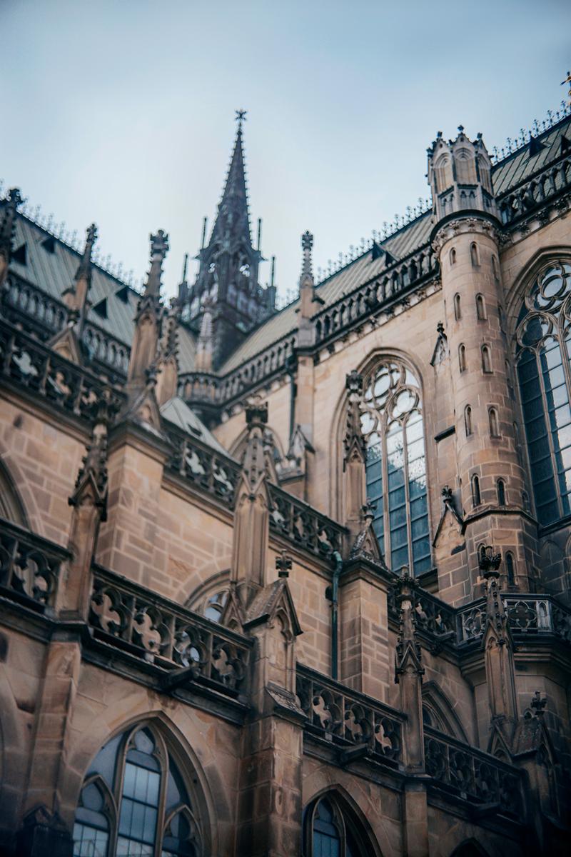
Two different shots from the same location, one outside:
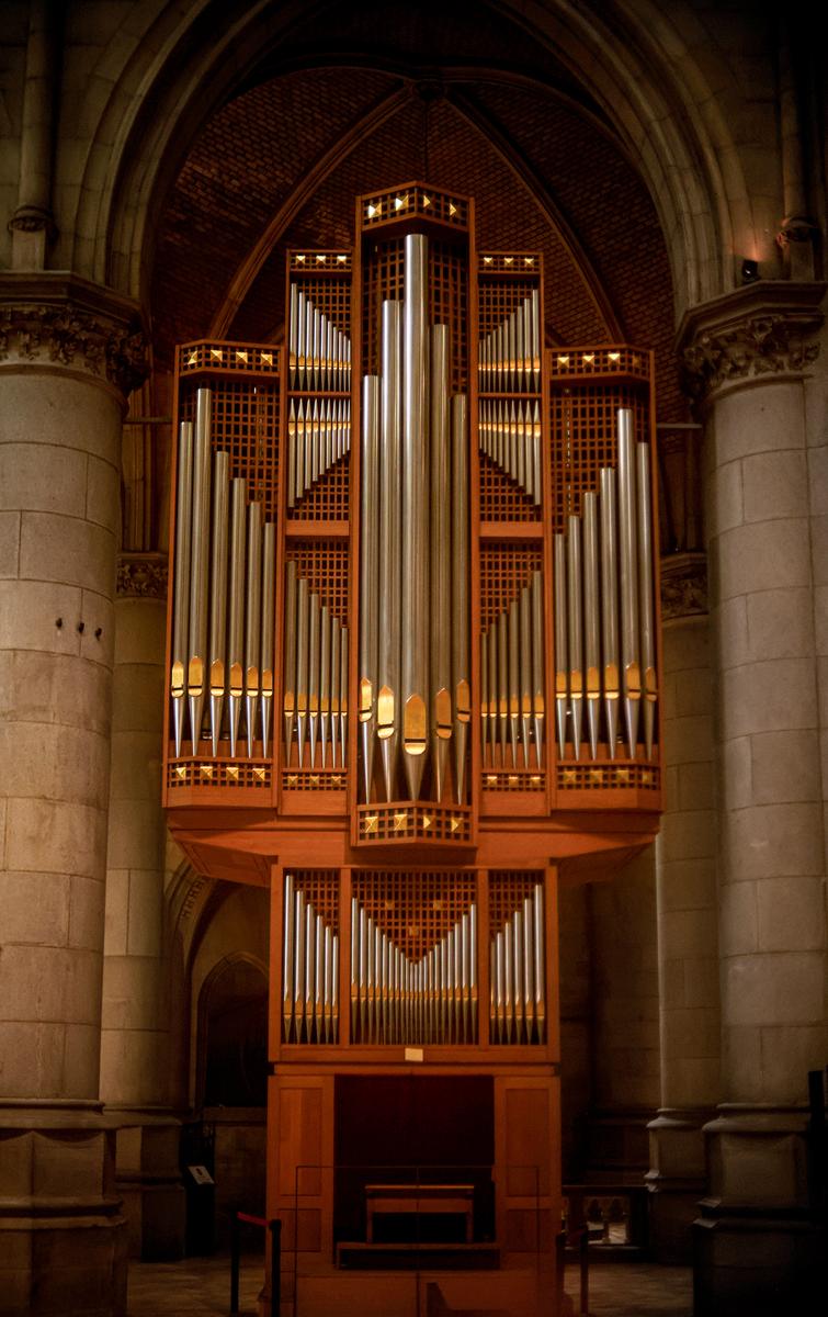
and one inside:
Very poor technique for sure... but I'm having fun with trying something different, despite the limitations I had to put up with.
As an introduction:
Please don't bring yourself down (or sell yourself short) by mentioning poor technique.
There is no need in this thread to provide excuses.
Moreover, (photographic) technique (as in: the technical basics of photographic skill, like how to expose manually etc) is rarely my focus in viewing images.
When a photographic technique is so obvious in an image, I sometimes feel that the photographer thinks he is more important than his image.
In other words: technique is not everything.
Some of my best images were shot with zero emphasis on "technique" : I used the simplest of cameras (point&shoot or phone) to capture a scene and create a striking representation of it. Most often, composition is so much more important than "technique".Confession:
I hardly ever use "serious" settings on my cameras.
More than 90% of my images are shot in "P" mode. I shoot a lot and in very varying circumstances, and the camera is faster than I am in determining the mainstream best settings for any situation. I am using that technology, not trying to outsmart it.
I shoot in "A" mode when DOF and sharpness are an important consideration.
I shoot in "S" mode when showing motion (or freezing it) is an important consideration.
I shoot in "M" mode only in controlled environment : on tripod, in studio, for static subjects.Having said all that (and you are free to disregard it all):
I do like both your images, and especially also their combination and juxtaposition.
The interior shot is static and symmetric, showing the impressive organ in the most objective way.
The harmony of the image is a channel towards the harmony of the organ music.The exterior shot, by contrast, is dynamic and has tension because of all the diagonals that you have found and shown.

