Great 3 takes, but there can only be one left, at least to me. The one with human figures is close behind. They all have features of great interest. It's all about variety.
-
-
Just a quiet beauty.
-
Tremendous impact thanks to various colours behind the main subject. Easily pic and pick of the week (imho).
-
Tunnel vision comes to mind. Well seen and executed.
-
It's all about catching light. That's what photography is all about. Well, other things matter also, like composition etc.
Brilliant. -
Once again, an image that didn't register with me until I looked it large. Then it came to life.
I'd add one thing to Roel's response. There's an intriguing counterplay going on here between vertical and horizontal lines. As well as the colour contrast, the lighthouse is a statement in horizontal l lines (plus some tree echoing verticals as well.) I suggest this would be a succesful, but very different, image in B&W where the line counterpoint within the composition would be more evident. -
@RoelHendrickx has written:@PeteS has written:
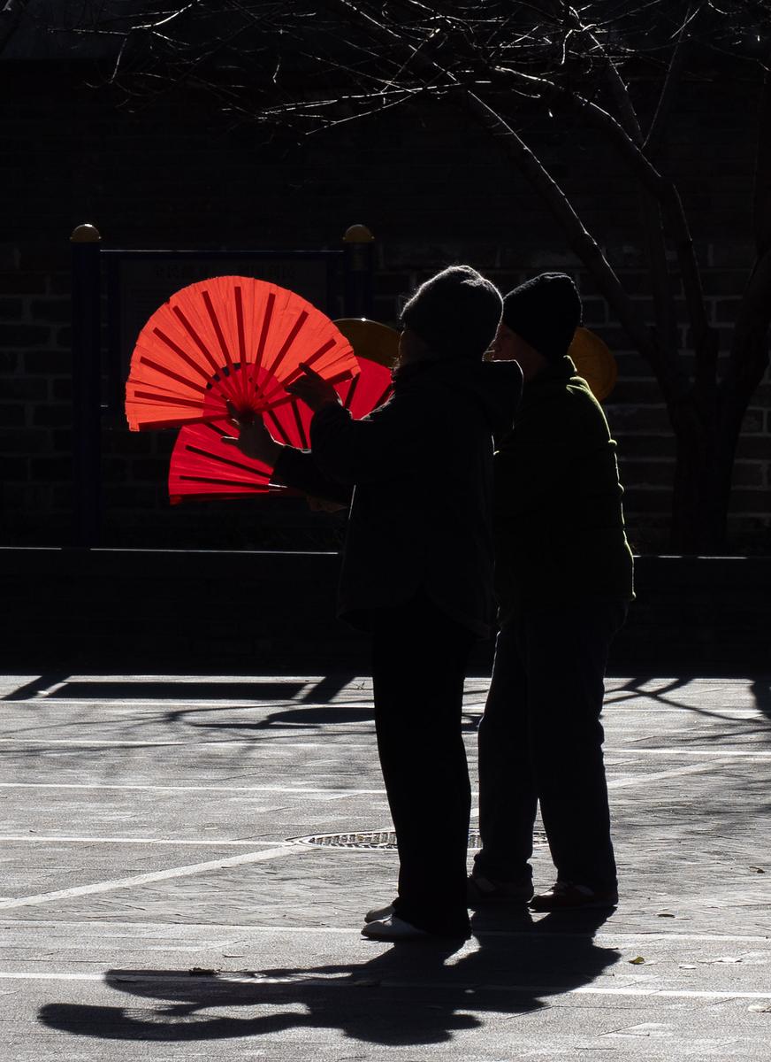
Fan Dance
In a Little Park by the Drum Tower in Beijing, I saw these two women practicing a fan dance. They were silhouetted by the low winter sunlight, which shone through their fans.
Your description emphasizes exactly what is attractive and effective in this image.
The backlighting not only illuminates the blood red fans, but also creates a nice backlighting halo effect on the first woman's hat.
And the little highlight is crucial in making us understand and appreciate the scene.
Imagine in your mind's eye the image without that highlight: the human figure would be lost in the background.The legs and feet are nicely silhouetted against the brightly lit pavement - and the shadows are nicely included in the image (no truncation).
But still I believe it would be a worthwhile experiment to crop this image radically.Not as an improvement, but as a second version.
You could consider a square almost-abstract showing only the torsos, hands, heads and fans, cropped just below the horizontal fine white stripe.*(That would be an image in true Frank Miller style - Frank Miller not a photographer but a graphic novel artist,
known from Sin City, 300 and other masterpieces of working with shadows and sparse light). *The original post from Pete breaks usual composition thinking and brings it off. The shots splits into a mainly black top section with figures picked out with lit outlines and the mainly bright bottom half with the same figures picked out as full silhouettes and black shadows. This alone makes the image a stand out. Then add the red fans. As Roel suggests, There are two photos here, each capable of standing on their own merits.
I prefer the original because of the audacity of the top/bottom split. In either case, I'd remove a couple of the bright horizontal lines around head level (but I'd be keeping those of the tree and the long horizontal around waist level. Those closer to the heads somewhat confuse the bright outlining of the heads. -
@ChrisOly has written:
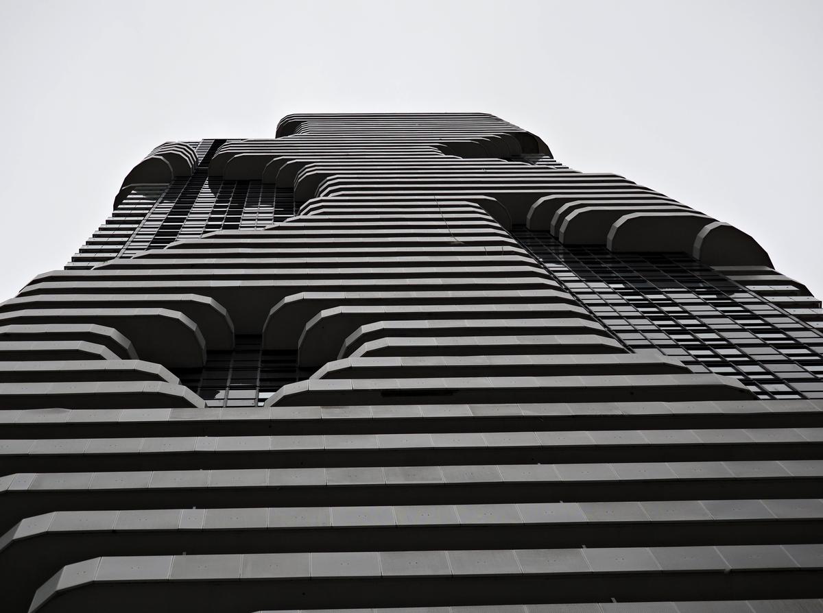
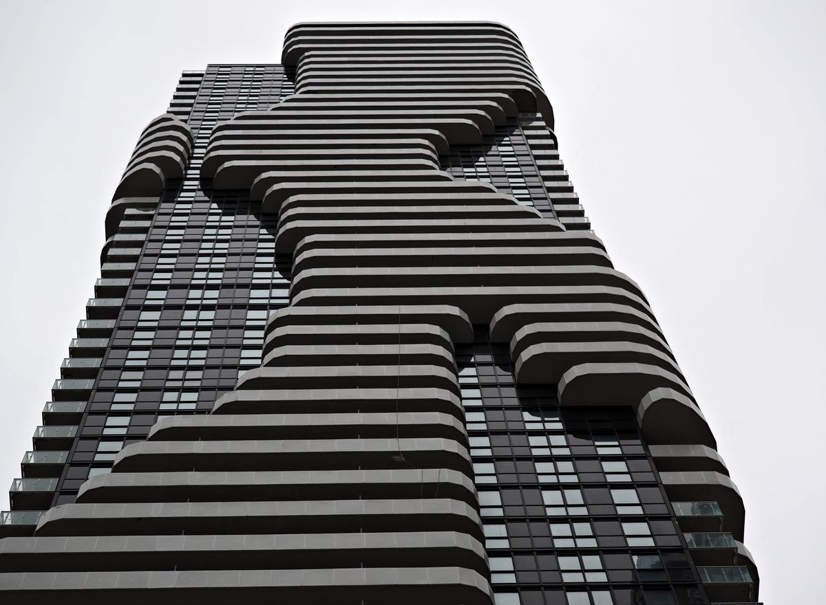
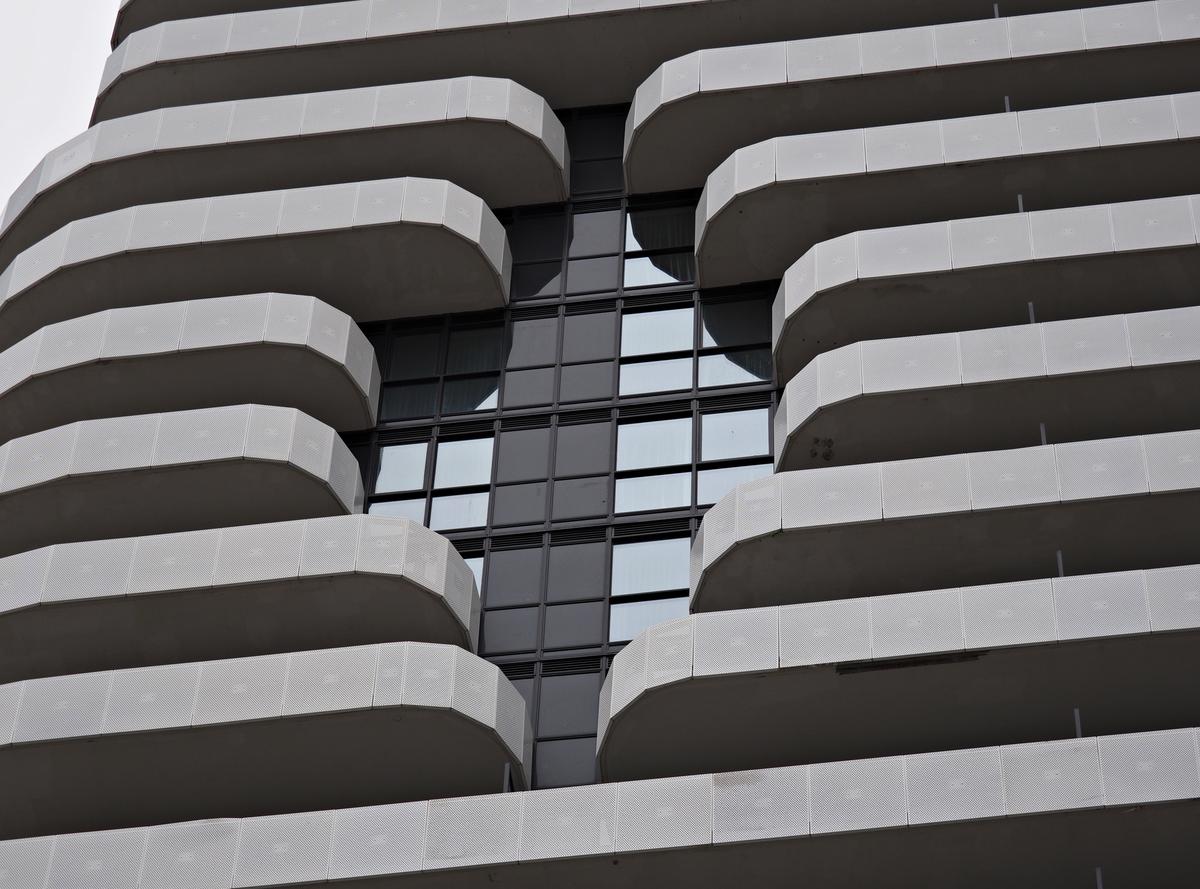
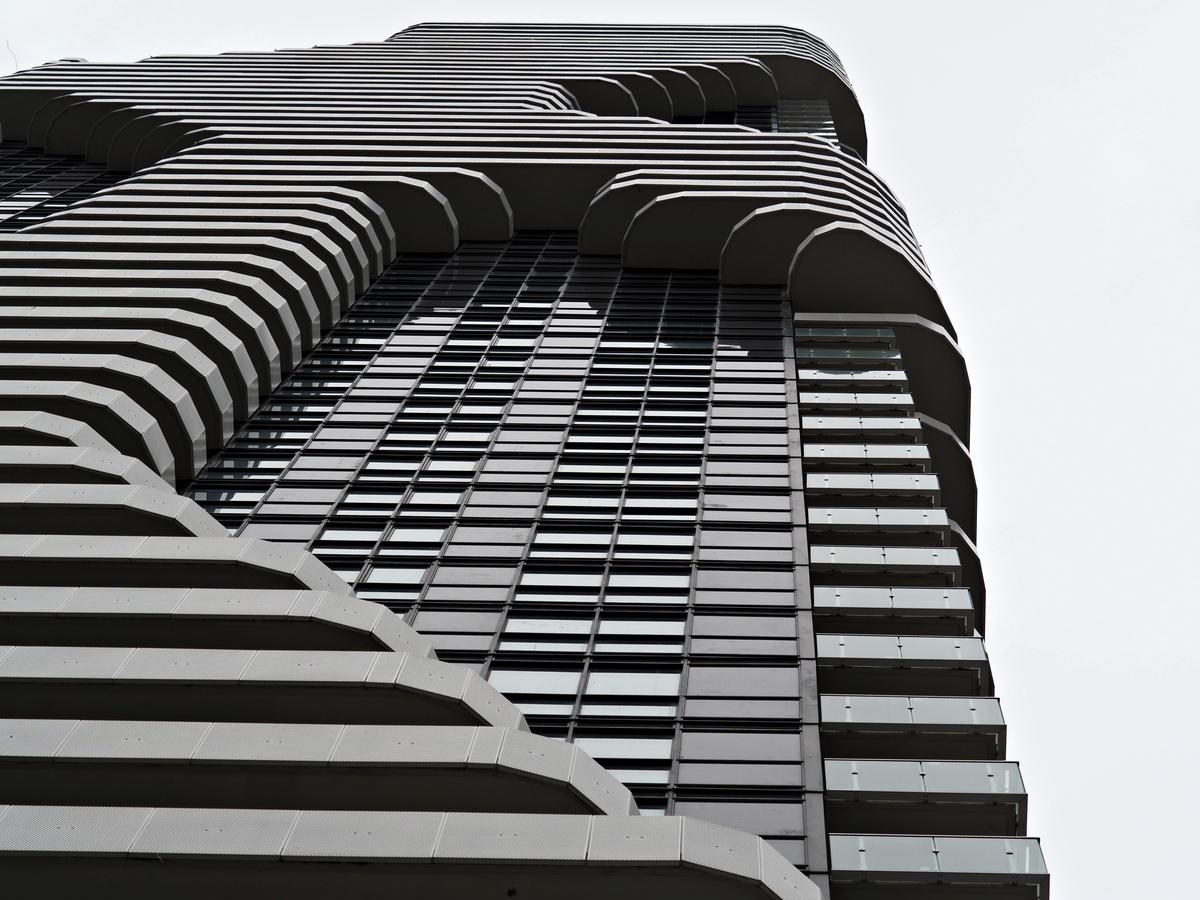
Glass cages - alienation
New housing development 50 km North of the city.
An extraordinary building. The architect had to be a photographer with B&W architecture in mind. It's a building worth returning to in different light and worth experimenting with various angles and processing.
I especially like the second shot that shows the overall pattern of the building face. I think this angle, from a little further away, makes the stripes of the upper levels stand out better. Considering these as a sequence, I'd start with your shot 2 and then use the close ups to go exploring.
How do these look with lots more contrast in the processing? -
@MikeFewster has written:@ChrisOly has written:
Glass cages - alienation
New housing development 50 km North of the city.
An extraordinary building. The architect had to be a photographer with B&W architecture in mind. It's a building worth returning to in different light and worth experimenting with various angles and processing.
I especially like the second shot that shows the overall pattern of the building face. I think this angle, from a little further away, makes the stripes of the upper levels stand out better. Considering these as a sequence, I'd start with your shot 2 and then use the close ups to go exploring.
How do these look with lots more contrast in the processing?Thank you Mike for your comments. The day I was there was cold, dark with no sun in sight. Naturally I intend to come back to this site since one can spend a couple of hours just to take it in and explore a number of possibilities for various angles and takes. It's rather unusual for architectural exploration to attract such an interest, but i am all for it. It's in a remote location, but this creates a big attraction for me as a result.
-
@ChrisOly has written:
Glass cages - alienation
New housing development 50 km North of the city.
This is an extraordinarily shaped building and your photos do a good job as showing us its different angles.
If I had to pick just one of the images (like: for an illustration in a book where only one photo can be shown), I would pick the second image because it is the most comprehensive and objective one. Images one and four are both closer, looking up, illustrating the shapes of the terraces as looming over us, while image 3 provides interesting detail. But number 2 is the one that "sells" the project and concept best. -
@ChrisOly has written:@MikeFewster has written:
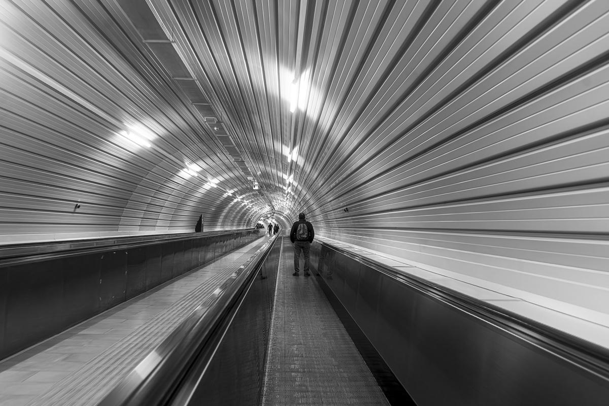
Perugia walkway.
Tunnel vision comes to mind. Well seen and executed.
This kind of tunnels lend themselves perfectly to make receding perspective images.
This is a good one, and B&W serves it well.
If I was in/on one of these walkways and I wanted to make a photo, I think I would be tempted to hold my camera as close to the wall as I could get away with, to exaggerate the extreme perspectives even further. -
Intriguing set of architectural images, well captured to show off the eye catching shapes the designer imbedded into these forms. Good use of shadow to highlight the indentations that remind me of one of those useless but addictive objects with a thousand little pins inside, that take the form of your hand. Black and white is definitely the right choice here, but I think you could create an interesting and surreal alternative set by pushing the blacks and whites further,
Good titling, BTW, sets the stage for how we perceive the set!
@ChrisOly has written:Glass cages - alienation
New housing development 50 km North of the city.
-
@RoelHendrickx has written:
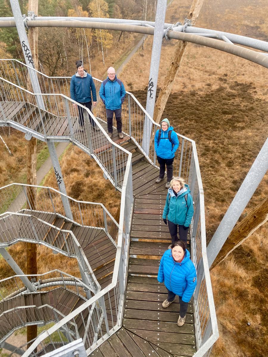
FLAESTOREN (FRIENDS ON A WALK)
This is the image I want to put up for your comments: a group portrait of our hiking fellowship:
The image you wanted a comment on shows the group of hiking friends, so quite apart from any artistic merit, it needs to be judged on how it suggests the friendship and activity.
Either by accident or design, they are all wearing the team colours of blue tops, dark trousers and boots in light colours. This unity in clothing suggests a strong link between the people. They are all smiling happily into the camera, indicating they are relaxed and content to be with each other. Together these signs do indeed suggest friendship.
The clothing is obviously for outdoors, and the scenery beneath them, and particularly the pathway, suggests walking, and because it runs straight through the frame without showing an obvious beginning or end, we get the idea of transit, a long walk. The fact that the weather does not look particularly inviting, shows the group is serious about their walking, and they are not on a pleasant fair-weather stroll after lunch. So, I think, the idea of serious, long-distance hiking is established too.
The group could have been photographed standing together as a close group, in one or two rows, maybe on top if a hill or in the middle of a forest. That would probably establish the friendship and hiking activity as well, but it would be a far more usual, expected and boring photo. Photographing the group from above already makes the photo more unusual and interesting, and then standing amongst the geometric lines of such an interesting structure elevates it further. The result is a photograph, which is interesting to fellow photographers and neutral observers, and not just to the group members themselves and their Mums. -
@minniev has written:
The old lighthouse on the island across from Munising harbor in Pictured Rocks National Park, on Lake Superior, Michigan. It once guided boats around Grand Island and into Munising harbor. It was rescued from ruin and is preserved to some extent (though not beautified) by a private restoration group. It was built in 1868. I bet it would be pretty in dramatic lighting but of course when you're traveling, you get what you get.
Camera: E-M1MarkIII/OLYMPUS CORPORATION ISO200 82mm (35mm eq. 164mm) 1/800s 𝑓/5.0
The idea of a lighthouse is to stand out and be noticed, but that is not the case here. There are so many wonderful autumn colours dominating, that we only see the lighthouse because the bright colours are missing, a similar effect to a silhouette portrait cut from black paper. It is an unusual and attractive way to see a lighthouse.
-
@simplejoy has written:
It might be a cliché shot, sure... but when I saw that leaf and the colors all around (including my jacket), I just had to take it regardless.

Hands of time by simple.joy, on FlickrI don’t think this is a cliché shot. It doesn’t cause me to recoil and say”Not again!”. In any case the reduced palette of colours throughout and the very appropriate swirly bokeh would make it stand out against similar images. I like it a lot.
-
@MikeFewster has written:
Perugia walkway.
Much of Perugia is built on a steep cliff face.
The city's solution has been to construct moving pathways underground.
There's a "but." It isn't easy for a visitor to know where these are.
It may only be a walkway, but those lights and lines trigger a visual signal we have seen in many films to suggest a much faster form of transport. Inter galactic travel in Star Wars or Star Trek or even time travel in Dr. Who, for instance. I think this brings a good tension to the image as we see a man standing, we understand he is moving slowly on a mechanised walkway, but have that superimposed subconsciously by super fast motion! Excellent.
-
@ChrisOly has written:
Glass cages - alienation
New housing development 50 km North of the city.
You have found a fascinating building, and I am pleased to hear you are thinking of returning to explore it more photographically. These photos are already extremely enjoyable, but returning to explore in different light, from different angles or with different focal lengths, are sure to give a harvest of good photos.
-
@PeteS has written:
Fan Dance
Thanks for the comments.
@RoelHendrickx : Yes, I think the dark half of the photo could produce a second version. The branches become a bit of a problem though, as they become a distraction, so some careful cropping or cloning would be required.
@MikeFewster : You are right about those shiny distractions near the women’s heads - they need to be removed. The editing was done on my iPad on the road, so I must address that when I do the final version on my desktop.
-
@MikeFewster has written:
Perugia walkway.
Much of Perugia is built on a steep cliff face.
The city's solution has been to construct moving pathways underground.
There's a "but." It isn't easy for a visitor to know where these are.
My mistake. This is Spoleto not Perugia. We had visited several towns in the Umbria region and they all have similar issues having been built on hill tops and steep slopes. Perugia has underground connections between levels as well.
