It must have been incredible experience watching the development of the event you took part in initially. Once in a lifetime I reckon.
-
-
@Sagittarius has written:
Clouds
Love the shot. The atmosphere, the locale, it's incredible.
-
@PeteS has written:
Transport
Taken two years ago in India
It's very unusual site, probably totally registered in your memory for ever.
-
@ChrisOly has written:
Legend
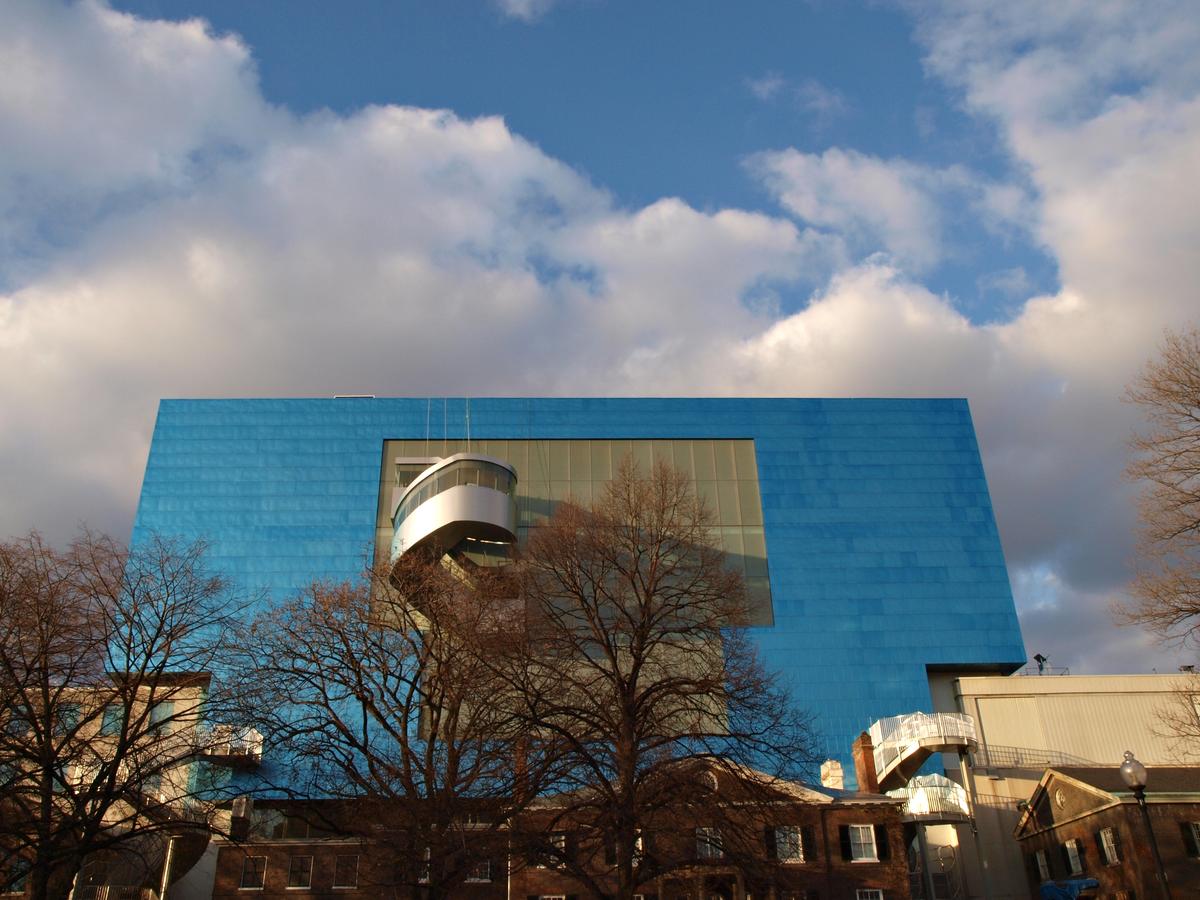
Renowned architect Frank Gehry passed away last week at 96. Toronto, Ontario, Canada born designer created one of the world's most iconic buildings
incuding Guggenheim Museum Bilbao in Spain, Walt Disney Concert Hall in L.A., Louis Vuitton Foundation in Paris etcThe pictures above represent reconstuction of Art Gallery of Ontario done in 2008.
More:
I am concentrating on the first two images here.
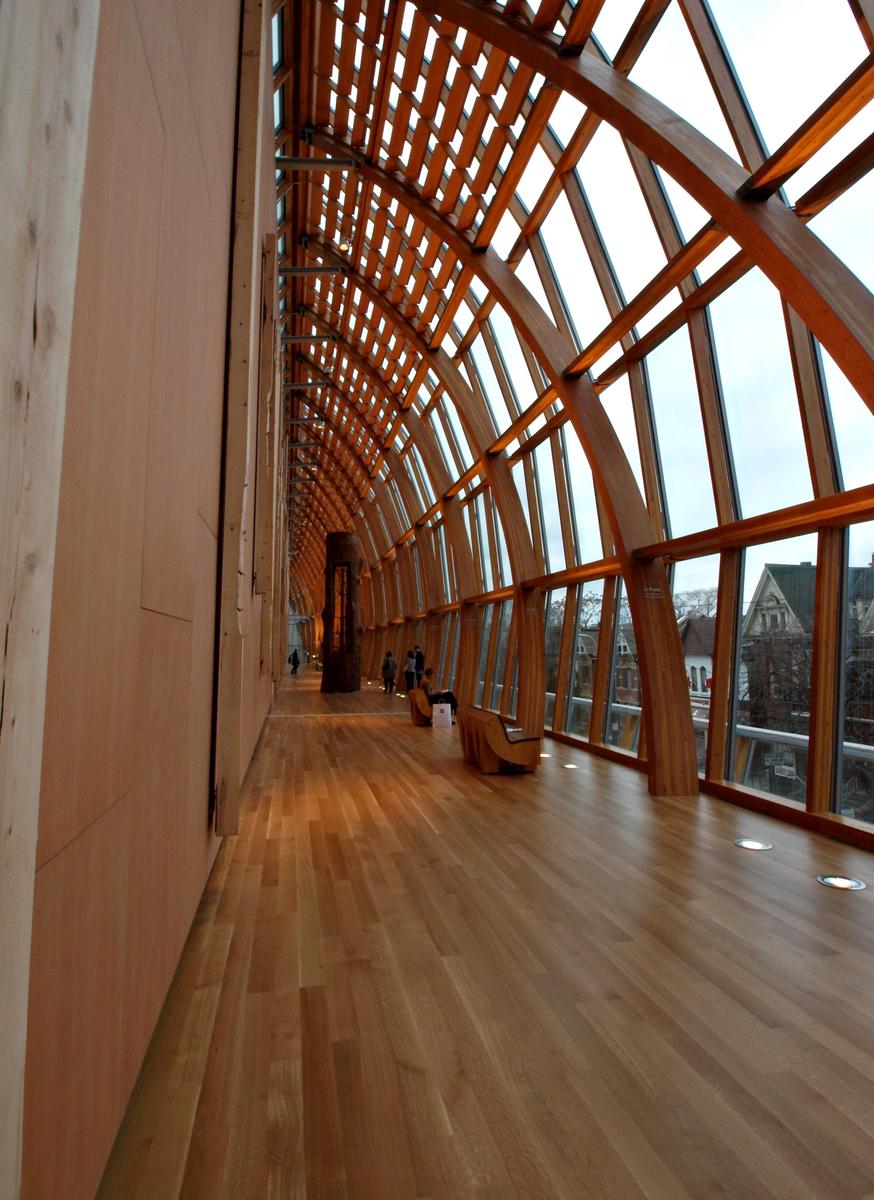
The third, with that exposed corridor, is nice in its own right, but the two others are more interlinked and tell a story about Gehry's architecture.You mention that the gallery underwent a reconstruction in 2008, so it is not a building that was completely built in that year, but rather renovated.
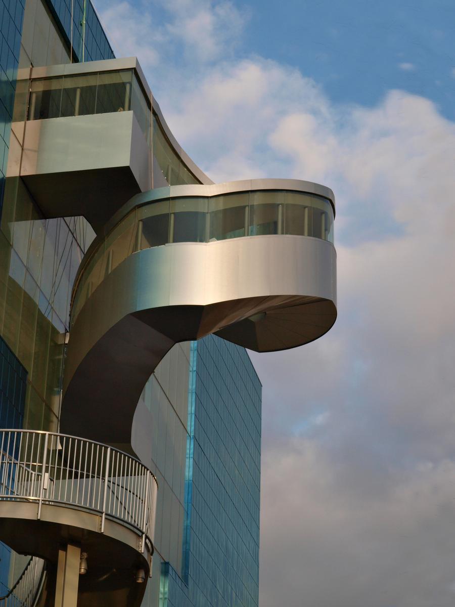
From that information, I assume that the big blue rectangular main structure was already there previously, and the quirky extrusion (a curved stairwell, I am guessing) was added later, and I also assume that Gehry was responsible for just that kind of alteration.The whimsical form gives the otherwise straight building extra character.
It reminds me a lot of the quite spectacular interior staircase (a double helix in shiny chrome) that was placed inside of the Fenix Migration Museum in Rotterdam, but that also bursts out of the building to create an elevated panorama platform. It is like a force of nature that cannot be contained by the straight lines of the former harbour warehouse. I may show images of this structure in a later edition.
-
@PeteS has written:
Transport
Taken two years ago in India
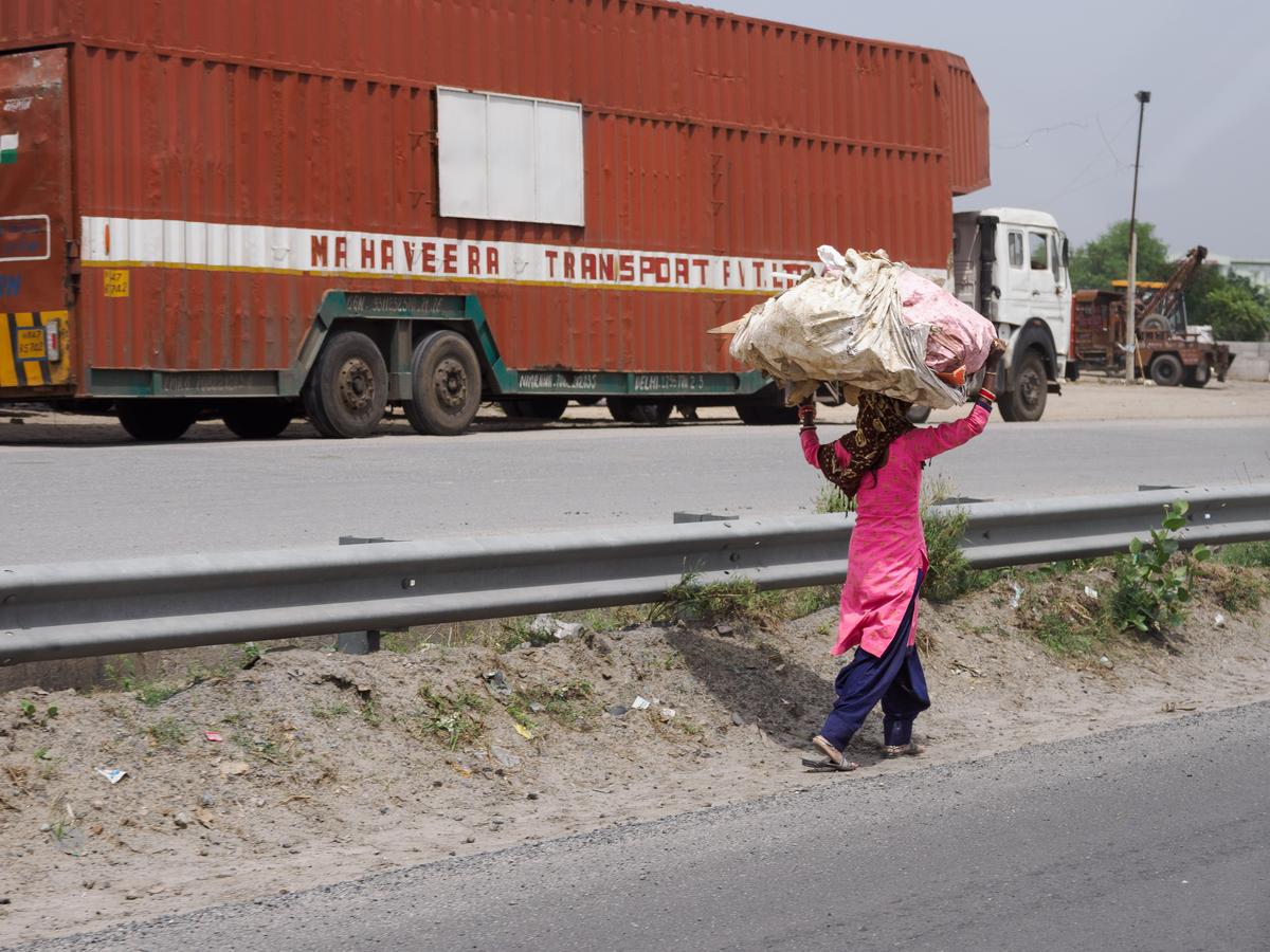
The whole essence of this image is obviously in the juxtaposition between the woman carrying her load on her head, and the word "transport" written in bold letters over the side of the oversized truck that is riding in the opposite direction. A great feat of timing in getting this image.
Because that juxtaposition is what the viewer should discover and appreciate, it does not need its title, or at least not THAT title.
If the photographer is unsure whether the audience will catch the irony, there are other means to draw closer attention to just the two main elements.
I could consider a tight crop that isolates the woman and the word. -
@RoelHendrickx has written:
LIBYA LIGHT
Back to our trip to the Libyan Sahara in April 2009.
Inbetween our forays into different parts of the surrounding desert landscapes (Fezzan, Meggedet, etc, some sandy, others rocky terrain) where we slept under the stars with our Tuareg companions, we made two stops in a small village, to stock up on supplies and petrol (and on one of those stops, also to take a shower).
The duration of those stops were a bit unpredictable, because it depended on how soon our crew was able to get the petrol for the landcruisers.
We relaxed, had something to eat, and the boys and girls got into a foosball match with some local youngsters (who got beaten by our young teenage girls, much to their friends' amusement).
I wandered off through the sandy streets of the town to look around and hunt for some photos.
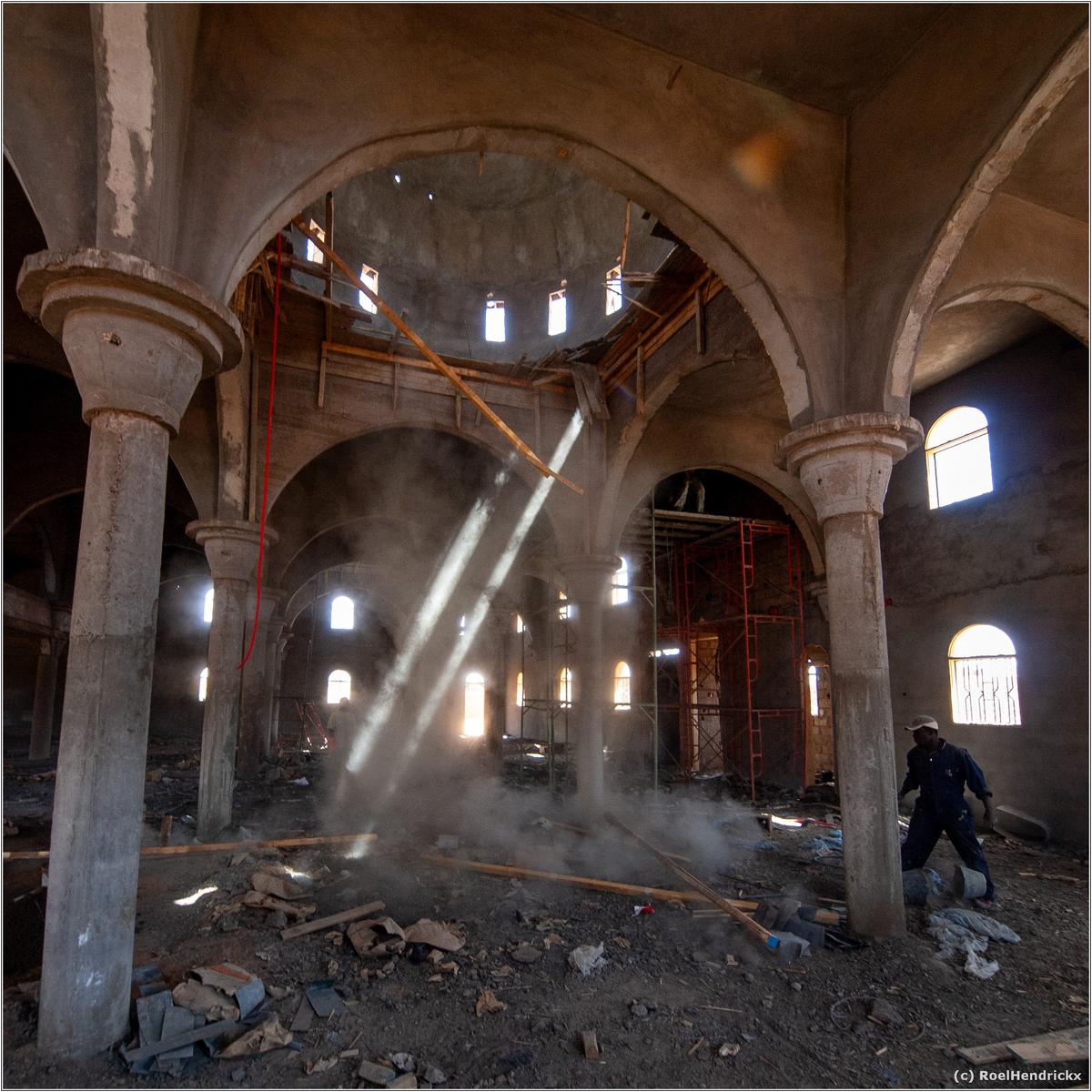
A door was open and I always consider that as an invitation.This ongoing one-man construction in a mosque (that was being torn down or renovated; the difference is not always clear) was one of the sights I found:
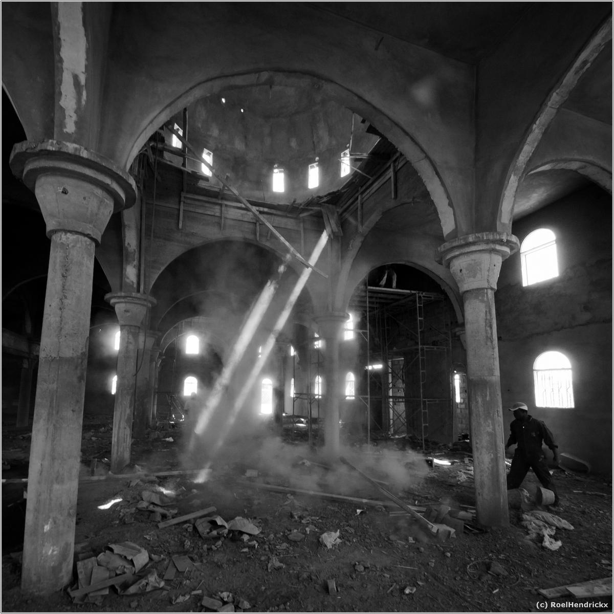
B&W version of same image:
At the time I carried the huge and heavy Olympus Zuiko 7-14mm F4 (equivalent 14-28mm) in my bag.
Sometimes a nuisance to be hauling that lens through the desert and on other travels, but sometimes worth the effort.The building is attractive and I think the uncertainty of whether this construction or destruction makes the photo even more interesting. The image is full of clear lines, mainly straight ones, but then there is the cloud of dust rising in the centre, which provides a net contrast and, perhaps even more important, makes the two rays of light visible. These can be seen as a link to Heaven.
Although the photo relies heavily on graphic details for its appeal, I actually prefer the colour version, mainly because it makes it easier to identify the rays of light as such, whereas in the B&W they could easily be planks of wood. There is not much colour present and mainly just shades of red, so they do not distract from the lines. -
@MikeFewster has written:
In the same spirit as last week's 'The expectation and the reality." post.
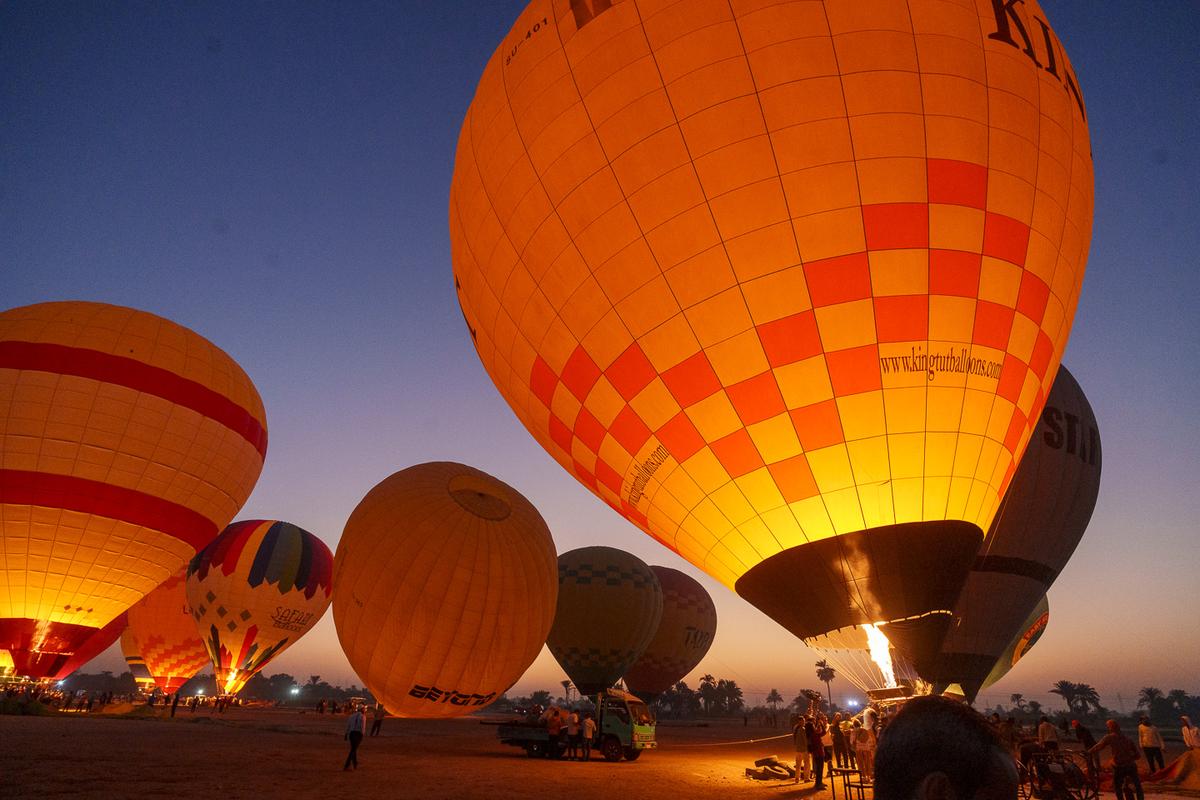
This time, "Hot Air Balloons at Luxor."
Photo 1. The launch.
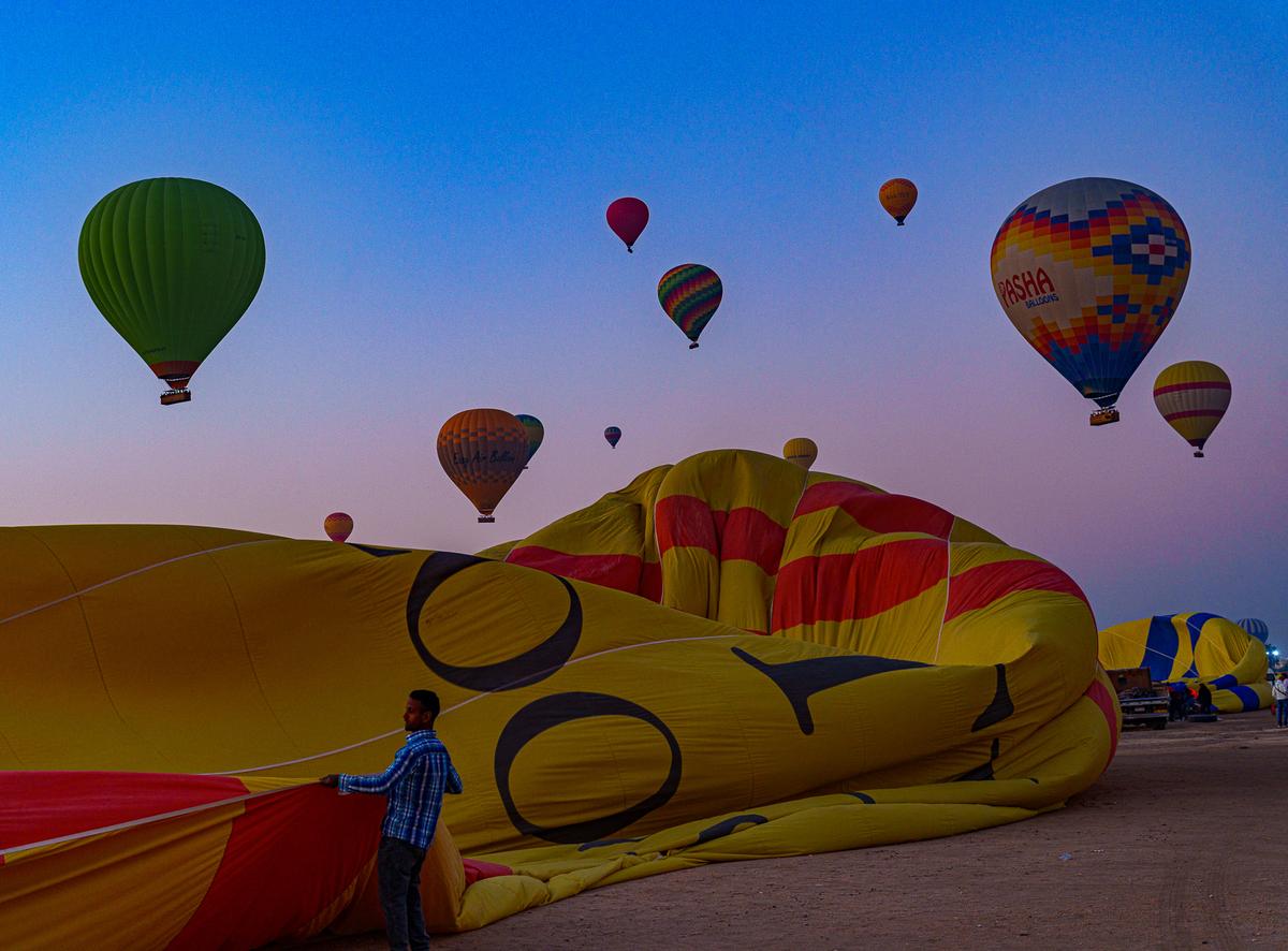
Photo 2. Us. Not a launch.
Actually, we were airborne but still tethered when flight control cancelled everyone still on the ground. High wind concerns.
Deflated but not complaining. Happy to see safety controls in place and being complied with.
I agree with comments already made that you have captured the bright/inflated and sombre/deflated moods of the (potential) passengers. The colours too convey that feeling, with the lively oranges and yellows in the first and then the second has blues and magentas as the brightest colours.
The missed opportunity to experience the flight is disappointing, but I am sure your record of what happened is not, and the third photo you posted is a nice addition too. -
@ChrisOly has written:
Legend
Renowned architect Frank Gehry passed away last week at 96. Toronto, Ontario, Canada born designer created one of the world's most iconic buildings
incuding Guggenheim Museum Bilbao in Spain, Walt Disney Concert Hall in L.A., Louis Vuitton Foundation in Paris etcThe pictures above represent reconstuction of Art Gallery of Ontario done in 2008.
More:
In terms of a series, I agree with Roel, that the third photo doesn’t really fit, and would need a few more to take the viewer inside the building first. However, as a single photos I like all three. I think you have caught very nice light in the first two, and managed to keep the highlights on the shiny surfaces under control.
The building itself looks cool too. -
@simplejoy has written:

A string of bad luck by simple.joy, on FlickrMy eyes are drawn towards the bright rectangle, but it is too bright, so the turn away and discover the broken string next door. Whether that was deliberate or not, it is a neat trick.
The photo is relatively simple, but it carries a message, which can be as deep as you wish. -
@Sagittarius has written:
Clouds
The clouds have an unusual and interesting shape, and the light is lovely. I like the left/right gradient from bright yellow sunlight to a darker blue sky, and also the lines of the beach and the clouds themselves seem to pull in that direction. Altogether it is a meditative and peaceful image.
-
@RoelHendrickx has written:@PeteS has written:
Transport
Taken two years ago in India
The whole essence of this image is obviously in the juxtaposition between the woman carrying her load on her head, and the word "transport" written in bold letters over the side of the oversized truck that is riding in the opposite direction. A great feat of timing in getting this image.
Because that juxtaposition is what the viewer should discover and appreciate, it does not need its title, or at least not THAT title.
If the photographer is unsure whether the audience will catch the irony, there are other means to draw closer attention to just the two main elements.
I could consider a tight crop that isolates the woman and the word.Yes, you have a good point about the title! I am not so keen on the crop idea though, because there are .a few more contrasting things I hoped would come across, but presumably didn’t. One of them was the difference in size between the two forms of transport, which would be lost in the crop. Also the contrast between the drab brown lorry and the brightly patterned clothes and the bangles of the woman, and the flat slab sides of the trailer and the amorphous and interesting bundle carried by the woman. Despite the different sizes of the bundle and the trailer, they are both large specimens of their kind.
There is another thing that I, as the photographer, like, but which I was not able to convey to the viewer, was that the huge lorry was safely parked in a rest area, whilst the woman was walking along the busy motorway…. -
@simplejoy has written:

A string of bad luck by simple.joy, on FlickrAlmost missed simplejoy's post. I'd seen it and made notes but then forgot to actually reply.
A musical instrument with a broken string is rich in interpretive possibilities. Life, performance, music, art... it goes on and on. We don't need to be specific, we can feel the potential. Art's like that. It's a potential rather than a precise meaning that is supported by the photo. Only a couple of strings are in sharp focus. The rest, including the guitar, is indistinct. The highlight here is a visual treasure. It somewhat repeats the size and form of the guitar. A window, a doorway, an opportunity - still to be realized, maybe lost?
Superb conjuring up of stories here.
