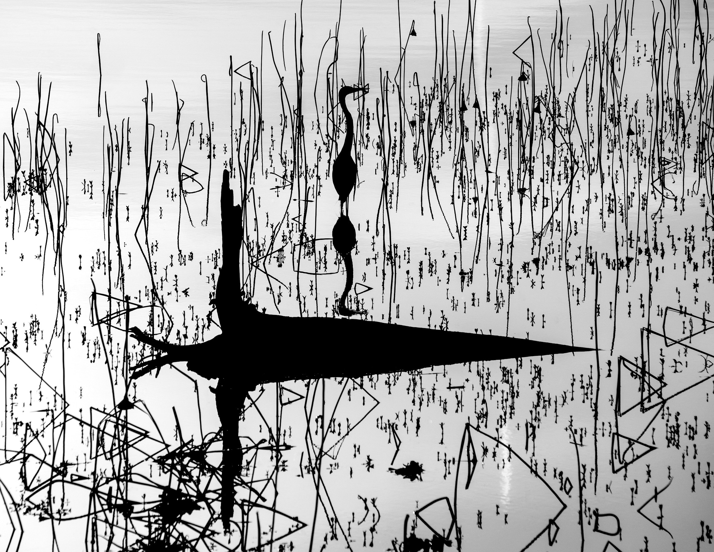
How does this look?
May 10, 2025
26
-

Alan,
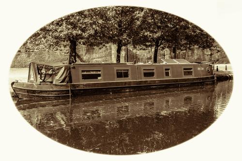
It looks like a period piece.
Add a little grain to it, and it looks like it could have come out of the 1800's 😃
Steve
-

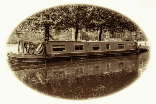
Thanks for the detailed ideas, I always appreciate someone taking time to fiddle with and explain things they discovered about my pictures. Could you share your own experiment to show me where you went with it?
In capture and in editing I was working deliberately towards a highly graphic image. Converting to b&w made it even more so than it was in the natural golds of the original. I'm a big believer in finding multiple versions of a single capture, so I'm interested in your take on it.
-
Here you are😊
-

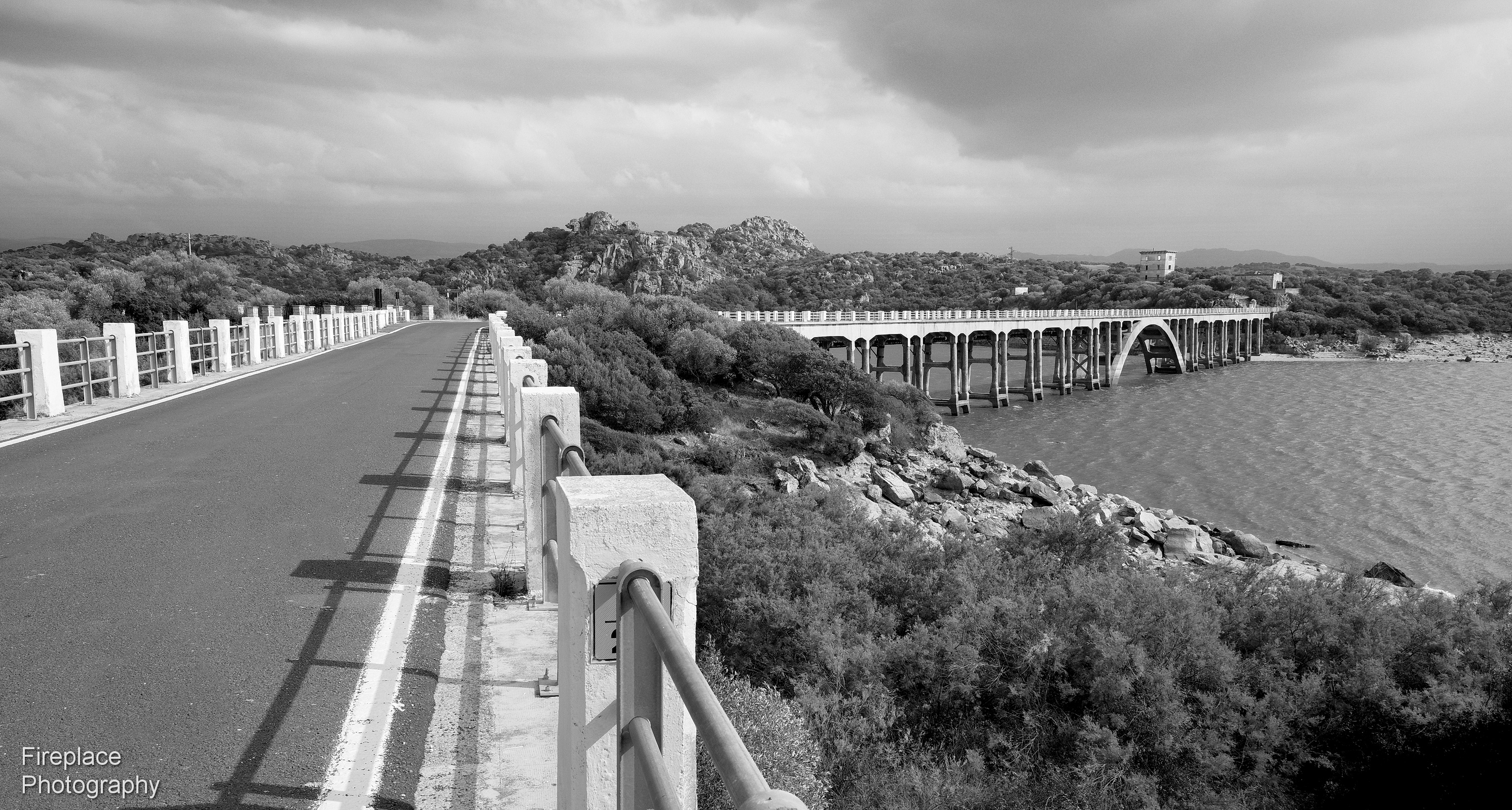
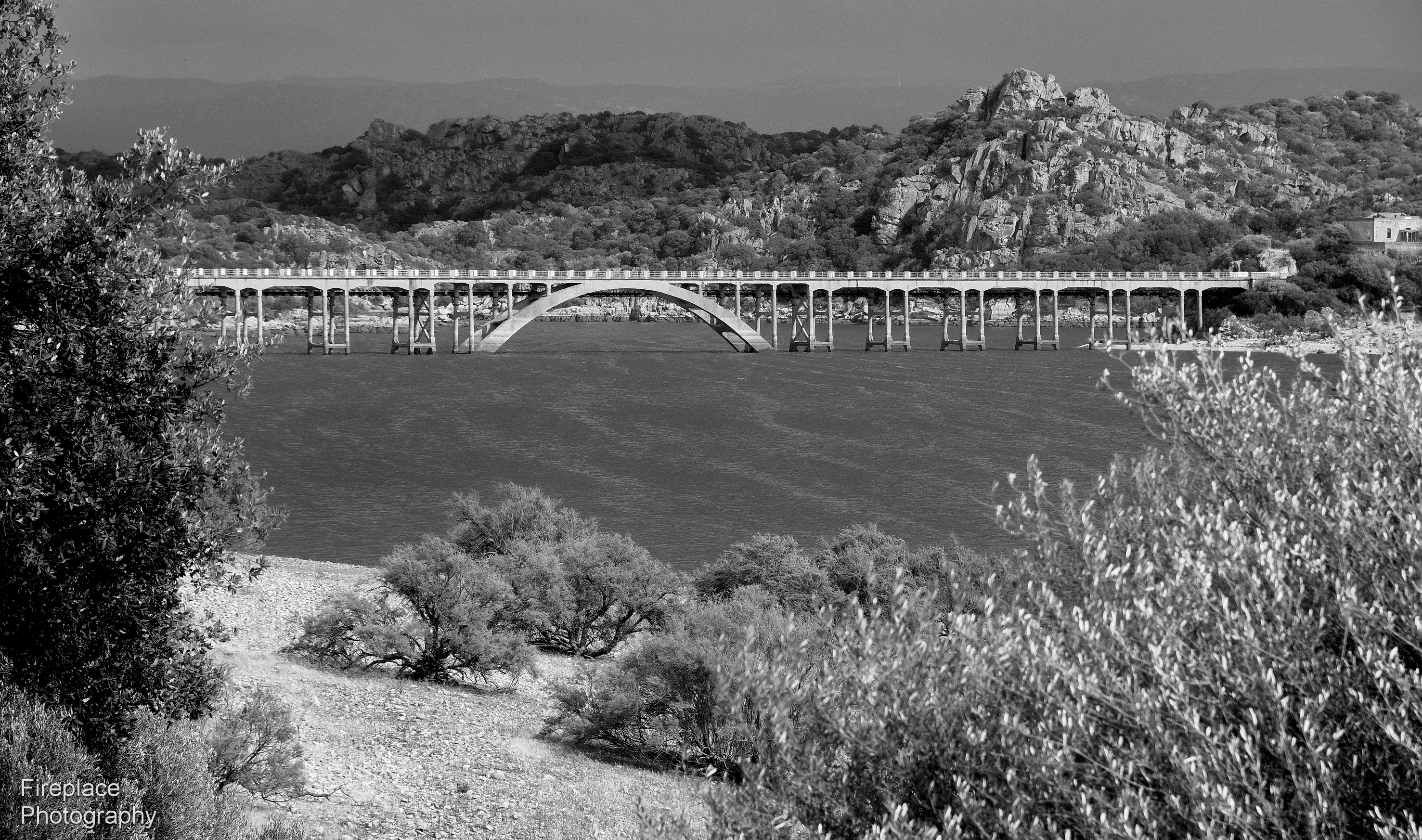
A bridge in Sardinia
Here's two views of a bridge we crossed somewhere on Sardinia, in 2016
-

[quote="@Fireplace33"]
A bridge in Sardinia
Here's two views of a bridge we crossed somewhere on Sardinia, in 2016
I particularly like the one above for its leading lines accentuated by the wide angle. I would probably jack up the contrast, but that's just me.
-

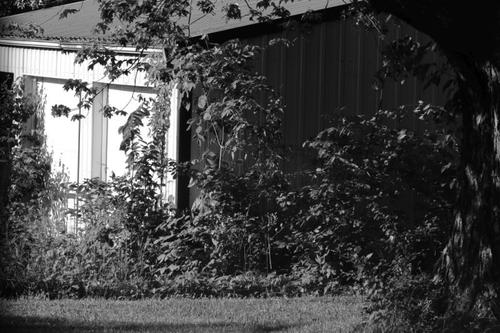
Sorry, was away fro a few days, don't log into social media on the phone...
Here it is, quite subtle:
-
Alan,
Looks good.
Steve
-
Spot metered on the barn door.
Steve Thomas