This relates to a personal preference so it shouldn't be taken as a negative comment.
I like looking at old photos but modern photos that are processed to look like old photos aren't my cup of tea. I'm the same with cameras. Old cameras- fine. Digital cameras that try to look "retro", again not my cuppa.
All of which makes it hard to explain why I like B&W.
Feb. 9, 2025
40
-

-
A shot that grabs attention. The composition is bold with the main objects suspended from the top of the frame. There's plenty of contrast so they stand out. Then there's the "What are we looking at"? factor.
B&W brings up the points and the varying textures and transparency of the ice. -
I'm unsure about how to discuss these. As individual shots or as a series? There are too many for individual discussion. You have about two month's worth of posts here.
Some might be part of the same performance, others, maybe not so I don't know how to approach them as a series either. If they are a series, I think the style should be consistent. The third and final shots don't look to belong with the others.
Re the multi images I'd guess strobe lighting or stage lights flashing. -
joman's title is important on this shot. It adds layers of meaning to the doorway.
We need to see the image larger. Something is written behind the doorhandle but I can't read it. It feels like it might be significant as we interpret the door and the opportunities.
I don't get too fussed by vertical/horizontal accuracy but in this shot horizontals dip to the left is unsettling. If the angle was increased another, say, ten degrees, the question posed by the title would have gained another dimension. -
Yes, I think it has the tonality for B&W.
The figure on the left entering the exit only got my attention. What is he doing going ? The photo show a longish empty walk in front of him. No one else is around.
Consider givibf a bit more attention to him by cropping off some of the dark area to the left of the lit Exit entrance. -
minniev, I know you will know this image.
sothebys-md.brightspotcdn.com/42/c5/3dfb7fcc4fb9a639e7c3e3fa0ebc/071n11109-c7m58-t1-03-cropped.jpgClouds and a moon like this are heaven sent for photographers. It might have been tempting to increase the blacks to something like the Adams level and I'm glad you didn't. It remains your vision and your image with a delicacy to the reflections in the water rather than the starkness of the Adams' scene.
one point, and I'm not sure about this. the clouds look as though they have received additional burning in pp. In a few areas it looks a little heavy?
It's still glorious. -

These are pictures of one particular show.
I am not particularly interested in the single image. I prefer to present a small, or maybe large picture story. My photographic style, is very much influenced by the picture stories in the "colour magazines" of the seventies and Eighties, that were in the Life tradition. I think you need to look at this set as a reportage on the show, where I have shown some "straight" actor portrait shots, together with some of the stranger scenic effects this company achieved. This is pretty much what the companies I worked for wanted to illustrate a program
Yes, the used a disco strobe.
-
We have been having some discussion elsewhere about whether or not B&W and Documentary are one or two genres.
I see Documentary as quite different. A series of images is presented as reportage or telling some form of story. In Weekly C&C for example we have had series that document events like the construction of a building or a major engineering project. I look at a series quite differently to the way I look at an individual image. The sequencing becomes important. There may be a mix of "locating" and "detail" images and other kinds of images to convey the story.
Should we have "Documentary" as a separate category? I'd be interested in opinions. -
The way I look at it is Black and White is a medium, not a genre nor a style. Photojournalism and Social Documentary, ah. la. Dorothea Lange, W. Eugene Smith, Robert Capa, etc., or Street photographers like Gary Winogrand, HBC, etc. worked in the medium. Landscape photographers, ah. la. Ansel Adams, Clyde Butcher, Brian Barnbaum work or worked in the medium of Black and White, although Barnbaum has worked in color also. Black and White is genre and subject invariant. Color photography is genre and subject invariant. I am not sure I would equate the photo essays of say W. Eugene Smith, "Country Doctor", "Dream Street the Pittsburg Project", "Minamata", "Jazz Loft Project", etc. to the documentation of a construction or engineering project.
-

I really like the delicacy of this image, with its nicely blurred background, old fashioned vignetting, and sepia toning. I'm a big fan of antique prints, and that's what this looks like.
-
Love all the lines and details and contrasts, which are so much stronger in black and white than they might have been in color. But the icing on the cake is that lone figure, rendered in black, moving along the gradient of light on the wall. Well done.
-
Regardless of how they were done they are fascinating examples of creative captures.
-
I'm exploring this topic a little because elsewhere we are thinking about the various categories being used in The Photo and I'm gathering opinions.
I'd see all the photo essays you mention as being in the same category as an engineering project. They are all using a series of images to tell a story of some sort. To me, it doesn't matter that the stories are quite different. I think of a documentary as a compiling of images to tell a story. The selection and sequencing of the images should be done purposefully to communicate the story. Whether or not the images should be B&W or colour is an aspect of the photographer's story telling technique. Therefore, if I'm looking at a series of photos, I'll be looking at the relationship between the images rather than looking at them as individual images. -
In general, documentary arises out of photojournalism as actually does street photography. You are right about the story needing to be laid out in a consistent and coherent manner. A documentary allows much deeper and nuanced story to be told than could be told by a photojournalist in a single image. There are few images that are so profound that they can tell a complex story standing along. I have only seen a few images that are so profound, "Migrant Mother" by Dorothea Lange, W. Eugene Smith's of a smiling Harry Truman holding up a copy of the Chicago Tribune announcing his demise, Nick Ut's Napalm Girl, Eddie Adams's, "Saigon Execution", Steve McCurry's "Afghan Girl" come to mind.
www.life.com/history/dewey-defeats-truman-the-story-behind-a-classic-political-photo/
People often forget the body of the wonderful work Dorothea Lange did for the Farm Service Administration during the dust bowl/depression era. While "Migrant Mother" is a powerful image - it was simply one page in the long story of the era. To me a documentary to be successful the whole should be greater than the sum of its parts.
-

This is a set of really interesting shots. I bet you had a lot of fun taking them and also watching the theatre group perform. Good memories!
-

As in the movies, the listener makes the narrator more interesting.
This is very well done in this photo, as the chosen aperture means that only the narrator catches the eye.
And what an interesting face this old man has... -
An excellent photo.
Landscape, composition, tonality... is really beautiful.
The moon and its reflection is the icing on the cake. -
tprevatt wrote "To me a documentary to be successful the whole should be greater than the sum of its parts."
That sums it up nicely.
I'm still thinking about whether on The Photo we should run Documentary as a separate category. Documentary is often B&W but there is plenty of it in colour as well. It seems to me that the story telling of a series is the main consideration that would be discussed in a Documantary, Whether the series is in B&W or colour is an aspect of the story telling choices made by the photographer. Text is legitimate in documentary. The words used and where they are positioned can be critical to the impact of the piece.
I'm inclined to want Documentary in its own forum. It could become an exciting collection of all kinds of stories. Having it apart might also encourage members to give it a try. -
It is an interesting proposition. The only drawbacks may be logistics, the number of images required and today how important is video, al. la. Ken Burns. The classic photo essay of which I have a few few sitting on my coffee table may be more of what is viable on a photo site. However, "Dream Street - the Pittsburg Project" is about 200 pages long. 😉 We can't underestimate the accompanying text that fills out the story and provide continuity.
-
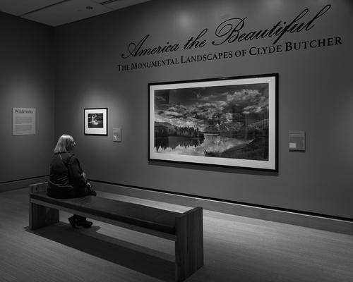
Facing Mt. Moran over Oxbow Bend in the Grand Tetons and Inspiration Point in Yosemite NP are two of the most iconic areas for photography in the American West. I like this image and I particularly like the moon and reflection in the smooth waters pitted agains Mt. Moran as compositional elements. The water in the Snake is not flat and glassy but the reflections are nonetheless present and the this image has a mirror like symmetry around the horizontal center line. Rule - never put the horizon or center line in the center of the frame. Just goes to show that rules are there to be broken. Nicely seen.
My favorite rendition of this scene is the on by Clyde Butcher. The day he took his was after several trials of getting up at 4 AM, setting up and hoping the light would cooperate. Most days it didn't. Then one morning as the sun rose over his back, the winds were calm the water was like glass, the skies were dramatic and this was the result.
clydebutcher.com/s/photographs/united-states/all-us/oxbow-bend-63/
This image is particularly stunning in the in the 6 foot by 8 foot print that at the Clyde Butcher - America the Beautiful and Ansel Adams Masterworks exhibit held at the James Museum of Western Art in St. Pete, FL a few years ago. An entire floor of two of the most iconic landscape photographers together.
creativepinellas.org/magazine/the-photographic-landscapes-of-ansel-adams-and-clyde-butcher/
We made a weekend of this event, spending hours looking at the artwork having a nice dinner at an Arminian restaurant. We spent the next morning photographing as the sun rose over the Tampa Bay. The wonderful about the James is they allow patrons to use their cameras (without any flash). I had just received by Leica Q2M and caught this image of a patron enjoying Butcher's image.
-
This one tells a story (to me) of opposites - beauty and rubbish
-
The kind of sharp observation that is relished in street photography. Plus the repetition of rectangular shapes, each framing a different message, that adds visual power to the message.
So much to enjoy here. -
Thank you Mike. You see even more in there than I did.
Alan