Thank you very much - now I got it!
-
-
I may fire up my DSLR one of these days and copy some slides to post, but the images look much better on a light box than on a computer monitor!
-
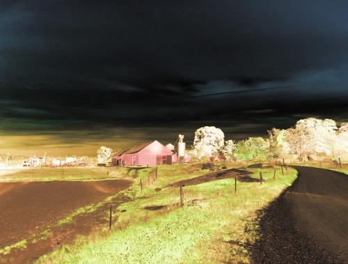
I've done something similar by extracting the channels for HSV hue and saturation and combine them back, simply leaving the value channel out.
It doesn't work with HSL if you don't use all three channels. But you can get dramatic effects if you extract hue and saturation and use one of them twice, i.e. use it for lightness also. I don't remember if I used hue or saturation here.
-
Excellent - looking forward to it! I don't have anything to digitize myself, even though I probably have some of the greatest lenses ever for that... 😅 Do you prefer shooting your slides with a DSLR compared to a high end scanner, like the Nikon Coolscan or Minolta DiMage Elite series?
-
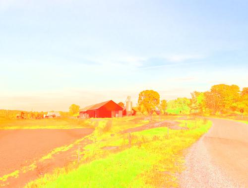
This made me remember a mistake I made a few years ago. I was going to use curves and a density mask. I clicked the wrong button and instead of loading the mask I applied the curve for the mask to the histogram. Since the mask was for midtones the curve was cut at the ends. The result was surprising. Playing with color spaces and different curves creates all sorts of effects. I posted about it at DPR, so I just link to that.
www.dpreview.com/forums/post/65440597 (more test images in the replies) -
Really interesting results - thanks for mentioning and explaining it!
-
Don't know what it can be used for. Maybe a poster in a certain style. But it was fun to discover and play with. And playing is what it's all about, right? 😛
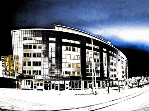
I actually like this more minimalist result from using HSL. But the right image is needed or it just becomes drab. Think it works for this monstrosity of a building.
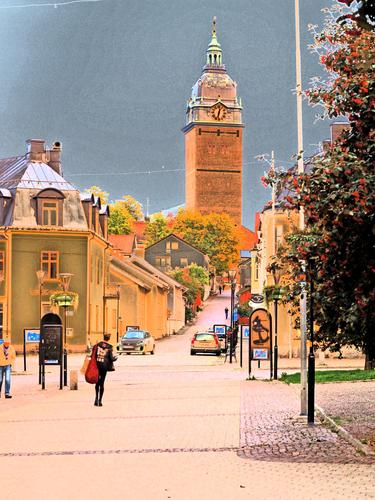
This (HSV) also turned out pleasant.
Dragging the end points in a bit makes for more subdued tones.
-
Interesting experiments
-
......
-
This is a bug test and the post can be deleted if an admin sees it.


