• March 27, 2025, 4:41 p.m.

    Bryan,

    Thanks for your comments and links. Here's my comments back again.

    We are not changing forum s/w. We would lose everything we have done so far. I've spend a lot of time looking into this and it's not practical to do so at the moment. If Misago fails (for whatever reason), then we may have to do that, but apart from Threaded view, it does everything we need (or it will do once we get to the next major version).

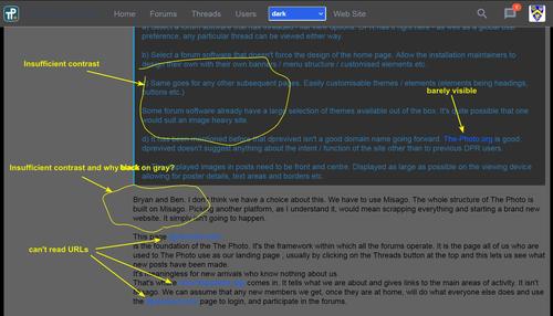
    The cameraderie site looks nice, but to my eyes, has far too much on the home page. If I were a newcomer, I'd get lost knowing where to go first. It's also not that friendly on a mobile phone.

    There's only me editing the web site and the forum structures. So, whatever is planned has to fit into my timetables. And I am not available 100% of the time. Martin (the maintainer of Misago) has even less time than me. Arvo has been really helpful modifying the CSS code so we can hide things/change colours etc and that has helped a lot.

    Given the above, I think we are in a reasonable place to move forward.The aim is to help people produce and enjoy photos - do we meet that aim? I think so.

    Nigel, thank you for your comment above.

    Mike, Yes, I think the web site meets the aims you mention.

    I intend to get another URL which has 'the-photo' in it so that we have a web site link and a forum link.

    There MAY be a possbility (but there may not), than I can embed the forum inside the web site, but that relies on Martin doing something and it may be that the structure there won't allow that.

    Alan

  • Members 776 posts
    March 27, 2025, 6:12 p.m.

    At 85, the dark theme suits me better than the gray-on-gray found here in DPrevived.

    Screenshot - clicking on buttons/links won't work ...
    cameraderie.jpg

    cameraderie.jpg

    JPG, 564.6 KB, uploaded by xpatUSA on March 27, 2025.

  • March 27, 2025, 6:18 p.m.

    Have you tried to choose dark theme from "Choose style" popup here?

  • Members 776 posts
    March 27, 2025, 6:45 p.m.

    Yes:
    dark.jpg

    The URL in blue is not possible to read with my vision. Remember Y'=0.3R+0.6G+0.1B ?

    Other sites offer white text on black or dark gray which is easy for me. My eyes need high-contrast text.

    dark.jpg

    JPG, 208.0 KB, uploaded by xpatUSA on March 27, 2025.

  • March 27, 2025, 6:54 p.m.

    Can you please hit Ctrl+F5 to reload site fully? At least for week (if not two) dark theme should look like next:

    image.png

    image.png

    PNG, 112.8 KB, uploaded by ArvoJ on March 27, 2025.

  • Members 776 posts
    March 27, 2025, 7:34 p.m.

    Slightly better but:
    dark comments.jpg

    dark comments.jpg

    JPG, 654.0 KB, uploaded by xpatUSA on March 27, 2025.

  • Members 776 posts
    March 27, 2025, 8:21 p.m.

    Sorry for the delay, my router is acting up.

    FireFox, Wndows 7, old 4-core Dell.

    Found this under settings:

    firefox theme.jpg

    I set it to automatic and the appearance has changed. Because FireFox is messing with theme appearance on my screen, I withdraw my comment.

    Thanks for the help!

    firefox theme.jpg

    JPG, 175.5 KB, uploaded by xpatUSA on March 27, 2025.

  • March 27, 2025, 8:25 p.m.

    The web site also has a dark mode - have you found that?

    Alan

  • March 27, 2025, 8:28 p.m.

    Can you tell me Firefox version? I created theme to be compatible with last year CSS options, it is possible that I didn't declare enough fallbacks for older versions - and browsers do not offer updates for Windows 7 for some time already.

  • Members 776 posts
    March 27, 2025, 8:31 p.m.

    Arvo has already pointed that out, Alan.

  • Members 776 posts
    March 27, 2025, 8:35 p.m.

    115.21.0esr (64bit). Good point about Win 7.

    For the time being, I will continue with the DPrevived 'original' theme.

  • March 27, 2025, 8:47 p.m.

    Well, sorry, Firefox 115 is not compatible; most likely even current 'light' theme looks wrong. Means that I need to define couple of fallbacks for older browsers (on Windows 7) - nothing impossible, but takes some time.

  • Members 776 posts
    March 27, 2025, 9:19 p.m.

    Thanks Arvo. No need to rush for me and you have opened my eyes as regards theme appearances.

  • Members 1363 posts
    March 27, 2025, 10:39 p.m.

    That's called throwing the baby out with the bathwater.

    I said it wasn't what I would do. It's just an example.
    I have also said at various times, pick out what works, ignore what doesn't. Use the "nice" bits...

    What I see on their site is photos. It smacks of a photography site.

    Why can't Misago be installed in a folder under The-Photo?

    The-Photo/Index.html - the landing page

    The-Photo/Forum/
    The-Photo/Forum/All Misago stuff...

  • March 27, 2025, 10:49 p.m.

    It probably can - or I can frig the system enough so it appears to be like that. To be honest, I hadn't thought of doing that. I will see if Martin can provide me with enough information to do that. But it depends on where they've put everything (the-photo.org is actually in dprevived.com/download)

  • Members 1896 posts
    March 28, 2025, 1:01 a.m.

    Thank you NCV. That's the information we need before we can move forward. Do you think the web page adequately describes what The Photo is about? I'm especially interested in whether you read the "Our Focus box and then clicked on "read more."

  • Members 1896 posts
    March 28, 2025, 1:22 a.m.

    What would be the advantage to us in doing this?

    I'll say it again. Whether or not the web page explains the concept of what The Photo is trying to do is critical. If it isn't doing this, we can't proceed. Ben and NCV have given the only feedback we have on this. Ben seems to say he didn't get the concept. I'm not sure what he looked at and so I asked him more specifically but he hasn't replied. NCV says it works Check his post in this thread and my reply.

    What we have to know is whether the web/landing page gives newcomers an idea of what we are about. If it doesn't, we have to understand and fix it, We will only get one chance at the current strategy to get more members. We have quite a small time window in which to try the membership plan and time is running out.
    My big worry is the Our Focus and "read more" section at the bottom of the page. I didn't want to point this out to Ben, I needed him to find or not find it himself. Is this section cut off on browsers? Do people bother reading it? If they do, do they get it? If feedback suggests it isn't working, we have to re do the web/landing page so it is taken on board. Apart from Our Focus, we only have the slogan at the top of the page and the selected quotes.
    Does anyone else have a comment to make on this?