Yes, but it can go at the bottom of the page.
Alan
Yes, but it can go at the bottom of the page.
Alan

I don't know Alan. If people are seeing it and understanding it where it is, it can stay as it is.
If they aren't, we have to do something about it. Only Ben has given us some feedback about the statement and he didn't seem to get it. "Easy to understand" is encouraging as far as the operation of the page is concerned. I want more feedback about whether www.the-photo.org/ communicates our concept before we use it for recruiting.
Without more feedback, I don't know what to think.
I have a couple of busy days coming up and I wont be back at the computer until late tonight to look at what is happening.
In the fifties I used to buy a monthly booklet by that name, IIRC. Relationship to that website is unknown to me.

Page looks fabulous. Cleaner and easier read. Superb job AlanSh.
Thanks,
barondla
A quick message. I'll try to spend more time on it tonight.
Well done Alan. those changes have really helped.
But. We are still not getting answers about the Our Focus section. Some of this may depend on the monitor being used.
Are people seeing and reading Our Focus? Are they OK with what is being said? Are they opening the "read more" link?
Would it help if the picture was smaller so Our Focus appeared higher on the page? The image could still be shown at bigger size when clicked on.
Some of our quotes are better in this position than others. The Faye Godwin quote I'm looking at right now is excellent for the new position. We might trim down our list of quotes accordingly.
Mike, Arvo et al, take a look at the dev web site webserve4-nas.synology.me/Dprlanding-dev2/ - I've moved the focus statement to the top and the other statement to the bottom. To me, it all makes sense now.
If you like it, it's 2 miutes to make that one the production so that's what everyone sees.
Alan
Well done Alan. I'd still like some members to talk to us about the Our Focus statement but I'm happy to run with what we now have.
OK - it's done. Please report back if there's anything on the Index (Home) page you don't like.
Alan
Alan, I'll make this a public message and I'll send you a personal also.
The new web/landing page is looking good and it's functional. The new photo of the week is playing a big part as well. I'm not attacking the Photo of the Week concept or the photos that have been winners. However, they don't always contribute to the clean, modern impression we need while we do the recruiting. I'm suggesting that while we do the membership drive, we carefully select images that support the look we want on the page. There have been plenty over the last couple of years posted to various sections of The photo that would do. We need to compile a list of standout images and contact the OP for their permission to reuse them in our promotion.
I think we need to have a look at the member approval process. It is concerning that you didn't get responses to your message, couple of days ago, to new member applicants
Mike,
If you have a better way of contacting/accepting members, I'd love to hear from you (or anyone else).
As for selecting photos. I agree we have lots of really good ones - but how to choose? I disagree that we need a 'clean, modern image' - the fact that there was a winner means that the choice was made by the members that voted and therefore it's good. I'm not going to contact the members to see if they'd like their photo published that way, it's too much effort. Because I would have to choose who to contact - which is wrong.
Alan
Alan

Hi,
I've been out 2 days and a lot has happened here !
Mike, I had seen the "our focus", yes, but being at the bottom and having to click on "more" made it mostly invisible. It's better up there. But the question of what is visible before clicking on "read more" remains. We do not want a lot of text on the front page, obviously, so having a detailed explanation is not an option. But I feel like now, the important part is hidden behind that button. The quote from Ernst Haas can provoke thoughts and discussions but maybe is not necessary here, and the other two lines (photography is the process... having a camera) are not a important as the last one hidden (in sharing or responses...).
I would suggest to have something like "Building our visual literacy together through thoughtful and sincere discussions of pictures, their qualities, their purpose, and the emotional response they create". Maybe this is a bit too much 😀
Also I have been thinking that the site can help make the purpose clear other than through this text. For example, there could be a message somewhere encouraging people to say a bit more about their picture when sharing (the purpose mainly : art ? Documentation ? Emotions ? Defending a cause ? ...), and that comments on pictures can include the feelings and not only technical details. Or the landing page could have something like a monthly "editorial" theme, making people take specific pictures and shaping discussions.

Membership: I know a lot depends on what you can do within the Misago forum options. We tried several different approaches in our forum, and the most effective was to have an automated pre-admission based on answers to two multiple choice questions and a captcha plus name, email, personal info. There were also two blanks on the same form, one for responding to a narrative question about photography and one for a link to see their photos. This got them into a holding pool until I activated or dismissed them. At this point they got an automated email saying thanks for your interest, your request is awaiting administrative attention. I screened them (the answers and links, and any additional research) and sent the ones I activated a standard welcome message explaining that they would need to respond to at least one post before they'd be able to post their own threads. That way there were 3 checkpoints before they could make posts of their own. Very few bad guys went to the trouble of working their way in and those that got through were quickly swatted before they'd could post a thread.
Selecting photos. I see we are only using one photo on the web page where I think we once had 3. There's a good bit of blank space, maybe enough to house another smaller photo or two that could be clicked for a larger version?? So there is that possibility to consider unless it crowds the space too much. We only have one image of the week so could rely on thread leaders to recommend outstanding images that come through their weekly shared threads.
I'll think about the member accreditation problem. Nothing comes to mind immediately. Anyone else?
Re the photos. Photos of the week are fine as a concept. The winners however aren't "winners" because of the way they mesh with our doorway. This week's colours and lines is great on the page. Simpler, bolder images work on the page.
We cou;d put together a list of images that we think would work. It doesn't mean they are better images, only that they visually work better with the style of our front page. I very much liked last week's squirrel. It was a fitting winner. This weeks feaured image looks a lot better on the page.
I want to discuss this more but I have very limited time over the next 24 hours. Apologies, your thoughts deserve more space than I can give them right now,
I feel that the opening statement showing now at the top of the page does a reasonable job of saying what we are about and the "read more" is prominent enough for those who want to follow it up in more detail.
Those quotes at the top of the page change at random every time the new page is opened. I gave Alan a grab bag of quotes. In their new position they take on new significance. Some are better for our needs than others. The previous one from Faye Godwin seemed to me to be perfect. We probably need to review the quotes being used in the light of the new position.
I agree 100% that the strength of what we do is in the conversations we are trying to develop. It's a difficult thing to summarize in a convincing and attractive way on the web/landing page. To be blunt, I think it is a work in progress on the site. The Weekly Thread concept is developing better, more in depth discussion. I can see what you are getting at.
Got to go.
Continuing from where I left off. Your comments on the discussions are important.
Developing discussion is one of the main ideas behind the Weekly Thread concept that we have been developing. The shepherds of each Weekly thread largely set the rules for their thread. They give these and general guidelines for their thread in the statement that begins each week's round of posts to the thread. I think each of the statements encourages thoughtful response. All the shepherds are very approachable if you want to take up this point up with any of them. From my conversations with them I think they all aim at building conversations rather than two way communications between the poster and a responder. This is a subject where we all, including the admin., know a threaded forum view works better. It has been discussed at considerable length and is complex. At this time, it simply can't be done.
I like your ideas about how we might state something on the web page about conversations. I'm giving it some urgent thought.
Sorry, but I don't like that. It would not make me want to join.
I like that idea. Just need to think of the right words. I can then make it a global sticky message.
That's sort of there now with the themes buttons. I don't really want to add more.
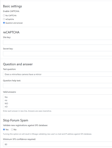
Very little. We can have a question and answer, or Captcha of one form or another and that's about it. We can get them to self activate with the response to an email, but that method brought in Danno & clones.
Alan,
Just to clarify this suggestion : I was thinking of one single theme featured on the front page, changing every now and then (I guess a month is ok). This is based on exercises I've seen in real life photo clubs : announcing a theme, planning a discussion & photo viewing session some time after, people take photos during that time. I think it is different than having themes on display continuously, it is more effective at making people do it now because the time is limited, instead of doing it later which often means never because everyone is so busy. It pushes peole to try photographic approaches that they are not used to. And I said "theme", but it may (should) be more specific than street or landscape : "hands at work", "childhood memories", "melancholy", "nature in cities", or even image manipulation techniques (miniature effect, etc)...
Amen to that, as I am armed to the teeth with the GIMP and G'MIC.😀