OK - but new users may wonder where those forums are.
Alan
OK - but new users may wonder where those forums are.
Alan

Stepping back into the fray after a month (I like to give you guys time to do your work and also to look at things with fresh eyes)...
I see some refinements to the website home page. This is improving. Couple of extra points for you to consider:
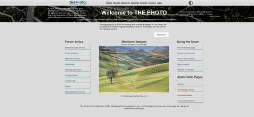
Inconsistencies: There is some inconsistency with the column headings eg "Forum topics" and "Using the Forum". You need to decide on your style guide rules here: capitalise each word in the heading, or just the first word (difficult I know when proper names are involved, but that is the point of a style guide :-) )
Heading justification: The column headings are currently centred. This leads to position variation depending on the number of letters. I would suggest left aligned to keep everything more consistent
Use of centring in general: This is to a degree, a matter of taste, but I'm not a fan of centre alignment for blocks of text on websites. It might work ok for poetry or song lyrics but for plain text it can give an untidy look. I think left aligned ragged is the safest and neatest option. The trouble is if you have been staring at centre alignment for a long time, you kind of get used to it and left alignment seems odd! But generally, left alignment usually looks neater because there is always a fixed and consistent vertical column. If you look at the left aligned button text and compare to the centre aligned column headings you get a good example of the slight scruffiness centre alignment can introduce...
Text size/typography: I'm not sure how you are setting the text size of different page elements. In absolute measures (like points or px) or relative (like 120% of base or ems)? To my eyes (and I understand this is subjective), the column headings seem too big compared to the text on the buttons. With relative sizing you can trial 105%, 110%, 120% of base text size etc. If set with absolute units, I'd recommend switching to relative because it makes it easier to experiment.
On the positive side, the pictures are good. That helps with the marketing. It's nice to have a dark/light theme and both seem effective. I also like that you have firmly bitten the bullet with the forum topic organisation. The site is now unambiguously centred around the images rather than the gear and I think that clarity of purpose is self-evident - exactly what you want prospective new members to see at first sight.
David,
Thanks for the feedback.
Thanks
Alan
I should add that the alignment of the page as a whole is fine - the central body with left and right empty columns is fine and allows rooms for different screen sizes. It's the centre aligned text I'm referring to. Particularly the column headings. It really helps for there to be a consistent left edge with all the text lines starting at exactly the same place ie you could draw an imaginary vertical line to the left of the first word, and every subsequent line of text is butted up against that line eg the 'F' of Forum topics needs to be aligned exactly above the 'S' of Showcase....
OK, I understand. As I said, let me try it on Dev3 first (later tonight, or early tomorrow).
Alan
Have a look at dev3 - tell me if that all works for you.
Alan
Hi Alan
I think that alignment looks more polished. I see you got rid of the Inicaps as well - well mostly, the Useful web links and Members' Images need changing as well. It might also be worth experimenting with the position of the Read More button. Maybe left aligning that for consistency?
As a now retired, but previously the person who was always being nagged by someone who wanted yet another minor change, I thoroughly understand of how sick you can get of even well-meaning (and often contradictory) nagging, so apologies and thanks for all your hard work and patience.
D.

In fact, that is the page I have bookmarked, and it is where I always start.
Please giver me a link to get to "dev3".
David
This is the one I'm using webserve4-nas.synology.me/the-photo-dev3/
and for ease of flicking back and forth, the live page: www.the-photo.org/

A couple of points I noticed today.
The random selection of Member's Images seems a bit borked. It seems to favour 4 or 5 images. I know one needs to run quite a few trials to see an even distribution but the 3 times I have looked at it the same pics seemed to show a lot more often than the others. It may need a randomize() call for each visit.
If a pic is a bit slow in downloading, the display of the next pic will start before the current one is completed. Is it possible to start the timer after the image is fully displayed?
Also, the timer seems a bit short - not a lot of time to view each image.
[Edit] After watching it again, one image displayed again after just two others. I would suggest randomizing the positions of the complete list and then showing them in the same order repetitively for that session.
dev3 is SUPER! Let's go with it, please. Thanks for your hard work and perseverance, Alan
David
Bryan,
There's nothingh I can do about that. It's the way randomisers work.
I can make it longer. It's currently 5 seconds. I'll make it 7 and see what happens. I don't want it too long.
Not easy to do and it would mean people see the same image every time they get in.
No. It is what it is. Images are a max of 3mb, so they shouldn't take long to load now.
Arvo wanted right aligned. You want left aligned, Mike wants the whole thing centred. We can't please everyone!!!!
Alan
Arvo asked to see, how that looks - and after seeing right aligned version, found that centered is way better :)
Which is why I suggested re-randomizing the list each visit in my edit
I wouldn't want it too long either
NO. They wouldn't see the same image each time. The list is randomized each visit and then the images are pulled from the randomized list sequentially.
Something any programmer could do.
Correct answer - you don't know how to do that.
Perhaps I shouldn't ask a leading question. Better a statement - It would be a good idea to start the timer after each image is loaded.
All those images order, randomizing and (pre)loading problems will likely be fixed in some future.
Indeed you can't which is always one of the frustrations of being a site manager. From my perspective it isn't a case of personal preference, I don't mind where the button is, as long as it looks like it belongs where it is and isn't just kind of floating randomly on the page. Left alignment, might anchor it better, might not. Depends.
Its current position is aligned with the right edge of the photo frame space but the (slight) problem is the images are not all the same size and with some of the narrower images the button looks kind of lost. What makes this worse is that it is positioned below the box for the site mission text and meant for expanding that text, yet on my 32" 4k monitor that looks like this:
The button is separated by too much vertical white space from the text it refers making it look like it a line too low and as a result kind of floats in limbo. I imagine this spacing will vary depending on screen and may just be bad luck on my screen and not be possible to optimise for everyone.
Personally, I think it looks OK with the text and the button centred (as per the production site the-photo.org).
Alan