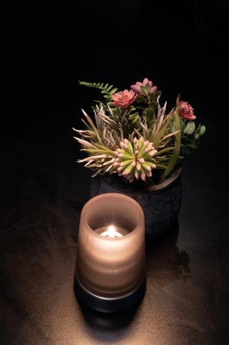
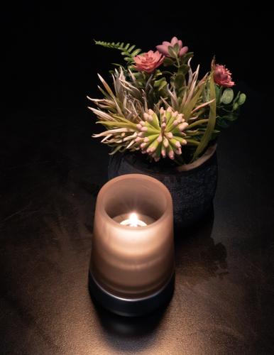
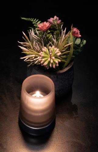
Taken in a hotel foyer, but I hadn't noticed that the aperture ring had moved and it was at F22. But PS cleaned up the noise and I quite like the effect. But do you like it? And, of the two, which do you prefer - the one with more black at the top or the one cropped?
-
Pretty picture 👍🏻
The first one for me, your subject breathes more -
Can you crop it to make it more balanced? Currently entire composition visual centre is somewhat on the right side.
Otherwise first one is better. -
The second for me.
The first is more of a crop if you want to emphasize the height of the subject. And in my opinion that does not apply here. But yes, everyone is free in the way he or she presents the image
-
-
Yes, but leave more black at top - more like on your first image.
(Sorry, I'm not at home, can't experiment myself.) -


