• Members 1027 posts
    March 26, 2024, 2:45 p.m.

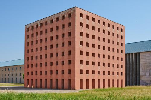
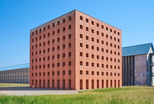
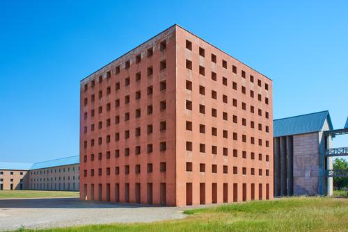
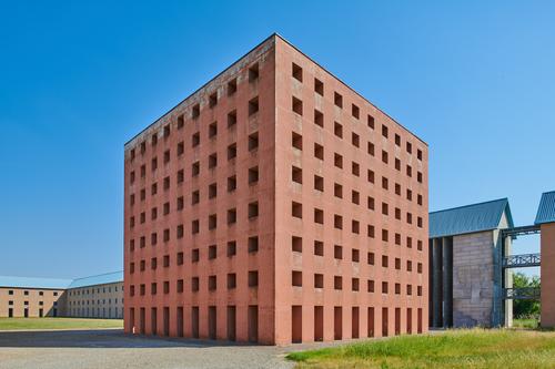
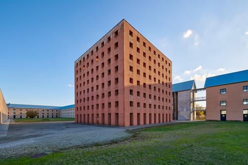
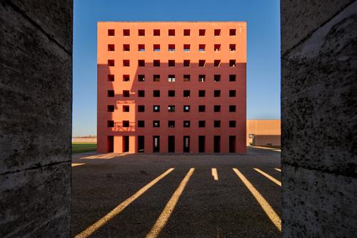
    I took my 4 shift lenses to the San Cataldo Cemetery in Modena to use the Ossario by Aldo Rossi as a test scene. I wanted to see the prospective effects as I switched lenses. Being a cube, it was almost perfect subject for my test. I stated with the 45mm TS and then attached the 35PC, 28PC and lastly the 24TS. I tried to fit the building equally into the pictures, but there is a certain approximation in my testing. I went back on a second occasion with the Laowa 15mm Zero Shift D to add this newly bought lens to the group. These pictures are not artistic.

    My first reaction is that the 45TS "flattens" to much at some angles. The 35PC seems the most natural, the 28PC neither here nor there and the 24mm the most dramatic. The 24mm is good for modern building exteriors, but perhaps too dramatic for older monuments. The 15mm is just for fun here, but it has other uses.

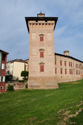
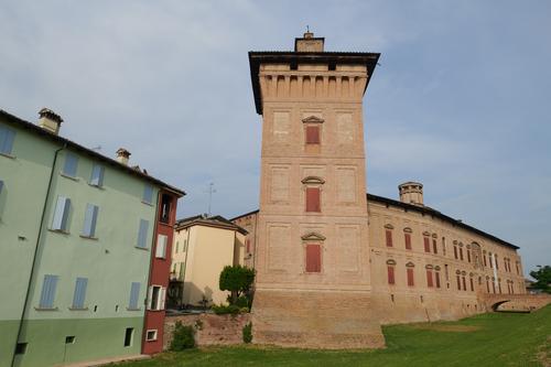
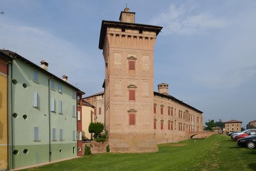
    The next test will be to find some old church with enough space to enable the use of the same four lenses for a similar test, but with the addition of diagonal shifts. Bell towers seem to be the critical part of the rendering of old churches, if you are not front on. But I want to codify the emotional perspective characteristics of each lens to make lens choice in the field easier.

    DSC_0526.jpg
    45mm

    DSC_7808.jpg
    35mm

    DSC_7811.jpg
    28mm

    DSC_0537.jpg
    24mm

    DSC_0677_HDR 1.jpg
    15mm

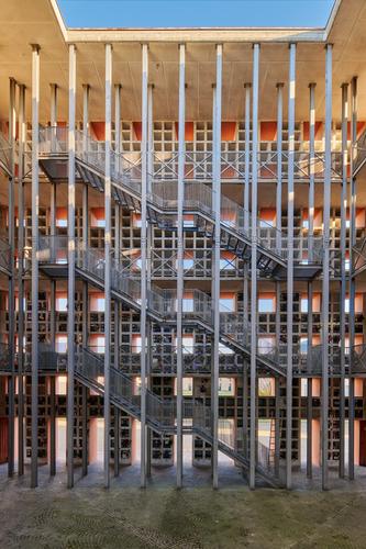
    The 15mm lens enabled an interesting view without using WA effects.

    DSC_0689_HDR 2.jpg

    And the Inside front on shot was only possible with the 15mm

    DSC_0698_HDR 1.jpg

    And the 45mm does not mean we always we lose nice perspective effects

    DSC_0540 3.jpg

    As a final note. I mostly discarded fixed focal lengths, from the moment that bought the Nikon 35-70 2.8 back in the nineties. I still mostly use a zoom for hiking and travel. But for Architecture, I prefer fixed focal lengths as it is easier to select the right focal length for the subject, as the stepped perspective effects between lenses are easer to assess in the field. The perspective gaps between my lenses in 24-45 range are not huge as can be judged by looking at the building in the background.

    DSC_0540 3.jpg

    JPG, 591.4 KB, uploaded by NCV on March 26, 2024.

    DSC_0698_HDR 1.jpg

    JPG, 1.0 MB, uploaded by NCV on March 26, 2024.

    DSC_0689_HDR 2.jpg

    JPG, 653.0 KB, uploaded by NCV on March 26, 2024.

    DSC_0677_HDR 1.jpg

    JPG, 670.2 KB, uploaded by NCV on March 26, 2024.

    DSC_0537.jpg

    JPG, 589.8 KB, uploaded by NCV on March 26, 2024.

    DSC_7811.jpg

    JPG, 720.0 KB, uploaded by NCV on March 26, 2024.

    DSC_7808.jpg

    JPG, 793.9 KB, uploaded by NCV on March 26, 2024.

    DSC_0526.jpg

    JPG, 654.7 KB, uploaded by NCV on March 26, 2024.

  • Members 474 posts
    March 27, 2024, 5:24 a.m.

    For this scene, I think I'm leaning (pun intended) to the 24mm photo as my favorite. For me, it's not about what's "most natural", but what's "most pleasing". You know, like before/after breast augmentation/reduction. 😉

  • Members 2076 posts
    March 27, 2024, 6:54 a.m.

    I like the 45, looks the most natural to my eyes. and its near perfect for a isometric drawing.

  • Members 480 posts
    March 27, 2024, 7:36 a.m.

    I agree. I like it best when viewed from a slightly oblique angle to compensate for the keystone correction that has been applied.

  • Members 1027 posts
    March 27, 2024, 8:07 a.m.

    Interesting that the first two replies seem to prefer a different perspective representation. Both are valid choices, as is my preference for the 35mm view.

    The 24mm is a more dramatic representation, which I agree suits the modern architecture in the picture.

    Don, Isometric projection is something I enjoyed when I did Technical drawing at school. My first Chief Engineer, taught me how to make perspective drawings, and I still have a copy of a scaffold tower constructed with a hard pencil from vanishing points, and then inked in with a Rotring pen. Must have taken me hours. Happy days!

  • Members 1027 posts
    March 27, 2024, 8:26 a.m.

    I do not quite get this reply. I believe keystone correction gives a picture of a building a polished and pleasing result. Do you really like these sort of results where the building gives the impression of falling backwards?

    DSC_0636 3.jpg

    DSC_0646.jpg

    OR maybe this looks better and closer to what we perceive

    DSC_0653.jpg

    When I see pictures of building without keystone correction, like my two deliberate examples, it just tells me that the photographer was just making happy snapshots of a trip, or that the photographer, if his intent was more serious, was just lazy and sloppy.

    Maybe because I am used to looking at technical drawings, and I work a lot with Architects, I am used to seeing their renderings, where verticals are vertical and perspective is balanced. Thus, I expect the verticals to be vertical (or near vertical in some cases), in a decent photograph.

    I am dismayed when I pick up one of those glossy travel magazines and see the non keystone corrected crap they are happy to publish, ( not to mention the cartoonish colours) when illustrating articles about some city or town. Pick up a publication from twenty years or more ago, and we can see that the craft of photography was once far more refined and serious, for certain subjects.

    DSC_0653.jpg

    JPG, 564.9 KB, uploaded by NCV on March 27, 2024.

    DSC_0646.jpg

    JPG, 528.9 KB, uploaded by NCV on March 27, 2024.

    DSC_0636 3.jpg

    JPG, 923.1 KB, uploaded by NCV on March 27, 2024.

  • Members 2076 posts
    March 27, 2024, 8:38 a.m.

    thats awesome mate. i did tech drawing at high school as well for 3 years and used rotring pens , can remember vanishing points too. i have my old school drawings somewhere. my final assesment drawing was a freehand of a 4 cylinder engine in pencil and then inked in.

  • Members 480 posts
    March 27, 2024, 9:43 a.m.

    Sorry, I should have explained why.

    With typical wide-angle photographs of buildings in books or magazines, the only comfortable way to view the images is from a distance far greater than the length of the diagonal. With wide-angle photographs, the centre of perspective is much closer to the image than the length of the diagonal, so there is little chance that they will be viewed from the centre of perspective. Under such viewing conditions, we see perspective distortion and I agree that it is much more pleasing to see the verticals vertical, rather than converging. It makes the distortion less jarring.

    However, if you can view a picture from the centre of perspective, then it generally looks more natural than viewing it from further away (even if the verticals have been corrected). With your 45mm image it is fairly easy to view it from the centre of perspective.

    Try it. Look at your 45mm image from a distance equal to the length of the diagonal or thereabouts. To get the centre of perspective, you need to move your eye so that it is in line with a point on the building that is the same level as the camera was when the shot was taken. (Correcting the verticals has the same effect as moving the optical axis to make it level. The centre of perspective lies on the optical axis.)

  • Removed user
    March 27, 2024, 3:58 p.m.

    An interesting concept, that of "compensating for the keystone correction" ... implying that less correction would have looked "better".

  • Members 480 posts
    March 27, 2024, 4:23 p.m.

    More precisely, viewing with the correct perspective (i.e. the perspective seen from the camera position) is generally "better" than viewing with a wide-angle perspective.

    However, if we are viewing with a wide-angle perspective, then the image will generally look "better" after keystone correction has been applied.