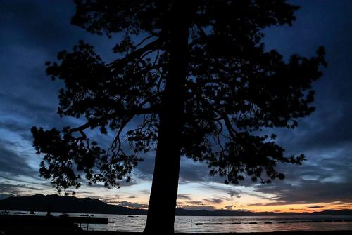
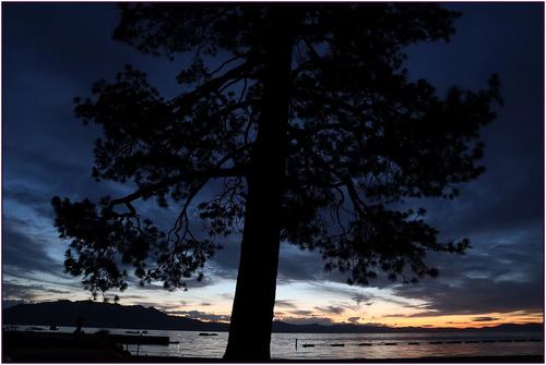
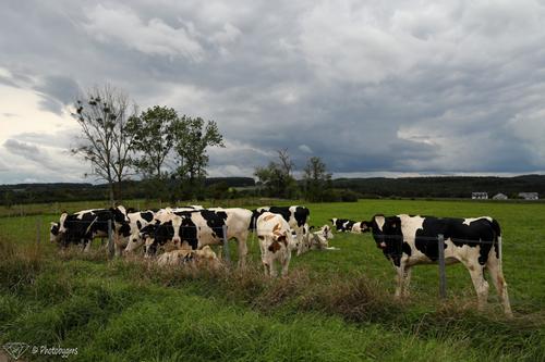
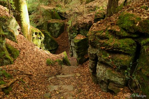
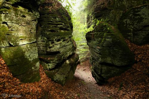
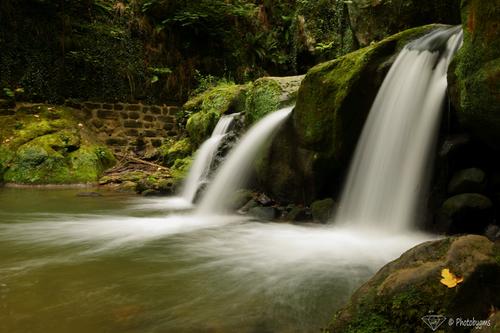
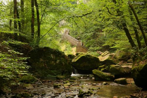
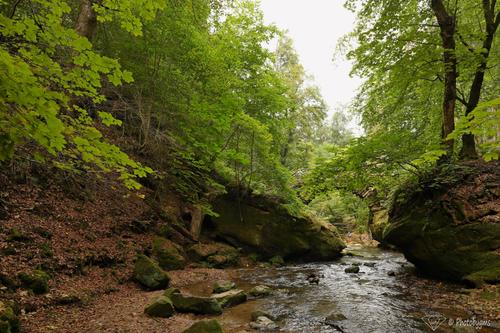
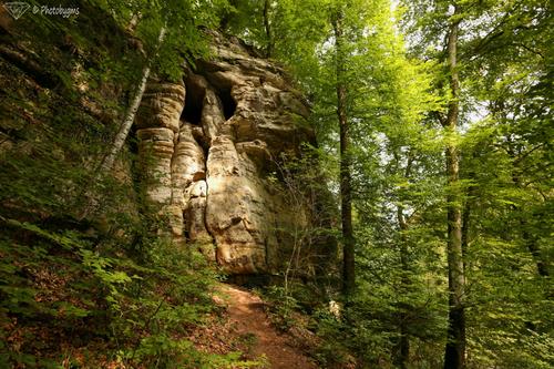
I agree with David. Also prefer this one. I would brighten it up a little bit though:
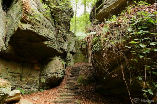
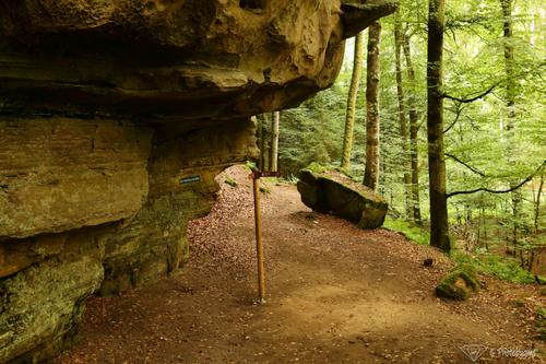
The other shots are also very interesting - I would suggest the same though. I know that my screen is a little bit on the dark side, but I still think they could benefit from a little bit of extra processing, making the distinction between silhouette and background a little bit clearer and increase saturation a tiny bit where necessary. Either way - fascinating shots, well done!
