An interesting set of comparisons of the Rose Lilies. I had to view them all up close to see how I felt. While the B&W and extended pp versions have their place, I feel the original wins hands down. The tall vase and the pastel blue background fit very well with the primary. I noticed the shadows are quite diffuse and unobtrusive - now I know why some photogs have those strange white umbrellas... The horizontal banding in the background does well to break up the length of the vase but is perhaps just a touch too strong. Beautiful image.

Sept. 26, 2024
176
-
-

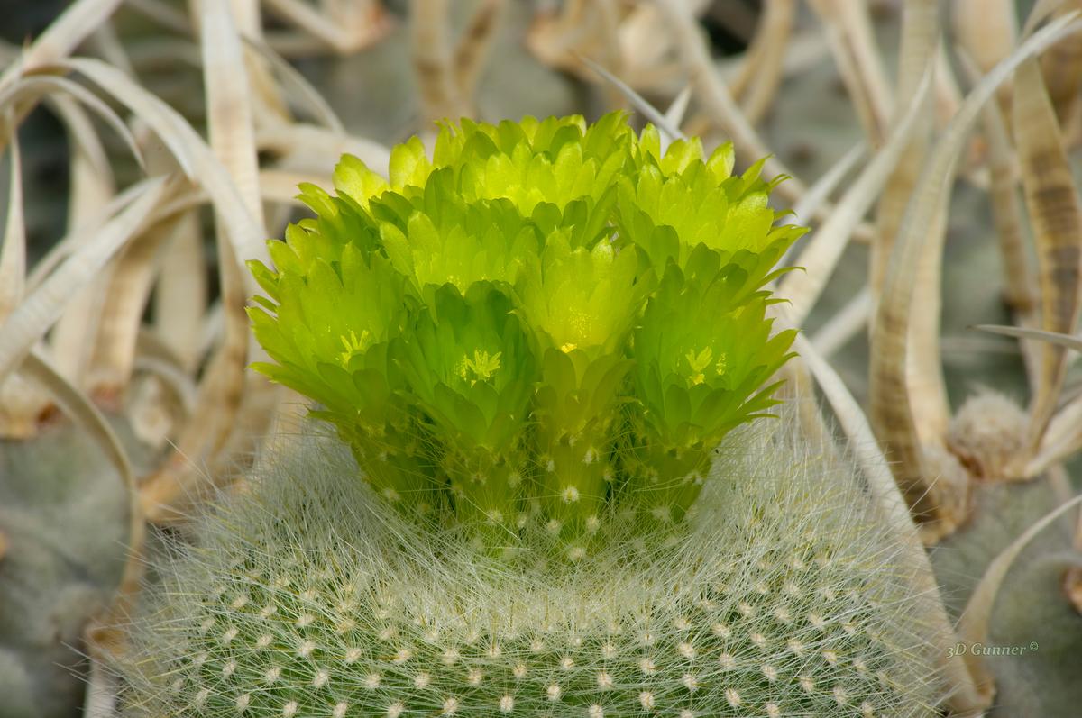
A cactus with green flowers.
-
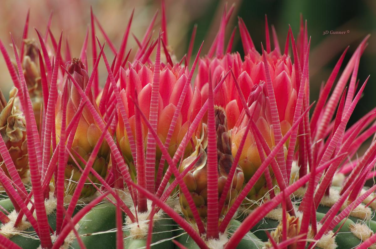
Another one, with purple thorns and flowers.
-
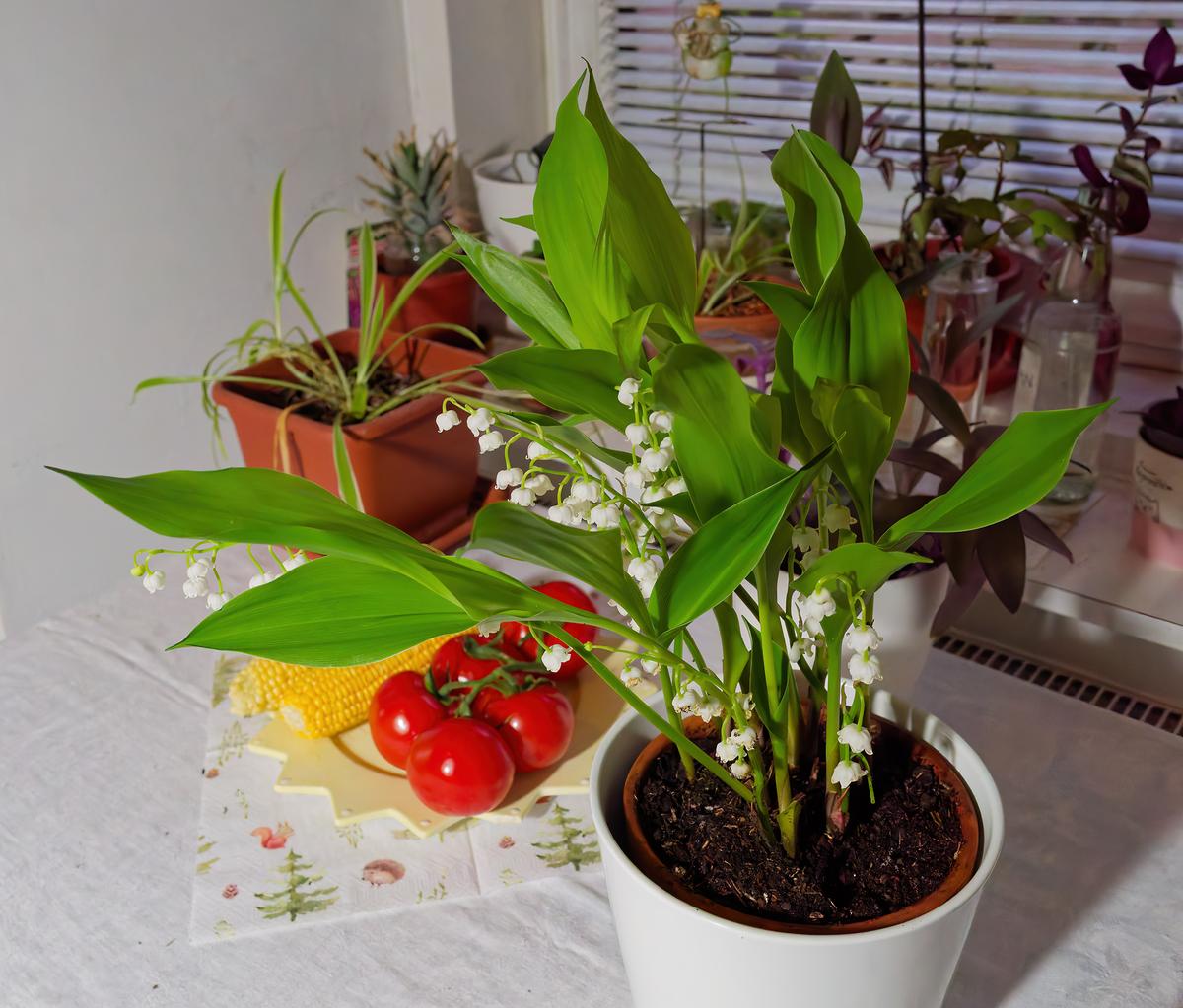
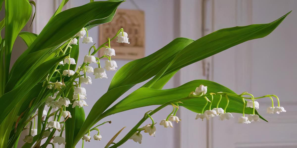
Lilly of the Valley
-
Watch this space...
-
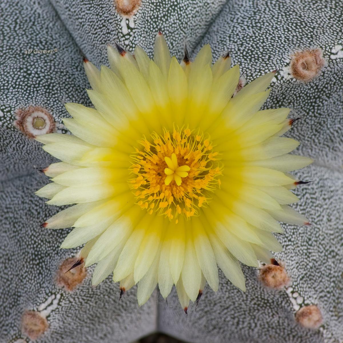
Cactus with yellow flowers.
-

Some flowers in the garden today
 180526 lots of white by softmarmotte, on Flickr
 180526 blue irises by softmarmotte, on Flickr
 180526 allium macro by softmarmotte, on Flickr
 -
That's a beautiful pic. Well constructed
-

-
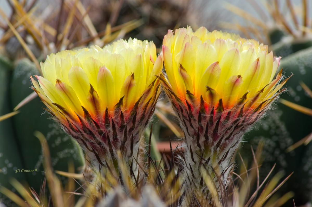
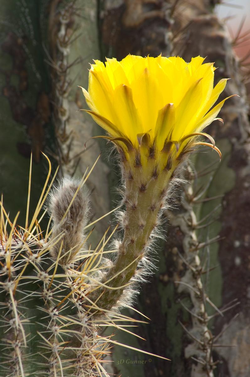
Two more different species of cactus with yellow flowers.
-

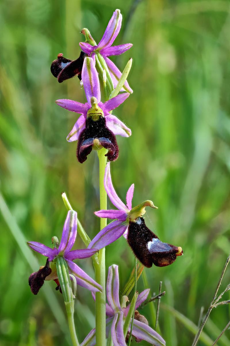
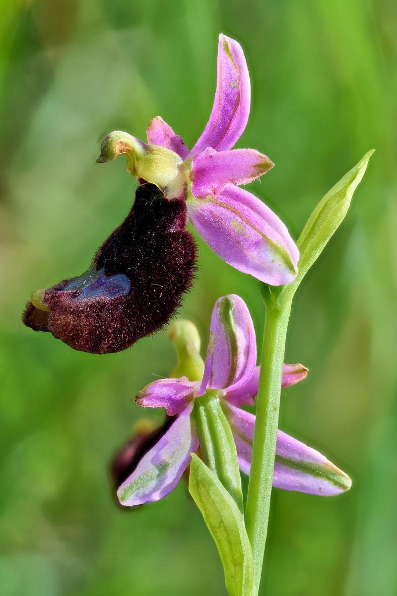
Ophrys Bertolonii Moretti
Shot in the Tosco Emilian Apennines
-

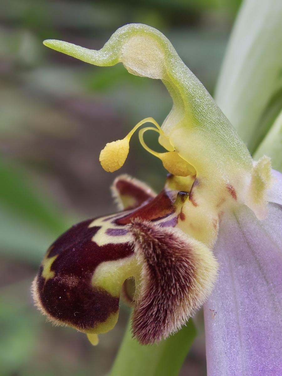
Ophrys apifera…
-
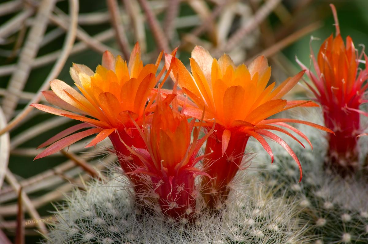
From the cactus flower series, red flowers.
-
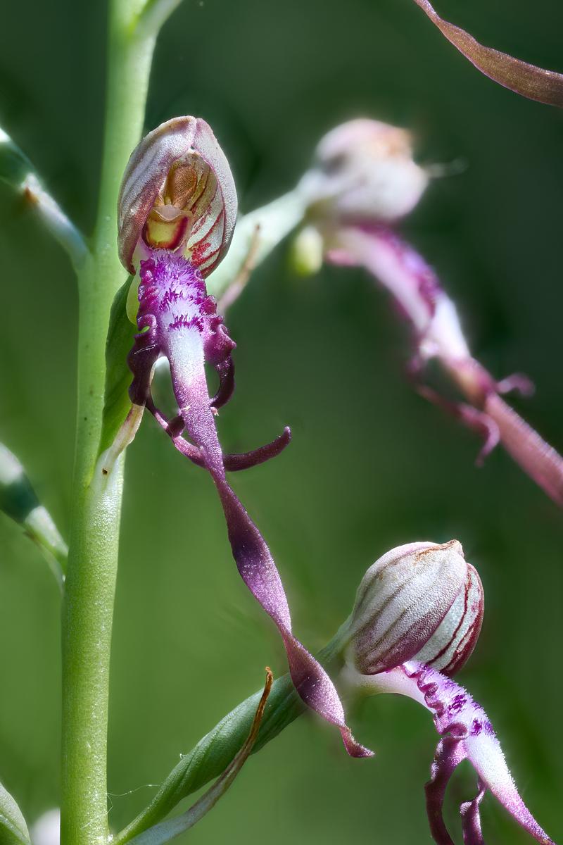
Himantoglossum adriaticum
-
 260526 orange foxglove by softmarmotte, on Flickr
 -

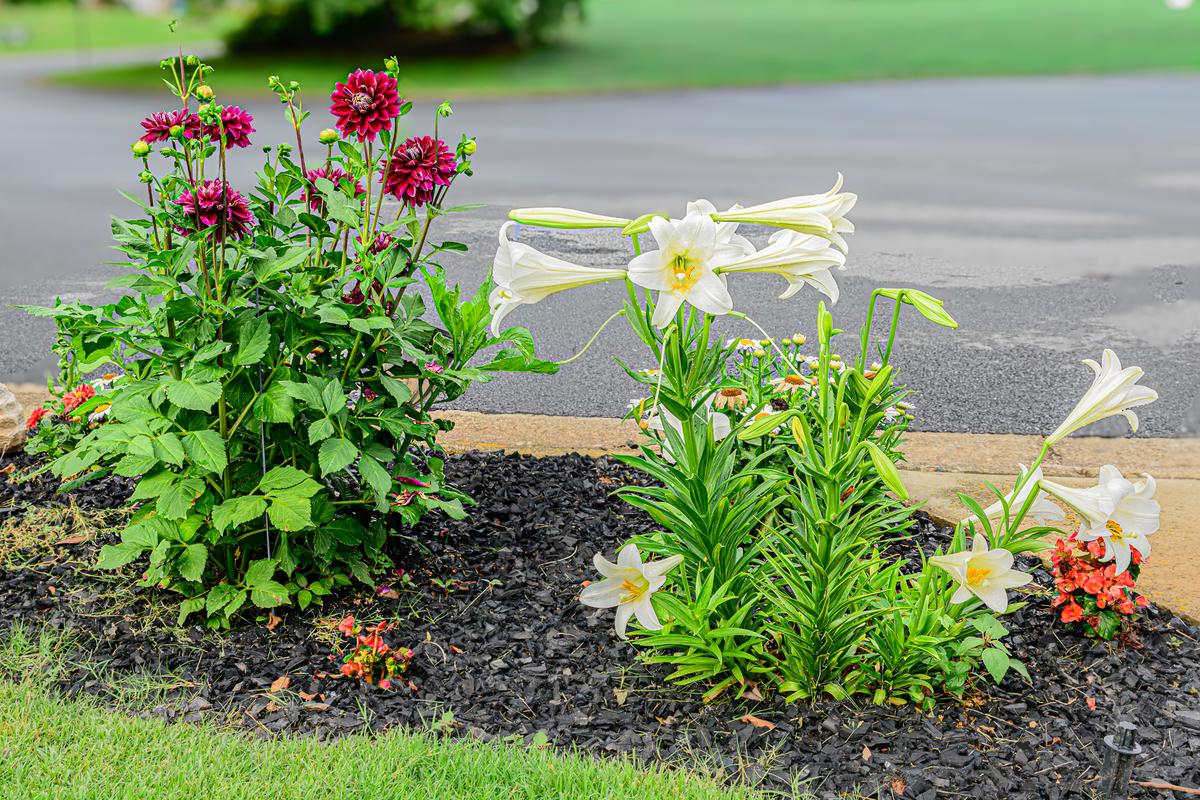
Little flowerbed
-
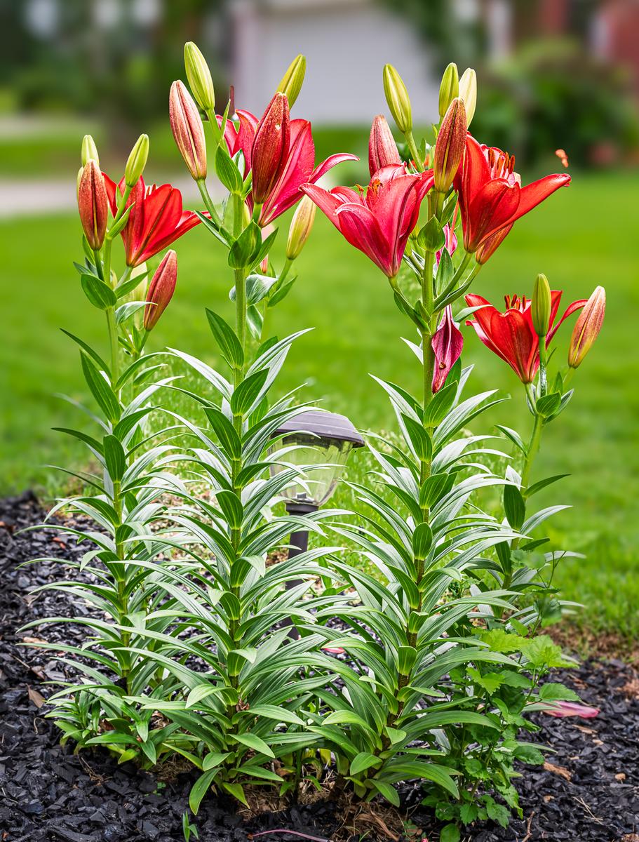
Red Lilies in our yard
-