. xxx
-
-
-
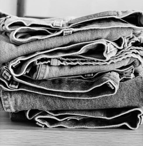
That pic certainly brings back the nice memory of putting on a freshly washed, crisp sun dried or soft tumbled pair.
You can even read the label on the top pair. Unfortunately that iconic brand has gone to the dogs in my country. Cheap poor quality denim but still asking a label price... I remember we used to joke that a new pair could stand up by themselves in the corner. -
-
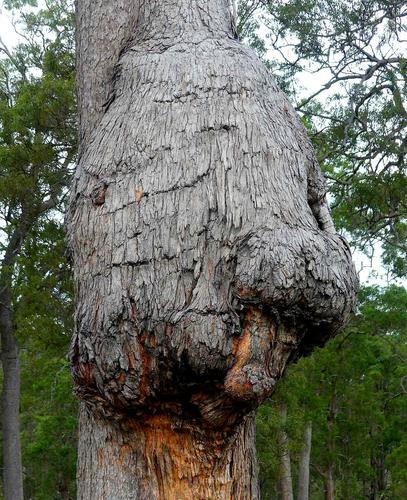
Fantasy makes it look like a woman climbing a tree. From behind we see her left arm, her narrow waist and her wide skirt. Children can see even more when the light fades. That is always the mystery of the forest. A doctor probably sees it differently, but yes, that's what a doctor does or e.g. a tree surgeon ;) 😀
Lou
-
Viewing this on my 1366 x 768 laptop I was thinking how difficult it is to capture the view seen real time in a photo. When I viewed it full size and the bottom and top were cropped, it came to life. I could see much more detail in the trees and grass and really nice yellow to soft purple (your fav) tones in the sky and reflection.
-
I agree. I am motivated every time I see photographs of some every day object or an often-photographic subject shown in a new, different or interesting way.
Thanks for looking!
Rich
-
@Bryan has written:@Rich42 has written:
4x5 T-Max 100, HC110, 210mm LF NikkorWell-worn jeans. Fresh from the washer and drier. Soft.
Rich
That pic certainly brings back the nice memory of putting on a freshly washed, crisp sun dried or soft tumbled pair.
You can even read the label on the top pair. Unfortunately that iconic brand has gone to the dogs in my country. Cheap poor quality denim but still asking a label price... I remember we used to joke that a new pair could stand up by themselves in the corner.I haven't bought a new pair in years! I wonder how the quality is now here in the U.S.
Rich
-
@LouHolland has written:
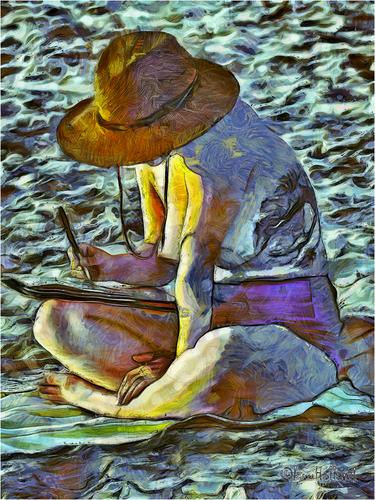
On the beach, a van Gogh style photograph
Lou
Click on the image, then on the arrow to get a better view on the processing.
A lovely result Lou. A 'painting' I would hang on my wall.
Andrew
-
@LindaS has written:
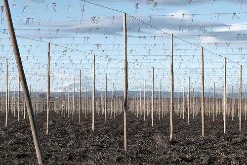
AFTER THE HARVEST
Shot in 2017, re-edited a few times since. Feedback has often been about the diagonal pole. Your thoughts? Also, do you know what the scene is, and does knowing or not knowing add or detract from any possible interest? Thanks much!
That would be a Hops field. I'd guess it was shot somewhere in the US Pacific Northwest. But I can't quite place the mountain in the background. Is it Mt St Helens? If so, that might place you somewhere south of Centralia and north of Vancouver Washington.
Now I'm getting thirsty for a beer.
-
@JimKasson has written:
Another series that isn't abstract. IR-modded camera.
I seriously love these. I have shot many stitched images over the years, but never thought to do so in a way that allowed the un-cropped border to become the frame. What a great idea!
After looking at these, I'm inspired to go out and try it. I am guessing that the combination of a black border and a good B&W image are key elements of the success here. Have you ever done one of these in color? If so, did you choose a color for the frame? I don't have an IR modified body. How much does the fact that these are IR images enter into their success?
-
@MikePDX has written:
Have you ever done one of these in color? If so, did you choose a color for the frame? I don't have an IR modified body. How much does the fact that these are IR images enter into their success?
Some. I didn't choose color for the negative space. I don't think that it's necessary to use this technique for only IR images.
-
@LouHolland has written:
On the beach, a van Gogh style photograph
Lou
Click on the image, then on the arrow to get a better view on the processing.
Such engaging body language, so intent of what she's writing. Love that we can't see her face; allows us to imagine even more of the story. Lou, do you do this with any plug-in assistance, or all your own digital brushwork?
-
@MikePDX has written:@LindaS has written:
AFTER THE HARVEST
Shot in 2017, re-edited a few times since. Feedback has often been about the diagonal pole. Your thoughts? Also, do you know what the scene is, and does knowing or not knowing add or detract from any possible interest? Thanks much!
That would be a Hops field. I'd guess it was shot somewhere in the US Pacific Northwest. But I can't quite place the mountain in the background. Is it Mt St Helens? If so, that might place you somewhere south of Centralia and north of Vancouver Washington.
Now I'm getting thirsty for a beer.
Thanks for playing! It is Mount Adams, as seen from the Yakima Valley. I've been fascinated with the design and architecture of these fields, poles and twine since moving here 20+ years ago from New England. I've also enjoyed photographing the spring preparation and the harvest. Alas, I still prefer sangria to beer 😂
-
@Bryan has written:
Sleeping Ram
I like the textures, angle of view and contrast with the lush green background. It's fun to imagine shapes of humans or animals, but I'm more interested in what caused the deformity/injury. Do you have any information?
-
-
@WhyNot has written:
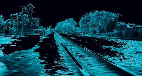
Something different
WhyNot
This image has a classic composition using railroad tracks as a leading line/compositional construct around which the rest of the image is built. A line emerging from the lower right corner and leading into the vanishing point left of center is a guaranteed effective compositional device. So right away we know the image has strength. You've simplified the image by reducing it to two colors. It still works as we make out the shapes necessary to understand the image. I don't know how you'd print it successfully which is always something I consider when assessing images. But it is an interesting, arresting, and well constructed image.
-
@Rich42 has written:
4x5 T-Max 100, HC110, 210mm LF NikkorWell-worn jeans. Fresh from the washer and drier. Soft.
Rich
Visually appealing image with full range of tones. The textures, which dominate the image, range from soft to rough, The folds and the tones they create pull the eye through the stack zigzagging from bottom to top.
Freeman Patterson, in his instruction on texture-as-subject, has a similar image but in color. It is in one of his books, too, but I can't remember which. His stack was a little neater than yours, so yours is more interesting😀.
![[Group 13]-_DSC8971__DSC8986-16 images_0000-Edit.jpg](/a/thumb/bnDVmKWh3hOcmMsH2arLRSzuZSxKnGwYrLa3YeuDbtL8UAfyijBUSEy6At8z6C8g/7564/?shva=1)
![[Group 9]-_DSC9424__DSC9462-39 images_0000-Edit.jpg](/a/thumb/pED7Z2HT54NWZFnVcKYTvs1nuX1gwIY777dFcxsu7ZSNsaR0xoWv27AVqWu51u2t/7565/?shva=1)
![[Group 8]-_DSC1685__DSC1730-43 images_0000.jpg](/a/thumb/RcAKyFzzxe8MKjulkSp0vAyvHkNkohmQqoCvms9LstB6slYQgC6nbPJy02QawXb4/7566/?shva=1)
![[Group 12]-_D410789__D410799-11 images_0000.jpg](/a/thumb/hIkmPQ1PzsOaDGZhNVimNnQgCJYADss4ExGxGxLYyAoA0z5uA5v07Z4nJ8TxYhtg/7725/?shva=1)
![[Group 9]-_D409453__D409465-13 images_0000.jpg](/a/thumb/kHszegSb2G4uiBlwIGltIbPJIUHPv3VfWB35io4glAKG7irDNA85hdybOUyiuuUR/7726/?shva=1)
![[Group 8]-_D418374__D418384-11 images_0000-Edit.jpg](/a/thumb/rK3kGLpR9RbXl9qSgCXK62r7o8EkN9KUxMkiIV5l1QdNkGRpPm8Kc7b8RCYYV0WR/7727/?shva=1)
![[Group 2]-_D416891__D416901-11 images_0000-Edit.jpg](/a/thumb/32zGotPGtM4CouokfW9o7CowfsvV7bMQkMmzOmYzROsI6Mx5a9be2rPF2VJCmq7P/7728/?shva=1)
