-
-
-
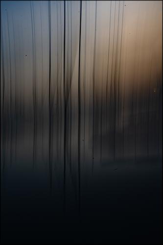
Love the wonderful lines and atmosphere of this shot. I assume it's an ICM shot? Very effective use of movement and beautiful tones. I also love how dark it is, seems just perfect and would work exceptionally well as a print, I'm sure.
-

Not just one among many! by simple.joy, on Flickr -
-
-
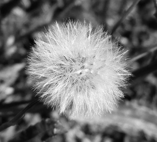
This works very well, the bright white dandelion definitely "pops" against that darker background!
-
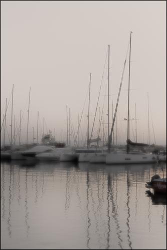
An image that is sharp and soft at the same time, the reflection at the bottom works well too.
best viewed large in hi res.
Sometimes we'll just pick fruit and eat it without looking closely, shame really, we miss out on the beauty you've captured here -
This dark image with ICM works well, I visited the Belvedere art exhibition at the weekend and the old masters often used such very dark themes in their paintings.
I have a famous dark print on my wall, of a seascape, to remind me to visit the "dark side" with my images more often :-)As a technical side-note, I assume you used a high F number to slow the shutter speed for this image. Is it that, that has caused dust on the sensor to be showing up so visibly here ?
-
-
-
Simplicity is the key here. Two colours, good graphic design principles, the shallow depth of field to ensure the supporting elements don't drag the eye away from the subject. The darker border to pull the eye to the centre. Then the clear, sharp fine detail, and soft tonal and hue gradations to enjoy. Classic "concentration of goodness" composition.
-
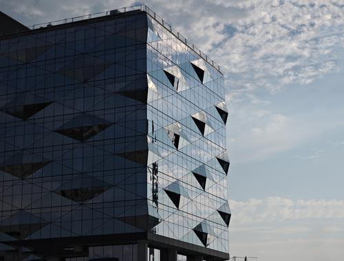
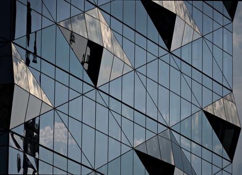
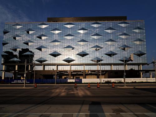
Nice subject, nice strong light, ideal for reflections and graphic images. If it was me, I would take the third image (the head on view) and crop tight so you have an image a little like the second image but directly head on. I'd also apply some geometric straightening so it looked perfectly square. I think the direct approach would maximise the graphic element, make things more abstract, accentuate symmetry and simplicity while avoiding distractions. But that's just my taste, others may disagree, Ultimately it is the photographer's choice: do what pleases you.
-
Both are stellar, with #1 having great atmosphere and #2 being an abstract easily wins me over. Print and hang category.
-
Just superb in it's simplicity. I like the black string bits hanging from the fruit. They definitely add a lot. Well done.
-
-
@DavidMillier has written:
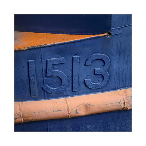
1513: Colour abstract, Royal Victoria Dock, London
(Click the thumbnail for a crisp view)Like your lines and different colours. It all plays very well together.
-
@WhyNot has written:
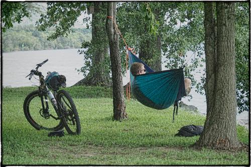
Summer 4
WhyNot
I call this freedom. He probably is looking at the lake, admiring the view...

