Chicago is my favorite city to photograph because of what you've got here: beautiful lake with water that tells the story of its glacial past, and a smorgasbord of wonderful architecture set against dramatic skies with a boundary of trees between for separation. Good exposure to hold onto the brights in the clouds and all those fine details in the buildings and even the boats. Curious about the colors, which I like a lot - wondering if this is an HDR exposure, or whether you got this with a filter or in post processing, or just lucky light.
April 17, 2024
45
-

-

Agree.
I've lived in Chicago for two months in the summer of 1994, but I don't have any photos from that time.
I've always wanted to go back to that city but it hasn't happened yet. Someday, for sure.To me also, the colours look HDR-like.
It works for this image, although I do not really like HDR in general.The only thing that could improve this skyline is a view that would be even slightly wider, to include the Hancock Center.
(That was my main view when looking towards the city, living just a bit north of it, near Oak Street beach.
In fact, I lived on Elm Street, and my time there was anything but a nightmare.) -
I've been known to just walk up to velvet ropes in museums and remove them for a photo, and then put them back where they were, before museum guards really saw what was happening. That was not an option with this fixed chain, although there were no guards around...
-

Thank you Rich, Mike, Pete. minniev and Roel for looking and commenting. There has not been used any filter or HDR exposure. Everything is a combination of the light from the sky, reflected light from the water and processing. The body of the water was bigger in the original image. I've cropped it out.
-

Decision time and I'm still fence sitting. The subject is doing nothing for me but the image still has allure. There's a moths and flame thing going on. We can't see the entrance but the red rimmed sign and the warm glow of the lamp appeal. I'm thinking about it as an abstract where colours and lines can be satisfying with no discernible subject. It isn't completely abstract, a mall and shops might offer goodies.The complementary colours are comfortable and enticing.The converging sides of the sign are acting like an arrow in combination with the lamp to pull us into the interior.
It's working but I have lots of problems in trying to explain why. -
Spring
-

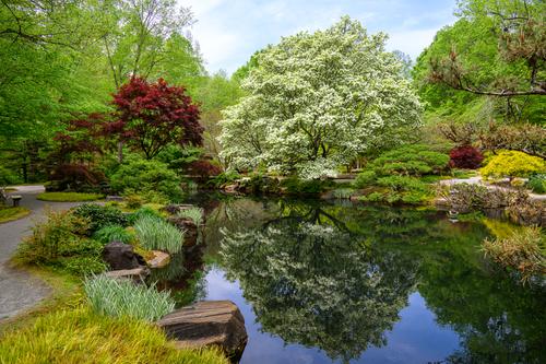
This is a busy photo, with lots of different colours and shapes of plants, but it is a well-balanced composition, so the overall impression is peaceful and not jarring. I particularly like how you dealt with the intruding branches on the right, which could have spoiled it, by cutting through shapes and colours. One branch runs along the edge of the lake and is hardly noticeable against the bank, and the one above follows the contours of the yellow and red bushes exactly, without cutting into them, so is not intrusive either.
The large tree with white blossom is the dominant subject and its reflection, contained perfectly within the lake, doubles the effect.Pete
-
Thanks for the comments.
I didn’t want to crop out the tree, because I wanted the photo to be about the tree as much as about the group of Buddhists, since Buddha’s first sermon was under the shade of a large tree. (The “Original” tree was nearby on the same site, surrounded by religious items, fences, seating etc., so this scene actually seemed more authentic). I also chose a square frame because that gives sense of stability and peacefulness, especially if the composition is based around the centre.
There is another amusing item, which nobody has mentioned, and I am not surprised, as it is tiny. The teacher on the right is wearing a microphone and has a loudspeaker at his side, which is actually rather an over-kill for the small group. It is at odds with the quiet scene, which otherwise could almost be from Buddha’s time, and this combination of seemingly being timeless, but is actually quite modern, influenced the title too.
Pete
-
-
A candidate for the "there is no absolutely right or wrong way to look at photographs" award.
I like the red cone on the right in 1 but prefer the crop of the road on the right in 2. I like the crop on the left in 2.
I like the crop of the bottom road in 2.
Love the sky in 1 but prefer the crop in 2. Like the section of clearer blues in 1 but don't like the murkier sky in 2.
Can't sum that up into a preference for one or the other.