A great shadow-selfie photo. They can often be very effective. This one certainly is.
A nice photo to add into the family album!

Sept. 9, 2026
58
-
-
Super shot. The yellow flowering field makes a great background for that long row of trees.
And the row of wind turbines looks good too. -
Bright and vivid colours everywhere. A joy to view
-

I really like the abstract quality of this!
-
Good captures! I feel like this one is particularly effective because of the combination of colors and nice separation from the background.
-

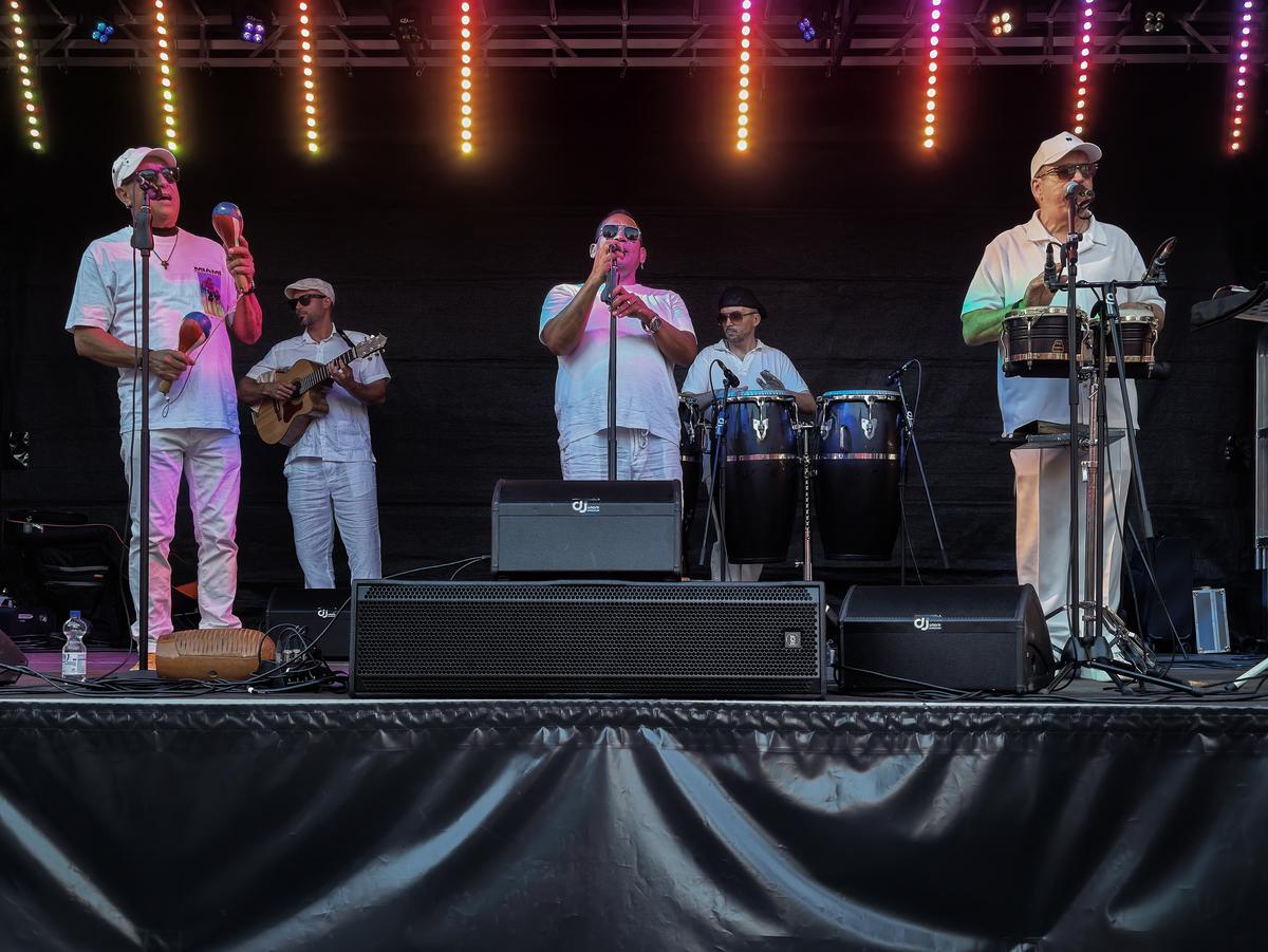
ORQUESTA SALSABORRR
-
I really like the photo, but I would have preferred to see it in a much higher resolution.
The colors, the composition, and of course the scenery are beautiful.
1440x381 pixels is simply too small. -
That's my favorite.
-

I'd have preferred to see it at much higher resolution too. The shot is at iso 200 and F8 taken with an outstanding zoom lens at ots full 70mm on a camera with a 61mpeg FF sensor. This is a huge crop from the original image. What is shown was a looong way away. We were driving. What is shown was on the horizon. I saw the possibilties so we stopped. The fields are fenced and getting closer wasn't possible. Frankly, I was surprised to be able to get it as well as it turned out.
I might play with it further. The power lines running right across the image need to be a little darker - I think they are important to the concept here. I have removed one power line that broke up the horizontal lines. -
Perhaps leave out the second last shot? The others create a study in delicacy. The fine vertical stems and leaves with the flower heads located at the top make a series where the viewer is invited to appreciate the delicacy of these blooms. In itself, there's nothing at all wrong with shot 5, it just breaks the mood of the series.
It's an unusual theme for a series and that makes it all the better.
Shot 4 is my favourite. Possibly this is because more of the stems are in focus and so in this shot the delicacy of the flowers is even more evident. -
Truly beautiful.
The positioning of the face, top right with eyes that look back to the lanterns, is inspired. It gives a diagonal line that brings everything together. A wonderful piece of composition.
I love the low key colours here. Add the eyes and there is a suggestion of passed time and memories. If these had been shining it may have given visual punch but I think the subtlety would have neen lost. -
It's difficult to get a shot of a band set up on stage and have it look different. Well done. Kumsal has managed it by careful inclusion and cropping of the lights above and the drapes below. The band themselves are doing nothing at all of interest.
That row of vertical lights complemets the staic verticality of the band members and breaks them up into smaller groups. The drapery below gives lines that take us straight to the lead singer while connecting him to those at the side.
A very clever piece of framing. -
This image has a supremely distinct ratio and it absolutely makes the most of it.
More still: it NEEDS that super wide horizontalityIf the image were any less wide, it would be about the modern windmills rising out of and standing above the plain.
Just imagine any square section of this image, and you will see what I mean.
It would be: some emptyish green foreground, a sliver of yellow hill with trees in front of it, and then windmills dominating above.The ultra wide ratio does something else completely: it shows us how wide the earth is, with the flag-like layers of green, yellow and blue (Brazilian colours!) catching the eye first. The tree line, while impressive up close, looks like a procession of ants in front of that gorgeous pure yellow. And the windmills are mere cocktail sticks thrown onto the land by a giant's hand.
I could see this image occupying a whole stretch of wall somewhere in an office space (or in a fitness room or bar, of course).
-
The colour on display here is like a child of gods has spilled his watercolours onto a welcoming canvas.
I love the whole atmosphere. I can almost smell exotic food cooking and somewhere some samba in the background.if you really twist my arm to give a constructive criticism, it would be that the thrid photo of only the yellow flowers on their plant, feels like an odd one out.
It can serve a purpose to illustrate that people in this environment take their cue to colour up their spaces from nature around them.
But we don't need that information. The series is, IMHO, stronger when limited to just the four others. -
That's an amusing title, riffing on the "Coke Zero" brand.
This coke can has indeed been crushed to nothing by the wall.The shallow DOF does its job keeping the attention on the coke can, but frankly, in this case, I think the image would have been just as effective with deeper DOF.
That red can is impossible to miss as a focal point.It would have been more a snapshot about the subject, less a photo showing off the lens.
-
It's a nice scene that would look good in any photograph.
No, let me correct that: it is a nice scene because you concentrated on the lantern and excluded the ground below them (probably busy and distracting).
Many people (the vast majority) would photograph such a scene with the ground and everything that is there, included, and it would be less.(People sometimes remark that in my city scapes, I show the buildings like I was walking through the city before dawn, when the streets were still empty.
The reality is that I often just photograph buildings from the second floor upwards, eliminating the street with cars and scooters, pedestrians, traffic and commercial signs, trashbins, etc.)But that observation is not my main one here.
The main observation is that I love the inclusion of the odd-one-out lantern that has not a floral motif, but an idealized human face.
Having that lantern anywhere in the frame would already have been OK.But it is a stroke of genius to place that lantern on the far right, almost out of the frame. The straight rectangles of the front of that lantern coincide with the frame, feeling almost like a postal stamp placed in the top corner of an envelope. But still we see the perspective of that lanter leading into the rest of the image.
Even better is the fact that you have respected the eyeline of the woman portrait.
Placing her on that right edge, with her look clearly to her right, although her face is turned to her left, feels extremely engaging, like she is looking straight at the viewer while he is enjoying the view of the other lanterns.
(Imagine this image with the female portrait anywhere more near the middle or, god forbid, on the left, looking out of the frame. You will see what I mean.)Reading this image as we westerners most often do when there is no other compelling reason to take another path, i.e. from left to right, our eyes go through the image, over the flowery lanterns, then end up with her and it is almost awkward: "hey, you have been watching me watching all this time, didn't you?"
That sensation makes the idealized portrait come alive.
I may have expressed this awkwardly, but that is the sensation that you have created with this choice.
-
There's no option to stop down a projection lens, so "showing off the lens" comes with the territorry even though it's usually not on my mind when shooting. I CAN (pun intended) understand that unique renderings might be distracting to anyone who instead prefers to see more of what's actually there. That being said, I admire people who are good at documenting stuff in photographs.
-

It's absolutely brilliant in it's simplicity. It has layers and layers of interest and discovery.