Mystery, deep at that.

Sept. 23, 2026
124
-

-
That is my fave, with red background to boot.
-
Absolutely amazing what one can achieve with expert smart phone usage.
-
You certainly give us some amazing examples in art of experiments.
-
That Vista IS priceless!
-
It's the view one really wants to experience.
-
Interesting specimen.
-

Agreed, mainly. It depends on the scene. Most panoramas have to be viewed large and trying to look at them through enlarged sections on a small screen is full of the problems. you point out. Sometimes though , because of the subject matter, the image may have panorama proportions but not need to be seen at big size. I never feel required to frame any image in classic proportions. I'll frame it so it fits a concept I have in mind. Simplejoy's photo this week has panorama side ratios but doesn't need to be viewed at huge size.
-
My shot should have been brighter. We were on a bird watching expedition early in the morning in thick forest. The photo doesn't do him justice. They are gloriously dark dark blue with a superb sheen and are besotted by the colour blue. Note the blue ring around the eye. I needed a bit of sun on him.
Feeding birds here is tightly controlled and requires a licence. What they are fed and how much they can be fed is rigidly set, and policed, by rangers. Offered a shiny blue object or food, these birds will choose the blue object. -
OK. I'm just pointing out an issue with exposure for panoramas. If the exposure is locked over a scene with widely varying light across the scene, some areas may appear too relatively dark or light. If a scene is stitched from multiple images and the camera has recorded them with auto exposure, there may be issues where the overlaps occur when stitching. Sometimes stitching software may try to even these out. Sometimes that variation is the way the scene was.
In the photo we are referring to, I feel the brightness of the area to the right pulls attention to a part of the image that isn't as interesting as the 2/3rds to the left. -
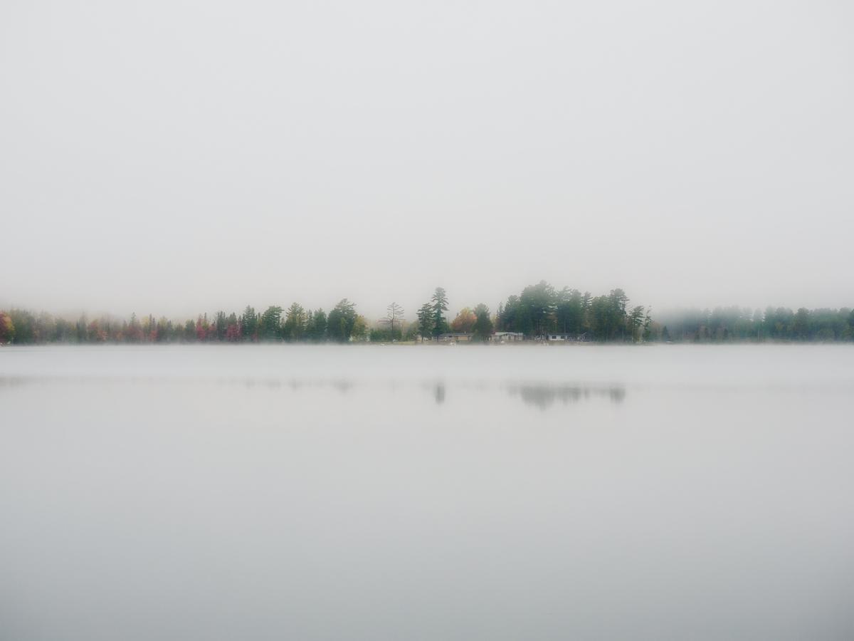
A bit late to this week's party, the site was down when I tried to post last night and I'm traveling so busy all day. Here's where I woke up this morning, at Ruth Lake on the upper peninsula of Michigan. I thought of cropping it to a panorama to go along with this week's discussion but I liked the negative space.
-

It's amazing! I love it, particularly because of the negative space you've mentioned... I think it is a shot which is easily missable, if you're not aware of how the abscence of stuff can work as an element in a composition.
I'm not really good at that yet, when it comes to landscapes, but sometimes I see similar views with fog in the mountain ranges around me. However usually it takes too much time and effort to get to a (ideally higher) viewpoint to capture it, without annoying distractions in the near vicinity...I guess that's a downside of living in the Alps, though otherwise it's something I really enjoy!
BTW. I also like the reflection in the water with the stripe of fog obscuring part of it. To think how far apart the trees in the background and the water surface reflecting them is, is fascinating. What a curious world we live in.
-
Speaking very generally, I'm not a fan of very out of focus nature backgrounds. I prefer more detail to give at least a hint of place behind the subject.
But not with these. Fierplace's macros give us the sharpest of detail of another world. The bokeh here lets the subject detail tell the story unimpeded. Our concentration is all on those details. For that reason my favourite is the first. -
While the photo is easily good enough to stand on its own, the link to the Doors of Durin ices the cake. The image has all the ancient, woody, leafy, mystery of Tolkein's pages.
The exposure with barely lit details is just right. Nothing is clear. A portal to..... A challenge for the bold.
Having a little more light on the keystone is brilliant. Engineeriing skills and strength alongside the earthy natural elements.
Tolkein (and his publishers) would approve. -
I'm latching onto this image on my first run through the contributions, because in a paradoxical way, it does tie in with the informal "theme" of panorama images that we have going seredipitously.
Obviously, this image has its visual information concentrated on a narrow horizontal band down the almost exact center of the image.
A lesser photographer would take that as a cue to cut this image to be a panorama, showing us only the bank of the water with the tree line and its reflection.
And that would not be a bad image. It could fill a long wall.But the uncropped image is so much stronger, because this image is made as much by the negative space as by the horizontal actual scene.
The void of sky above and water below are not superfluous distractions.
They are reminders that (as Gursky knows very well) emptiness serves a purpose : it makes us appreciate more what is actually there, and it gives that actual subject space in which to breathe and to expand and reverberate. -

To be honest, sometimes I think we're patting each other on the back.
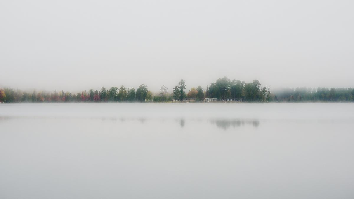
16:9 would do this photo good.
Perhaps a magazine needs that much negative space when it has to fit text in the top and bottom.
And, I have my doubts about the comparison to Gorsky's photos. -
Hi Minniev,
I really like the photo.
But so much negative space?
I would have cropped the photo like that and still had plenty of negative space. -
Excellent photo and very interesting background story.
I've been a Tolkien fan ever since I read the Hobbit many many years ago. Now my two kids are grown up and they are both big fans too.
They liked your photo :-)