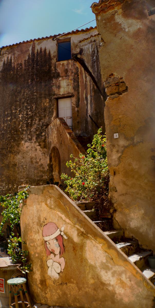

I'm considering comments from Kumsal and Roel here. They have opened an interesting point about viewing images. It is especially relevant to panoramic format.
Perhaps the space around the image alters the way we respond to what is inside the frame of the image? ie., the shape of the wall or page and what else is on the wall or page, may be factors that influence what we feel looks best. Similarly, the distance between the viewer and the image becomes a factor. Looking at a panorama on the average monitor screen is very different to seeing the image big and when the viewer is far enough away to take in more of the composition in the view. These are subjective things. With reference to minniev's shot, here I think I prefer it as she has posted it but I suspect that if I was looking at a large print on an otherwise blank gallery wall (and it might depend on the shape of the wall) I'd prefer a cropped version where the wall was adding space. I don't know.
Back to the image as I'm seeing it on my small laptop screen andt then exploring it with section enlargement.
It's impressionistic and that's what fog does to scenes. A white-out foggy day with a horizontal line of soft detail making a determined stand. Here, I prefer this colour version to what I think a B&W treatment might have given. There are mere hints of colour and that feels right to me along with the fog softened shapes. This isn't empty space. It's a photograph of fog. The line of trees and the reflection help show fog as well as the objects. I'd have preferred a very fine black line around the image as on my screen/viewing it somewhat bleeds into the surrounds.
It's a wonderful , wonderful photo.