Those are great! Especially #1, but I think I like the soft/calm feel of #2 the best. What lens did you use? How much patience do you need?

Sept. 23, 2026
124
-

-
The attraction to blue... very interesting (although the bird does have a blue hue). It makes sense (Wikipedia) but still very unique. This is not a standard crow. If he would also pick-up other colored objects (and white/black they would be a great litter control mechanism! Image #3 -- how did you do that?
-
That's really a great shot! Well done. When I clicked on it and took a look... THAT's when the "pano light" turned on in my head (building on the initial post from RoelHendrickx). . THANKS for sharing this. WOW, I would LOVE to go to Istanbul.
-
WOW. You are right there on the ROCK of Gibraltar! What a great scene. You framed it perfectly.
-
Thanks for the background info and I also looked it up for more details. That's the real thing! Yes, indeed. I like trains, too, but I haven't been inspired to Tolkien's extent! Just some pictures now and then. THANKS.
-
You shutter speed is spot-on in this instance! Cool.
-
Topkapı Palace is quite modest, lacking the grandeur and extravagance of many other palaces. However it boasts the most beautiful view.
You captured the city and Bosphorus very well.
-
You should....
-
:-) That's kind of a Debbie Downer view of the whole thing. I think the process is always worth the journey. If you end up with something that is satisfying to you, GREAT. On the other hand, if, at the end of the overall pano effort, things don't come together, at least you tried! But yes, panos are a niche... and to take the "discipline" to its next logical creative level, you would need a HUGE gallery with massive printing capabilities to properly display the "artist's" creations! THAT would be FUN to develop and see. :-)
-
That's very nice, and I like the overall dreamy effect coupled with the houses on the shore being sharp/distinct. I hear you on the negative space, but a crop would be cool, too. Reminds me of Lake Tapps a little bit.
-
I really like this. Feels like it could be somewhere around here (NW USA) plus, we are starting to get fall weather now, so that's part of it, too. Maybe crop just a tad off the top? But it's great. Warm and cool and breezy and slightly mysterious.
-
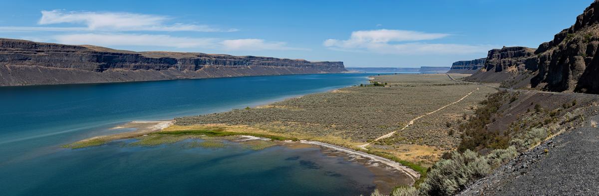
Some really great conversation here from MikeFewster in regard to panoramas -- THANKS for your keen insights/perspectives. We're probably getting a little burned-out on the subject, but I will post ONE MORE (from me, at least) -- taken on a short 2-day road trip in Eastern Washington (August 2025). This is Banks Lake -- looking north along HWY 155 (about 10 miles north of Coulee City). I'm guessing offhand that it is probably reduced to 30% or 40% of original (MP's) and then JPEG compressed to reduce the MB's. Panos are fun! I have glued-together hundreds and hundreds of them over the past 20 years. A very satisfying hobby. Now, all I need is that HUGE gallery I alluded to in a prior post and some sort of highway billboard printing system... along with ways to display the end-product (mounting/framing and lighting). And then I will realize... I really need a MF camera! LOL. It's all fun. 😀
-

Gerneral Pano question; do you think foreground makes a difference? Should it be continuous or just in one part of the image? Maybe if I expect someone to view the image as a whole or in segmeents?
This one is here so the post doesn't get lost.
-

Almost missed this shot from Chris while I was immersed in the panoramas.
It's a fine example of the photographer "seeing" and using a camera so we look again and become aware of beauty we might overlook.
As I've said before, I see no reason for an image to be constrained to any set proportions. This image is wider than usual and it looks just right to me. It's an unusual composition. The bright green leaves place the attention at the very top left. The extended lines to the right however give visual balance. While wider than the usual, I wouldn't see this as a panorama. The proportions allow the whole image to be seen in a single view.
All the Vs of water give pattern and direction. The photographers' choice of shutter speed is exactly right in freezing the water and constructing the Vs. The contrast between the concrete colours and textures and the water is quite perfect.
Definitely a photo for colour not B&W. The small area of delicate green/golds are a joy.
It would make a fine print. -
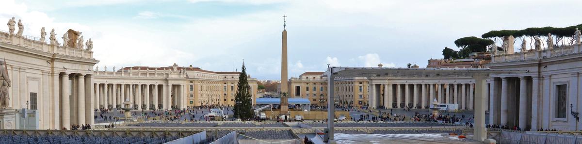
Yes, I think foregrounds are important in panoramas but how they contribute varies from shot to shot. Here, I think the foreground is a problem. The strength of the shot is in the repeating verticals. The foreground is busy and adds extra lines but it feels too truncated. I'd guess that the scene itself is the problem here and the photographer wanted to avoid even more distracting detail that would have intruded with more foreground area. Check CPM's phot, the one posted before yours, for a significant use of foreground in a panorama. Us photographers just have to work with whatever the scene has given us.
-
Thanks for the kind words cpm. I got a bit carried away this week.
Re the banks lake image. It is highly relevant to the question jsphotohobby asks about foregrounds in the post after yours. Foreground and background are linked by lines generated by the curve of the bay that draws the eye down the L blue water and out to the horizon. -
Check the explanation I gave Chris about bird feeding control at this national park in Queensland, Australia. Even though the feeding is very tightly controlled, the birds anticipate it and have learned to sit on hands. That isn't my hand in photo 3.
Bower birds are fascinating. The western bower bird is fascinated by bright green rather than blues. The famous Australian Lyre bird has similar behaviour but I don't think the species are closely related. Bower birds and lyre birds are wonderfull mimics. Anything from other birds to chainsaws, sirens and camera clicking. Quite a few Australian birds are great mimics. -
CPM's shot prompted my question.
I played with this image a lot and you are right, it just doesn't work. I imagine if I had a higher perspetive it would have been better. The chairs and platform were setup for a Christmas Mass and I didn't have the time to explore to find a better perspective. I just threw it in to make the the post more visible.